Watercolor still life painting Apples and Oranges 1

So, I signed up to participate in a short three day art challenge solstice week with the theme of fruit in a bowl. Not even a full second had passed when I already knew what the first artwork would be: a watercolor still life painting using the reference photos from last year that inspired my Apples sketches and acrylic paintings. This time, though, I would only use photos with apples and oranges together in the frame. The bowl requirement excluded a handful of photos, but there was still plenty to choose from.

image of large art print of my watercolor still life Apples and Oranges 1 hanging on a wall over a set dining table
the final watercolor still life painting printed and framed in a mockup – wouldn’t this look lovely over your table?

Choosing the reference photo

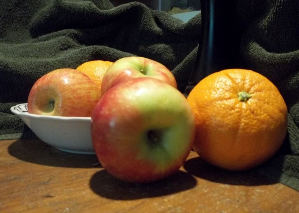
Armed with the parameters of the specific theme for this art challenge, I began browsing my collection of photos taken on my own kitchen table with fruit chosen for its appearance. Yes, I actually went grocery shopping for fruit (and some vegetables) for the purpose of getting myself some reference photos that had the layout and lighting to draw and paint. As most of y’all know, I am blogging buddies with a handful of fine art photographers, and my hundred-or-so photos would probably make each of them cringe. I do not claim to be a photog, but sometimes I can get a snapshot that will make a decent painting reference. Focus tends to be a bonus, not a hard requirement. Here is the photo I chose for the first painting.

reference photo for my watercolor painting, a still life with fruit
cropped to how I wanted the fruit to fill the page

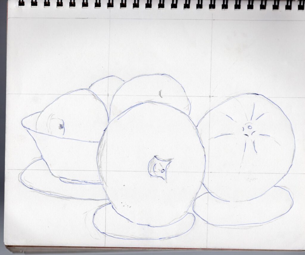
The preliminary sketch done in the sketchbook

I have learned from experience to do my gridding and layout in my sketchbook, not on my watercolor paper. Once I am happy with the general line drawing, I transfer it to my watercolor paper with graphite transfer paper. Then I take a kneaded eraser to clean up the lines and lift up any smudges from resting my hand on it.

contour drawing for the basic layout of Apples and Oranges 1, a still life watercolor painting with fruit in a bowl for the art challenge
the preliminary sketch for Apples and Oranges still life with fruit

This is where the progress photos stop, because once I picked out which paints I wanted to use, I got into the art zone and was only thinking about how I would apply the paint to paper. It took more layers than I expected, because apparently QoR brand watercolor paints have a color shift when they dry. I did do almost the entire painting with my newer QoR set, though I needed to pull out the burnt umber from my Turner set because I had evidently forgotten to make sure I had a nice strong dark brown tube when I purchased the colors last time. I’ll need to fix that with my next art supply splurge, maybe in January.

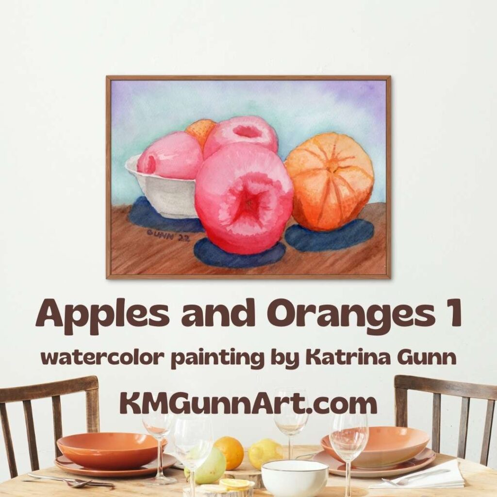
The finished still life in watercolor

I painted this fruit still life (with a bowl) on my 9 by 12 inch watercolor block, which means I did not need to tape a sheet of loose paper to a board. That means the paint goes all the way out to the edges, which is now my preference. I have not sealed it yet, because I am still debating if I should add another layer of pigment to the front apples and orange or not. If you want to purchase the original watercolor still life painting, you can make that decision for me.

Apples and Oranges 1, still life painting in watercolor on paper, 9 x 12 inches
Apples and Oranges 1, 9 x 12 inch watercolor still life on paper, original for sale $100

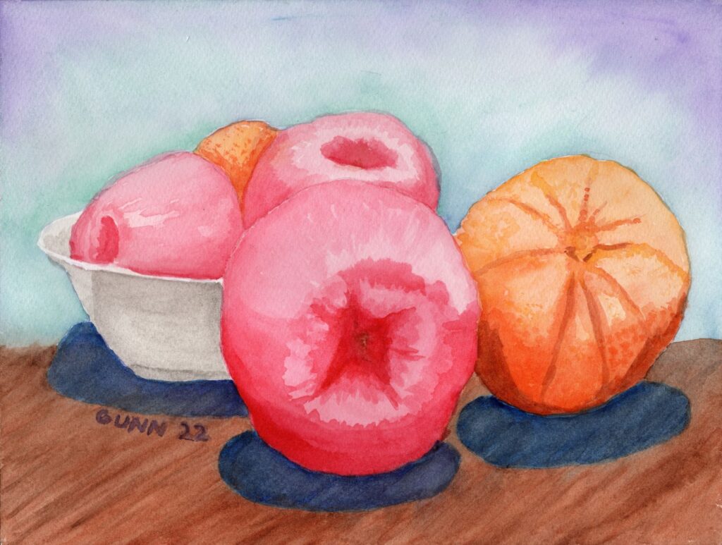
If you want a larger version, you can order a fine art print all the way up to 60 by 45 inches (before matting and framing) from my Pixels shop. That’s almost as tall as I am on the long side! Or, if you prefer your art printed on apparel or useful accessories for you and your home, check into the swag at my RedBubble shop. Finally, if this one is “close but not quite” for you, you can always commission a slightly different piece. I have a 12 by 16 inch watercolor block now.

Stay tuned here for the second piece in this series, which will not be in watercolor, but will still be named “Apples and Oranges.” Or put in an email address so you can have the next post delivered to your inbox. I don’t seem to be able to keep a regular schedule for publishing new blog posts, so that’s probably the best way to keep up.

December Virtual Art Walk

This latest virtual art walk post was supposed to have been a “Feature Friday” post, but apparently I picked up an unwelcome microbial hitchhiker when I was up in town earlier this week. I spent Friday feeling worse and worse, but the good news is, it didn’t last long at all and I am back to my old self. That means it is time to grab a mug of afternoon coffee, apply fingers to keyboard, and type out my post for our December edition of the virtual art walks we’ve been doing the past couple months on our art blogs.

But first, an earworm. Typing out the opening paragraph immediately brought this song to mind:

December by Collective Soul
social media graphic for December virtual art walk
social media image for December virtual art walk

December mean winter

At least in the northern hemisphere. Folks in the southern hemisphere are opposite of us, but I have never traveled south of the equator, so for me it means winter. I grew up in the Midwest in the late 70s and through the 80s, so I saw my share of snow and even a couple blizzards. It may be pretty to look at, but the cold just does not do me any favors. However, on the visual side, Jim Hughes up in the great frozen north – er, Minneapolis – has posted up his black and white record of the battle between the ice and the water flowing beneath and even compares it to images by abstract artist Jackson Pollock. I am not as familiar with the abstract works, so will leave that comparison to those who are, but Jim’s photos do make intriguing visuals.

black and white photo of a partially frozen creek up in Minnesota
Jim Hughes’ photo of the partially-frozen creek

December is a time to look back

Being the last month of the calendar year, December is the logical time to reflect on the year as a whole. Steve Heap has been doing monthly recaps recently, and for this virtual art walk he looks back at his November sales, including one of his personal favorites involving the West Virginia University’s mountaineer statue edited into a photo of a particularly picturesque building on the other side of campus. In the comments, the puffin photo seems to be getting most of the admiration, but my personal pick us the Hawaiian canoe photo. Between the colors and the layout, I would be inclined to paint the Kauai canoe scene out of the group.

traditional red and yellow Hawaiian canoe up on the beach on Kauai
Kauai canoe up in beach at sunset

Jo over at Siena Blue is also doing a bit of looking back, this time spotlighting some of her watercolor and gouache (pronounced “gwash” or similar, for those of us who look at French spellings oddly). The bird painting is cute, and hard to believe that is so small – an artist trading card which is 2.5 inches by 3.5 inches. The one that really turned out beautifully is her landscape in burnt sienna and “a shade of blue,” as she describes it. Personally, I’d like to know which shade of blue, but that is probably because I love the triad of blue, purple, and red/pink so much. Either way, the burnt sienna and blue are across from each other on the color wheel, and if you aren’t careful and those two colors blend too much, you will get a greyish-brown color artists call mud. To use complementary colors and have it work without the dreaded mud happening – especially in watercolor! – is the challenge that both keeps us coming back to the studio while saying some very “nsfw” words when it goes wrong.

watercolor landscape painting by Jo Wortman of Siena Blue
unnamed (?) landscape watercolor painting by Jo Wortman of Siena Blue

I also wrote a bit of a look-back post earlier this week, but hey – I had a good reason to do so! For those who missed it, I took first place in the watercolor category at the VA Creative Arts Festival for the second year in a row.

Looking back at trying something new

Sometimes, the December retrospective is all about looking back after trying something new, and new art walk participant Dorothy Berry-Lound’s post is a look back at a new art technique she was inspired to try after watching a YouTube video. (Funny how many of us can get so fired up after watching a short YT vid!) She describes how physical the new technique was for her, since she has fibromyalgia. Hubby has “fibromyalgia-like symptoms,” so I know what that looks like and the fact she decided to do a second painting using the new technique tells me exactly how pleased she is with her results.

abstract art by Dorothy Berry-Lound called Cat Scratch

I rarely “get” abstract art, but the art world is certainly large enough to encompass the entire spectrum from hyperrealism all the way to the most abstract of abstractions. The color combination is certainly pretty, and it definitely looks textured. I’ll also note that it does resemble a few of my practice watercolors that ended up with cat prints across them (phthalo green does NOT lift), but that is about as far as my more-literal mind will go in trying to interpret. Again, the fact she did a second painting using this physically-exhausting technique tells me she likes the end result.

Looking forward to 2023

I’ve already started getting emails this weekend warning that products ordered this far into December may not arrive in time for Christmas, so I suppose it is time to turn my sights to the new year. After New year’s Dat, there is my birthday, and it is the “big five-oh.” Yeah, I’ll be turning fifty, and Friday before the stomach bug jumped me in earnest, my mother-in-law cut my hair in a new style since my friend Keashia said I should try to style my hair like my new internet “face.”

One last December earworm

This one is for my Dad, and my Mom as well, since they probably will both wrinkle their noses at the one I posted at the beginning. Here is a bit of Frankie Valli for some December music.

Frankie Valli and the Four Seasons December 1963 (Oh What a Night)

Award-winning artwork 2022 Creative Arts Festival

In the absence of an email congratulating me this year, I had assumed I did not win any places for my entries to this year’s VA regional healthcare system’s Creative Arts Festival. As of checking the post office box yesterday, I am happy to report that assumption is wrong. All three of my entries this year took either first or second place! Here is the breakdown of my award-winning artwork. Oh, and the medals in the images? Those were in the envelope, and now hang on the shelf next to my desk.

First place award watercolor painting

snapshot of the first place medal for the watercolor painting Pumpkin Close-Up with on-image caption and inset of artwork
the actual medal mailed to me, with the watercolor painting that won the award

For the second year in a row, I took first place in the watercolor division! Those of y’all reading last year recall I won the first place slot (and advancement to the national competition) with my Flamingo in Rippled Water. This year it is my Pumpkin Close-Up that moves up to national competition – and the original artwork is still available if you would like to hang it on your wall and boast you own a real “award-winning” painting. If the original 10 by 14 inches is just too small, you can order a fine art print large enough to fit most people’s walls at my Pixels store. Or, if you want to wear my art like my mother sister enjoy, check out the apparel options at my RedBubble store.

Second place award winning charcoal drawing

2nd place award winning artwork Two Flamingoes in monochromatic drawing division
Charcoal artwork Two Flamingoes won 2nd place award in monochromatic drawing

Last year, I took first place in the monochromatic drawing category with my white pencil on black paper Dew on a Calla Lily. This year, both Twitter and Facebook voted that I should enter this charcoal drawing of Two Flamingoes, and it took second place. Not bad, and it really IS an unexpected medium for this subject. Most people who draw or paint flamingoes will do so in color.

Want the original drawing to put on display as award-winning artwork? It’s a small 8 by 10 inches, so it will fit into small spaces if need be. If you have a need or strong desire to go BIG, you can always order a larger art print from Pixels. I don’t currently have it up at RedBubble, but may add it in if people ask.

Second place award in oil painting with an oil pastel

Now we get to the award I feel the most pride when I think about it. This would be taking “just” second place in the oil painting division – but with an oil pastel picture! Seriously. I figure the artists who invest in the materials for oil painting and the time involved (because it takes quite a while to dry!) do so when they are confident in their artist skill. Or maybe it’s just me who has hesitated so long. Going up against oil paint on canvas and still winning a medal with my oil pastel on paper feels good.

2nd place award winning artwork Book Reading By Candlelight oil pastel artwork
Book Reading By Candlelight, oil pastel artwork won 2nd place in the oil painting category

If you want the 11 by 14 inch original artwork, I recommend buying it sooner rather than later. My friend Keashia loves this piece, and will be debating anew whether she wants to buy it or not. Want a larger art print? Head to my Pixels shop for those (or a jigsaw puzzle). This image is definitely in my RedBubble shop for apparel and accessories.

Weekly email newsletter starting

If y’all have read down this far, you might as well fill in the little form at the bottom of this post for email subscription and a weekly newsletter (especially for those weeks I don’t get a new post finished!) that I will be sending out on Fridays. It’s been on my to-do list for months, but now it is in place!

Third virtual art walk this Friday

We’re having so much fun doing these virtual art walks, and will do another this weekend. I of course will be posting on Friday so I can do a new Feature Friday. We have at least one new artist playing, so check back in.

Roses in Artwork: Feature Friday 10

I am on a rose kick this week! Roses are such popular flowers and subjects for artwork due to their beauty and elegance – and having a pleasing fragrance helps the real flower’s popularity in bouquets. While I have drawn and painted single roses, I had not yet tackled drawing or painting an entire bouquet of roses. This is in the process of changing, courtesy of my recent experiment with text-to-image software and digital art.

Everything is coming up roses

Sprinkled in among the three new rose bouquet computer-generated images will be blogging friends’ posts featuring roses in artwork in various media. I also wish to note that new hand-drawn and hand-painted art will be created and posted within the next month – before I talk to my Mom again on the phone. Yesterday, she did not beat around the bush or try to sugarcoat her opinion when she immediately asked me when I plan to get my paints back out and make real art instead of playing around on the computer and posting that. Mom knows how to use a clue-by-four!

Pink roses

It should be no secret that pink is my favorite color. So of course the first bouquet of roses I prompted the software to generate was specifically pink. No modifiers, just “bouquet of pink roses in vase on table,” if memory serves me correctly.

large bouquet of pink roses in a vase on the table
Bouquet of Pink Roses, digital artwork

This was only the second image I prompted the program to create, and I felt pretty lucky to get something that looked correct. Being a digital image, there is no original artwork available, but you can get art prints from my Pixels store. If you prefer to wear the art you buy, then take a look at my RedBubble shop options for this image.

If this is not enough pink roses for you, you can always take a look at Tatiana’s Spanish rose, a close-up photograph with enough detail the little ant on one of the rose petals is in clear focus. She found this pair in a garden in Andalusia, Spain. And on the subject of pink rose petals, Sharon Cummings beefed up her description of her rose petal mandala artwork at my request. (Sharon recently won a spot on one of Fine Art America’s billboards, and they even put that one near her in Tampa.)

Red roses

Red roses will be very popular come mid-February. While this won’t win me any points with the independent florists, I think it would be better to gift your Valentine with a rose that won’t wilt – in the form of artwork! Here is another lucky combination of text prompt and random number from the computer program that features red roses.

bouquet of red and pink roses with green foliage in blue vase on table
Roses in Blue Vase, computer-generated artwork

Buy your art prints of this beautiful bouquet through my Pixels store. Get your apparel and accessories with this image at my RedBubble shop. Again, being digital, there is no original painting or drawing available (yet).

If you need a little assistance getting into a romantic Valentine’s mood, check out Steve Heap’s flower photography where he revisits a red rose bouquet he had waiting with champagne for his wife’s birthday in 2012. He does his own version of digital art by using software filters on his photography.

Bouquet of multiple colored roses

In the process of searching for just the right set of modifiers for my text prompt, I noticed two that just go together like chocolate and peanut butter: romanticism (the art movement) and …. Thomas Kincade. Seriously, that would be how I would describe Kincade’s painting style in just one word. No “neo-” prefix, but straight up Romanticism. While he did mostly landscapes, I feel that soft, lovely style is best suited for floral artwork. When I did not specify which color of roses I wanted, I got this lovely image.

a very classic image of a bouquet of different colored roses in a fancy vase on a table, done in the Romanticism style with a Thomas Kincade look
Classic Roses in Vase, digital art

I must admit, I like this one. Not only because the notion of time-shifting Thomas Kincade back to the Romantic period of European oil painting and having him paint flowers appeals to me. Except for that odd but of red in the middle of the bouquet, this may well be the closest that computer program has come to generating the image in my mind. I may break out my oil paints and try this one myself (but after I do the yellow roses in pastel).

Meanwhile, if you want this classic bouquet of roses as an art print, get it at my Pixels shop. If you want it on a shirt or accessories for you home and person, it is available at my RedBubble shop. Again, no original of the digital artwork.

Finally, if you are in search of a perfect rose, Jim Hughes believes he has taken the perfect photograph of a perfect rose. The technical details sailed right over my head, but I do think that is a very good portrait style photo of an elegant rose. Be sure to read the backstory on said rose as well.

I hope all y’all have enjoyed this virtual cornucopia of roses in artwork! It may seem early to be thinking about Valentine’s Day flowers, but I want to be ready for 2023.

Yellow Roses in Purple Vase

First, believe it or not, this is a computer-generated image. I’ve been working for a while on trying to get some classic floral still life style images from the text-to-image software I’ve been playing around with, and after exhausting a certain look, I decided to try some different modifiers to the same basic text prompt.

I’ll cover this other style on Friday, but this particular image gets its own post for the simple fact I will be working on doing it by hand in the next week. Even more inspiring to me than the Sunset Palms image, this is a simple but elegant floral still life composition of a bouquet of yellow roses in a purple vase, sitting on a wood table. It is the complementary colors that make this idea pop.

Inspiring digital artwork

Picture of woman holding framed art print Yellow Roses in Purple Vase
Yellow Roses in Purple Vase, digital artwork available as an art print

But first, the important links for print products to buy. I have it on most products at my Pixels store as well as art prints. It doesn’t looks right on objects where the printing is horizontal in orientation. I recommend getting art prints from there because Pixels is owned by Fine Art America, who are big in the art print world. For those who enjoy wearing artwork, I recommend my RedBubble shop. My sister and mother both recommend them and are repeat customers.

The search for a good rose image

No surprise to long-time blog followers here, but I personally love yellow roses. I’ve been trying to paint or draw the “perfect” yellow rose piece since the day after I picked my art back up, and I have a couple watercolor paintings I did one to two years ago – Electric Yellow Rose and Yellow Rose. (If you buy the originals, you can rename them. I don’t try to be cute with what I name my artwork.) While I’ve played around with the idea in pastel and colored pencil, I have not accomplished anything I want to share. I think part of that is a matter of finding a good reference photo for it, because buying a nice bouquet of roses in a pretty vase each time I want to paint or draw would get rather expensive.

Enter the text-to-image digital artwork idea

So, what does an artist who lives on her veterans’ disability pay do in this situation? Well, I gave in to curiosity about the whole text-to-image software that so many people misname “artificial intelligence.” It is not intelligent. It just generates images based on your text prompt plus a style filter and any modifiers you use from the lists of phrases that will get you certain looks.

First, I tried the basic text prompt “bouquet of yellow roses” without any modifiers, and got a bunch of images that more-or-less fit that. The biggest variation is in that hard-to-define quality of composition. One was good, while the rest were mediocre at best. Here is the one I liked best.

bouquet of yellow roses

Using modifiers in the text prompts

Not completely satisfied with this, I began to experiment with different modifiers to see what kind of image style I could get from which modifier. Some modifiers are specific art movements; some are specific artists’ names (and some of those are still alive and still painting), and others are descriptions like “dynamic lighting,” which is one of my favorites. No “chiaroscuro” or Edgar Degas, though my favorites are romanticism and Thomas Kincade, a combination that makes some very pretty images that don’t have much variation.

romantic yellow roses in vase on table
Romantic yellow roses in glass vase on table

Another style modifier I tried was Renaissance painting, which certainly has that feel to it, and I may experiment with that style further, but first I wanted to see how well (or how poorly) the software handled the idea of simulated pastels. These are soft pastels, not oil pastels, and I was disappointed to not find any famous pastellists in the artist list like Edgar Degas or Mary Cassat. Fellow Impressionist powerhouse Claude Monet was on the list, so on a whim I used his name along with pastels as the “medium” used and Impressionism as the style. I also specified the color scheme as yellow and purple. Here is the four-pack of images generated:

four computer-generated images using my text prompt
four computer-generated images using the text prompt “bouquet of yellow roses in fancy vase on table dynamic lighting yellow and purple pastels impressionism Claude Monet”

A bit of variation here, and while the first image is nice enough, it’s the second one (top right) that has captured my imagination. It is so close to being good! I think it is just missing that tiny little bit – perhaps toning down the background colors to make the focal point more attention-grabbing. I’ll also be tweaking that table, perhaps more of a tan than yellow, so it looks more like oak (like the image above).

Bouquet of Yellow Roses in a Purple Vase

So that is the development of a vague idea, “bouquet of yellow roses,” into a piece of digital artwork that you can purchase and I can use as a springboard to create my next work of art in pastel. I am thinking of giving my soft pastel set a proper workout for this, with details added in with pastel pencils. Until then, have a pleasant Thanksgiving week, and watch this space for a new Feature Friday.