December Virtual Art Walk

This latest virtual art walk post was supposed to have been a “Feature Friday” post, but apparently I picked up an unwelcome microbial hitchhiker when I was up in town earlier this week. I spent Friday feeling worse and worse, but the good news is, it didn’t last long at all and I am back to my old self. That means it is time to grab a mug of afternoon coffee, apply fingers to keyboard, and type out my post for our December edition of the virtual art walks we’ve been doing the past couple months on our art blogs.

But first, an earworm. Typing out the opening paragraph immediately brought this song to mind:

December by Collective Soul
social media graphic for December virtual art walk
social media image for December virtual art walk

December mean winter

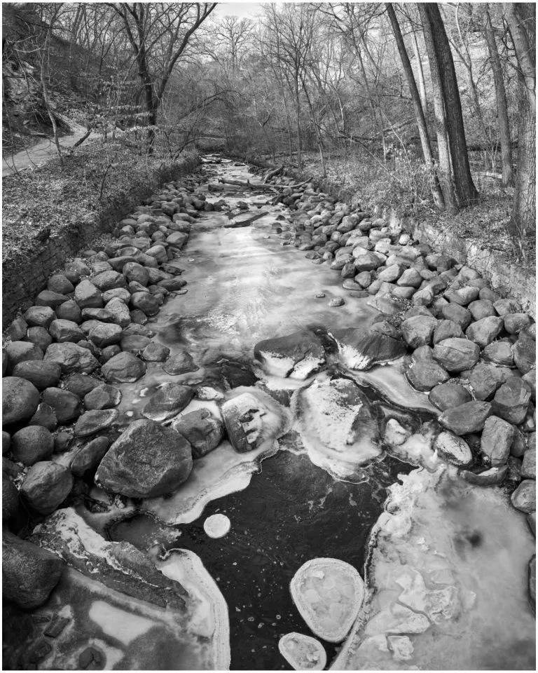
At least in the northern hemisphere. Folks in the southern hemisphere are opposite of us, but I have never traveled south of the equator, so for me it means winter. I grew up in the Midwest in the late 70s and through the 80s, so I saw my share of snow and even a couple blizzards. It may be pretty to look at, but the cold just does not do me any favors. However, on the visual side, Jim Hughes up in the great frozen north – er, Minneapolis – has posted up his black and white record of the battle between the ice and the water flowing beneath and even compares it to images by abstract artist Jackson Pollock. I am not as familiar with the abstract works, so will leave that comparison to those who are, but Jim’s photos do make intriguing visuals.

black and white photo of a partially frozen creek up in Minnesota
Jim Hughes’ photo of the partially-frozen creek

December is a time to look back

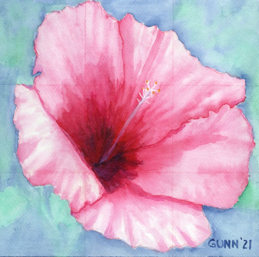
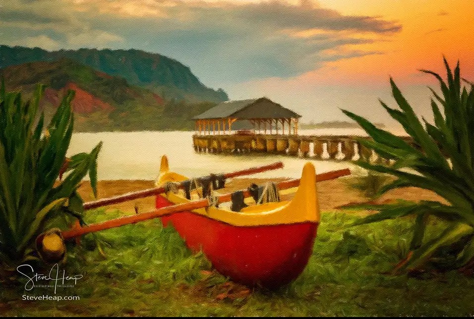
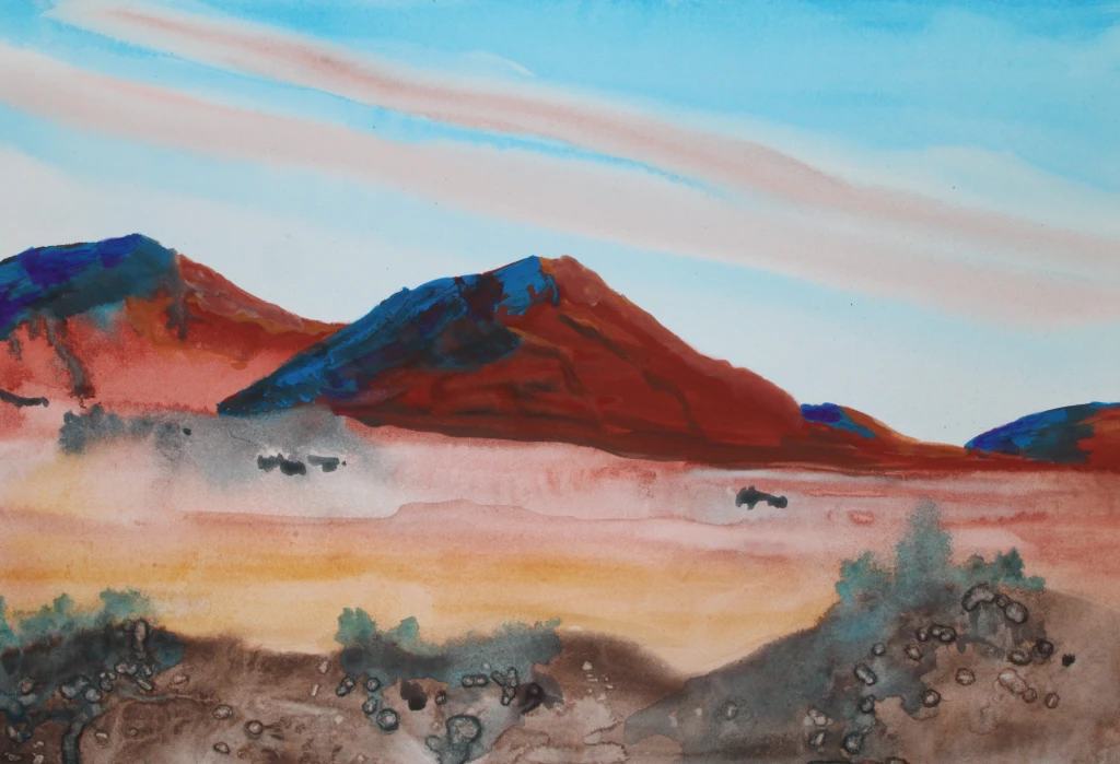
Being the last month of the calendar year, December is the logical time to reflect on the year as a whole. Steve Heap has been doing monthly recaps recently, and for this virtual art walk he looks back at his November sales, including one of his personal favorites involving the West Virginia University’s mountaineer statue edited into a photo of a particularly picturesque building on the other side of campus. In the comments, the puffin photo seems to be getting most of the admiration, but my personal pick us the Hawaiian canoe photo. Between the colors and the layout, I would be inclined to paint the Kauai canoe scene out of the group.

traditional red and yellow Hawaiian canoe up on the beach on Kauai
Kauai canoe up in beach at sunset

Jo over at Siena Blue is also doing a bit of looking back, this time spotlighting some of her watercolor and gouache (pronounced “gwash” or similar, for those of us who look at French spellings oddly). The bird painting is cute, and hard to believe that is so small – an artist trading card which is 2.5 inches by 3.5 inches. The one that really turned out beautifully is her landscape in burnt sienna and “a shade of blue,” as she describes it. Personally, I’d like to know which shade of blue, but that is probably because I love the triad of blue, purple, and red/pink so much. Either way, the burnt sienna and blue are across from each other on the color wheel, and if you aren’t careful and those two colors blend too much, you will get a greyish-brown color artists call mud. To use complementary colors and have it work without the dreaded mud happening – especially in watercolor! – is the challenge that both keeps us coming back to the studio while saying some very “nsfw” words when it goes wrong.

watercolor landscape painting by Jo Wortman of Siena Blue
unnamed (?) landscape watercolor painting by Jo Wortman of Siena Blue

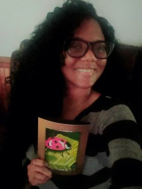
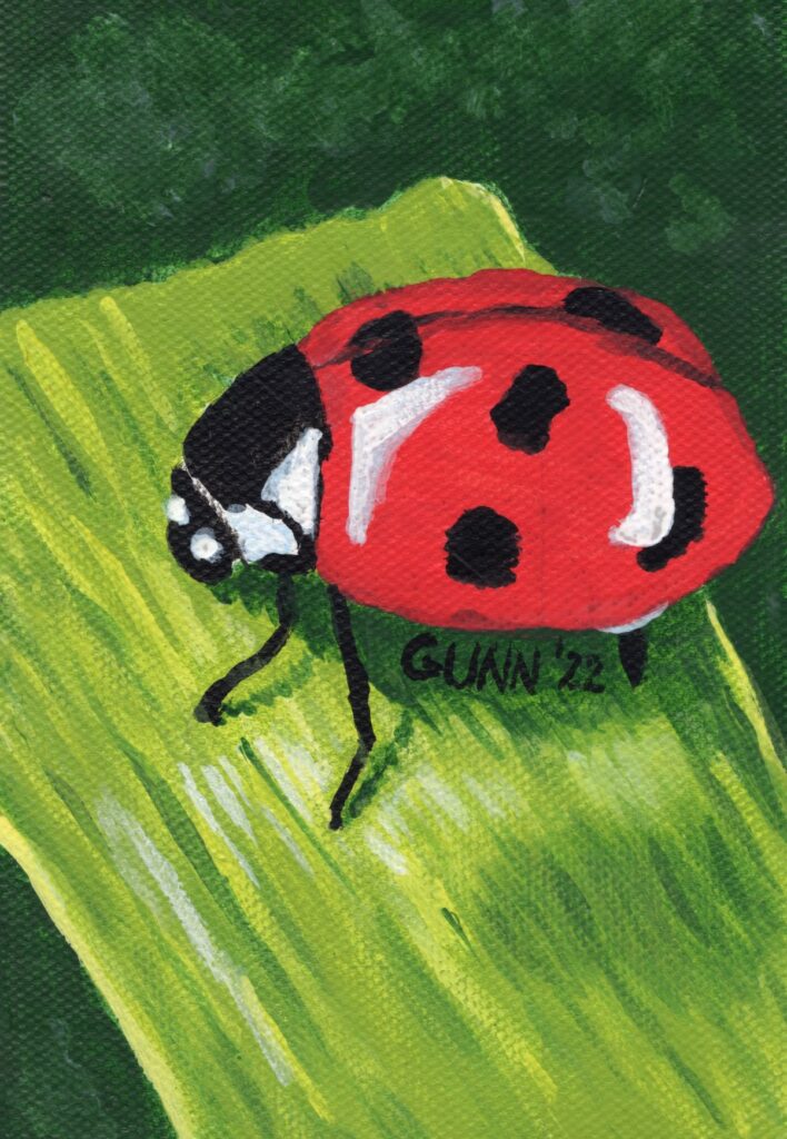
I also wrote a bit of a look-back post earlier this week, but hey – I had a good reason to do so! For those who missed it, I took first place in the watercolor category at the VA Creative Arts Festival for the second year in a row.

Looking back at trying something new

Sometimes, the December retrospective is all about looking back after trying something new, and new art walk participant Dorothy Berry-Lound’s post is a look back at a new art technique she was inspired to try after watching a YouTube video. (Funny how many of us can get so fired up after watching a short YT vid!) She describes how physical the new technique was for her, since she has fibromyalgia. Hubby has “fibromyalgia-like symptoms,” so I know what that looks like and the fact she decided to do a second painting using the new technique tells me exactly how pleased she is with her results.

abstract art by Dorothy Berry-Lound called Cat Scratch

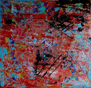
I rarely “get” abstract art, but the art world is certainly large enough to encompass the entire spectrum from hyperrealism all the way to the most abstract of abstractions. The color combination is certainly pretty, and it definitely looks textured. I’ll also note that it does resemble a few of my practice watercolors that ended up with cat prints across them (phthalo green does NOT lift), but that is about as far as my more-literal mind will go in trying to interpret. Again, the fact she did a second painting using this physically-exhausting technique tells me she likes the end result.

Looking forward to 2023

I’ve already started getting emails this weekend warning that products ordered this far into December may not arrive in time for Christmas, so I suppose it is time to turn my sights to the new year. After New year’s Dat, there is my birthday, and it is the “big five-oh.” Yeah, I’ll be turning fifty, and Friday before the stomach bug jumped me in earnest, my mother-in-law cut my hair in a new style since my friend Keashia said I should try to style my hair like my new internet “face.”

One last December earworm

This one is for my Dad, and my Mom as well, since they probably will both wrinkle their noses at the one I posted at the beginning. Here is a bit of Frankie Valli for some December music.

Frankie Valli and the Four Seasons December 1963 (Oh What a Night)

Pink for Breast Cancer Awareness month

Yesterday was the first of October, but it didn’t really click for me until I ran into town to pick up some critter feed and saw a couple of businesses with the flocks of plastic pink flamingoes: October is breast cancer awareness month, and locally that means it’s time for Pink-Out Putnam again. Local participating businesses will not only decorate with the standard pink ribbons, but since this is Florida it means there will be a population explosion of those wonderfully tacky plastic pink flamingo yard ornaments.

Along with pink being one of my favorite colors to wear, and flamingoes being one of my favorite birds to paint, there is a darker personal connection for me. Both of my mom’s sisters and my dad’s surviving sister have all gone through breast cancer diagnosis and treatment. Thankfully, all three are still alive to tell about it, but having women on both sides of my family get diagnosed leaves me at a higher risk of developing this myself. (For the record, my appointment for my next mammogram in early November. VA healthcare system takes this seriously.)

My pink flamingo watercolor series

Last year, I did a series of six watercolor paintings that featured flamingoes in or near water as part of an art challenge, which included my first place winning Flamingo in Rippled Water. I’ll be taking the series to various local businesses to see if any new small mom-and-pop places would like to display them.

Pink flower paintings

Pink flowers are also on my list of favorite things to paint, and I have some of those to share for this very pink post. I did a cherry blossom watercolor painting this spring, actually a little earlier than they bloomed, but it is very much an annual thing and I love to see photos and paintings of them in March. I also did two pink rose pieces last year: one in watercolor and one in oil pastel. Gathering up the links for this post made me realize I have not yet blogged one of my pink flower paintings yet …

Pink Hibiscus

Pink Hibiscus watercolor painting by Katrina Gunn
Pink Hibiscus, 10 x 10 inch watercolor painting, original available $100 USD

First things first: yes, if you look closely you can see the grid I used for sketching the proportions out properly. I had used a red watercolor pencil to do this, thinking when I painted over it would dissolve. It was a lesson learned. Not all pigments in watercolor pencils will disappear with regular application of water. I should note that this was the last time I did my grid-and-sketch directly on my watercolor paper. Now I sketch in one of my sketchbooks and use graphite transfer paper to make my marks on the watercolor paper. The punchline here is that people who see it don’t seem to care. Feedback on this paintings has always been quite positive despite the graphite outline and grid lines showing. I guess folks feel that shows this was painted by a person and not a software program.

Purchase info so you too may “Pink Out” like Putnam

Along with overlooking this piece here on the blog, I had also forgotten to upload it to my gallery over at Daily PaintWorks, which is the online venue where I prefer to sell my original artwork. This has been rectified. I had also forgotten to upload it to my RedBubble shop, but I fixed that as well now, so those of y’all who want your RB swag with this painting can have at it. Finally, for those who want an art print larger (or smaller) than the original 10 by 10 inches can order it at my Pixels shop.

So pick your favorite pink painting for Breast Cancer Awareness month. Please feel free to share this post, because this is an issue that has affected my family … and perhaps yours as well. My county will be decorated to the nines with pink ribbons, pink signs, and of course plastic pink flamingoes everywhere, and I invited everyone to join us! I have at least one new pink flamingo painting in my mind already, so stay tuned.

Mostly realistic Ladybug painting only art prints available

So I finally have a photo from Whitney, who won the June 2022 frame giveaway, with her face and her prize both in frame. She says she loves it. It may not be big – the frame holds only a 4 by 6 inch picture – but she can always look at it knowing she won the frame and was able to request a realistic ladybug painting to go in it. Personalized art is the benefit of working with living artists!

Whitney holding the framed realistic ladybug painting she won
Whitney holding her framed painting

Planning and painting the ladybug

When Whitney entered the giveaway, she had said she wanted some kind of pretty plant – her exact phrase was, “Surprise me!” Once I messaged her to let her know she had won, she changed that to ask if I could paint her a ladybug, as she wanted to use a ladybug as part of her logo. Not a problem, as I already had a reference photo selected for when I got around to doing up some more pretty bugs in my art.

Ladybugs are not complex objects; in fact, compared to butterflies and dragonflies, they are really rather simple until they open their wings. I expected the trick for this painting to be more about getting the blade of grass right, so it looked curved with just the right amount of texture to it.

Ladybug acrylic painting You can order art prints of this, but the original is claimed
Ladybug 4 x 6 inch acrylic painting, prints available

The canvas is from a 6×8 inch canvas pad by Paramount, and seems to have a smooth-enough surface up until I did a bit of drybrushing, then the texture also showed up in the scan. I used the quick-dry acrylic paints that my husband has used for years, and are sold at WalMart under the names Apples Barrel and Folk Art, made by Plaid who also makes Mod Podge that I use to seal my oil pastel pieces. I painted two layers, and thought that was sufficient to cover the graphite pencil lines … but if you look closely at the scan you can just see them on the ladybug’s carapace. I need to remember to do a minimum of three paint layers for the next one.

Realistic ladybug art prints and accessories for sale

The original painting was put into the frame and mailed off in a timely manner – Whitney probably doesn’t realize how significant that statement is. The point is, if you want the original, you’ll need to try to talk her out of it. Personally, I have my doubts anyone will be able to do that within the next decade. You can still order yourself a ladybug art print though! As usual, art prints are available to purchase through my store at Pixels, along with a few printed accessories. If you want to wear my artwork, then check out the apparel options at my RedBubble store.

About Whitney

In addition to being mother to small children, Whitney runs the online business Healing Over Everything. We met on Facebook in a blogging group we both participate in, and she asked for links to her Facebook business page. So, you can check out her Healing Over Everything page on Facebook, and maybe even check out her blog (which I am working on a guest post for).

More pretty insect art from me

If that is not enough bug art for you, Tatiana at GiftSmart has a cute macro photo of an insect on a green leaf that does look like it is laughing.

The green challenge and the elephant ear plant

Continuing my self-audit of artwork created versus art pieces blogged, I find myself missing yet another of last summer’s art challenges, the green challenge and the elephant ear plant in my pasture. I meant to write about these last autumn, but apparently it just slipped my mind once “new project fever” swept up my last two working brain cells. I tend to get the new project fever in some rather big doses.

So, let’s travel back in time to July of 2021, which would put us after the flamingo series but prior to the blue-feathered bird series (which starts with the hyacinth macaw painting – I really need to do a roundup of that series and revisit those paintings with a fresh eye). It was another short challenge, with the theme “green,” and I just happen to have the perfect plant model that regrows each year in the goat pasture. Before the challenge started, I was out back with my old Kodak EasyShare digicam (I certainly got my $109 USD worth out of that thing!) to get reference photos of what my husband and I call the elephant ear plant for obvious reasons.

my elephant ear plant, likely a Xanthosoma species and the inspiration for the green challenge
my elephant ear plant in midmorning sun in the pasture

Since I was curious what its real name is (the plant was already here when we bought this place) I posted in a local Facebook group to see what it might be. Answers came in ranging from colocasia to taro to a xanthosoma species, and when I went researching what the differing names, I decided my specimen looks most like Xanthosoma roseum. (Edit: it may be Xanthosoma sagittifolium, which is native to the south of us and this one might have been brought up a county or two.) The largest leaves are often 18-20 inches long, and we sometimes joke about it being an escapee from the set of Jurassic Park.

The artwork

The first piece I did is similar to the above photo/snapshot, and I worked it in soft pastel (aka my “dusties”) on a blue sheet of Canson Mi Tientes paper, which I am still not enamored with except to use with colored pencil. Overall, I feel I got the shape right, but was hoping it would be brighter in the high key values (highlights) than it turned out. It isn’t awful, but I was hoping for it to be a bit more … just a bit more. The original is 9 by 12 inches, heavy paper, and lightly sprayed with fixative. Prints in larger and smaller sizes are also available at my Pixels store, and here it is on RedBubble apparel and accessories.

Xanthosoma in Morning Sun, soft pastel on paper
Xanthosoma in Morning Sun, 9 by 12 inches, soft pastel on paper, $100 USD original available

For the second day of the green challenge, I decided to zoom in on one leaf of the plant, because it really is a fun-to-draw shaped leaf (like Monstera species). I also decided to switch media and pulled out my oil pastels and the oil-primed practice paper, also a Canson product and one I like using. This piece captured the brightness I was hoping to achieve, and honestly it looks almost as if it is glowing. I so enjoy that about oil pastels – if you want serious, saturated COLOR, you can do it with the oilies. The original is also 9 by 12 inches, which is my favorite size for drawing and sketching, and it is sealed with ModPodge, which really works great for oil pastel work. Prints in larger or smaller sizes are available at my Pixels store, as are 500 and 1000 piece puzzles for those who love a good challenge and don’t have cats to “help” them with all the pieces. RedBubble swag is here.

Elephant Ear Leaf, oil pastel on primed paper
Elephant Ear Leaf, 9 by 12 inches oil pastel on primed paper, $100 USD original available

For some reason that I cannot recall, I dropped out of the green challenge after this second piece, despite having a good half a dozen more reference photos already chosen and cropped and still in a folder on my computer labeled “green.” Since yellow fly season has started here, I will be spending the majority of daylight hours hiding in the house from those vicious biting monsters that seem to wait outside my door for both of us, which means I will have plenty of time to “art it up,” as hubby says, and maybe this summer I’ll blog more of the results.

On the Easel: Red admiral butterfly in acrylic

I felt motivated to paint today, and this painting of a red admiral butterfly has actually been on my easel for a few weeks without progress. I originally picked out the subject and reference photo back in November for the red challenge that I didn’t finish. In fact, I had even done up an acrylic sketch on paper. You can even get a print of the sketch, though once I complete the final painting and scan it in, I will be replacing the image that is there now.

rough acrylic sketch for red admiral butterfly, 11 by 14 acrylic on paper

I did it quickly, and in the evening after running errands around the county and was tired and my back hurt … yet when my friend Keashia saw it, she immediately said I needed to do it again “for reals.” I didn’t get around to that until last month, and am not setting any speed-painting records on it, but today I’ve managed to make it look like I want it to look.

on the easel: red admiral butterfly, 11 by 14 inch acrylic on stretched canvas

Yes, that is purple where I will eventually be painting black (maybe). I have two sampler sets of Golden brand Open acrylic, which is their slow-drying formula made for the en plein aire painters, but right now I am using the quick-dry acrylics to get the undertones down. I don’t have actual black in the Golden Open sets, but I do have a very traditional work-around: ultramarine blue and burnt umber, along with a convenience mixture they call sap green which I am using in the background of the piece.

The red admiral butterfly

When I looked up the red admiral butterfly, all the sources said I ought to have seen this pretty and eye-catching bug at least over the winter season, as Florida is very much in their habitat range. Alas, I have yet to catch a glimpse of one, though we have plenty of swallowtails and sulfurs fluttering across and around the property. I’ll be painting those as well in the future.