New Floral Painting Iris in Watercolor

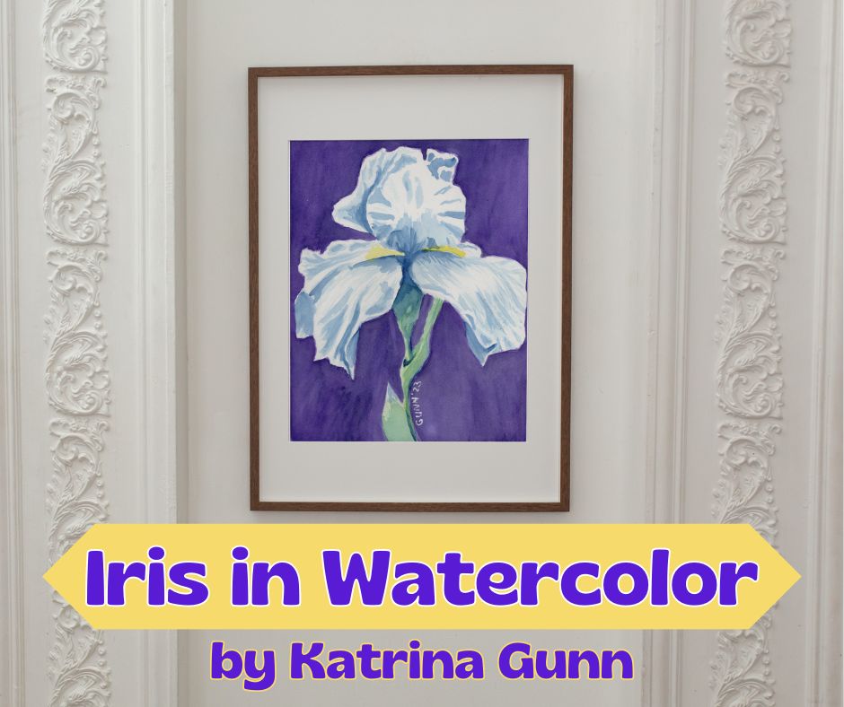
I know I’ve left y’all hanging on the Going Bananas series, but this most-recent floral watercolor painting is getting so much positive feedback on the handful of social media I’ve posted it to that I just had to do this one first. Plus, it’s a white iris in full bloom – how could I not?

The inspiration behind the painting

I never thought I would say this, but the inspiration for this came from Facebook … specifically, FB asked if I wanted to reshare an image from three years ago, an (overly) detailed drawing of an iris in full bloom. Seeing that drawing again made me realize I had never done anything else with that image, and the next thing I knew I was transferring the general outline to some watercolor paper to do it in better and in color.

detailed charcoal iris drawing from 2020 and the watercolor painting I made from it in October of 2023
my iris drawing from 2020 and watercolor painting from last week, late October 2023

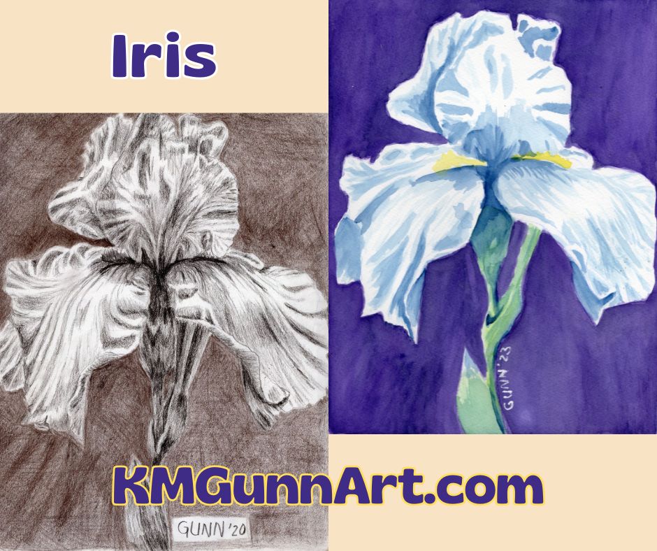
Before I traced over it to transfer the lines, I did do a high-quality scan of the drawing first, so if you’d like an art print of it you can get one in the size you want. I used my first tinted charcoal (sepia) for the background, though looking at it now I can see it is both too dark and too light and didn’t provide me with the contrast I hoped to achieve. That is probably why it’s called drawing practice.

Recording the painting process

Since the little Nikon digicam died at the start of another art challenge, I was left with just using the old webcam my husband bought a few years ago when 1080p was the top-of-the-line in video. I used it for most of the four pieces in that challenge (I’ll link to it once I get those written!) and I have to admit: I love having video clips of it. In fact, I love it so much I am making an effort to do it more often. I also checked out the current top-of-the-line 4K webcam. It’s on my wishlist. (Edit: I bought it. Yeah, I am really impatient with some things.)

Once I get the video footage edited, I’ll embed that here. Until then, you can see a couple of short vertical videos I’ve uploaded to YouTube here.

software-generated mockup of a larger print of my iris floral watercolor painting in white matting with a slim dark wood frame
how my Iris in Watercolor floral painting looks in white matting and a slim dark wood frame

Notes about my iris floral watercolor painting

As I mentioned in the first paragraph, this was another one of those watercolor paintings that felt as if it just flowed from my brush. I absolutely LOVE when that happens. In fact, the part that took the longest was simply getting the background dark enough to provide the right amount of contrast for the white petals. I used alternating layers of dioxazine purple and indanthrene blue, going round and round the unpainted flower until it finally looked right. Painting the iris and its stem took less than a third of the total painting time, according to the video footage.

my Iris in Watercolor painting printed on the cover of a spiral notebook from RedBubble
Iris in Watercolor printed on a spiral notebook cover from RedBubble

Links to purchase

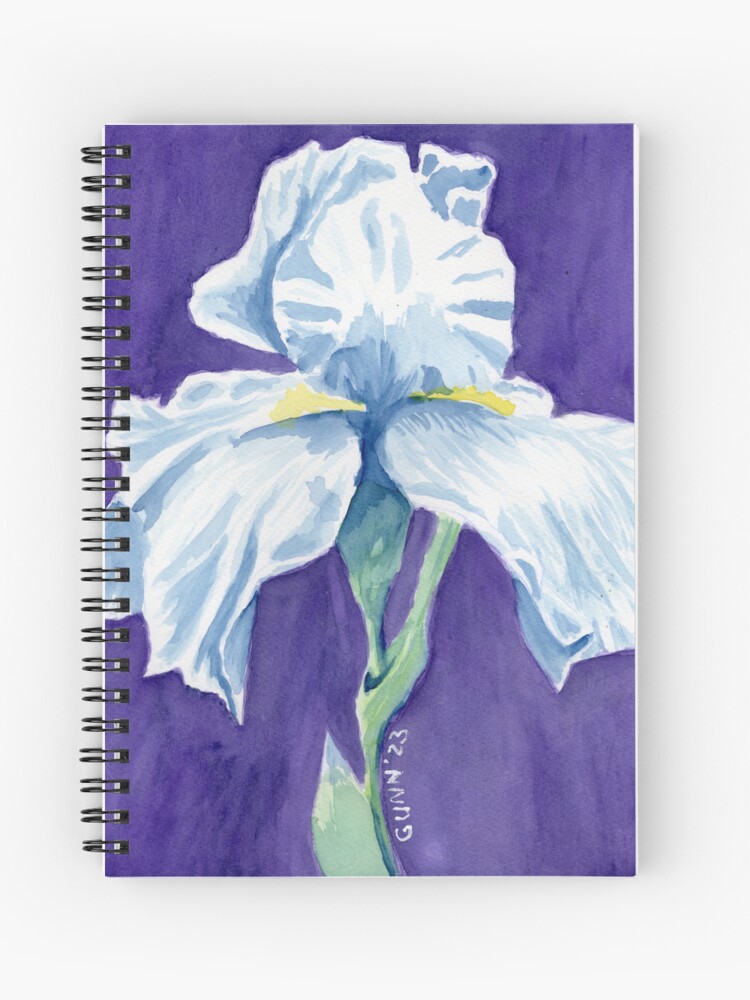
The 9 by 12 inch original painting is still available to buy through Daily PaintWorks. This artwork scanned beautifully, so you can order an art print through Pixels in sizes as small as 8×6 inch all the way up to 45×60 inches before framing. I also uploaded it to my RedBubble shop because my mother and sister like to wear my artwork. Finally, if you want an original but need a larger size, you can always commission me to do a similar painting. (I could not paint an exact duplicate even if I tried.)

Watercolor painting Red Rose 2

I had another idea over the weekend: I will be showing how I use my line drawings that I offer free to email subscribers. My first example is using my watercolor paints to make a lovely red rose painting.

mockup of new watercolor painting Red Rose 2 in slim wood fame hanging above a piano
Red Rose 2 framed and hanging over a piano

Step one: Transfer the drawing

After I had learned that my grid lines and sketching lines might still be visible on the finished painting, I bought some graphite transfer paper. This way I can sketch it in my sketchbook, erase, and redraw however many times necessary until I am happy with the lines, then put the finished drawing onto my watercolor paper.

transferring the sketch onto the watercolor block
Transferring the contour drawing onto the watercolor paper

Because I inked the line drawing onto decent-weight watercolor paper, I actually needed to go back to the sketchbook for my original drawing. I think a standard ballpoint pen works best with the transfer paper, so some of my sketchbook pages are getting multiple colors of ink over the graphite or charcoal I use to do the drawings.

For this piece, I inked the lines with waterproof India ink. I used one of my husband’s brush pens to do it, since he has been very happy with how his drawings turn out using them. One of the brush pens is labelled in either Chinese or Korean, so I couldn’t be sure it was waterproof. The other he loves is a Pitt brand and says on the side it is waterproof India ink. I had first tried to use my calligraphy pen and ink, but the ink has dried too thick of a consistency to draw neatly.

Step Two: the background

I wanted a simple, single color for my background – and I have been just watching and waiting for the right opportunity to use this lovely teal blue that came in my QoR high chroma set. Seriously, how can someone who loves vivid colors (as I do!) not want to use this color? The only question I started with was, “How many layers to get the right level of saturation?” My answer is just one. I didn’t want it overpowering the main subject, but I also didn’t want an unpainted white.

the teal blue background only needed one layer of paint
the teal blue background (partially wet still)

Step Three: Get into the art zone and finish it!

I waited patiently for the background to dry completely this time to avoid paint bleed issues. Plus, the paper buckled because I wasn’t using one of the blocks (where the page edges are glued in place) so I had to wait for it get mostly-flat again. This is where the in-progress photos stop, because I got into the zone and just painted until it was time to wait for the next layer of paint to dry completely.

Working with red and green next to each other on the paper is a tricky thing in watercolor painting. If these two colors blend or bleed into each other, you can get a very unattractive color we often call mud. When you mix two colors that are opposite of each other on a color wheel, the result is somewhere between gray and brown. For a red rose with a brilliant green stem and leaves, I wanted the colors to be as clear as possible.

first layer of paint done
First layer of paint on the rose done

After this first layer dried, I went over the shadows again on both colors to deepen the shadows. Then I needed to wait for it to dry again to see if a third layer was needed. I used my Mijello Mission Gold paints for the flower itself, and this brand has very little color shift when dry.

So, with just one layer of paint for the background and two layers of paint for the rose, this turned out to be a rather quick painting! I just love it when everything feels like it is just falling into place. No need to wrestle the art onto the paper. It felt like it just flowed out from my brush.

Links to purchase this painting or prints

The original 9 by 12 inch watercolor on heavy paper is available to purchase here. If you want a larger or smaller art print of this painting, you can find the right size at my Pixels shop. To buy this printed on apparel, home accessories or even tech accessories visit my RedBubble shop.

finished painting Red Rose 2, watercolor  and ink on paper, 9 by 12 inches, $100 USD
finished painting Red Rose 2, 9 by 12 inches watercolor and ink on paper, $100 USD

More red rose artwork

I am almost embarrassed to note that this is only the third red rose at any stage of bloom I have painted or drawn! I must remedy that over the next few weeks. My only other previous watercolor painting of a red rose is my Red Rosebud 1, which is a small watercolor sketch of the very beginning of the petals unfurling. The other is my Red Rose I did in oil pastel on canvas board.

Coming attractions

I will be doing at least one more of these before the month is over, so stayed tuned! Better yet, put your email address in the form and get your own copy of the printable rose coloring page and color along with me. I am feeling a new pink rose and/or white rose in soft pastel.

A rose coloring page for email subscribers

I’ve had this idea pinging around my brain for about a month now, and yesterday for art group I sat still and just did it. I will be making pen-and-ink contour drawings (as in simple line drawings) as a fun little gift for my email subscribers to print out and color for themselves. Right now, one a month feels very doable for me. The very first coloring page is a rose, since Valentine’s Day is next month. I still need to hammer out a couple technical details, but I should have those squared away in a couple days.

The start of the idea

This all started because conventional wisdom in the current blogging space is that email subscribers want to be wooed with some kind of gift or freebie to sign up. For some bloggers, this is an easy thing to whip up. For an art blogger who wants to sell her artwork, it didn’t seem so obvious. I am persistent if nothing else – some might call me stubborn even. Browsing through examples of gifts for various email lists, I saw my niche: coloring pages. THAT I can do!

At the start of art group yesterday, I asked the others if they would subscribe to an email list to get a printable coloring page “like this.” Immediately one of the other artists, who works 3d instead of 2d, responded with a very enthusiastic, “Hell yeah!” I guess that answered any doubts I was having.

A rose for the first coloring page

contour drawing of a rose as a coloring page
rose coloring page for the email subscriber list

This is the first coloring page, a single rose with only enough detail to make it obvious what it is. The original is 9 by 12 inches, and is for sale if you’d like to hang it on your wall. I will NOT be making prints of this available, and the printable coloring page is 8.5 by 11 inches (standard US letter size). For those outside the US, that is approximately 21.5 cm by 28 cm.

I’ve used this rose drawing before

If you are thinking this rose drawing looks familiar, you are correct! I used it last January during my month of charcoal drawing. It is the basic outline for my black and white charcoal piece, A Single Rose.

A Single Rose charcoal drawing
A Single Rose, traditional charcoal drawing

This actually started out as a practice exercise, but I kept working on it because it just flowed out of the charcoal and onto the page at the time. It’s in my new sketchbook, and the edges are looking a bit worn already. I could do it again, or even in color, if you’d like to commission that. Or you could just order an art print of it in whatever size you need to beautify that empty space on your wall.

More coloring pages to come

I already have two more pen-and-ink drawings for the next two coloring pages: the line drawing for my Apples and Oranges 1 as well as one of a rooster crowing. Perhaps by the time I get to the rooster page, I’ll finally have a painting of it available. It was one of those days when I brought my sketchbook with me for the waiting room at the doctor’s office.

Want on the email list to get your monthly coloring page? There is a sign-up box at the bottom of each individual blog post, as well as a sign-up form at the top of the sidebar (which is below the posts on mobile touchscreen phones). Keep scrolling down to find it. Once you’ve entered your email address, the email service will send you a confirmation link, which you need to click to verify that yes, you did sign up for this. If you sign up after the 15th of the month, you can always email me and ask for a previous one.

Finally, do we want to have a cute or clever name for the email list? If so, does anyone have any ideas to share in the comments? My last two working brain cells have not come up with anything, so I am open to suggestions if you have them.

Roses in Artwork: Feature Friday 10

I am on a rose kick this week! Roses are such popular flowers and subjects for artwork due to their beauty and elegance – and having a pleasing fragrance helps the real flower’s popularity in bouquets. While I have drawn and painted single roses, I had not yet tackled drawing or painting an entire bouquet of roses. This is in the process of changing, courtesy of my recent experiment with text-to-image software and digital art.

Everything is coming up roses

Sprinkled in among the three new rose bouquet computer-generated images will be blogging friends’ posts featuring roses in artwork in various media. I also wish to note that new hand-drawn and hand-painted art will be created and posted within the next month – before I talk to my Mom again on the phone. Yesterday, she did not beat around the bush or try to sugarcoat her opinion when she immediately asked me when I plan to get my paints back out and make real art instead of playing around on the computer and posting that. Mom knows how to use a clue-by-four!

Pink roses

It should be no secret that pink is my favorite color. So of course the first bouquet of roses I prompted the software to generate was specifically pink. No modifiers, just “bouquet of pink roses in vase on table,” if memory serves me correctly.

large bouquet of pink roses in a vase on the table
Bouquet of Pink Roses, digital artwork

This was only the second image I prompted the program to create, and I felt pretty lucky to get something that looked correct. Being a digital image, there is no original artwork available, but you can get art prints from my Pixels store. If you prefer to wear the art you buy, then take a look at my RedBubble shop options for this image.

If this is not enough pink roses for you, you can always take a look at Tatiana’s Spanish rose, a close-up photograph with enough detail the little ant on one of the rose petals is in clear focus. She found this pair in a garden in Andalusia, Spain. And on the subject of pink rose petals, Sharon Cummings beefed up her description of her rose petal mandala artwork at my request. (Sharon recently won a spot on one of Fine Art America’s billboards, and they even put that one near her in Tampa.)

Red roses

Red roses will be very popular come mid-February. While this won’t win me any points with the independent florists, I think it would be better to gift your Valentine with a rose that won’t wilt – in the form of artwork! Here is another lucky combination of text prompt and random number from the computer program that features red roses.

bouquet of red and pink roses with green foliage in blue vase on table
Roses in Blue Vase, computer-generated artwork

Buy your art prints of this beautiful bouquet through my Pixels store. Get your apparel and accessories with this image at my RedBubble shop. Again, being digital, there is no original painting or drawing available (yet).

If you need a little assistance getting into a romantic Valentine’s mood, check out Steve Heap’s flower photography where he revisits a red rose bouquet he had waiting with champagne for his wife’s birthday in 2012. He does his own version of digital art by using software filters on his photography.

Bouquet of multiple colored roses

In the process of searching for just the right set of modifiers for my text prompt, I noticed two that just go together like chocolate and peanut butter: romanticism (the art movement) and …. Thomas Kincade. Seriously, that would be how I would describe Kincade’s painting style in just one word. No “neo-” prefix, but straight up Romanticism. While he did mostly landscapes, I feel that soft, lovely style is best suited for floral artwork. When I did not specify which color of roses I wanted, I got this lovely image.

a very classic image of a bouquet of different colored roses in a fancy vase on a table, done in the Romanticism style with a Thomas Kincade look
Classic Roses in Vase, digital art

I must admit, I like this one. Not only because the notion of time-shifting Thomas Kincade back to the Romantic period of European oil painting and having him paint flowers appeals to me. Except for that odd but of red in the middle of the bouquet, this may well be the closest that computer program has come to generating the image in my mind. I may break out my oil paints and try this one myself (but after I do the yellow roses in pastel).

Meanwhile, if you want this classic bouquet of roses as an art print, get it at my Pixels shop. If you want it on a shirt or accessories for you home and person, it is available at my RedBubble shop. Again, no original of the digital artwork.

Finally, if you are in search of a perfect rose, Jim Hughes believes he has taken the perfect photograph of a perfect rose. The technical details sailed right over my head, but I do think that is a very good portrait style photo of an elegant rose. Be sure to read the backstory on said rose as well.

I hope all y’all have enjoyed this virtual cornucopia of roses in artwork! It may seem early to be thinking about Valentine’s Day flowers, but I want to be ready for 2023.

Yellow Roses in Purple Vase

First, believe it or not, this is a computer-generated image. I’ve been working for a while on trying to get some classic floral still life style images from the text-to-image software I’ve been playing around with, and after exhausting a certain look, I decided to try some different modifiers to the same basic text prompt.

I’ll cover this other style on Friday, but this particular image gets its own post for the simple fact I will be working on doing it by hand in the next week. Even more inspiring to me than the Sunset Palms image, this is a simple but elegant floral still life composition of a bouquet of yellow roses in a purple vase, sitting on a wood table. It is the complementary colors that make this idea pop.

Inspiring digital artwork

Picture of woman holding framed art print Yellow Roses in Purple Vase
Yellow Roses in Purple Vase, digital artwork available as an art print

But first, the important links for print products to buy. I have it on most products at my Pixels store as well as art prints. It doesn’t looks right on objects where the printing is horizontal in orientation. I recommend getting art prints from there because Pixels is owned by Fine Art America, who are big in the art print world. For those who enjoy wearing artwork, I recommend my RedBubble shop. My sister and mother both recommend them and are repeat customers.

The search for a good rose image

No surprise to long-time blog followers here, but I personally love yellow roses. I’ve been trying to paint or draw the “perfect” yellow rose piece since the day after I picked my art back up, and I have a couple watercolor paintings I did one to two years ago – Electric Yellow Rose and Yellow Rose. (If you buy the originals, you can rename them. I don’t try to be cute with what I name my artwork.) While I’ve played around with the idea in pastel and colored pencil, I have not accomplished anything I want to share. I think part of that is a matter of finding a good reference photo for it, because buying a nice bouquet of roses in a pretty vase each time I want to paint or draw would get rather expensive.

Enter the text-to-image digital artwork idea

So, what does an artist who lives on her veterans’ disability pay do in this situation? Well, I gave in to curiosity about the whole text-to-image software that so many people misname “artificial intelligence.” It is not intelligent. It just generates images based on your text prompt plus a style filter and any modifiers you use from the lists of phrases that will get you certain looks.

First, I tried the basic text prompt “bouquet of yellow roses” without any modifiers, and got a bunch of images that more-or-less fit that. The biggest variation is in that hard-to-define quality of composition. One was good, while the rest were mediocre at best. Here is the one I liked best.

bouquet of yellow roses

Using modifiers in the text prompts

Not completely satisfied with this, I began to experiment with different modifiers to see what kind of image style I could get from which modifier. Some modifiers are specific art movements; some are specific artists’ names (and some of those are still alive and still painting), and others are descriptions like “dynamic lighting,” which is one of my favorites. No “chiaroscuro” or Edgar Degas, though my favorites are romanticism and Thomas Kincade, a combination that makes some very pretty images that don’t have much variation.

romantic yellow roses in vase on table
Romantic yellow roses in glass vase on table

Another style modifier I tried was Renaissance painting, which certainly has that feel to it, and I may experiment with that style further, but first I wanted to see how well (or how poorly) the software handled the idea of simulated pastels. These are soft pastels, not oil pastels, and I was disappointed to not find any famous pastellists in the artist list like Edgar Degas or Mary Cassat. Fellow Impressionist powerhouse Claude Monet was on the list, so on a whim I used his name along with pastels as the “medium” used and Impressionism as the style. I also specified the color scheme as yellow and purple. Here is the four-pack of images generated:

four computer-generated images using my text prompt
four computer-generated images using the text prompt “bouquet of yellow roses in fancy vase on table dynamic lighting yellow and purple pastels impressionism Claude Monet”

A bit of variation here, and while the first image is nice enough, it’s the second one (top right) that has captured my imagination. It is so close to being good! I think it is just missing that tiny little bit – perhaps toning down the background colors to make the focal point more attention-grabbing. I’ll also be tweaking that table, perhaps more of a tan than yellow, so it looks more like oak (like the image above).

Bouquet of Yellow Roses in a Purple Vase

So that is the development of a vague idea, “bouquet of yellow roses,” into a piece of digital artwork that you can purchase and I can use as a springboard to create my next work of art in pastel. I am thinking of giving my soft pastel set a proper workout for this, with details added in with pastel pencils. Until then, have a pleasant Thanksgiving week, and watch this space for a new Feature Friday.