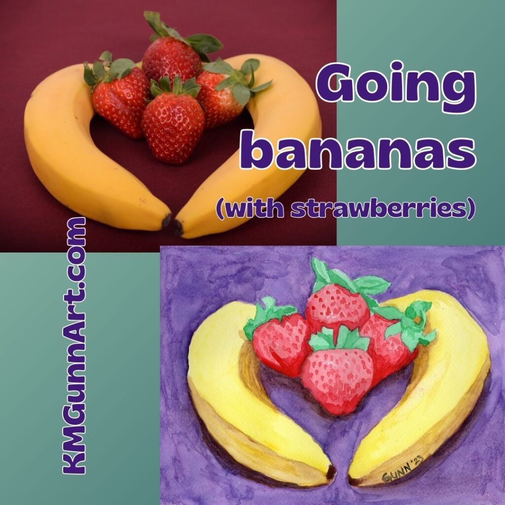
For the official final painting in my watercolor still life series I call the “going bananas” series, I decided to finally tackle some strawberries. It makes sense to my weird brain – I love that flavor combination, so why not draw and paint the two together? Famous last words, y’all ….
Choosing a reference photo and making changes to it
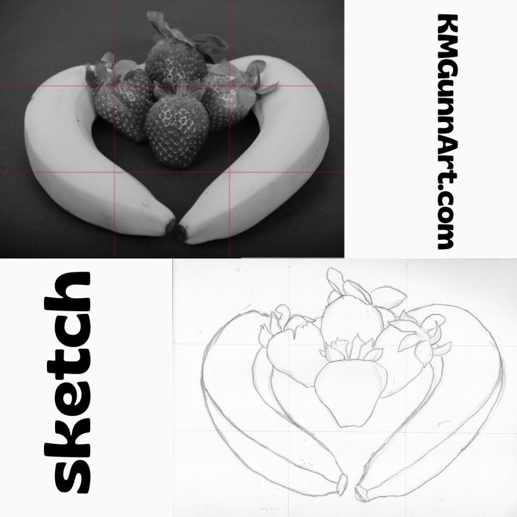
Choosing the reference photo was not difficult. I saw this one with the two bananas encircling four strawberries, and loved the layout and how the light and shadows played. What I simply did not like was that background color. Setting the fruit on any red was a bad idea (to my eye) as that overwhelmed the strawberries. So I took the color out of the reference photo and began working on the sketch.
ref photo and preliminary sketch from my sketchbook for Strawberries and Bananas
As y’all can see, I do use a 3 by 3 grid to do my sketches. This keeps me from starting in the center and then going off the right edge like I used to do all the time. That was a big weakness I had from as long as I could remember. I just can’t explain why I didn’t start using a grid sooner than I did. It was probably the same reason I didn’t start using transfer paper until this past year – the mistaken belief that I shouldn’t need it if I am a “real” artist. I guess there really is something magical about turning fifty, in that I can now laugh and say I don’t care what others think.
Coloring it in (with watercolor paint)
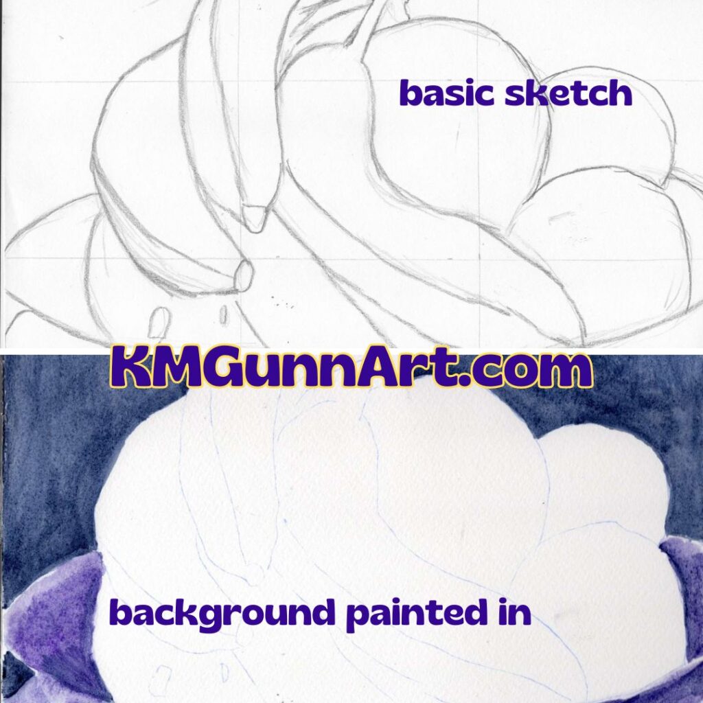
Once I had the basic lines transferred to my paper, it was time to play with color! The two bananas were no problem, especially since this was the third day in a row for painting the yellow fruit. I just kept using the same tubes of yellow. Seriously, why change it up when I was satisfied with what has been working?
I decided I wanted the background to be purple, but first I tried a lighter and redder shade called Cobalt Violet. Even after it dried, it looked too pale and far too pink. So, back to the dioxazine purple. Again, if it ain’t broke, don’t try to fix it.
For the strawberries, first I laid down a base layer of red. Then I went to work on all that green, trying to catch the shadows to make it look three dimensional. It was while I was working on the strawberries that my back started to really hurt. Since this was the finale of the series, and no one had dropped out of the art challenge yet, I had to get to some semblance of done. I gritted my teeth and painted on.
third painting of my watercolor still life series exploring the shapes and color of bananas
Links to purchase!
If you have the perfectly-sized blank spot on your wall to accommodate the 9 by 12 inch original watercolor painting, then head to my Daily PaintWorks gallery and purchase through them. Trust me, it will be easier than getting my attention when I am in the art zone. If you need a different size, you can order from as small as 6 by 8 inches up to as large as 45 by 60 inches through my Pixels shop. They also have some good swag, and I’ve heard they’ve improved their jigsaw puzzles.
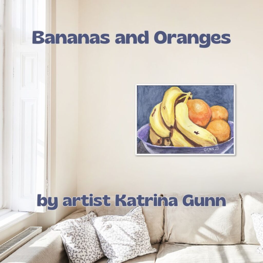
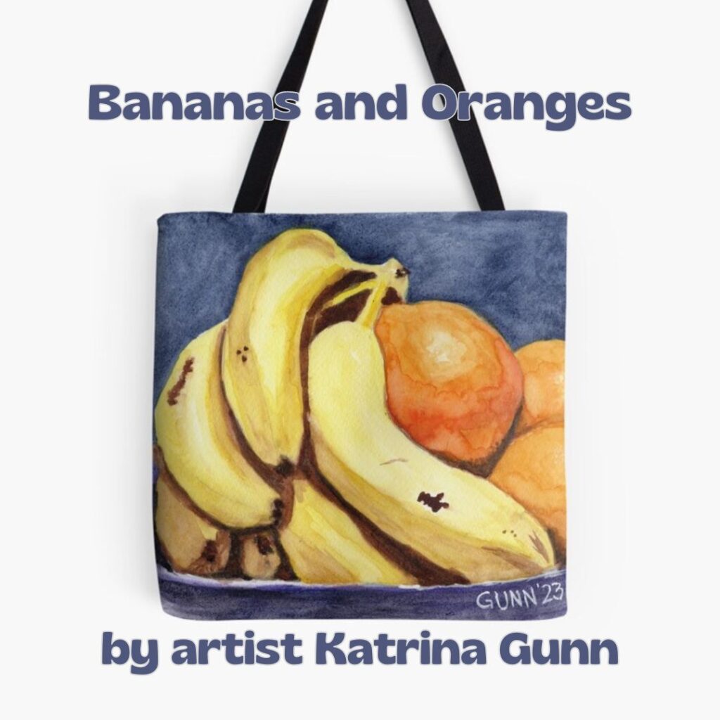
Second in my still life watercolor paintings series I am doing as part of a short art challenge is this unimaginatively titled work, Bananas and Oranges. As previously mentioned, the challenge was to do three new artworks in three days, all focused on the theme of banana(s). Since I had considered doing some bananas as still life subjects, I jumped on it with my watercolor paints at the ready.
reference photo and watercolor painting of my still life Bananas and Oranges
Using my artistic license to make the still life more traditional
While I was able to find a reference photo to work from, I was much less impressed with the color choices the original photographer made. While I loved the dark background and shadowed surface, I detest the red bowl. It is jarring to my eye, especially next to the oranges in the bowl. So, I needed to pick a different color for that bowl. Should I make it white (very traditional) or a complementary color like purple or blue? Since I was not feeling a white bowl, I decided to make the bowl one complementary color with the background being the other.
In-progress scans
This piece didn’t flow as easily as the first one did, but after I blocked out the sketch, transferred it to watercolor paper, and got the background painted a lovely deep Prussian blue – and got scans of those two steps – I slipped into “the art zone” and didn’t stop until suddenly it was finished. I really did mean to get more scans of the stages! It’s just that once I am in the zone, I don’t think of anything else but the work in front of me.
the two stages of my second bananas painting: the main sketch and the background
Painting the bananas and oranges
Contrary to most watercolorists, I like to start off with the darkest shadows. I know the conventional wisdom says to work from light to dark, and I have certainly tried that the first couple years. This series of paintings, I decided to try doing it “backwards.” Long story short – I prefer it. It even helps me get my shadows deep enough. Since this was basically a repeat of the subject matter, I just used the same colors as the day before. Once again, I was pleased with the color.
Links to purchase the original painting and art prints
How can you purchase this artwork? If you have the right space for the 9 by 12 inch original watercolor (on paper) painting, get that through my gallery at Daily PaintWorks. If you want larger (or even smaller) sized prints, you can order from 8 by 6 inch all the way up to 45 by 60 inches from Pixels here. For my mother and sister, who prefer to wear my art, there are several apparel options along with home accessories with this image printed on them in my RedBubble shop.
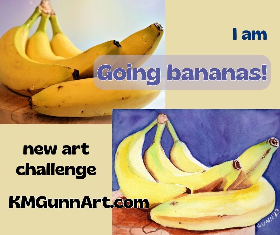
I could not resist jumping in on a quick three-day art challenge over on Fine Art America’s artist discussion board. Like most of the art challenges over there, this one has a theme: banana(s). I have thought about doing a series of banana-themed fruit still life like my Apples and Oranges series for a while, so I figured this was my cue to just do it. Just to be cute, I am calling this short series “Going bananas!” and intend to execute it in classic still life format as I see it.
reference photo of bananas I used to make my still life watercolor painting
(I should note that I have not abandoned the 100 faces challenge. I am only taking a quick side-quest, as the DnDers would say. I’ll also say that I successfully completed the challenge, and just need to get caught up on blogging it.)
Finding paintable reference photos
I’ve probably mentioned before that what makes for a good painting reference is not always what makes a good photograph. Hunting up some reference photos to use proved that – most have softer lighting so the subject can be seen as well as a two-dimensional image can allow. A good painting, on the other hand, works best with dramatic lighting, with a single light source ideally. Dramatic lighting produces dramatic shadows, which a lot of photographers seem to avoid. I did manage to find three photos with a more or less classic still life arrangement … and one that is more of a wild card that I may do as a bonus.
Setting some clear objectives
I wanted to do this short (and fun) art challenge with some pre-defined objectives, which is military for goals. (The cranky old Army sergeant in me still rises to the surface from time to time.) I knew I wanted to do somewhat traditional fruit still life paintings, so that cried out for a mostly-traditional medium. Since I hadn’t used my watercolor paints in quite a while, this seemed the perfect excuse to work in watercolor. I did choose to use more modern pigments, and am happy with the results.
Since only one of my reference photos had anywhere near the level of drama in its lighting, another objective was to see if I could adjust for that on my paper.
My final objective was to utilize complementary colors: the obvious yellow/purple, but also some red/green where I could.
Painting the bananas in my still life
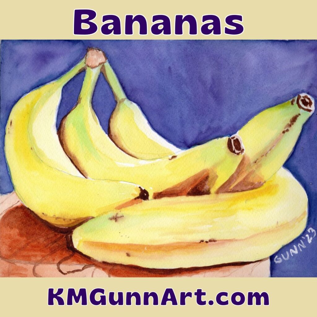
With my objectives in mind, I went to work. This first painting simply FLOWED from first my pencil, then my paintbrush. It was one of those days when every step went smooth as silk. In fact, I started the sketch at approximately 1030 and was waiting for the paint to dry so I could scan it before 1530! Only five hours from start to finish, including drying time, is a quick and easy watercolor painting for me.
square graphic of my watercolor still life I simply call Bananas
Hubby says he loves how the green looks on the bananas, with the comment that this small bunch looks exactly like what I search for in the grocery store – still a touch green. To contrast with the green, I chose to paint the plate as a reddish wood, instead of the really light color in the photo.
Overall, I am VERY pleased with how this one turned out. I feel I nailed both the color and the lighting, though I should probably at some point practice painting wood grain, as that is the only part that I think needs improvement. It scanned even better than it looks in person (to my eye; hubby disagrees) which is unusual for my work. Personally, I think my painting is better than the photo I used for reference.
All in all, a good start to this new art challenge.
How to purchase!
If you have the right space for the 9 by 12 inch original painting, then click over to the listing at Daily Paintworks to handle the transaction. It’s likely quicker than trying to hunt me down when I am in a mood to be unplugged.
Need a bigger and bolder version? I have art prints available through my Pixels shop ranging from as small as 8 by 6 inches to as large as 60 by 45 inches, so that should cover most walls quite nicely. You can also get jigsaw puzzles through this link.
Want to wear my art, like my mother and sister prefer? Click through to see the options at my RedBubble shop. There are also some home accessories – and yes, my favorite is still the analog clock.
I made a video of this post
Check it out on YouTube, give it a like and share!
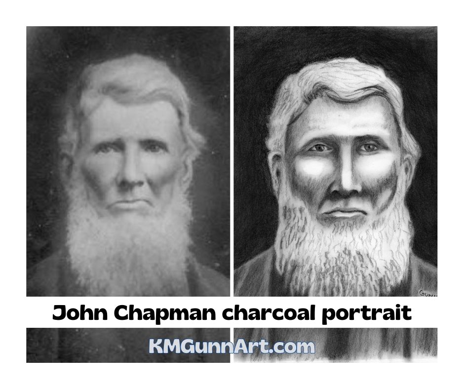
Moving right along in my attempt to get caught up on blogging my 100 faces art challenge is John Chapman, a portrait of a famous American folk hero done in traditional black charcoal. You might not recognize his real name, but you have probably heard his nickname: Johnny Appleseed. He was a colorful enough character to fill up a whole book, but I promise I’ll keep this short enough to still only be a blog post in length.
reference photo on left; my charcoal portrait on right
Better known as Johnny Appleseed
The main points about Chapman are fanciful enough to have earned him the colorful nickname of Johnny Appleseed, which started throughout what was then called the Northwest Territory while he was still very much in his prime as a man and as a businessman. Even by early 19th century American standards, he was considered a very eccentric character, though a lot of sources shy away from the reason behind that.
In fact, I was surprised that not only did my dad not recognize the name John Chapman, but he also had never heard why he was often seen barefoot with a cooking pot as a hat. For the record, my dad was a history major in college and has lived in Fort Wayne, Indiana (where Chapman retired to, and was buried) since the mid-1970s, so it is possible to not know that Johnny Appleseed was a devout follower of the Swedish Christian mystic Emmanuel Swedenborg.
Because Swedenborg was against grafting, Chapman planted as many apple seeds as he could and nurtured them. Another factor of his legacy lies in the requirements for making a homestead claim in the region: planting a fruit orchard – even a small one – was one of the major factors that would get the homestead claim approved. So, when Johnny Appleseed came into your area with several young apple trees, it just made sense to buy some and plant them near your home. Even though most wouldn’t be good for eating straight off the tree, all could be used in making hard cider.
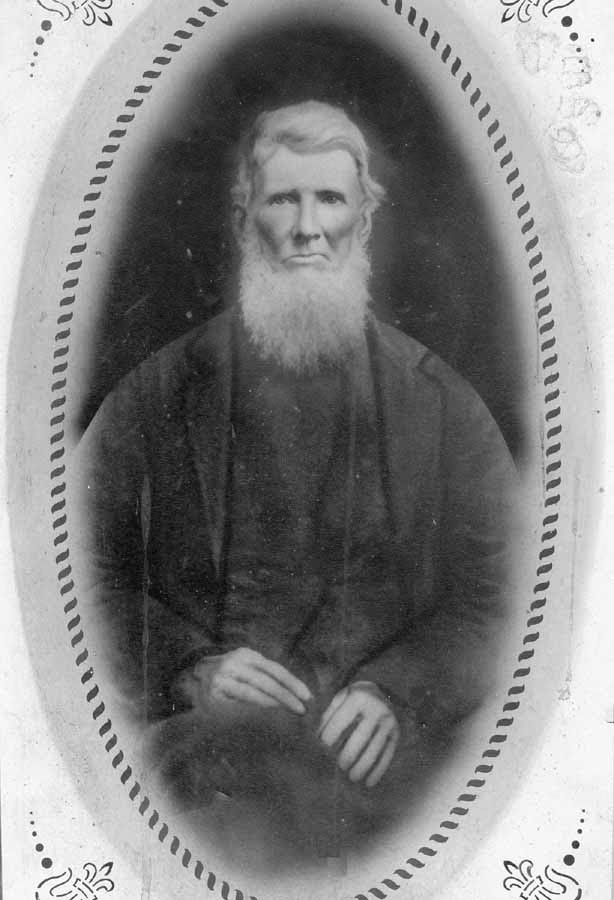
Only reference photograph
I could find only one historical photograph of John Chapman, and that is this one taken sometime between his birthday in March and his day of death in September of 1845. The reason there is only one is quite simple: he achieved his local legend status prior to photography being invented and becoming available to the broader public. As was the style of early photo portraiture, the photo shows most of his body as opposed to being a close-up of his face.
John Chapman shortly before his death at age 70 (better known as Johnny Appleseed)
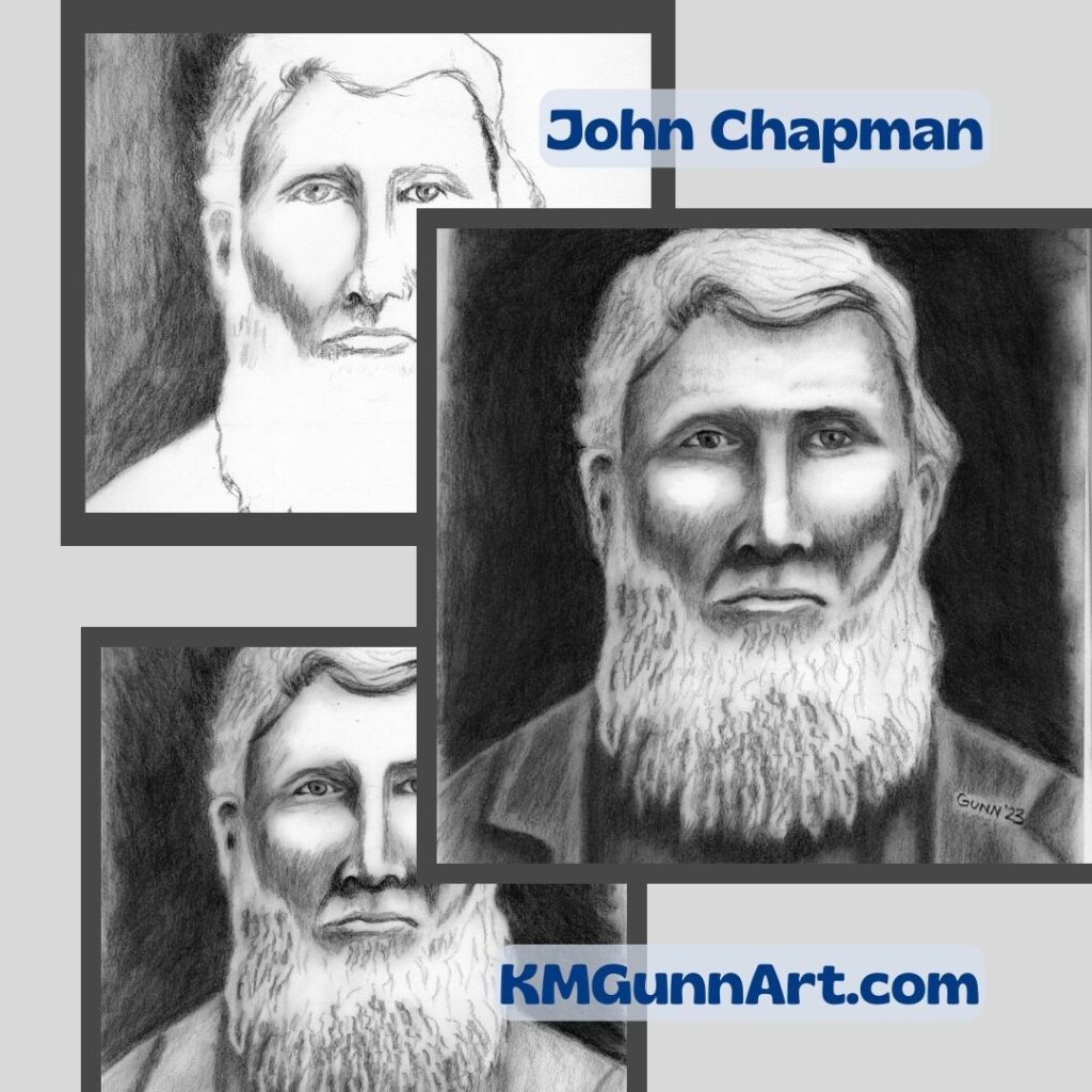
Portrait in black charcoal
I wanted my charcoal portrait to be only a close-up of his face, so some cropping of the original and enlarging was necessary. Then it was just a matter of gridding the crop and putting charcoal to sketchbook. I even made a cute collage showing the progression. U chose to use traditional black charcoal just because I liked the value contrast of his white hair against the black background.
evolution of my charcoal portrait of John Chapman
Applying the after-action-review process to my charcoal portrait of John Chapman
I learned a rather useful mental tool in my time in the army, the after-action review (of course we abbreviated that to AAR). The format for it was to first summarized what happened, then to discuss three things that needed improvement, and to finish up with three things that went well. I decided to apply this to all 100 faces I draw and paint for this challenge. I may not have all the points for an official AAR, but the general practice of finding thing that could be improved and finishing up with things done well is a very practical and valid learning method.
What could be improved
The big thing that jumps out at me when looking at the finished portrait is that I either drew or shaded his face too fat. His face in the original photo is lean from his years of voluntary austere living. I probably could have shaded his beard a little better. It looks fuller in my drawing than in the photograph. I also got the one ear too low, and did not notice until just today.
What turned out well
I am pleased that I was able to catch and correct the eye placement early enough that it didn’t mess up the portrait! Given that the paper does not tolerate much erasing, that is a big thing in my mind. I was also pleased with the overall look to this drawing: this is obviously an older man with white hair. Basically, he looks like a real person, so I am counting that as a win.
Newest portraits on Facebook
Just to let everyone know: I do post the newest face I am doing on my art page on Facebook because that is part of my accountability. My page is open to all the public, not just FB members, so other than Meta wanting you to login or sign up, you ought to be able to check there and see what I’ve posted most recently. I even post in-progress scans sometimes, like yesterday’s peek at my number eight.
I’ve been in a bit of a slump this year, as y’all may have noticed. In an effort to climb out of this slump, I decided the best way to accomplish that would be with an art challenge. Rather than wait for others to coordinate their schedules, I decided to challenge myself. For a couple years now, I’ve noticed the “100 faces” art challenge, and decided it was finally time to do that. Of course, I would be starting with drawing, and that means charcoal since I decided I just don’t love graphite anymore. I also decided to start the charcoal portrait drawing portion of the challenge with a personal hero of mine from when I was a kid.
the start of my personal 100 faces art challenge and the historical photo I used as reference
The “100 Faces” art challenge
I actually haven’t seen much about the 100 Faces challenge as far as “rules” go, just that an artist needs to draw or paint 100 faces in whatever time frame. With such broad parameters, that left me free to make up my own rules. So, I decided I would do 100 portrait drawings and paintings, and I set myself an arbitrary deadline for the end of 2023. I decided I would officially launch this challenge on July 1st, so it would be a matter of drawing or painting 100 portraits of people in approximately 182 or 183 days.
I knew I definitely did not want to do the more rigid one drawing per day as my challenge, since that has tripped me up in more than one previous challenge. Sometimes, I just have a bad day when I feel as though I am fighting each stroke of the charcoal out onto the paper. There are even some days when I actually have plans that involve leaving the property! (We’ve really become such homebodies since the lockdowns.)
Finding reference photos for drawing portraits
The first criteria for using an historical photograph is to make sure we are as sure as we can reasonably be that the person in it is who we think that is. This may seem obvious, until you look up Billy the Kid and all the disputes about whether he is or is not in all but one photo.
I should probably also mention that the reference photo idea excludes quite a few historical figures simply because the technology had to be invented before it could be used. Again, that sounds so obvious, but does exclude anyone who lived and died prior to the 1840s. (this point will become important in the next post.)
I started my search at the Library of Congress website, and found my personal hero from childhood featured at that time.
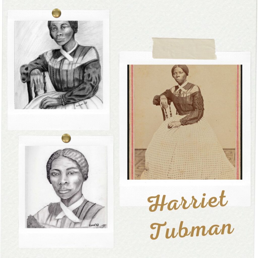
Harriet Tubman, a personal hero
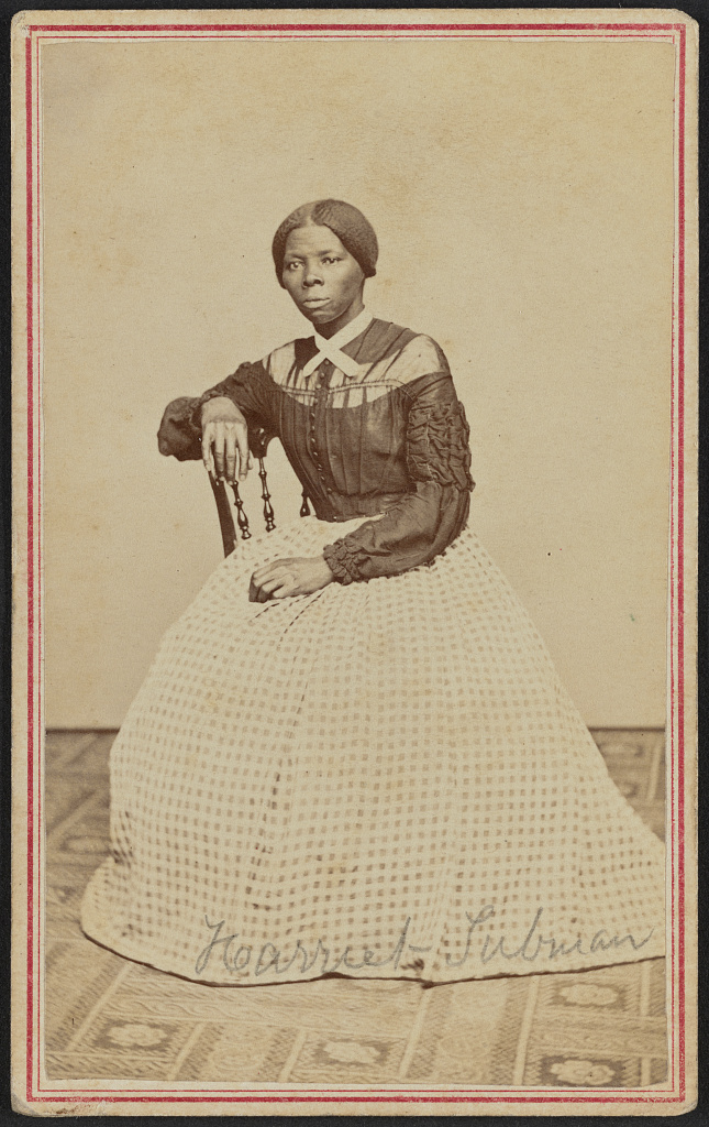
photograph of Harriet Tubman from Library of Congress website, listed as taken in 1868
I first learned about Harriet Tubman the year I was in third grade (if I recall right) by watching a documentary. At the time, I thought it was so cool to finally come across an historical figure who was a woman, and one remembered as being unusually brave. While I hadn’t taken very many history classes at that tender age of nine or ten, most of what I knew of history (Dad was a history major in college) was all centered around men doing brave things.
I actually started the first version of my charcoal portrait drawing prior to resolving to do the 100 faces challenge. I thought Harriet Tubman was the perfect subject for a portrait for Juneteenth, and intended to do the whole thing that holiday weekend. Something or other came up or distracted me that weekend, and I did not get the ball really rolling on that drawing until after the start of July.
Once I finally got rolling on it, the first portrait came together well enough. I discovered when trying to fix the one eye that this paper wasn’t an exact match to my previous sketchbook in that it did not take much erasing before it became noticeable (even though it was the same brand and specific type). So, I made a mental note that I would not be able to do much fixing of errors in this sketchbook and then moved on.
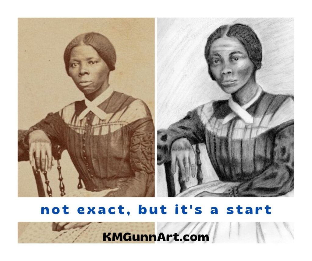
side by side comparison of my reference photo and first charcoal portrait drawing
Recrop for a “closer” portrait
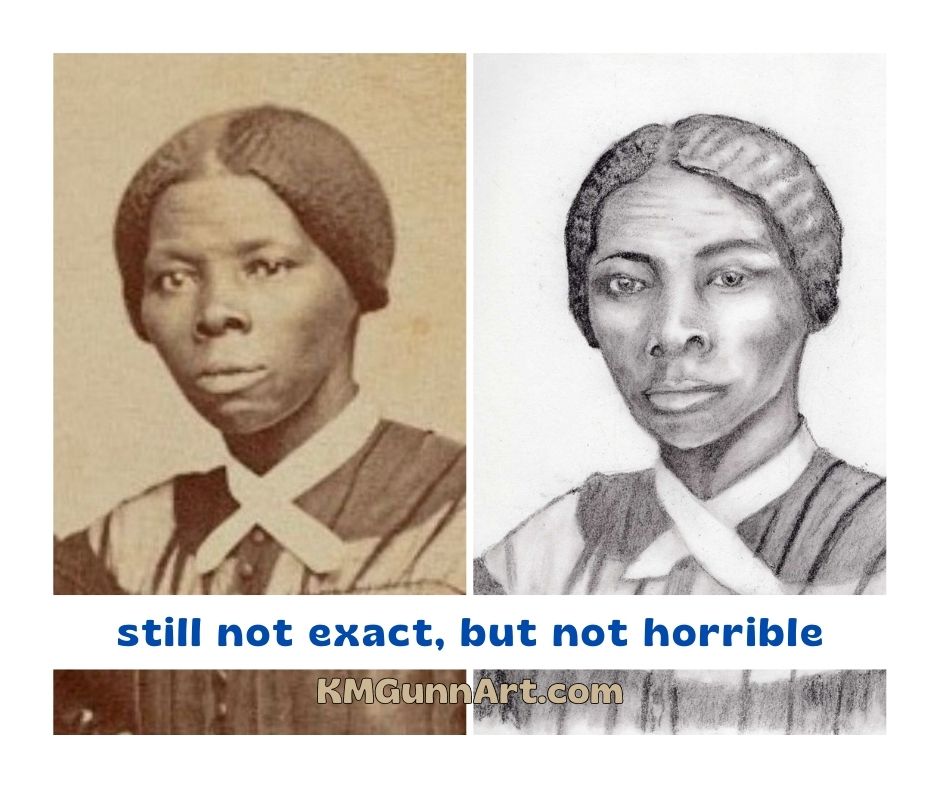
Once I realized I could not erase any section of paper more than once, I decided I wanted to do another version of this historical photograph. I wanted a closer crop of just her face for a more personal, intimate feel to the portrait. While the scan of the original photo is probably as high a quality as one can reasonably expect, there was still a bit of graininess to it by the time I cropped it down then enlarged it.
Since the photos from that general time period are often in sepia instead of grayscale, I thought I would have a little fun with the shades of brown in my tinted charcoal set for this second portrait. I’ve been trying to consistently post in-progress scans over on my Facebook art page, and after the first scan was posted I realized I needed to fix the features – the eyes were not even with each other and the line of the nose and mouth were off-center. Some careful erasing, and it was fixed “good enough.”
second charcoal portrait, this time drawn in brown tinted charcoal I simply call “Harriet” because it feels a little more personal
Traditional black charcoal versus tinted charcoal
Visually, the end results between the first portrait I drew in black charcoal and the second in a dark brown tinted charcoal are not very different. My very dark brown is extremely close to the traditional black, especially on the shadow areas where I tried to get it as dark as it would go.
The main difference in the “feel” of the medium comes down to how well the hard and medium black charcoal pencils hold a point, versus the softer tinted charcoal pencil. As I figure out on face number four, the tinted charcoal pencils really are not good for detail work and should be relegated to nondetail drawings or close-up portraits. It was an interesting idea, just one that didn’t translate as well as I hoped. Future portrait drawings in charcoal will be in the traditional black charcoal.
The goal of this art challenge
I have a very specific goal that I want to accomplish with this art challenge: I want to improve my people-drawing skills. I figure that by the time I get to my 100th face, whether it is a drawing or painting, I should see noticeable improvement over these first few efforts. I’ve been saying for a couple years now that I need to “knock the rust off” my people drawing skills I used to have, and finally decided to just knuckle down and do it.
The only way I will get better is by learning from my mistakes. The only way to make mistakes is to put medium to paper and “just do it,” as the old ad campaign said.
Feel free to follow along here on the blog – I will get caught up soon! – or on one of my social media accounts. I will definitely be posting to the FB page, as my friend Keashia is on Facebook and she has agreed to be my accountability partner on this project. As of writing this, I am on number seven – all charcoal portrait drawings so far, but I’ll likely try my pastels and paints at some point.