Computer-Generated Digital Floral Art

As I mentioned in my previous post, I have been playing with digital art in the form of text-to-image software. I must say that trying to coax nice flower bouquet images from the program has had its ups and downs. While not quite as grotesque as some images, there are a few head-scratchers until you realize both flowers and fruit are spherical shapes. Yes, I’ll get to that image soon enough, while also showcasing a trio of digital floral images I actually like.

Bouquet of pretty tulips done digitally

large art print of Vase of Tulips in a family room mockup, with magenta-purple flowers in a white vase on a wood table, with two yellow tulips to provide a pop of contrasting color
Vase of Tulips, square format digital floral artwork available as art prints

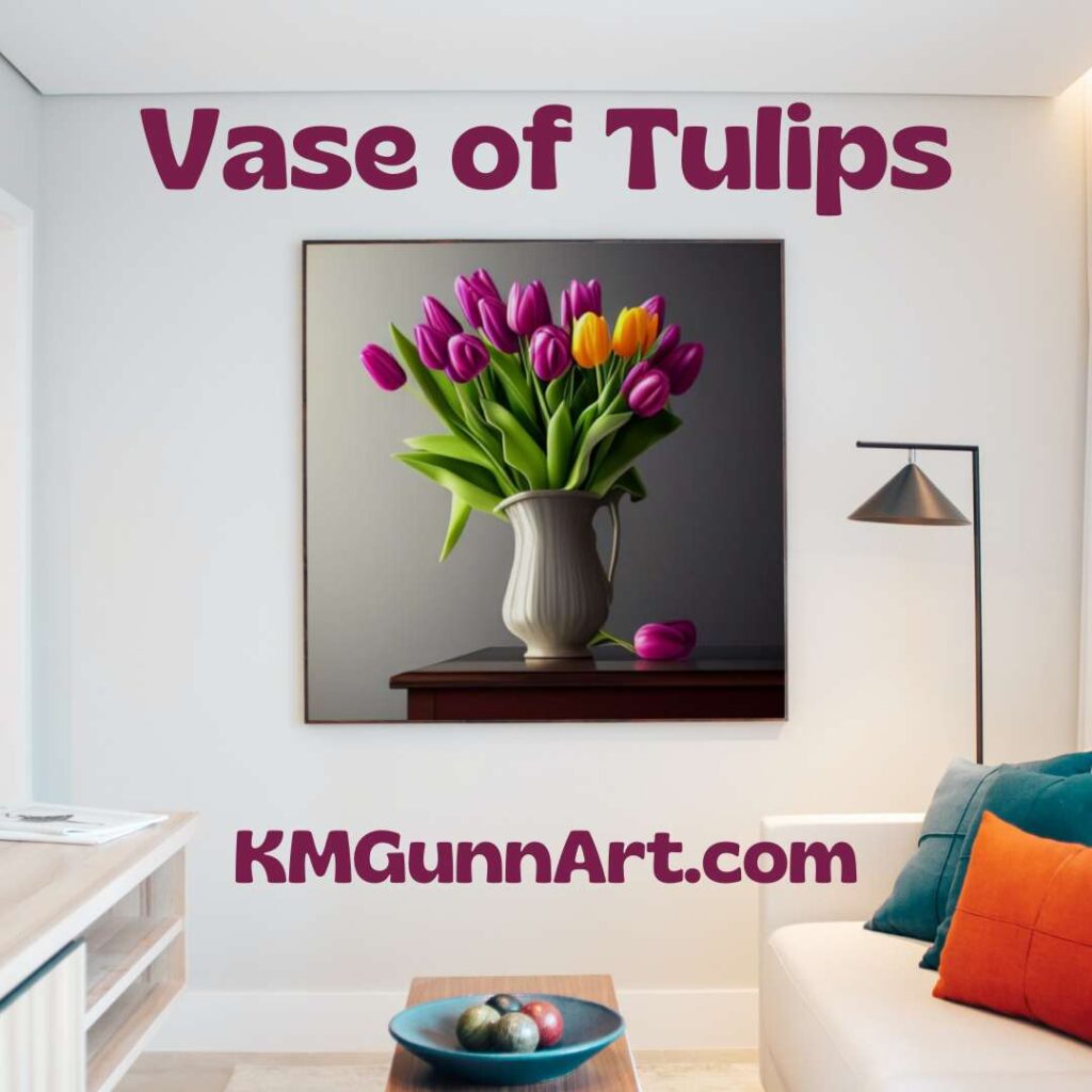
An early win (and it does feel like playing a word game) for me is this lovely square-format piece I simply call Vase of Tulips. Anyone who has read more than one blog post from me knows I am rather unimaginative when it comes to naming my artwork. As always, if you buy a piece you are free to name it whatever you like. I had not specified much for this text prompt, so getting a large bouquet as opposed to a small one, and getting two complementary (and realistic!) colors for the blooms was a pleasant surprise. Add in the single flower lying on the table top partially obscured by the pretty white vase, and I was so pleased. The lighting is both realistic and dramatic.

Purchase this digitally-created floral

As is the case for all the digital art pieces, there is no original. I am open to painting this in more traditional media if you’d like to commission me to do so. You can order art prints from small to ego-boosting BIG from my Pixels shop. To get this image printed on apparel and accessories for the home, visit my RedBubble shop.

Romantic pink tulips bouquet

mockup of large art print of Pretty Pink Tulips hanging behind a small table next to a window letting in sunlight
Pretty Pink Tulips hanging behind a table next to a sunny window

After a couple dozen failures from the software, I started playing around with different modifiers. I finally scored a lucky “roll of the dice” with this pretty pink bouquet of tulips done in the Romantic style that I personally adore but have not yet tried my hand at achieving. (I’ll need to fix that sometime this year.) The only part of this piece of floral digital art that gave me pause was the single pink petal floating in the air along the left side. Other than that, the software managed to get the right combination of dramatic sunlight coming in through the window. It’s mostly (but not completely!) correct with the highlights on the flowers, and the overall effect is quite pretty.

Buy a print of Pretty Pink Tulips

No “original” exists since this is digital art, but you can buy an art print from small to impressive from my Pixels shop. If you are inclined to wear my art instead of framing it, my RedBubble shop has a wide range of apparel (and swag for the home) with it printed on it. Right now, I am on the fence as to whether or not I’d like to try my hand at recreating this on canvas or paper.

Slightly surrealistic Pink Peonies

I did try several species of flowers for a wider variety of floral bouquets, but the results were – at best – mixed. While the software generated a nice bouquet of white daisies in a nice ceramic pitcher, it set that pitcher on a gloomy flat rock instead of a table. Attempts to coax images of mums and chrysanthemums resulted in either unrealistic colored flowers, or a very drab composition. I tried red poppies in November, but did not like how those looked either. The one success (that is not roses or tulips) is a bouquet of pink peonies.

square-format digital floral artwork Pink Peonies
Pink Peonies, floral digital art in square format

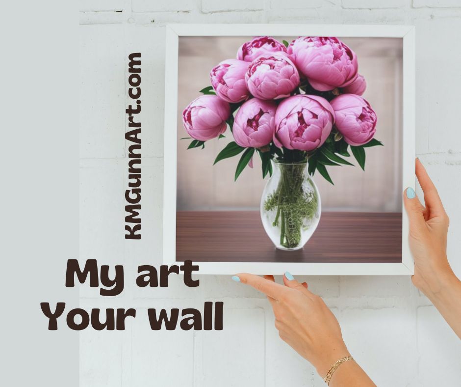
While it has most of the elements correct – the size of the peonies is “larger than life.” We had two pink peony bushes at the house where I grew up, and while they are not small flowers they are not quite this big either. I’m not sure of the physics of putting flowers this big into such a small vase without it tipping over. This one is the best of the bunch the software generated.

Links to buy prints of Pink Peonies

Once again, no “original” exists off of my hard drive and the site’s server. You can buy an art print for your wall from my Pixels shop in whichever size you desire. Over at my RedBubble shop you can find it printed on apparel and accessories for the home if you prefer your art to also be practical.

The bloom is off the digital art flower for me

Back in the comments section of my first blog post on digital art, blogging buddy Jim Hughes predicted that the novelty of this form of digital art will likely wear off. I have to admit; he called it. I find myself putting in fewer text prompts these days. Far too much of the output I get is disappointing when it isn’t blatantly wrong.

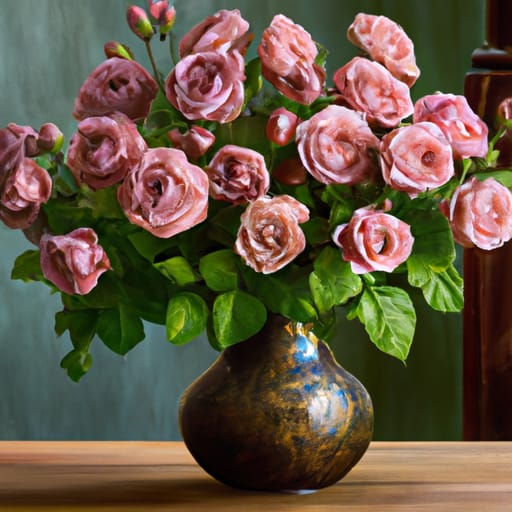
Still life composition: fruit and florals

One very traditional still life composition going back centuries is to do a floral bouquet with some fruit around it. There is usually some symbolism involved, which I need to research for its own post. Even if the software developers only used art in the public domain, this ought to be an easy subject for the program to generate. It isn’t. Trust me. I tried!

one of the more amusing efforts from so-called AI image-generating software
not quite what I was trying for …

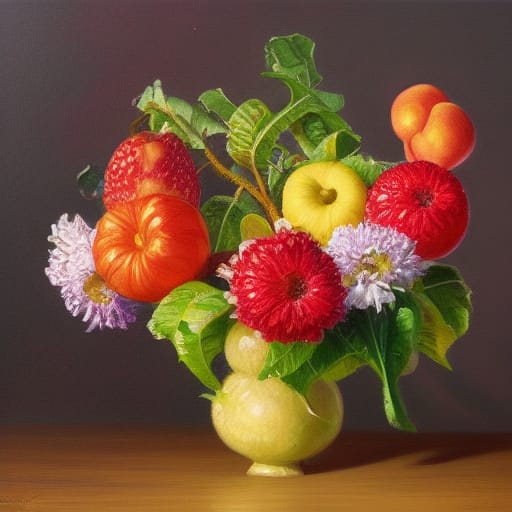
Apparently, so-called AI software cannot distinguish between fruit and a flower. They are both usually spherical, so it jumbles them together any which way. A big element in the program is a randomizing factor akin to rolling dice or drawing a number out of a hat, and this is the element that completely messes up my attempts to get a floral with fruit on a table composition. This is why we human artists are still relevant. We know early on in life that fruit doesn’t go at the end of a flower stem!

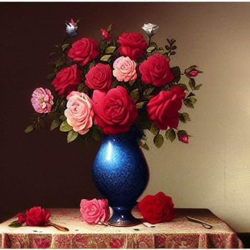
While I will likely still play around with the text-to-image software from time to time, I just cannot see it replacing the more traditional version of art. This is particularly true for my rather traditional style of art. I still would like to do up a classical still life involving both a bouquet of flowers and some fruit (on a table and not some gloomy flat rock). I do see it as a way to get ideas for layout and composition, like my yellow roses examples. The results from this program still need to be sorted by and filtered through a living human artist.

Roses in Artwork: Feature Friday 10

I am on a rose kick this week! Roses are such popular flowers and subjects for artwork due to their beauty and elegance – and having a pleasing fragrance helps the real flower’s popularity in bouquets. While I have drawn and painted single roses, I had not yet tackled drawing or painting an entire bouquet of roses. This is in the process of changing, courtesy of my recent experiment with text-to-image software and digital art.

Everything is coming up roses

Sprinkled in among the three new rose bouquet computer-generated images will be blogging friends’ posts featuring roses in artwork in various media. I also wish to note that new hand-drawn and hand-painted art will be created and posted within the next month – before I talk to my Mom again on the phone. Yesterday, she did not beat around the bush or try to sugarcoat her opinion when she immediately asked me when I plan to get my paints back out and make real art instead of playing around on the computer and posting that. Mom knows how to use a clue-by-four!

Pink roses

It should be no secret that pink is my favorite color. So of course the first bouquet of roses I prompted the software to generate was specifically pink. No modifiers, just “bouquet of pink roses in vase on table,” if memory serves me correctly.

large bouquet of pink roses in a vase on the table
Bouquet of Pink Roses, digital artwork

This was only the second image I prompted the program to create, and I felt pretty lucky to get something that looked correct. Being a digital image, there is no original artwork available, but you can get art prints from my Pixels store. If you prefer to wear the art you buy, then take a look at my RedBubble shop options for this image.

If this is not enough pink roses for you, you can always take a look at Tatiana’s Spanish rose, a close-up photograph with enough detail the little ant on one of the rose petals is in clear focus. She found this pair in a garden in Andalusia, Spain. And on the subject of pink rose petals, Sharon Cummings beefed up her description of her rose petal mandala artwork at my request. (Sharon recently won a spot on one of Fine Art America’s billboards, and they even put that one near her in Tampa.)

Red roses

Red roses will be very popular come mid-February. While this won’t win me any points with the independent florists, I think it would be better to gift your Valentine with a rose that won’t wilt – in the form of artwork! Here is another lucky combination of text prompt and random number from the computer program that features red roses.

bouquet of red and pink roses with green foliage in blue vase on table
Roses in Blue Vase, computer-generated artwork

Buy your art prints of this beautiful bouquet through my Pixels store. Get your apparel and accessories with this image at my RedBubble shop. Again, being digital, there is no original painting or drawing available (yet).

If you need a little assistance getting into a romantic Valentine’s mood, check out Steve Heap’s flower photography where he revisits a red rose bouquet he had waiting with champagne for his wife’s birthday in 2012. He does his own version of digital art by using software filters on his photography.

Bouquet of multiple colored roses

In the process of searching for just the right set of modifiers for my text prompt, I noticed two that just go together like chocolate and peanut butter: romanticism (the art movement) and …. Thomas Kincade. Seriously, that would be how I would describe Kincade’s painting style in just one word. No “neo-” prefix, but straight up Romanticism. While he did mostly landscapes, I feel that soft, lovely style is best suited for floral artwork. When I did not specify which color of roses I wanted, I got this lovely image.

a very classic image of a bouquet of different colored roses in a fancy vase on a table, done in the Romanticism style with a Thomas Kincade look
Classic Roses in Vase, digital art

I must admit, I like this one. Not only because the notion of time-shifting Thomas Kincade back to the Romantic period of European oil painting and having him paint flowers appeals to me. Except for that odd but of red in the middle of the bouquet, this may well be the closest that computer program has come to generating the image in my mind. I may break out my oil paints and try this one myself (but after I do the yellow roses in pastel).

Meanwhile, if you want this classic bouquet of roses as an art print, get it at my Pixels shop. If you want it on a shirt or accessories for you home and person, it is available at my RedBubble shop. Again, no original of the digital artwork.

Finally, if you are in search of a perfect rose, Jim Hughes believes he has taken the perfect photograph of a perfect rose. The technical details sailed right over my head, but I do think that is a very good portrait style photo of an elegant rose. Be sure to read the backstory on said rose as well.

I hope all y’all have enjoyed this virtual cornucopia of roses in artwork! It may seem early to be thinking about Valentine’s Day flowers, but I want to be ready for 2023.

Pink for Breast Cancer Awareness month

Yesterday was the first of October, but it didn’t really click for me until I ran into town to pick up some critter feed and saw a couple of businesses with the flocks of plastic pink flamingoes: October is breast cancer awareness month, and locally that means it’s time for Pink-Out Putnam again. Local participating businesses will not only decorate with the standard pink ribbons, but since this is Florida it means there will be a population explosion of those wonderfully tacky plastic pink flamingo yard ornaments.

Along with pink being one of my favorite colors to wear, and flamingoes being one of my favorite birds to paint, there is a darker personal connection for me. Both of my mom’s sisters and my dad’s surviving sister have all gone through breast cancer diagnosis and treatment. Thankfully, all three are still alive to tell about it, but having women on both sides of my family get diagnosed leaves me at a higher risk of developing this myself. (For the record, my appointment for my next mammogram in early November. VA healthcare system takes this seriously.)

My pink flamingo watercolor series

Last year, I did a series of six watercolor paintings that featured flamingoes in or near water as part of an art challenge, which included my first place winning Flamingo in Rippled Water. I’ll be taking the series to various local businesses to see if any new small mom-and-pop places would like to display them.

Pink flower paintings

Pink flowers are also on my list of favorite things to paint, and I have some of those to share for this very pink post. I did a cherry blossom watercolor painting this spring, actually a little earlier than they bloomed, but it is very much an annual thing and I love to see photos and paintings of them in March. I also did two pink rose pieces last year: one in watercolor and one in oil pastel. Gathering up the links for this post made me realize I have not yet blogged one of my pink flower paintings yet …

Pink Hibiscus

Pink Hibiscus watercolor painting by Katrina Gunn
Pink Hibiscus, 10 x 10 inch watercolor painting, original available $100 USD

First things first: yes, if you look closely you can see the grid I used for sketching the proportions out properly. I had used a red watercolor pencil to do this, thinking when I painted over it would dissolve. It was a lesson learned. Not all pigments in watercolor pencils will disappear with regular application of water. I should note that this was the last time I did my grid-and-sketch directly on my watercolor paper. Now I sketch in one of my sketchbooks and use graphite transfer paper to make my marks on the watercolor paper. The punchline here is that people who see it don’t seem to care. Feedback on this paintings has always been quite positive despite the graphite outline and grid lines showing. I guess folks feel that shows this was painted by a person and not a software program.

Purchase info so you too may “Pink Out” like Putnam

Along with overlooking this piece here on the blog, I had also forgotten to upload it to my gallery over at Daily PaintWorks, which is the online venue where I prefer to sell my original artwork. This has been rectified. I had also forgotten to upload it to my RedBubble shop, but I fixed that as well now, so those of y’all who want your RB swag with this painting can have at it. Finally, for those who want an art print larger (or smaller) than the original 10 by 10 inches can order it at my Pixels shop.

So pick your favorite pink painting for Breast Cancer Awareness month. Please feel free to share this post, because this is an issue that has affected my family … and perhaps yours as well. My county will be decorated to the nines with pink ribbons, pink signs, and of course plastic pink flamingoes everywhere, and I invited everyone to join us! I have at least one new pink flamingo painting in my mind already, so stay tuned.

Pink flamingoes in watercolor

So, I intended to do up a flamingoes watercolor painting roundup when I noticed I only blogged about two of my six paintings last year. Oops! It’s high time I fix that, so grab a beverage and some popcorn (if you like popcorn and your husband hasn’t yet eaten it all) and let me get caught up on my favorite pink-feathered birds.

As I mentioned last year while it was happening, this was for a seven day challenge that had the theme of liquid. I naturally decided to use watercolor paint as my medium for the entire week, and picked out seven reference photos of flamingoes in or near water, and my Flapping Flamingo was the first one I painted. I fell behind on the blogging portion of the challenge, resurfacing to post my favorite of the series, Flamingo in Rippled Water, which y’all will recognize as one of the artworks that won first place in last autumn’s VA Healthcare system regional competition. When I finished up the challenge with a beachscape, I mentioned I would upload the others “soon.” I suppose less than a year can sort-of count as “soon,” in a certain light.

Very pink flamingo

For the second painting of the series, I did up this one I just call Wading Flamingo. I seriously doubt I will ever win any recognition for naming my art, but that doesn’t really bother me so I keep naming things with an obvious title. While this one isn’t really my favorite of the bunch, I have heard from a few folks who saw it and liked it. One artist also participating in the challenge said it was her favorite of the set. Like all the other flamingo paintings, this is on 9 by 12 inch watercolor paper, and prints are available. The page at my RedBubble swag shop is here.

Wading Flamingo watercolor painting
Wading Flamingo, 9 by 12 inch watercolor on paper, $100 USD available

Fun flamingo pose

Third in this series, and my second favorite overall, is this much more subdued version I call Curious Flamingo. My husband says flamingoes have such expressive faces, and that expression often looks startled, but I have found some nice ref photos where the bird looks not-startled, like this one. It still looks almost silly, the way this flamingo has cocked its head just so, but the overall effect with the less-saturated colors just work for me. Also on 9 by 12 inch watercolor paper, with prints available in larger sizes. Link to the RedBubble swag shop here.

Curious Flamingo watercolor painting
Curious Flamingo, 9 by 12 inch watercolor on paper, $100 USD available

Flamingoes on the beach

For my fourth flamingo watercolor painting, I managed to salvage something workable from what at the time looked like very much the disaster. After a couple days of touch-and-go, my masking fluid finally tore the (bleep) out of my paper. I was furious, went on Facebook and asked in a watercolor artists’ group for a better brand than what I was using. Once armed with a brand name that was recommended, I placed an order that very evening for what I now use, which is Pebeo drawing gum. As for the painting, which I was originally going to call Beachcombing Flamingoes but instead titled Impressionist Flamingoes … I totally intended for it to be done in an Impressionist style. That’s my story, and I’m sticking to it. I am still a bit ambivalent about the idea of selling the original due to the damage to the paper’s surface, but it scanned well and I uploaded it to RedBubble for apparel and accessories. Prints in various sizes are available.

Impressionist Flamingoes, was intended to be called Beachcombing Flamingoes
Impressionist Flamingoes, 9 by 12 inch watercolor

Pale flamingo

Pale Flamingo is as its title suggests, and a pale pink on the flamingo’s feathers while it feeds in shallow pale blue water. The black of the beak and tail feathers provides sharp contrast with all the pale versions of color, and this one was identified as another artist’s favorite of the series. The contrast is certainly eye-catching. The original is also on 9 by 12 inch watercolor paper, and prints are available from my Pixels store, while the RedBubble swag is located here.

Pale Flamingo watercolor painting
Pale Flamingo, 9 by 12 inch watercolor on paper, $100 USD available

So this gets me finally caught up on my flamingo series of watercolor paintings, which means it’s about time I painted and drew some new flamingo artwork. I’ll need to finish a few pieces on the easels – yes, I now have multiple easels to hold my works-in-progress – and one of those just happens to be a flamingo.

Cherry Blossoms of Spring

Spring is my busy season around the property, and this year has been par for the course with five goat kids, firing up the incubator, and rabbits kindling. While I have been on a charcoal kick so far for 2022, yesterday and this morning it felt so good to have a paint brush in my hand and to work with some color. The interesting angle on this is Judith over at Artistcoveries posted the other day about an historical debate between color and drawing, and how she feels she is on the color side of the argument because she can do color without drawing. I commented that given my ongoing charcoal drawing kick, I have to take the drawing side of that argument, because I can (and do) draw without employing color but flounder on the idea of using color without some drawing element. I suppose that is a succinct way of saying I just don’t feel abstract art like some folks do. We then agreed that it is better to not try to draw a line between these aspects since the art world is certainly big enough for not only both viewpoints, but some that are outside of this binary.

Inspiration

Yeah, I do indeed read other artists’ blogs, and heartily recommend doing so because the interplay of ideas often sparks inspiration all around. Case in point, fellow art blogger Steven of Backyard Image was inspired by my charcoal monarch butterfly I posted last time to play with his photographs and filter software to produce his own new piece. What he doesn’t (yet) know is a previous post of his inspired me to do up both charcoal and watercolor pictures of cherry blossoms, because what says spring quite like the brief glorious week of the cherry trees in Washington, D.C. in bloom? My post inspired him, and one of his inspired me.

I had intended to use the cherry blossom motif for a new art challenge which had the stated theme of “time,” but apparently the lady who organizes these challenges had a much more narrow interpretation than I do. I wasn’t the only participant who took a broader view of the theme, though most focused on timepieces of one sort or another. I just quietly dropped out to pursue my own thing, because that is what I do.

Value study sketch in charcoal

First step for me was to hop onto Pixabay and hunt up some nice cherry blossoms reference photos. As usual, I found a good handful that suited what I had in mind, then it was on to cropping it “just right” because I am just picky like that. Once I selected my target ref photo and had it cropped, then it was time for a charcoal value sketch, where I get a feel for the shapes and shadows. This is “just” a sketch, so nothing as fancy as a full drawing for a charcoal piece, and since it is in my raggedy sketchbook, there is no original to offer, but I did upload it to Pixels for art prints since it makes a nice companion to the watercolor version.

charcoal value sketch for Cherry Blossoms of Spring
charcoal value sketch for Cherry Blossoms, 9 by 12 inches, in sketchbook

Adding color

Once I was satisfied the image has enough value contrast to be visually appealing, it was time to transfer it to watercolor paper to paint. These days I do not sketch on watercolor paper, because even when I use watercolor pencils I can still see grid lines, so I now draw it in my sketchbook and use graphite transfer paper to get the necessary lines, which I often lighten up with a kneaded eraser before laying down paint. Just for fun, I wanted to see if I could pull this painting off only using three colors: cobalt blue, rose red (which is more a magenta if you ask me), and burnt umber. I think I succeed.

watercolor painting Cherry Blossoms of Spring
Cherry Blossoms of Spring, 9 by 12 inches, watercolor, $80 USD

For this iteration, the original is available, 9 by 12 inches, sealed with Dorland’s wax medium and if you are not local you can purchase through Daily PaintWorks via PayPal. Prints are through Pixels, along with a bit of swag like puzzles or a fancy shower curtain. I also uploaded the image to RedBubble, which has a nice variety of apparel, plus the face clock. I simply must include the image of the face clock – I think it looks awesome.

Cherry Blossoms of Spring watercolor painting as an analog clock face
Cherry Blossoms of Spring as a clock face

Now, for the best news: the goat kids are down to two and three bottle feedings a day, which means I now have more time to get back to my art. They are cute, they are affectionate, but for the first four to five weeks they are rather needy, but now they are growing up and two have gone off to a new home where I have no doubt they will be spoiled rotten (no change from their life here).