Daisy watercolor painting in only four colors

While I am behind on blogging it, I did finish up the three-day daisy art challenge. Before I start in with the second day’s daisy watercolor painting, I thought I would share a comment left on my Pixels page for the blind contour daisy drawing that made me chuckle. Fellow challenge participant Karen Kasper remarked that it reminds her of a Pablo Picasso drawing, and she suggests I get a better image of it so it could potentially be a bestseller on the site. (I should probably clarify she means Picasso’s later work – he started out classically trained and did wonderfully detailed representational drawing and painting, but later followed his muse to something completely different.) I intended to replace the blind contour with the acrylic painting I was looking at while drawing it, but in light of Karen’s comment I may leave it up.

Next daisy artwork, a watercolor painting

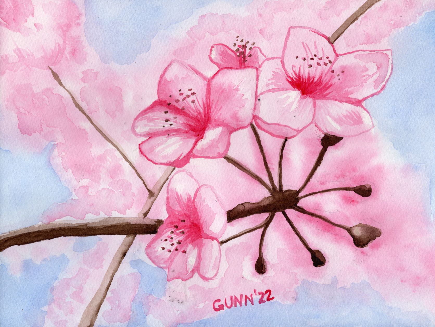
Now to move on to day two of the three day art challenge focused on daisies as its theme. I knew I wanted to do at least one daisy painting in watercolor, so Sunday after sketching out a single flower, I transferred the outline to the first cold press watercolor block I picked up and then sorted through my watercolor paints to see how few tubes of paint I would actually need. I am up to three brands of watercolor paint now: the Mijello Mission Gold paints that I discovered in late 2020, that are excellent for beginners because they don’t run across cold press paper as much as other brands; the Turner paints that don’t lift as easily as Mijello, run at a medium rate, and have always been in stock over at Jerry’s Artarama each time I’ve looked; and my new brand, QoR from Golden (more about this brand later). I had purchased a bottle of QoR’s synthetic oxgall to make my Mijello paint run better for backgrounds, and holy cow does it make the Turner paint really spread, so I knew this would be my most unpredictable paint to work with wet-on-wet. (Note to self: this probably makes no sense to anyone who has not painted with watercolor paint. Must write a post on what all this means.)

Choosing the specific watercolor paints

I ended up with only four tubes of paint: Turner ultramarine blue for the background (because daisies need either a green or a blue background), Turner permanent yellow and transparent yellow oxide for the center of the daisy and to mix with the blue for the bit of stem, then QoR’s ardoise gray for the shadows on the petals. Just don’t ask me to pronounce that name. I wanted to get the paint done while cats were napping, and succeeded, so I was pleased with the result.

watercolor painting of single daisy flower using only four colors
Four Color Daisy watercolor sketch, 9×12 inches on paper, $80 USD original available

The one thing that sticks out to my eye is that the transparent yellow oxide (yellow ochre for all intent and purpose) does not go well with the permanent yellow in the flower’s center. I probably could have gotten away with mixing the grey and permanent yellow together to achieve a more-harmonious shadow for that part, and I may do it over doing just that sometime this summer.

Links to purchase

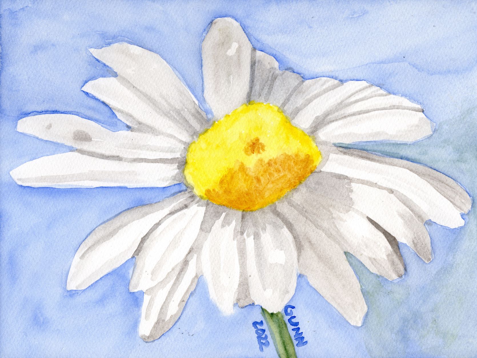
The 9 by 12 inch original is available through Daily PaintWorks, as usual sealed with Dorland’s wax medium. If you want a larger print, those are available through my Pixels store, along with greeting cards and some accessories. RedBubble apparel, accessories, and swag is here.

The starting photo

For those curious, the reference photo I used is this one from Pixabay. When I look for a reference photograph, I don’t worry about the shot’s composition, just lighting and subject, because as you can see I crop it to what would make a good painting or drawing to my eye.

the reference photo for my Four Color Daisy

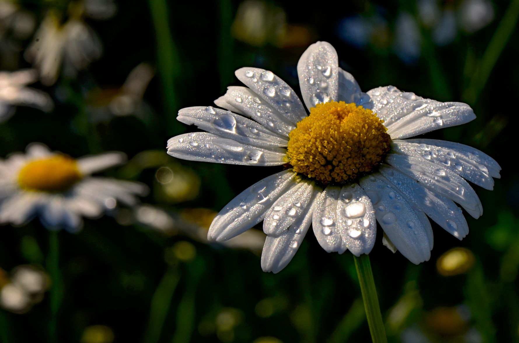
I suppose my lack of reverence for the original photo is a product of my total lack of photography skills – I’ve received valid criticism of my wildflower snapshots, but the simple fact is I am not much of a photographer. If I am going to do a fine art image, that will require something other than a camera. Once again, all I can say is I am so glad digital cameras were invented, or I would still be wasting money and resources on film developing.

Still one more daisy picture from the challenge, then I will need to post up one I did last summer for a 30 day drawing challenge I ended up dropping out of about halfway through, and of course I will need to finished the acrylic painting I used for the blind contour drawing, so there will still be plenty more daisy artwork in the near future.

Cherry Blossoms of Spring

Spring is my busy season around the property, and this year has been par for the course with five goat kids, firing up the incubator, and rabbits kindling. While I have been on a charcoal kick so far for 2022, yesterday and this morning it felt so good to have a paint brush in my hand and to work with some color. The interesting angle on this is Judith over at Artistcoveries posted the other day about an historical debate between color and drawing, and how she feels she is on the color side of the argument because she can do color without drawing. I commented that given my ongoing charcoal drawing kick, I have to take the drawing side of that argument, because I can (and do) draw without employing color but flounder on the idea of using color without some drawing element. I suppose that is a succinct way of saying I just don’t feel abstract art like some folks do. We then agreed that it is better to not try to draw a line between these aspects since the art world is certainly big enough for not only both viewpoints, but some that are outside of this binary.

Inspiration

Yeah, I do indeed read other artists’ blogs, and heartily recommend doing so because the interplay of ideas often sparks inspiration all around. Case in point, fellow art blogger Steven of Backyard Image was inspired by my charcoal monarch butterfly I posted last time to play with his photographs and filter software to produce his own new piece. What he doesn’t (yet) know is a previous post of his inspired me to do up both charcoal and watercolor pictures of cherry blossoms, because what says spring quite like the brief glorious week of the cherry trees in Washington, D.C. in bloom? My post inspired him, and one of his inspired me.

I had intended to use the cherry blossom motif for a new art challenge which had the stated theme of “time,” but apparently the lady who organizes these challenges had a much more narrow interpretation than I do. I wasn’t the only participant who took a broader view of the theme, though most focused on timepieces of one sort or another. I just quietly dropped out to pursue my own thing, because that is what I do.

Value study sketch in charcoal

First step for me was to hop onto Pixabay and hunt up some nice cherry blossoms reference photos. As usual, I found a good handful that suited what I had in mind, then it was on to cropping it “just right” because I am just picky like that. Once I selected my target ref photo and had it cropped, then it was time for a charcoal value sketch, where I get a feel for the shapes and shadows. This is “just” a sketch, so nothing as fancy as a full drawing for a charcoal piece, and since it is in my raggedy sketchbook, there is no original to offer, but I did upload it to Pixels for art prints since it makes a nice companion to the watercolor version.

charcoal value sketch for Cherry Blossoms of Spring
charcoal value sketch for Cherry Blossoms, 9 by 12 inches, in sketchbook

Adding color

Once I was satisfied the image has enough value contrast to be visually appealing, it was time to transfer it to watercolor paper to paint. These days I do not sketch on watercolor paper, because even when I use watercolor pencils I can still see grid lines, so I now draw it in my sketchbook and use graphite transfer paper to get the necessary lines, which I often lighten up with a kneaded eraser before laying down paint. Just for fun, I wanted to see if I could pull this painting off only using three colors: cobalt blue, rose red (which is more a magenta if you ask me), and burnt umber. I think I succeed.

watercolor painting Cherry Blossoms of Spring
Cherry Blossoms of Spring, 9 by 12 inches, watercolor, $80 USD

For this iteration, the original is available, 9 by 12 inches, sealed with Dorland’s wax medium and if you are not local you can purchase through Daily PaintWorks via PayPal. Prints are through Pixels, along with a bit of swag like puzzles or a fancy shower curtain. I also uploaded the image to RedBubble, which has a nice variety of apparel, plus the face clock. I simply must include the image of the face clock – I think it looks awesome.

Cherry Blossoms of Spring watercolor painting as an analog clock face
Cherry Blossoms of Spring as a clock face

Now, for the best news: the goat kids are down to two and three bottle feedings a day, which means I now have more time to get back to my art. They are cute, they are affectionate, but for the first four to five weeks they are rather needy, but now they are growing up and two have gone off to a new home where I have no doubt they will be spoiled rotten (no change from their life here).

Three Dragonflies acrylic sketch

We started a new art challenge yesterday. It is a short duration one, only three days, with the theme of “three.” Separate from this, but hosted by the same moderator, is an “Edit This” challenge where we are given a photo to edit, draw, or paint in whatever way we please, as long as the hosting moderator can tell you’ve started with the given photo. Inspiration struck first with the ET photo (that sounds funny to me!), then quickly blossomed into an idea where I can do both, plus get the first day of the November 30 day challenge which has the theme of “red.” First, the sacrificial photo:

photo of a purple mushroom for the Edit This art challenge
Edit This #54 photo

It’s cute, and painting mushrooms seems to be a thing right now, so first I thought butterflies around the mushroom, but then I thought dragonflies, or maybe even fireflies … or better yet, dragonflies around the mushroom by day (on white paper to start) and then fireflies around it by night, which would give me the perfect excuse to try out my black gesso on white oil and acrylic paper to see if that stuff is as strong as it looks (spoiler alert: it certainly is!). And so that brings us to day one of the 3-day “three” challenge and the first of my entries into the Edit This challenge: Three Dragonflies.

acrylic sketch Three Dragonflies
Three Dragonflies, 9 by 12 inch acrylic on paper, available, $80 USD for original

It turned out cute, a bit on the whimsical side, mostly simple in layering and color, and overall I like it. I listed the original on Daily Paintworks last night, as well as uploading the high resolution scan to my Pixels site for prints. This morning I uploaded said hi-res scan to my shop at RedBubble for the apparel and accessories, positioning the image just right for the clock. At some point, I will get myself one of those clocks … once I decide which artwork to have on it. I doubt I have enough wallspace for all the ones that look nice on that clock face, not to mention the amount of batteries I’d need to keep them all on the right time.

I started the firefly version, as alluded to above, by first testing the black gesso. It’s almost dry enough to start painting now!

Summer Jalapeno acrylic painting

I am finally getting to the final image from the black and white challenge, which ended up being a photograph I took in early July of my husband’s jalapeno plant, cropped, straightened, and with the color taken out. I had a busy day out of the house that day, running errands up in Palatka, and was tired both physically and mentally once I got home. I really was not happy with the result, and immediately planned to redo it and replace the image with something better, something more “me” than a cluttered and busy photo.

black and white photo of my husband's jalapeno plant with blossoms and peppers
greyscale version of my reference photo

That something else ended up being the very next challenge, which I started with the Calla Lily painting in acrylic. Since the theme for the next challenge was “anything goes,” I figured to do up three images from the black and white challenge in color, using acrylic paint since I could use the practice with that medium.

Starting the painting

Some days, the paint just flows perfectly, and the painting comes together “like magic,” as the saying goes. Then, there are days when I feel as though I am fighting every step of the way … and the first day of this painting was definitely a struggle. I blocked out the position of everything easily enough, but my first stab at the background color turned out too purple, so I mixed up some more paint and tried again, with this time being too light a blue. Then, when that dried, I noticed I didn’t cover the too-violet paint well enough in some spots, so I went over it a third time, using the paint straight from the bottle. Then, I turned my attention to the green leaves and stems.

Trouble getting the green of summer

At the time, I only had two shades of green at hand, and neither one was dark enough to be a good jalapeno green. I tried mixing, but at this point it was time to put the critters up for the night and I was frustrated enough I needed to suppress the urge to throw the canvas across the room. That’s usually a clear sign to stop working on it, and try again the next day. So, this painting knocked me out of the short, three-day “anything goes” art challenge, which requires one completed work each day of the challenge. Dropping out of a challenge is only a minor disappointment for me, and one I actually prefer to posting up something I don’t like.

After officially dropping out, hubby was home and asked me what part of the painting had me so frustrated. When I got to the part about not having a good green, he started digging around his bunch of paint (he has used this brand for several years now) and started pulling out half a dozen shades of green for me to choose from. Then he remembered some blending medium that slows drying time that he tried but doesn’t use often, and also a wet palette setup to keep the paint you mix up on the palette from drying while you work.

Finishing the painting

With the expanded selection of greens available the next day, this painting came together so much easier! This one I actually like, and it is currently on display at El Amigo Mexican Restaurant – because that really is a perfect place to display a painting of a jalapeno plant that has a couple white blossoms, one dark green fruit, and two ripe red peppers (when jalapenos turn red, they are called chipotles). This particular painting may not be perfect (and to be honest, it isn’t because I can spot mistakes) but I like it much better than the photograph.

Summer Jalapeno, acrylic painting on stretched canvas
Summer Jalapeno, 11 by 14 acrylic painting on 5/8 deep stretched canvas, original available $175 USD

I’ll likely do a similar painting, or maybe recrop the photo for a more close-up view of it, and hopefully it will have fewer mistakes and be less frustrating. For those who may want a print either larger or smaller than the original 11 by 14, check out my Pixels store. If you want this printed on apparel or swag, look here on RedBubble. For the original, you can purchase through Daily PaintWorks – or call the number on my business card at the restaurant.

Scarlet Macaws have Blue Feathers Also

I am finally finishing up my six day blue-feathered bird series from the other week, with a pair of scarlet macaws. Personally, I’ve always thought we should call them rainbow macaws, because while most of their feathers are a lovely shade of scarlet red, they also have bright yellow, vivid green, and brilliant blue feathers, as you can see from their multicolored backs. They are certainly one of the brightest colored parrots.

Rainbow Macaws, a pair of scarlet macaws sitting on a branch with a green background
Rainbow Macaws, 11 by 14 inches acrylic on paper, original available, $140 USD

I was extremely pleased with how the tree limb perch came out, although getting the scarlet red with shading was a challenge. In retrospect, I think the green background is not quite right, and probably needed to be toned down a bit more. The birds themselves look more Impressionist style than realist, but since this was for an art challenge I had a (self-imposed) time limit on how much I could fiddle with it. Being the last day of the art challenge, I was not inclined to drop out to fuss over it. As usual, prints are at my Pixels store, while swag and accessories are at RedBubble. If you are interested in the original, you can purchase easily through Daily Paintworks.

Thoughts on this art challenge

I have to say that I am loving these art challenges organized on an art forum that I participate on. I particularly love the themed challenges, as it feels more like a group activity, instead of just me as a solitary artist trying to capture fleeting images from my mind. I remember that one semester of drawing I took in the autumn of 1991 in Texas, where there were about forty of us situated around the large room, all drawing the same objects in the center, but from forty different angles and by forty different hands. I like to listen to an art podcast while doing it, which reinforces that feeling, as we used to discuss the drawing subject while we did it.

I have finished another art challenge, seven days with the theme of “black and white,” and will be starting a shorter three days (“anything goes” non-theme) tomorrow. I may even get caught up over this week, as I am planning to redo at least two of the images I did for the black and white challenge, in color on stretched canvas, but in a different aspect ratio – 8 by 10 inches instead of 9 by 12 inches all the black and white drawings are.

Stay tuned for the next two challenges!