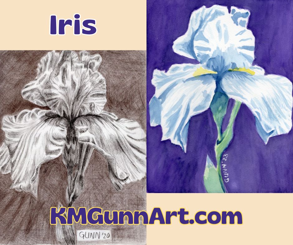
I know I’ve left y’all hanging on the Going Bananas series, but this most-recent floral watercolor painting is getting so much positive feedback on the handful of social media I’ve posted it to that I just had to do this one first. Plus, it’s a white iris in full bloom – how could I not?
The inspiration behind the painting
I never thought I would say this, but the inspiration for this came from Facebook … specifically, FB asked if I wanted to reshare an image from three years ago, an (overly) detailed drawing of an iris in full bloom. Seeing that drawing again made me realize I had never done anything else with that image, and the next thing I knew I was transferring the general outline to some watercolor paper to do it in better and in color.
my iris drawing from 2020 and watercolor painting from last week, late October 2023
Before I traced over it to transfer the lines, I did do a high-quality scan of the drawing first, so if you’d like an art print of it you can get one in the size you want. I used my first tinted charcoal (sepia) for the background, though looking at it now I can see it is both too dark and too light and didn’t provide me with the contrast I hoped to achieve. That is probably why it’s called drawing practice.
Recording the painting process
Since the little Nikon digicam died at the start of another art challenge, I was left with just using the old webcam my husband bought a few years ago when 1080p was the top-of-the-line in video. I used it for most of the four pieces in that challenge (I’ll link to it once I get those written!) and I have to admit: I love having video clips of it. In fact, I love it so much I am making an effort to do it more often. I also checked out the current top-of-the-line 4K webcam. It’s on my wishlist. (Edit: I bought it. Yeah, I am really impatient with some things.)
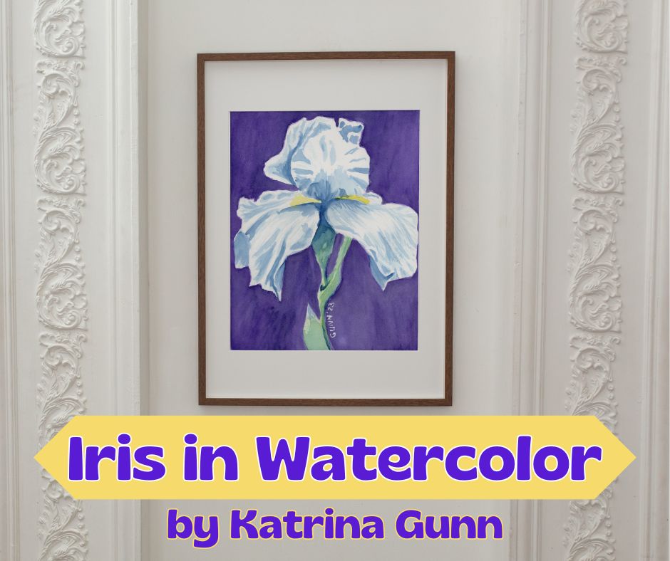
how my Iris in Watercolor floral painting looks in white matting and a slim dark wood frame
Notes about my iris floral watercolor painting
As I mentioned in the first paragraph, this was another one of those watercolor paintings that felt as if it just flowed from my brush. I absolutely LOVE when that happens. In fact, the part that took the longest was simply getting the background dark enough to provide the right amount of contrast for the white petals. I used alternating layers of dioxazine purple and indanthrene blue, going round and round the unpainted flower until it finally looked right. Painting the iris and its stem took less than a third of the total painting time, according to the video footage.
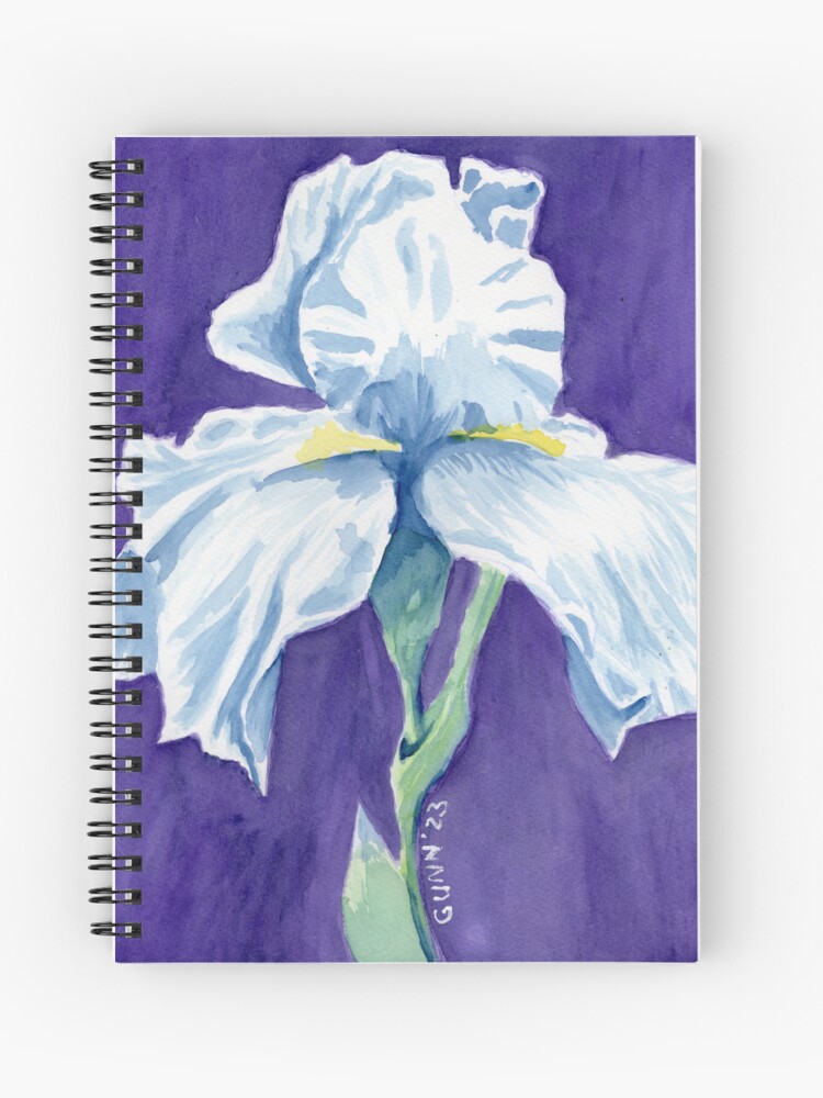
Iris in Watercolor printed on a spiral notebook cover from RedBubble
Links to purchase
The 9 by 12 inch original painting is still available to buy through Daily PaintWorks. This artwork scanned beautifully, so you can order an art print through Pixels in sizes as small as 8×6 inch all the way up to 45×60 inches before framing. I also uploaded it to my RedBubble shop because my mother and sister like to wear my artwork. Finally, if you want an original but need a larger size, you can always commission me to do a similar painting. (I could not paint an exact duplicate even if I tried.)
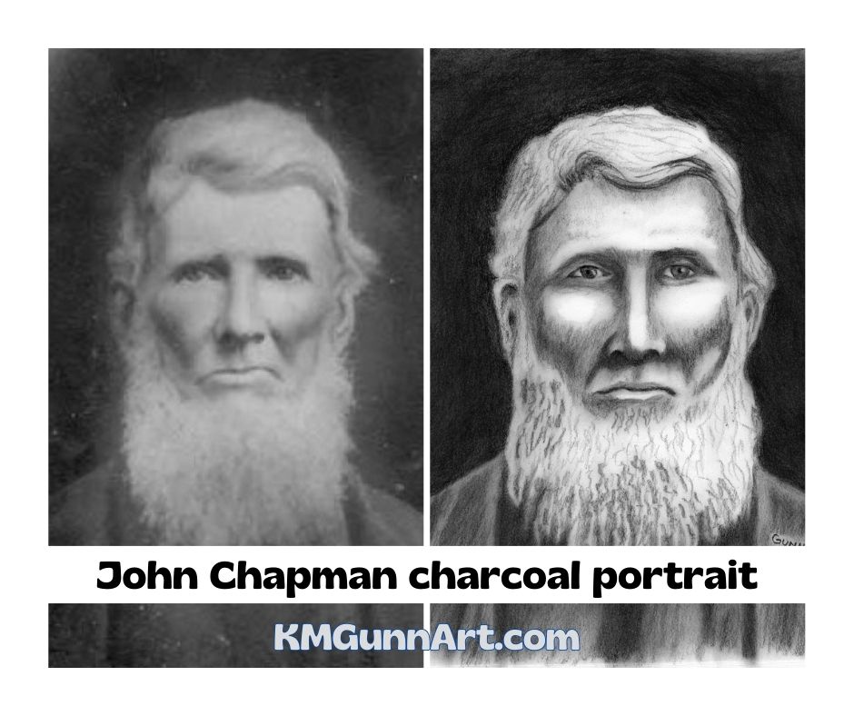
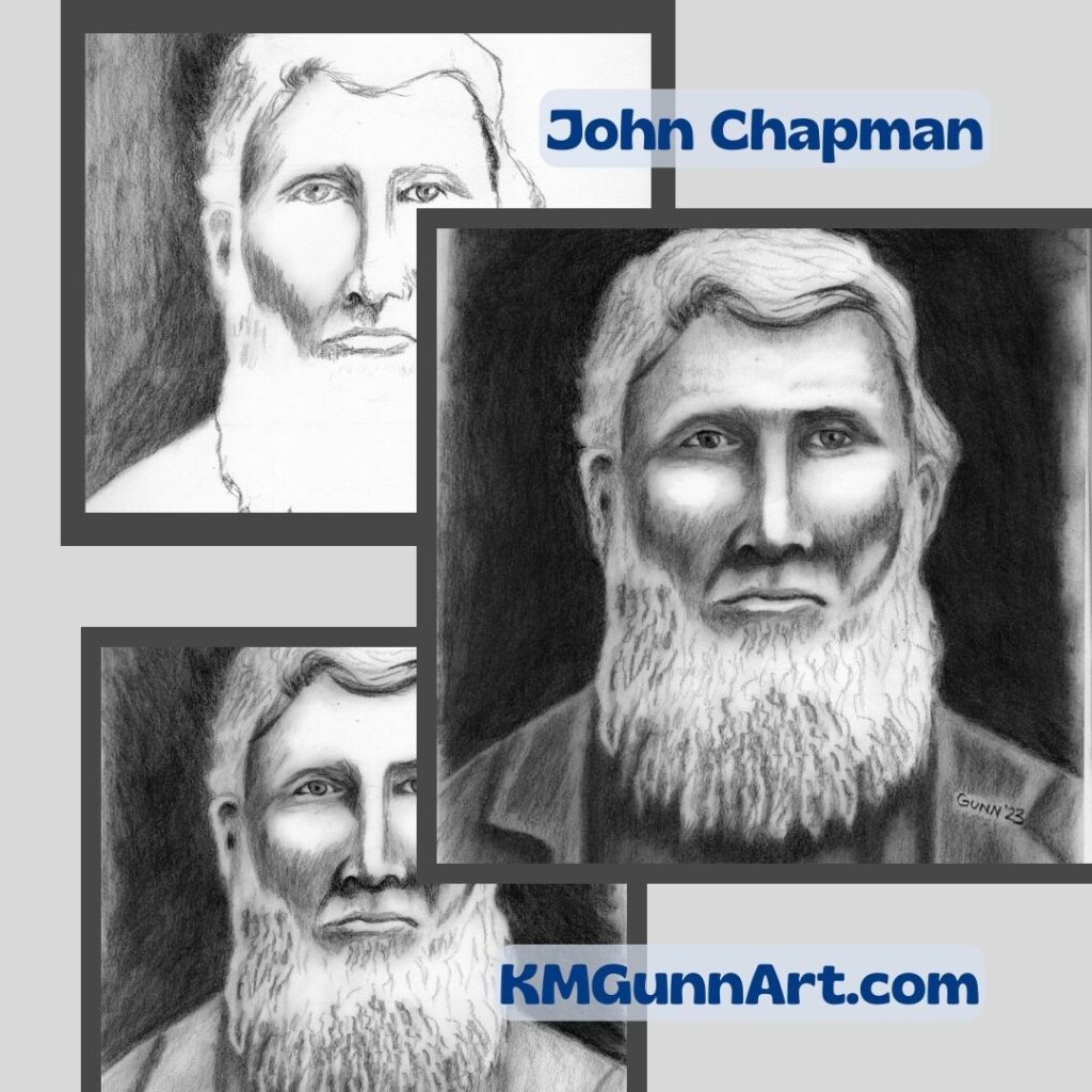
Moving right along in my attempt to get caught up on blogging my 100 faces art challenge is John Chapman, a portrait of a famous American folk hero done in traditional black charcoal. You might not recognize his real name, but you have probably heard his nickname: Johnny Appleseed. He was a colorful enough character to fill up a whole book, but I promise I’ll keep this short enough to still only be a blog post in length.
reference photo on left; my charcoal portrait on right
Better known as Johnny Appleseed
The main points about Chapman are fanciful enough to have earned him the colorful nickname of Johnny Appleseed, which started throughout what was then called the Northwest Territory while he was still very much in his prime as a man and as a businessman. Even by early 19th century American standards, he was considered a very eccentric character, though a lot of sources shy away from the reason behind that.
In fact, I was surprised that not only did my dad not recognize the name John Chapman, but he also had never heard why he was often seen barefoot with a cooking pot as a hat. For the record, my dad was a history major in college and has lived in Fort Wayne, Indiana (where Chapman retired to, and was buried) since the mid-1970s, so it is possible to not know that Johnny Appleseed was a devout follower of the Swedish Christian mystic Emmanuel Swedenborg.
Because Swedenborg was against grafting, Chapman planted as many apple seeds as he could and nurtured them. Another factor of his legacy lies in the requirements for making a homestead claim in the region: planting a fruit orchard – even a small one – was one of the major factors that would get the homestead claim approved. So, when Johnny Appleseed came into your area with several young apple trees, it just made sense to buy some and plant them near your home. Even though most wouldn’t be good for eating straight off the tree, all could be used in making hard cider.
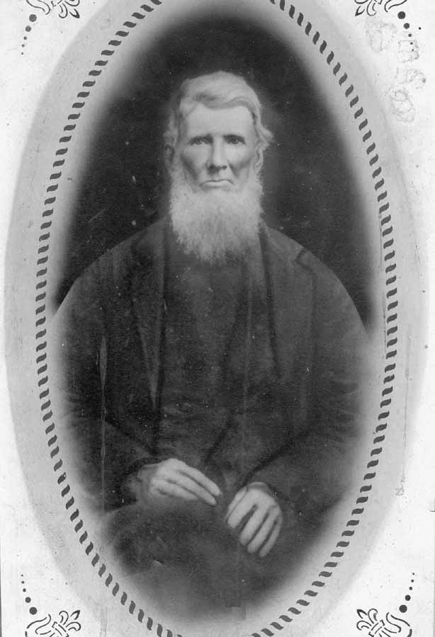
Only reference photograph
I could find only one historical photograph of John Chapman, and that is this one taken sometime between his birthday in March and his day of death in September of 1845. The reason there is only one is quite simple: he achieved his local legend status prior to photography being invented and becoming available to the broader public. As was the style of early photo portraiture, the photo shows most of his body as opposed to being a close-up of his face.
John Chapman shortly before his death at age 70 (better known as Johnny Appleseed)
Portrait in black charcoal
I wanted my charcoal portrait to be only a close-up of his face, so some cropping of the original and enlarging was necessary. Then it was just a matter of gridding the crop and putting charcoal to sketchbook. I even made a cute collage showing the progression. U chose to use traditional black charcoal just because I liked the value contrast of his white hair against the black background.
evolution of my charcoal portrait of John Chapman
Applying the after-action-review process to my charcoal portrait of John Chapman
I learned a rather useful mental tool in my time in the army, the after-action review (of course we abbreviated that to AAR). The format for it was to first summarized what happened, then to discuss three things that needed improvement, and to finish up with three things that went well. I decided to apply this to all 100 faces I draw and paint for this challenge. I may not have all the points for an official AAR, but the general practice of finding thing that could be improved and finishing up with things done well is a very practical and valid learning method.
What could be improved
The big thing that jumps out at me when looking at the finished portrait is that I either drew or shaded his face too fat. His face in the original photo is lean from his years of voluntary austere living. I probably could have shaded his beard a little better. It looks fuller in my drawing than in the photograph. I also got the one ear too low, and did not notice until just today.
What turned out well
I am pleased that I was able to catch and correct the eye placement early enough that it didn’t mess up the portrait! Given that the paper does not tolerate much erasing, that is a big thing in my mind. I was also pleased with the overall look to this drawing: this is obviously an older man with white hair. Basically, he looks like a real person, so I am counting that as a win.
Newest portraits on Facebook
Just to let everyone know: I do post the newest face I am doing on my art page on Facebook because that is part of my accountability. My page is open to all the public, not just FB members, so other than Meta wanting you to login or sign up, you ought to be able to check there and see what I’ve posted most recently. I even post in-progress scans sometimes, like yesterday’s peek at my number eight.
I’ve been in a bit of a slump this year, as y’all may have noticed. In an effort to climb out of this slump, I decided the best way to accomplish that would be with an art challenge. Rather than wait for others to coordinate their schedules, I decided to challenge myself. For a couple years now, I’ve noticed the “100 faces” art challenge, and decided it was finally time to do that. Of course, I would be starting with drawing, and that means charcoal since I decided I just don’t love graphite anymore. I also decided to start the charcoal portrait drawing portion of the challenge with a personal hero of mine from when I was a kid.
the start of my personal 100 faces art challenge and the historical photo I used as reference
The “100 Faces” art challenge
I actually haven’t seen much about the 100 Faces challenge as far as “rules” go, just that an artist needs to draw or paint 100 faces in whatever time frame. With such broad parameters, that left me free to make up my own rules. So, I decided I would do 100 portrait drawings and paintings, and I set myself an arbitrary deadline for the end of 2023. I decided I would officially launch this challenge on July 1st, so it would be a matter of drawing or painting 100 portraits of people in approximately 182 or 183 days.
I knew I definitely did not want to do the more rigid one drawing per day as my challenge, since that has tripped me up in more than one previous challenge. Sometimes, I just have a bad day when I feel as though I am fighting each stroke of the charcoal out onto the paper. There are even some days when I actually have plans that involve leaving the property! (We’ve really become such homebodies since the lockdowns.)
Finding reference photos for drawing portraits
The first criteria for using an historical photograph is to make sure we are as sure as we can reasonably be that the person in it is who we think that is. This may seem obvious, until you look up Billy the Kid and all the disputes about whether he is or is not in all but one photo.
I should probably also mention that the reference photo idea excludes quite a few historical figures simply because the technology had to be invented before it could be used. Again, that sounds so obvious, but does exclude anyone who lived and died prior to the 1840s. (this point will become important in the next post.)
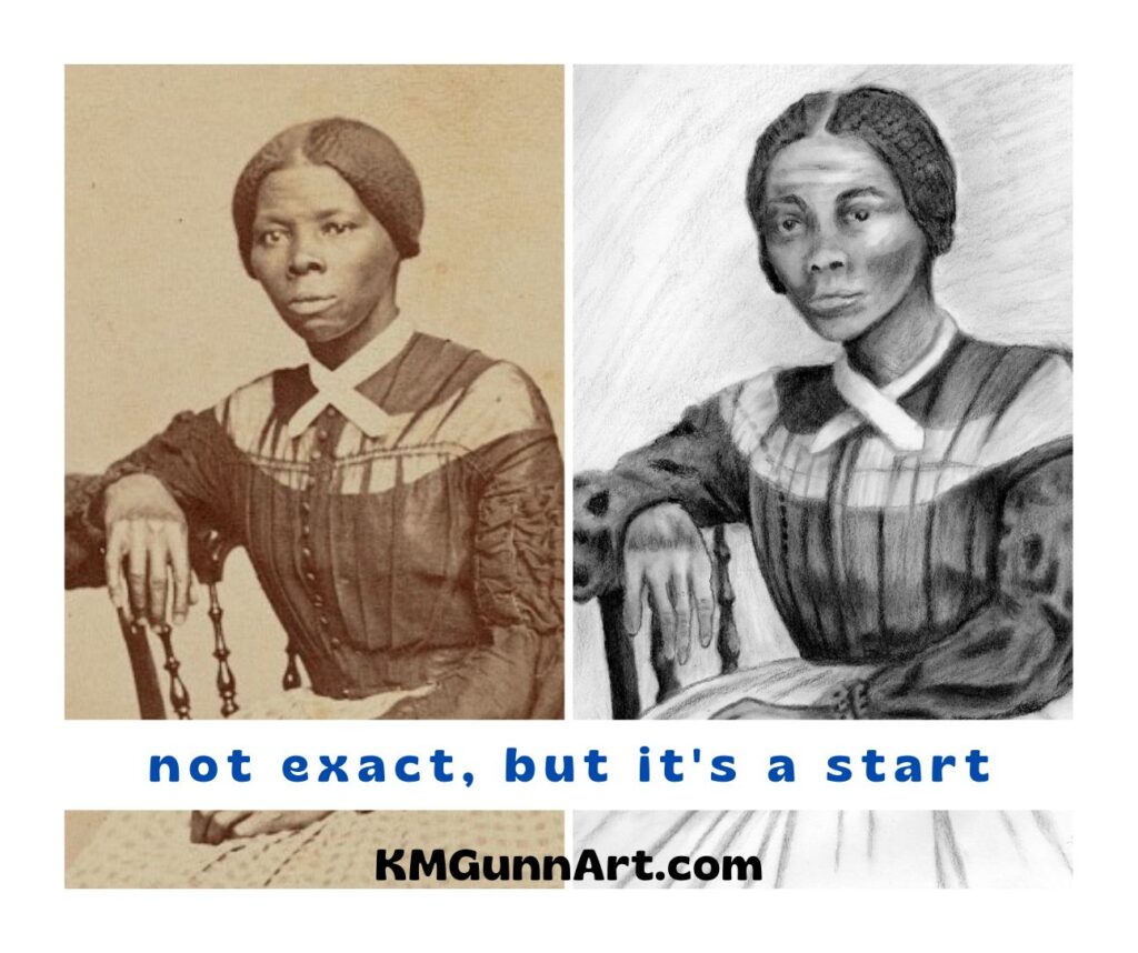
I started my search at the Library of Congress website, and found my personal hero from childhood featured at that time.
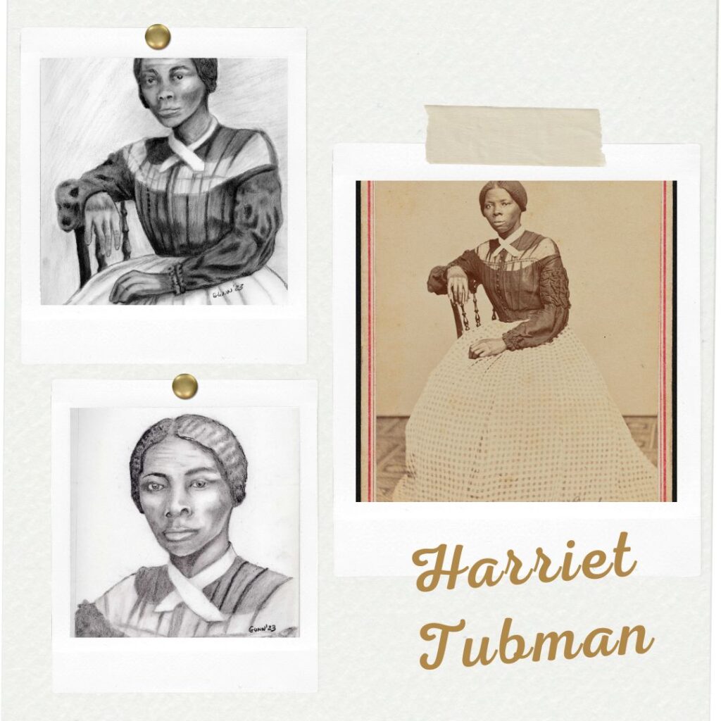
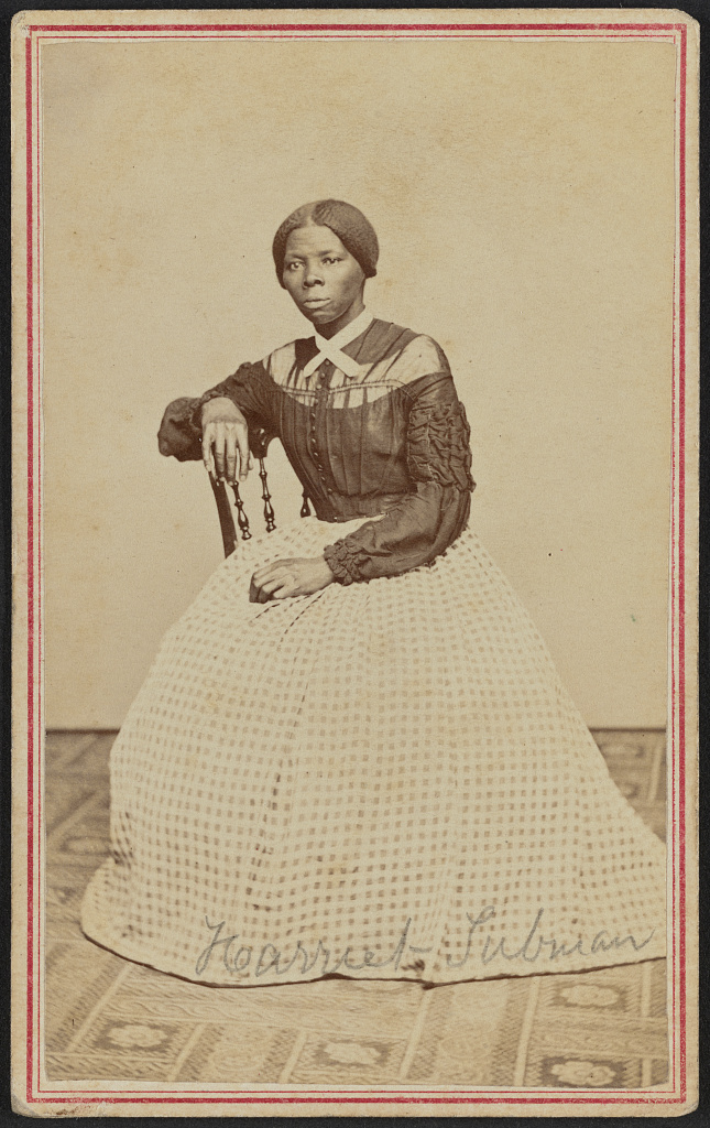
Harriet Tubman, a personal hero
photograph of Harriet Tubman from Library of Congress website, listed as taken in 1868
I first learned about Harriet Tubman the year I was in third grade (if I recall right) by watching a documentary. At the time, I thought it was so cool to finally come across an historical figure who was a woman, and one remembered as being unusually brave. While I hadn’t taken very many history classes at that tender age of nine or ten, most of what I knew of history (Dad was a history major in college) was all centered around men doing brave things.
I actually started the first version of my charcoal portrait drawing prior to resolving to do the 100 faces challenge. I thought Harriet Tubman was the perfect subject for a portrait for Juneteenth, and intended to do the whole thing that holiday weekend. Something or other came up or distracted me that weekend, and I did not get the ball really rolling on that drawing until after the start of July.
Once I finally got rolling on it, the first portrait came together well enough. I discovered when trying to fix the one eye that this paper wasn’t an exact match to my previous sketchbook in that it did not take much erasing before it became noticeable (even though it was the same brand and specific type). So, I made a mental note that I would not be able to do much fixing of errors in this sketchbook and then moved on.
side by side comparison of my reference photo and first charcoal portrait drawing
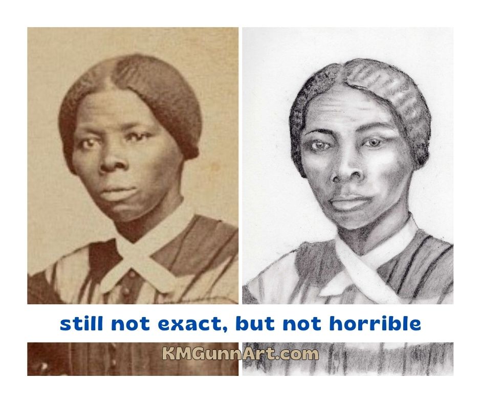
Recrop for a “closer” portrait
Once I realized I could not erase any section of paper more than once, I decided I wanted to do another version of this historical photograph. I wanted a closer crop of just her face for a more personal, intimate feel to the portrait. While the scan of the original photo is probably as high a quality as one can reasonably expect, there was still a bit of graininess to it by the time I cropped it down then enlarged it.
Since the photos from that general time period are often in sepia instead of grayscale, I thought I would have a little fun with the shades of brown in my tinted charcoal set for this second portrait. I’ve been trying to consistently post in-progress scans over on my Facebook art page, and after the first scan was posted I realized I needed to fix the features – the eyes were not even with each other and the line of the nose and mouth were off-center. Some careful erasing, and it was fixed “good enough.”
second charcoal portrait, this time drawn in brown tinted charcoal I simply call “Harriet” because it feels a little more personal
Traditional black charcoal versus tinted charcoal
Visually, the end results between the first portrait I drew in black charcoal and the second in a dark brown tinted charcoal are not very different. My very dark brown is extremely close to the traditional black, especially on the shadow areas where I tried to get it as dark as it would go.
The main difference in the “feel” of the medium comes down to how well the hard and medium black charcoal pencils hold a point, versus the softer tinted charcoal pencil. As I figure out on face number four, the tinted charcoal pencils really are not good for detail work and should be relegated to nondetail drawings or close-up portraits. It was an interesting idea, just one that didn’t translate as well as I hoped. Future portrait drawings in charcoal will be in the traditional black charcoal.
The goal of this art challenge
I have a very specific goal that I want to accomplish with this art challenge: I want to improve my people-drawing skills. I figure that by the time I get to my 100th face, whether it is a drawing or painting, I should see noticeable improvement over these first few efforts. I’ve been saying for a couple years now that I need to “knock the rust off” my people drawing skills I used to have, and finally decided to just knuckle down and do it.
The only way I will get better is by learning from my mistakes. The only way to make mistakes is to put medium to paper and “just do it,” as the old ad campaign said.
Feel free to follow along here on the blog – I will get caught up soon! – or on one of my social media accounts. I will definitely be posting to the FB page, as my friend Keashia is on Facebook and she has agreed to be my accountability partner on this project. As of writing this, I am on number seven – all charcoal portrait drawings so far, but I’ll likely try my pastels and paints at some point.
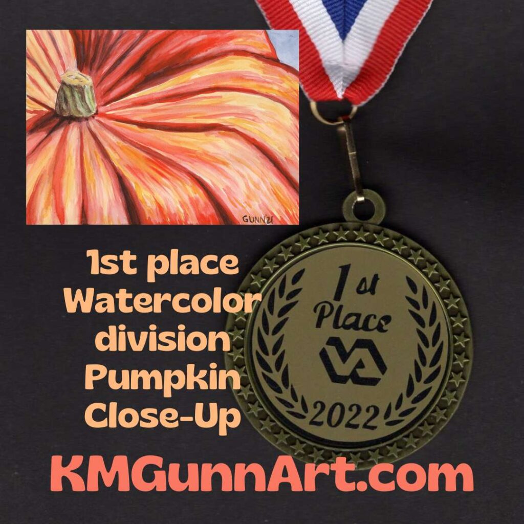
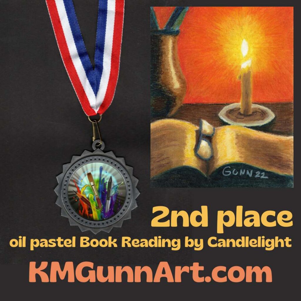
In the absence of an email congratulating me this year, I had assumed I did not win any places for my entries to this year’s VA regional healthcare system’s Creative Arts Festival. As of checking the post office box yesterday, I am happy to report that assumption is wrong. All three of my entries this year took either first or second place! Here is the breakdown of my award-winning artwork. Oh, and the medals in the images? Those were in the envelope, and now hang on the shelf next to my desk.
First place award watercolor painting
the actual medal mailed to me, with the watercolor painting that won the award
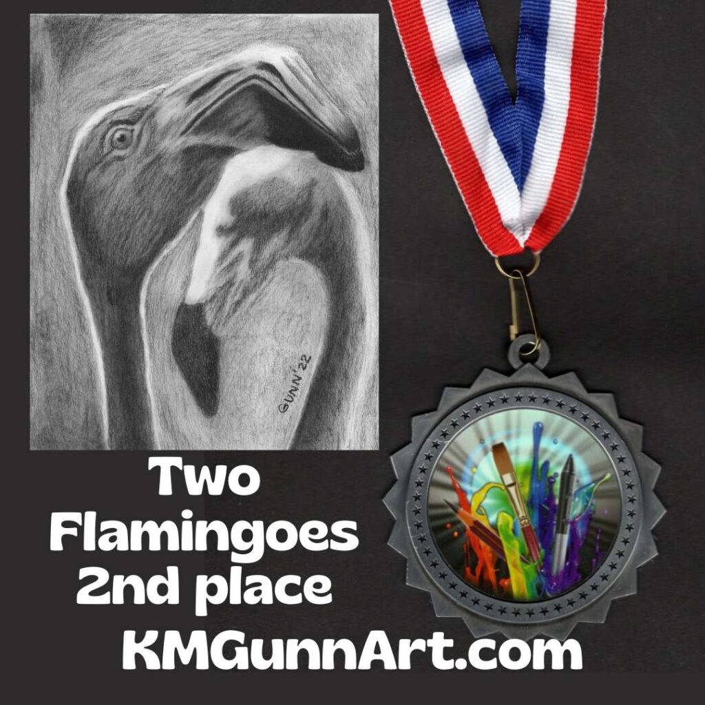
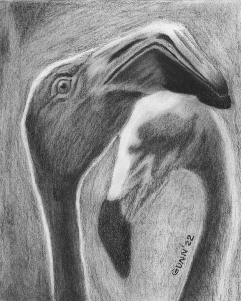
Charcoal artwork Two Flamingoes won 2nd place award in monochromatic drawing
Last year, I took first place in the monochromatic drawing category with my white pencil on black paper Dew on a Calla Lily. This year, both Twitter and Facebook voted that I should enter this charcoal drawing of Two Flamingoes, and it took second place. Not bad, and it really IS an unexpected medium for this subject. Most people who draw or paint flamingoes will do so in color.
Want the original drawing to put on display as award-winning artwork? It’s a small 8 by 10 inches, so it will fit into small spaces if need be. If you have a need or strong desire to go BIG, you can always order a larger art print from Pixels. I don’t currently have it up at RedBubble, but may add it in if people ask.
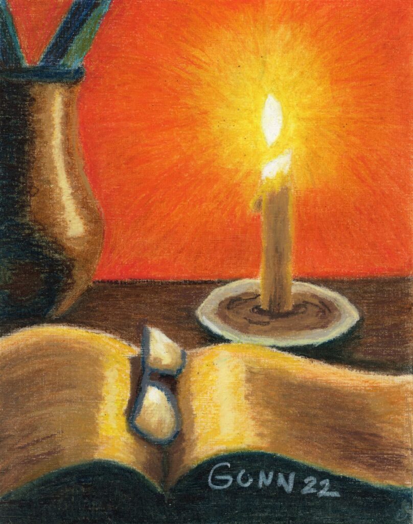
Second place award in oil painting with an oil pastel
Now we get to the award I feel the most pride when I think about it. This would be taking “just” second place in the oil painting division – but with an oil pastel picture! Seriously. I figure the artists who invest in the materials for oil painting and the time involved (because it takes quite a while to dry!) do so when they are confident in their artist skill. Or maybe it’s just me who has hesitated so long. Going up against oil paint on canvas and still winning a medal with my oil pastel on paper feels good.
Book Reading By Candlelight, oil pastel artwork won 2nd place in the oil painting category
If y’all have read down this far, you might as well fill in the little form at the bottom of this post for email subscription and a weekly newsletter (especially for those weeks I don’t get a new post finished!) that I will be sending out on Fridays. It’s been on my to-do list for months, but now it is in place!
Third virtual art walk this Friday
We’re having so much fun doing these virtual art walks, and will do another this weekend. I of course will be posting on Friday so I can do a new Feature Friday. We have at least one new artist playing, so check back in.
Y’all recall last year when I placed first in two of the three categories I entered in the regional VA healthcare-sponsored creative arts festival? I am entering again, but this year picking the artwork to enter seemed much more difficult, given I can only enter three pieces again this year. I work in six media categories, not including mixed, and have made multiple pieces in most of those categories in the past year. So I took to Facebook and even Twitter to ask for opinions on which pieces I ought to put in the competition. This actually did not help as much as I hoped.
Oil pastel artwork
Oil pastels are not judged in the pastel category for this competition, but against oil painting as they define the category to include oil paint, oil sticks (which I have yet to try) and oil pastel. Basically, they want anything that includes pigment with some form of oil to fix it to a surface, which is not limited to canvas either. I felt my two best pieces from the past year are my Sunset Over the Hayfield landscape and my candle still life, Book Reading by Candlelight.
Folks on Twitter preferred the hayfield, while folks on Facebook preferred Candlelight, and when added together the votes were just about a dead heat. Any wonder why I asked for help deciding? In the end, I stopped to think (while milking goats) about the category and potential competition, and went with Candlelight because a bit of the textured paper shows in Hayfield, which might be enough to knock my piece down compared to the more traditional paintings.
Book Reading By Candlelight oil pastel still life composition
Picking a watercolor painting
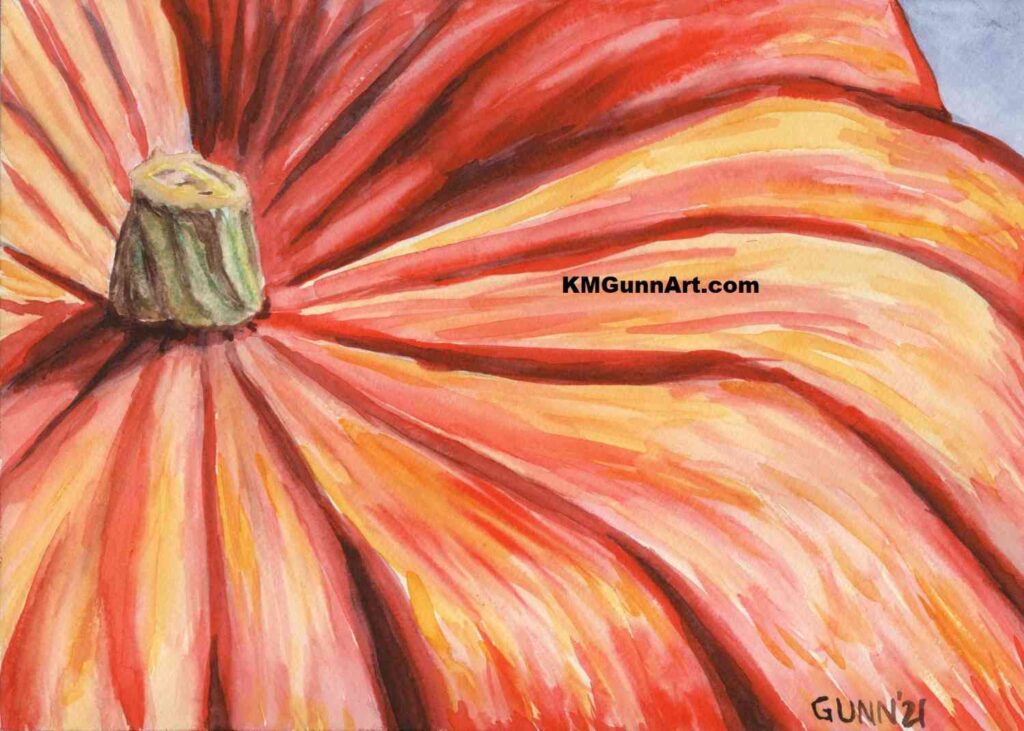
For this category, it was pretty easy for me. I simply love how my Pumpkin Close-Up came out last autumn. Truth be told, I really have not made many watercolor paintings over the past year, and this particular pumpkin one is my favorite of the three I did last fall (even though my mom just loves my Jack O’Lantern).
Pumpkin Close-Up watercolor painting
Picking a charcoal drawing
If y’all have been reading since the beginning of the year, you will know I was on a major charcoal drawing kick that started prior to New Year’s Day and continued through the spring goat kid bottling season. I made quite a few charcoal drawings, both traditional black and the tinted charcoal I am still experimenting with.
I managed to get my short list down to three, then once again asked on Facebook and Twitter which I ought to enter. The results surprised me. Personally, I had been thinking to enter my Apples 3 still life, but my husband said he really likes my Two Flamingoes. Meanwhile, my Single White Rose (in the same post as the flamingoes) tends to get positive reactions from folks. Both Twitter and Facebook enthusiastically said I should enter the flamingoes, though the rose was in second. What sealed the deal for me was the comments about how flamingoes usually aren’t depicted in black and white, and that I nailed the expression on the front bird’s face.
Two Flamingoes charcoal drawing
So, there we have it: my three entries to this year’s creative arts festival. I sent them off this morning, because today is the deadline. For whatever reason, I seem to always wait until the last day to enter. Perhaps it ties in with my usual answer when asked what I think my best piece of art is. My answer is always, “The next one.”