Watercolor painting Red Rose 2

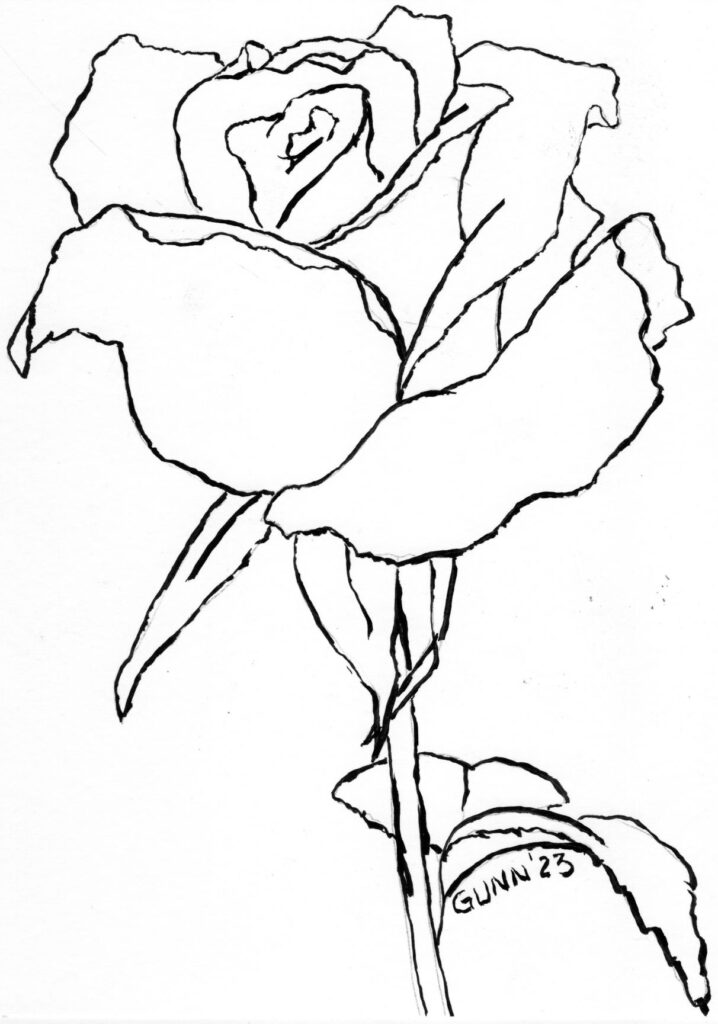
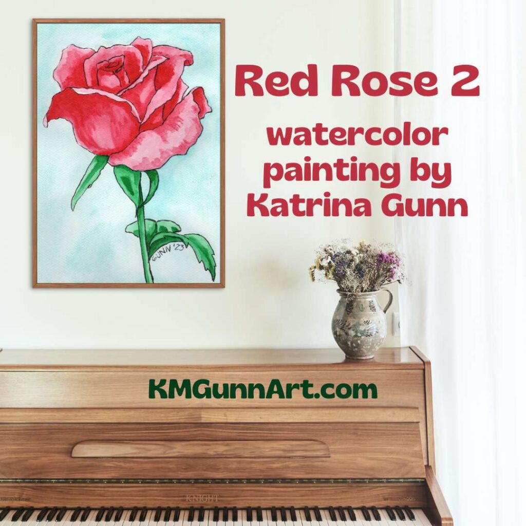
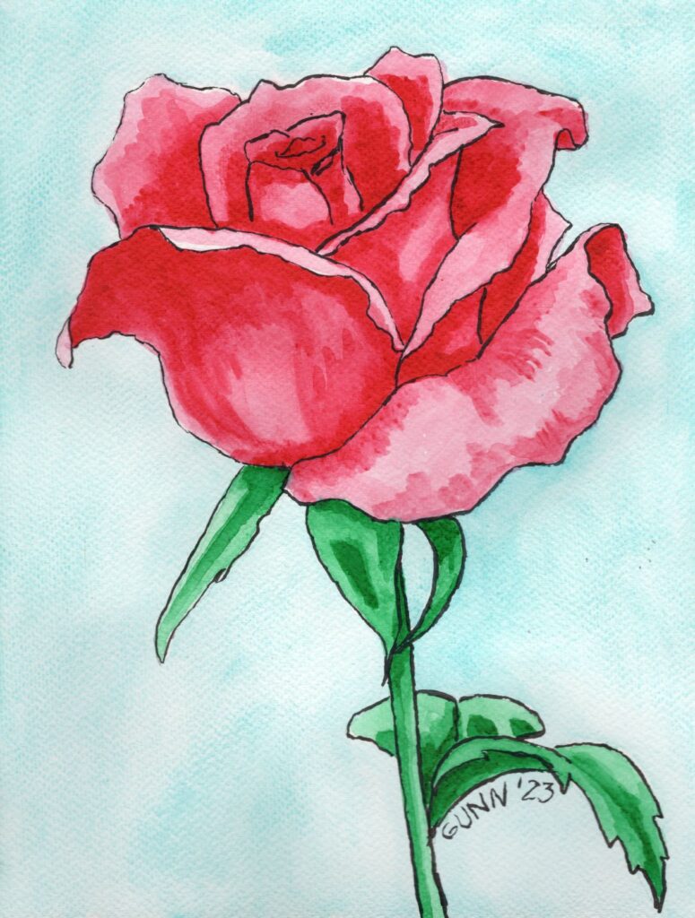
I had another idea over the weekend: I will be showing how I use my line drawings that I offer free to email subscribers. My first example is using my watercolor paints to make a lovely red rose painting.

mockup of new watercolor painting Red Rose 2 in slim wood fame hanging above a piano
Red Rose 2 framed and hanging over a piano

Step one: Transfer the drawing

After I had learned that my grid lines and sketching lines might still be visible on the finished painting, I bought some graphite transfer paper. This way I can sketch it in my sketchbook, erase, and redraw however many times necessary until I am happy with the lines, then put the finished drawing onto my watercolor paper.

transferring the sketch onto the watercolor block
Transferring the contour drawing onto the watercolor paper

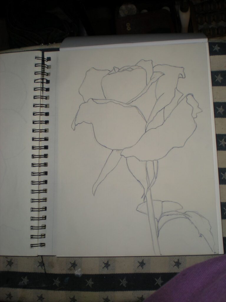
Because I inked the line drawing onto decent-weight watercolor paper, I actually needed to go back to the sketchbook for my original drawing. I think a standard ballpoint pen works best with the transfer paper, so some of my sketchbook pages are getting multiple colors of ink over the graphite or charcoal I use to do the drawings.

For this piece, I inked the lines with waterproof India ink. I used one of my husband’s brush pens to do it, since he has been very happy with how his drawings turn out using them. One of the brush pens is labelled in either Chinese or Korean, so I couldn’t be sure it was waterproof. The other he loves is a Pitt brand and says on the side it is waterproof India ink. I had first tried to use my calligraphy pen and ink, but the ink has dried too thick of a consistency to draw neatly.

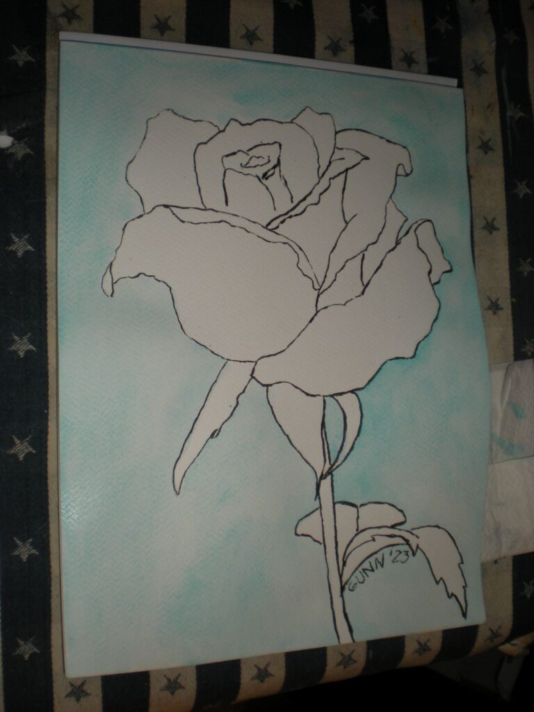
Step Two: the background

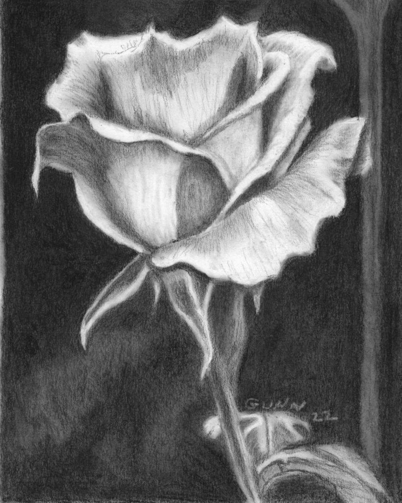
I wanted a simple, single color for my background – and I have been just watching and waiting for the right opportunity to use this lovely teal blue that came in my QoR high chroma set. Seriously, how can someone who loves vivid colors (as I do!) not want to use this color? The only question I started with was, “How many layers to get the right level of saturation?” My answer is just one. I didn’t want it overpowering the main subject, but I also didn’t want an unpainted white.

the teal blue background only needed one layer of paint
the teal blue background (partially wet still)

Step Three: Get into the art zone and finish it!

I waited patiently for the background to dry completely this time to avoid paint bleed issues. Plus, the paper buckled because I wasn’t using one of the blocks (where the page edges are glued in place) so I had to wait for it get mostly-flat again. This is where the in-progress photos stop, because I got into the zone and just painted until it was time to wait for the next layer of paint to dry completely.

Working with red and green next to each other on the paper is a tricky thing in watercolor painting. If these two colors blend or bleed into each other, you can get a very unattractive color we often call mud. When you mix two colors that are opposite of each other on a color wheel, the result is somewhere between gray and brown. For a red rose with a brilliant green stem and leaves, I wanted the colors to be as clear as possible.

first layer of paint done
First layer of paint on the rose done

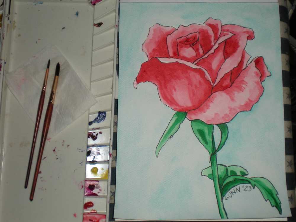
After this first layer dried, I went over the shadows again on both colors to deepen the shadows. Then I needed to wait for it to dry again to see if a third layer was needed. I used my Mijello Mission Gold paints for the flower itself, and this brand has very little color shift when dry.

So, with just one layer of paint for the background and two layers of paint for the rose, this turned out to be a rather quick painting! I just love it when everything feels like it is just falling into place. No need to wrestle the art onto the paper. It felt like it just flowed out from my brush.

Links to purchase this painting or prints

The original 9 by 12 inch watercolor on heavy paper is available to purchase here. If you want a larger or smaller art print of this painting, you can find the right size at my Pixels shop. To buy this printed on apparel, home accessories or even tech accessories visit my RedBubble shop.

finished painting Red Rose 2, watercolor  and ink on paper, 9 by 12 inches, $100 USD
finished painting Red Rose 2, 9 by 12 inches watercolor and ink on paper, $100 USD

More red rose artwork

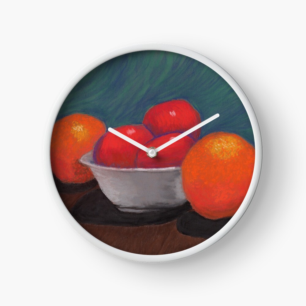
I am almost embarrassed to note that this is only the third red rose at any stage of bloom I have painted or drawn! I must remedy that over the next few weeks. My only other previous watercolor painting of a red rose is my Red Rosebud 1, which is a small watercolor sketch of the very beginning of the petals unfurling. The other is my Red Rose I did in oil pastel on canvas board.

Coming attractions

I will be doing at least one more of these before the month is over, so stayed tuned! Better yet, put your email address in the form and get your own copy of the printable rose coloring page and color along with me. I am feeling a new pink rose and/or white rose in soft pastel.

January Virtual Art Walk

Once again this month, a handful of us artists who blog our art have gotten together for a virtual art walk! While there are art walks scheduled for January down here in Florida, a lot of the country is just not feeling it due to normal January weather, so why not do the art walk idea online? We have a nice selection of virtual art booths to browse.

January virtual art walk preview image
January virtual art walk – a quick preview

Art walk virtual booth 1: Snowy Scenes for January

We’ll start this month’s art walk up north in snow country, where Jo Wortman of Siena Blue up in New York has posted a bit of a retrospective on her snow scenes. She does an overview of her snowy landscapes so far this winter, and compares them to paintings she did in 2022 and 2021. I can certainly see the difference, and like other commenters on her post, I think the watercolor painting where she worked from a reference photo she found on Unsplash – as opposed to following a tutorial – is her strongest in this category. It’s interesting to see how her earlier work hints at this.

snowy landscape of a stream in winter by Jo Wortman of Siena Blue
Jo Wortman’s snowy landscape in watercolor

Virtual art walk booth 2: Braving the cold weather

Jim Hughes lives in Minnesota, and that area gets COLD in the winter. That doesn’t seem to deter Jim in his quest to get a really good photo portrait of a pileated woodpecker. We have them down here as well, but they are definitely camera-shy. Jim unleashes his creativity to solve the challenge. He basically built a fake tree trunk and put a suet cake just inside it – close enough to his porch to get the photo he desired. Then he got up before sunrise enough mornings in a row until he was finally able to slip out onto his porch in subzero temperatures to get the shot. I think he nailed it.

close-up photo portrait of a pileated woodpecker by Jim Hughes
Jim Hughes’ detailed photo portrait of a pileated woodpecker

Art walk booth 3: Steve Heap takes us to Hawai’i

Next booth for our January virtual art walk is where Steve Heap of Backyard Image takes us to the Hawai’ian island of Kauai. I didn’t know this landscape existed until he posted about it, but apparently Waimea Canyon is called the Grand Canyon of the Pacific. He starts his virtual tour at the ocean, and follows the canyon up to the mountain top. The part I find most interesting is his observation that like the Grand Canyon in Arizona (which he has also visited and photographed) he finds it difficult to capture the grandeur in most photos. Some clouds and a few rainbows helped him get good shots though!

a rainbow adds a splash of spectacular color to this photo of Waimea Canyon on Kauai in Hawaii
a rainbow in Waimea Canyon, called the Grand Canyon of the Pacific

Ben’s Angel: Painting and poem by Dorothy Berry-Lound

Hang on to your hats, folks. Dorothy Berry-Lound‘s virtual booth is a powerful one. She shows you the painting first, then tells the moving story behind the artwork. Then she finishes up with a poem to go with this powerful painting with a moving story … and wow. I don’t think very many people will be able to forget this one. I don’t want to drop spoilers, but when you click through, be prepared for this emotionally. This is about her last visit with a dying friend, Ben.

powerful painting Ben's Angel by Dorothy Berr-Lound
Ben’s Angel, painting by Dorothy Berry-Lound

Before you go

After browsing all these booths, I’d like to just remind you about my new idea for my email list: coloring pages drawn by me. It may seem frivolous after such a journey, but I like to say it’s the little things in life that end up mattering so much over time. I’ve decided to make the 15th of each month when I send out a new drawing y’all can print out and color, so tomorrow I will be figuring out the technical details to make this work. New email subscribers will get the current printable image once they confirm their email addresses. (Confirming your email address is an important anti-spam step that I require.)

I do hope everyone has enjoyed this month’s virtual art walk. Visit the other blogs, leave comments to let us know what you think and feel about the art, and sign up for an email list or five.

A rose coloring page for email subscribers

I’ve had this idea pinging around my brain for about a month now, and yesterday for art group I sat still and just did it. I will be making pen-and-ink contour drawings (as in simple line drawings) as a fun little gift for my email subscribers to print out and color for themselves. Right now, one a month feels very doable for me. The very first coloring page is a rose, since Valentine’s Day is next month. I still need to hammer out a couple technical details, but I should have those squared away in a couple days.

The start of the idea

This all started because conventional wisdom in the current blogging space is that email subscribers want to be wooed with some kind of gift or freebie to sign up. For some bloggers, this is an easy thing to whip up. For an art blogger who wants to sell her artwork, it didn’t seem so obvious. I am persistent if nothing else – some might call me stubborn even. Browsing through examples of gifts for various email lists, I saw my niche: coloring pages. THAT I can do!

At the start of art group yesterday, I asked the others if they would subscribe to an email list to get a printable coloring page “like this.” Immediately one of the other artists, who works 3d instead of 2d, responded with a very enthusiastic, “Hell yeah!” I guess that answered any doubts I was having.

A rose for the first coloring page

contour drawing of a rose as a coloring page
rose coloring page for the email subscriber list

This is the first coloring page, a single rose with only enough detail to make it obvious what it is. The original is 9 by 12 inches, and is for sale if you’d like to hang it on your wall. I will NOT be making prints of this available, and the printable coloring page is 8.5 by 11 inches (standard US letter size). For those outside the US, that is approximately 21.5 cm by 28 cm.

I’ve used this rose drawing before

If you are thinking this rose drawing looks familiar, you are correct! I used it last January during my month of charcoal drawing. It is the basic outline for my black and white charcoal piece, A Single Rose.

A Single Rose charcoal drawing
A Single Rose, traditional charcoal drawing

This actually started out as a practice exercise, but I kept working on it because it just flowed out of the charcoal and onto the page at the time. It’s in my new sketchbook, and the edges are looking a bit worn already. I could do it again, or even in color, if you’d like to commission that. Or you could just order an art print of it in whatever size you need to beautify that empty space on your wall.

More coloring pages to come

I already have two more pen-and-ink drawings for the next two coloring pages: the line drawing for my Apples and Oranges 1 as well as one of a rooster crowing. Perhaps by the time I get to the rooster page, I’ll finally have a painting of it available. It was one of those days when I brought my sketchbook with me for the waiting room at the doctor’s office.

Want on the email list to get your monthly coloring page? There is a sign-up box at the bottom of each individual blog post, as well as a sign-up form at the top of the sidebar (which is below the posts on mobile touchscreen phones). Keep scrolling down to find it. Once you’ve entered your email address, the email service will send you a confirmation link, which you need to click to verify that yes, you did sign up for this. If you sign up after the 15th of the month, you can always email me and ask for a previous one.

Finally, do we want to have a cute or clever name for the email list? If so, does anyone have any ideas to share in the comments? My last two working brain cells have not come up with anything, so I am open to suggestions if you have them.

Computer-Generated Digital Floral Art

As I mentioned in my previous post, I have been playing with digital art in the form of text-to-image software. I must say that trying to coax nice flower bouquet images from the program has had its ups and downs. While not quite as grotesque as some images, there are a few head-scratchers until you realize both flowers and fruit are spherical shapes. Yes, I’ll get to that image soon enough, while also showcasing a trio of digital floral images I actually like.

Bouquet of pretty tulips done digitally

large art print of Vase of Tulips in a family room mockup, with magenta-purple flowers in a white vase on a wood table, with two yellow tulips to provide a pop of contrasting color
Vase of Tulips, square format digital floral artwork available as art prints

An early win (and it does feel like playing a word game) for me is this lovely square-format piece I simply call Vase of Tulips. Anyone who has read more than one blog post from me knows I am rather unimaginative when it comes to naming my artwork. As always, if you buy a piece you are free to name it whatever you like. I had not specified much for this text prompt, so getting a large bouquet as opposed to a small one, and getting two complementary (and realistic!) colors for the blooms was a pleasant surprise. Add in the single flower lying on the table top partially obscured by the pretty white vase, and I was so pleased. The lighting is both realistic and dramatic.

Purchase this digitally-created floral

As is the case for all the digital art pieces, there is no original. I am open to painting this in more traditional media if you’d like to commission me to do so. You can order art prints from small to ego-boosting BIG from my Pixels shop. To get this image printed on apparel and accessories for the home, visit my RedBubble shop.

Romantic pink tulips bouquet

mockup of large art print of Pretty Pink Tulips hanging behind a small table next to a window letting in sunlight
Pretty Pink Tulips hanging behind a table next to a sunny window

After a couple dozen failures from the software, I started playing around with different modifiers. I finally scored a lucky “roll of the dice” with this pretty pink bouquet of tulips done in the Romantic style that I personally adore but have not yet tried my hand at achieving. (I’ll need to fix that sometime this year.) The only part of this piece of floral digital art that gave me pause was the single pink petal floating in the air along the left side. Other than that, the software managed to get the right combination of dramatic sunlight coming in through the window. It’s mostly (but not completely!) correct with the highlights on the flowers, and the overall effect is quite pretty.

Buy a print of Pretty Pink Tulips

No “original” exists since this is digital art, but you can buy an art print from small to impressive from my Pixels shop. If you are inclined to wear my art instead of framing it, my RedBubble shop has a wide range of apparel (and swag for the home) with it printed on it. Right now, I am on the fence as to whether or not I’d like to try my hand at recreating this on canvas or paper.

Slightly surrealistic Pink Peonies

I did try several species of flowers for a wider variety of floral bouquets, but the results were – at best – mixed. While the software generated a nice bouquet of white daisies in a nice ceramic pitcher, it set that pitcher on a gloomy flat rock instead of a table. Attempts to coax images of mums and chrysanthemums resulted in either unrealistic colored flowers, or a very drab composition. I tried red poppies in November, but did not like how those looked either. The one success (that is not roses or tulips) is a bouquet of pink peonies.

square-format digital floral artwork Pink Peonies
Pink Peonies, floral digital art in square format

While it has most of the elements correct – the size of the peonies is “larger than life.” We had two pink peony bushes at the house where I grew up, and while they are not small flowers they are not quite this big either. I’m not sure of the physics of putting flowers this big into such a small vase without it tipping over. This one is the best of the bunch the software generated.

Links to buy prints of Pink Peonies

Once again, no “original” exists off of my hard drive and the site’s server. You can buy an art print for your wall from my Pixels shop in whichever size you desire. Over at my RedBubble shop you can find it printed on apparel and accessories for the home if you prefer your art to also be practical.

The bloom is off the digital art flower for me

Back in the comments section of my first blog post on digital art, blogging buddy Jim Hughes predicted that the novelty of this form of digital art will likely wear off. I have to admit; he called it. I find myself putting in fewer text prompts these days. Far too much of the output I get is disappointing when it isn’t blatantly wrong.

Still life composition: fruit and florals

One very traditional still life composition going back centuries is to do a floral bouquet with some fruit around it. There is usually some symbolism involved, which I need to research for its own post. Even if the software developers only used art in the public domain, this ought to be an easy subject for the program to generate. It isn’t. Trust me. I tried!

one of the more amusing efforts from so-called AI image-generating software
not quite what I was trying for …

Apparently, so-called AI software cannot distinguish between fruit and a flower. They are both usually spherical, so it jumbles them together any which way. A big element in the program is a randomizing factor akin to rolling dice or drawing a number out of a hat, and this is the element that completely messes up my attempts to get a floral with fruit on a table composition. This is why we human artists are still relevant. We know early on in life that fruit doesn’t go at the end of a flower stem!

While I will likely still play around with the text-to-image software from time to time, I just cannot see it replacing the more traditional version of art. This is particularly true for my rather traditional style of art. I still would like to do up a classical still life involving both a bouquet of flowers and some fruit (on a table and not some gloomy flat rock). I do see it as a way to get ideas for layout and composition, like my yellow roses examples. The results from this program still need to be sorted by and filtered through a living human artist.

Apples and Oranges 2 still life in soft pastel

After the first still life art in watercolor, I decided day two simply needed to be in soft pastel. Not only because I haven’t recently played with my “dusties,” as I call them, but I also bought a sample pad of Clairefontaine’s Pastelmat, an expensive but highly recommended paper for soft pastels and pastel pencils. I figure an art challenge is a good excuse to try something new, so the apples, oranges, and bowl still life composition needed to be worked up in dusty pastel.

Apples and Oranges 2 still life art in soft pastel
Apples and Oranges 2, still life in soft pastel shown framed and hanging above a kitchen table

Selecting my reference photo

Once again, I looked through the set of photos I took back in October of 2021 for the right one to use as a reference. I almost didn’t pick this one, as I wasn’t sure at first how well the composition would work with the fruit mostly in a line like this. In the end I figured, “Why not?” This is for an art challenge and that is permission to try things that seem uncertain. So here is the cropped version of my reference photo, featuring the apples, oranges, and bowl mostly in a line.

reference photo of fruit for still life on my kitchen table - focus is a bonus when it comes to and photos!
my reference photo of a line of fruit including the white bowl on my kitchen table

Once again, I consider focus to be a bonus feature, and not a requirement. I am most interested in the shapes and shadows for a reference photo of familiar objects. (We got very familiar with these subjects when we ate them!)

Working the still life in soft pastels

I did my basic sketch directly onto the sheet of Pastelmat, as I know I am able to cover up the light graphite lines with the dusties. Soft pastel in particular tends to be quite opaque, so I felt confident as I sketched in the main shapes after lightly gridding the sheet. I had decided before starting that I would “edit” out the background of the photo in favor of more stylized colors behind the apples and oranges. In fact, I also planned to omit the towel and pepper grinder as well, choosing to focus only on the fruit.

First the oranges

I worked on both oranges first, mostly because I knew I would need to turn the mat this way and that to keep from accidently smudging the soft pastel. Actually, I started with a reddish tone they call sienna, not wanting to deal with trying to completely cover a stark white sheet. I used my Mungyo Gallery soft pastels for the blocking in, and even for the shading. My intention had been to use my Stabilo CarbOthello pastel pencils to add in details at the end, which turned out to be barely needed as the Mungyo set worked wonderfully with the Pastelmat.

The three apples in the bowl

Since I had made the previous day’s apples straight red instead of the variegated red and green they actually were, I decided to keep that for this version of the still life series so they look like a cohesive set of pictures. As I worked the color into first shapes then forms, I found myself enjoying the process of laying down dry pigment onto the expensive heavy paper. By the time I had the apples in the bowl looking like red apples in a white bowl, I made the decision that I will only be buying Pastelmat for my soft pastel paintings and drawings going forward.

Coloring the table for the fruit and the background to complement the colors

I had no intention of leaving these apples and oranges to float in a colorful ether, so after I was satisfied with the fruit it was time to color in a table for it all the set on top. A couple broad strokes in brown accomplished the illusion of a table with shadows. I then turned my attention to the background. Getting the background color right was actually a critical component of how successful this composition would be! I needed just the right combination of blue and green, blended just enough to be harmonious but still dynamic enough to stay interesting. It is a fine line, but I think I am getting more familiar with where that line is on each piece.

Apples and Oranges 2, second in a series of still life paintings featuring fruit in a bowl, soft pastel on Pastelmat, 24 by 30 cm
Apples and Oranges 2, soft pastel on Pastelmat paper, 24 by 30 cm $100 USD

Links to purchase original artwork and prints

Now for the part y’all have been waiting for: links to buy. The original is on paper made in Europe, which means they measure in centimeters, so if you purchase the 24 by 30 cm pastel piece you will need to have it custom matted to fit standard US frames. The long side is 11 -7/8 inches, while the short side is 9-7/16 inches, so neither measurement will work for a 9×12 inch frame or mat. It’s worth it though! The Pastelmat holds the dry pigment surprisingly well. Seriously, I’ve been playing with pastels off and on since I was seven, and this stuff is the best I’ve ever worked on in over forty years of making dusty, colorful messes.

For art prints, I recommend my Pixels shop. There is a good variety of surface to choose from, and you can get it matted and framed as well if you like. Shipping might seem a bit steep, but the quality of product is high.

If you prefer to wear your art like my mother and sister love to do, then I recommend my shop at RedBubble for the wide variety of apparel styles. I’m also partial to the analog face clocks, even though I definitely do NOT have enough wall space to hang even half of the ones I like. The struggle is real.

Apples and Oranges 2 as an analog clock
Apples and Oranges 2 as a clock

And this concludes the second in my short series of fruit in a bowl for the three work art challenge. If anyone thinks my method of naming to be boringly bland, you have permission to rename it if you purchase the original. Meanwhile, I’ll continue to refer to this still life in soft pastel as simply Apples and Oranges 2.

And with that, I wish everyone a happy new year, and I’ll be back in 2023!