Strawberries and Bananas: finishing the watercolor still life series

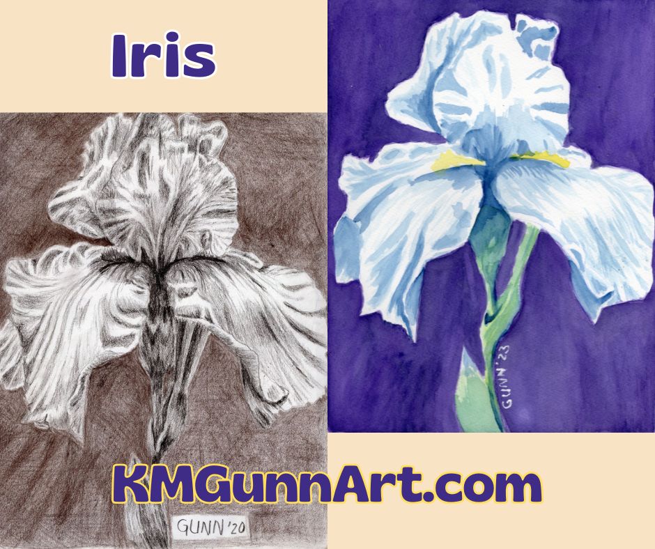
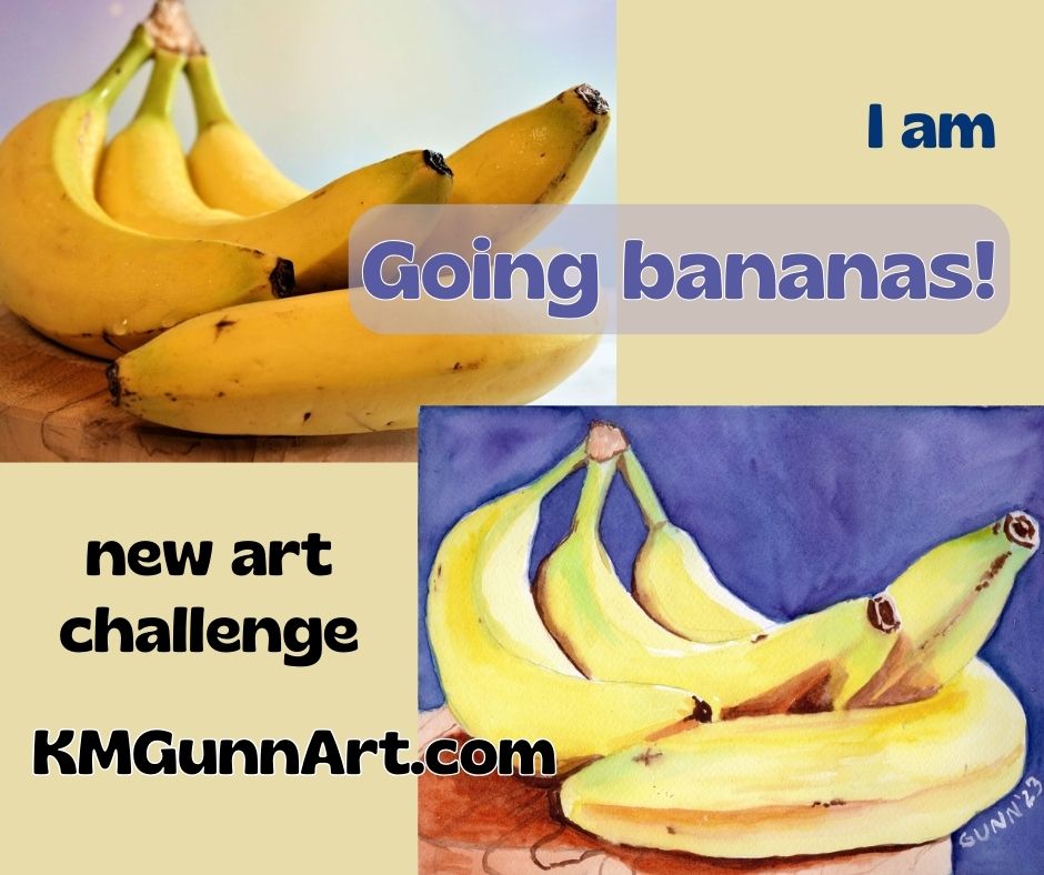
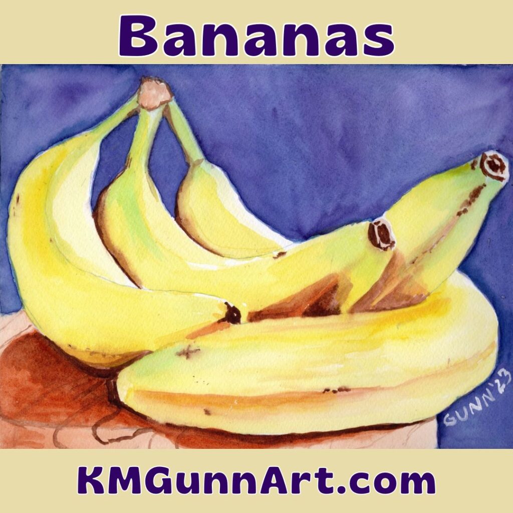
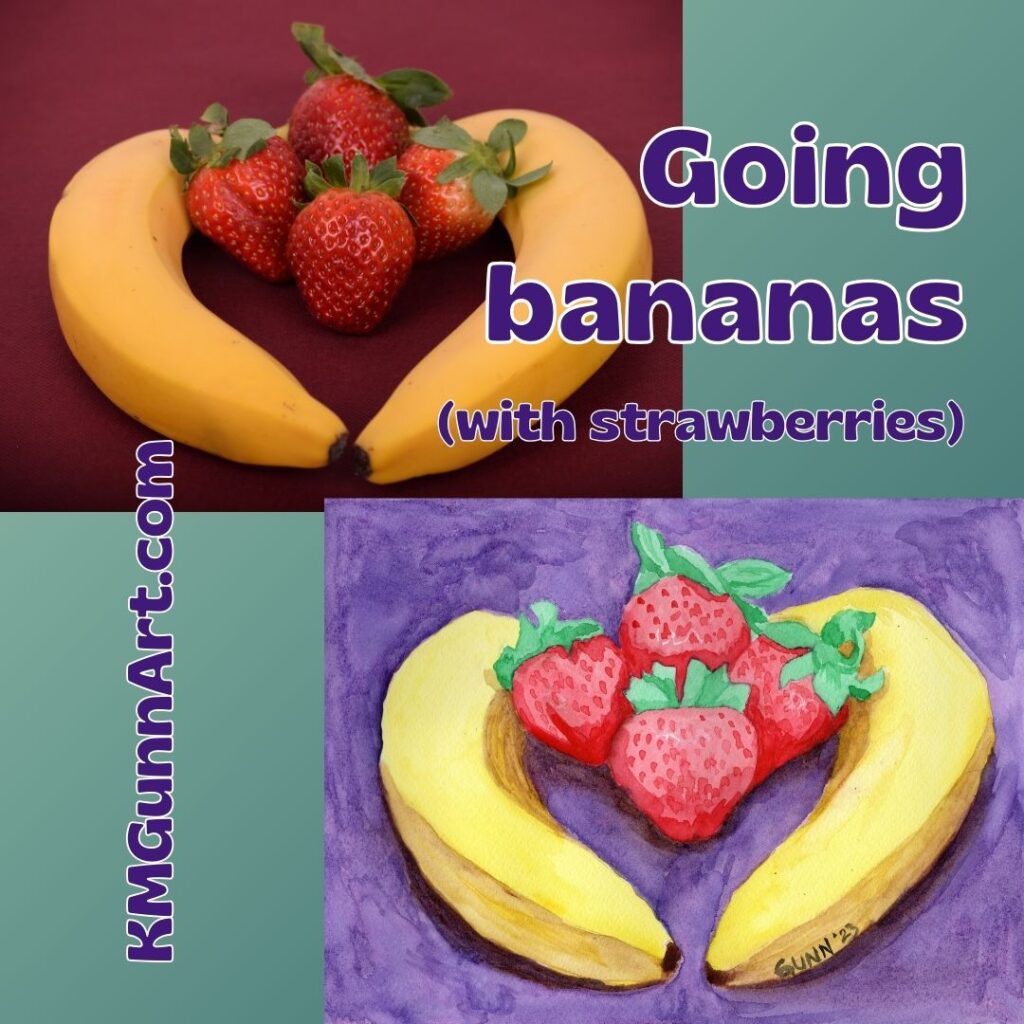
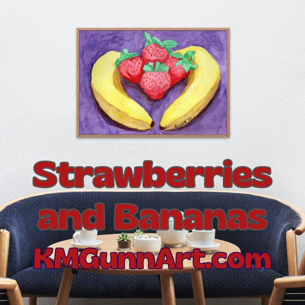
For the official final painting in my watercolor still life series I call the “going bananas” series, I decided to finally tackle some strawberries. It makes sense to my weird brain – I love that flavor combination, so why not draw and paint the two together? Famous last words, y’all ….

collage of the reference photo and my finished watercolor painting Strawberries and Bananas

Choosing a reference photo and making changes to it

Choosing the reference photo was not difficult. I saw this one with the two bananas encircling four strawberries, and loved the layout and how the light and shadows played. What I simply did not like was that background color. Setting the fruit on any red was a bad idea (to my eye) as that overwhelmed the strawberries. So I took the color out of the reference photo and began working on the sketch.

collage of the reference image in grayscale and my preliminary sketch for Strawberries and Bananas from my sketchbook
ref photo and preliminary sketch from my sketchbook for Strawberries and Bananas

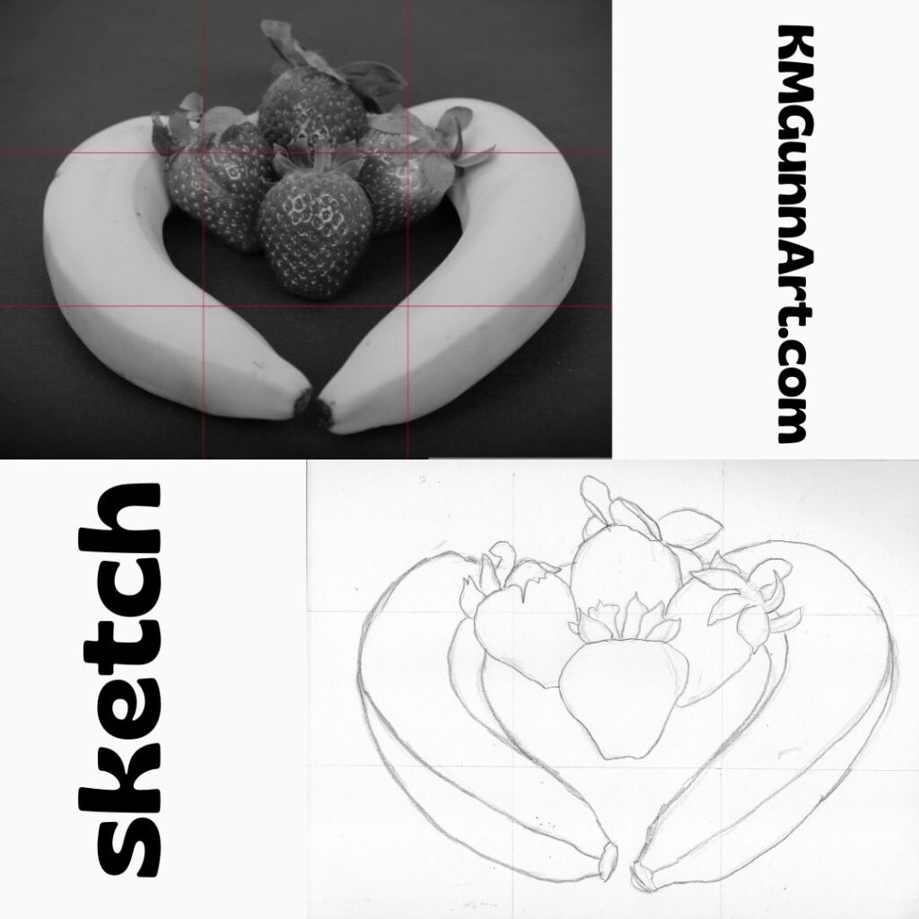
As y’all can see, I do use a 3 by 3 grid to do my sketches. This keeps me from starting in the center and then going off the right edge like I used to do all the time. That was a big weakness I had from as long as I could remember. I just can’t explain why I didn’t start using a grid sooner than I did. It was probably the same reason I didn’t start using transfer paper until this past year – the mistaken belief that I shouldn’t need it if I am a “real” artist. I guess there really is something magical about turning fifty, in that I can now laugh and say I don’t care what others think.

Coloring it in (with watercolor paint)

Once I had the basic lines transferred to my paper, it was time to play with color! The two bananas were no problem, especially since this was the third day in a row for painting the yellow fruit. I just kept using the same tubes of yellow. Seriously, why change it up when I was satisfied with what has been working?

I decided I wanted the background to be purple, but first I tried a lighter and redder shade called Cobalt Violet. Even after it dried, it looked too pale and far too pink. So, back to the dioxazine purple. Again, if it ain’t broke, don’t try to fix it.

For the strawberries, first I laid down a base layer of red. Then I went to work on all that green, trying to catch the shadows to make it look three dimensional. It was while I was working on the strawberries that my back started to really hurt. Since this was the finale of the series, and no one had dropped out of the art challenge yet, I had to get to some semblance of done. I gritted my teeth and painted on.

third painting in my watercolor still life series I call "Going bananas"
third painting of my watercolor still life series exploring the shapes and color of bananas

Links to purchase!

If you have the perfectly-sized blank spot on your wall to accommodate the 9 by 12 inch original watercolor painting, then head to my Daily PaintWorks gallery and purchase through them. Trust me, it will be easier than getting my attention when I am in the art zone. If you need a different size, you can order from as small as 6 by 8 inches up to as large as 45 by 60 inches through my Pixels shop. They also have some good swag, and I’ve heard they’ve improved their jigsaw puzzles.

New Floral Painting Iris in Watercolor

I know I’ve left y’all hanging on the Going Bananas series, but this most-recent floral watercolor painting is getting so much positive feedback on the handful of social media I’ve posted it to that I just had to do this one first. Plus, it’s a white iris in full bloom – how could I not?

The inspiration behind the painting

I never thought I would say this, but the inspiration for this came from Facebook … specifically, FB asked if I wanted to reshare an image from three years ago, an (overly) detailed drawing of an iris in full bloom. Seeing that drawing again made me realize I had never done anything else with that image, and the next thing I knew I was transferring the general outline to some watercolor paper to do it in better and in color.

detailed charcoal iris drawing from 2020 and the watercolor painting I made from it in October of 2023
my iris drawing from 2020 and watercolor painting from last week, late October 2023

Before I traced over it to transfer the lines, I did do a high-quality scan of the drawing first, so if you’d like an art print of it you can get one in the size you want. I used my first tinted charcoal (sepia) for the background, though looking at it now I can see it is both too dark and too light and didn’t provide me with the contrast I hoped to achieve. That is probably why it’s called drawing practice.

Recording the painting process

Since the little Nikon digicam died at the start of another art challenge, I was left with just using the old webcam my husband bought a few years ago when 1080p was the top-of-the-line in video. I used it for most of the four pieces in that challenge (I’ll link to it once I get those written!) and I have to admit: I love having video clips of it. In fact, I love it so much I am making an effort to do it more often. I also checked out the current top-of-the-line 4K webcam. It’s on my wishlist. (Edit: I bought it. Yeah, I am really impatient with some things.)

Once I get the video footage edited, I’ll embed that here. Until then, you can see a couple of short vertical videos I’ve uploaded to YouTube here.

software-generated mockup of a larger print of my iris floral watercolor painting in white matting with a slim dark wood frame
how my Iris in Watercolor floral painting looks in white matting and a slim dark wood frame

Notes about my iris floral watercolor painting

As I mentioned in the first paragraph, this was another one of those watercolor paintings that felt as if it just flowed from my brush. I absolutely LOVE when that happens. In fact, the part that took the longest was simply getting the background dark enough to provide the right amount of contrast for the white petals. I used alternating layers of dioxazine purple and indanthrene blue, going round and round the unpainted flower until it finally looked right. Painting the iris and its stem took less than a third of the total painting time, according to the video footage.

my Iris in Watercolor painting printed on the cover of a spiral notebook from RedBubble
Iris in Watercolor printed on a spiral notebook cover from RedBubble

Links to purchase

The 9 by 12 inch original painting is still available to buy through Daily PaintWorks. This artwork scanned beautifully, so you can order an art print through Pixels in sizes as small as 8×6 inch all the way up to 45×60 inches before framing. I also uploaded it to my RedBubble shop because my mother and sister like to wear my artwork. Finally, if you want an original but need a larger size, you can always commission me to do a similar painting. (I could not paint an exact duplicate even if I tried.)

Going Bananas: New 3 day still life art challenge

I could not resist jumping in on a quick three-day art challenge over on Fine Art America’s artist discussion board. Like most of the art challenges over there, this one has a theme: banana(s). I have thought about doing a series of banana-themed fruit still life like my Apples and Oranges series for a while, so I figured this was my cue to just do it. Just to be cute, I am calling this short series “Going bananas!” and intend to execute it in classic still life format as I see it.

graphic collage of the reference photo of bananas I used for my still life watercolor painting for the short art challenge
reference photo of bananas I used to make my still life watercolor painting

(I should note that I have not abandoned the 100 faces challenge. I am only taking a quick side-quest, as the DnDers would say. I’ll also say that I successfully completed the challenge, and just need to get caught up on blogging it.)

Finding paintable reference photos

I’ve probably mentioned before that what makes for a good painting reference is not always what makes a good photograph. Hunting up some reference photos to use proved that – most have softer lighting so the subject can be seen as well as a two-dimensional image can allow. A good painting, on the other hand, works best with dramatic lighting, with a single light source ideally. Dramatic lighting produces dramatic shadows, which a lot of photographers seem to avoid. I did manage to find three photos with a more or less classic still life arrangement … and one that is more of a wild card that I may do as a bonus.

Setting some clear objectives

I wanted to do this short (and fun) art challenge with some pre-defined objectives, which is military for goals. (The cranky old Army sergeant in me still rises to the surface from time to time.) I knew I wanted to do somewhat traditional fruit still life paintings, so that cried out for a mostly-traditional medium. Since I hadn’t used my watercolor paints in quite a while, this seemed the perfect excuse to work in watercolor. I did choose to use more modern pigments, and am happy with the results.

Since only one of my reference photos had anywhere near the level of drama in its lighting, another objective was to see if I could adjust for that on my paper.

My final objective was to utilize complementary colors: the obvious yellow/purple, but also some red/green where I could.

Painting the bananas in my still life

With my objectives in mind, I went to work. This first painting simply FLOWED from first my pencil, then my paintbrush. It was one of those days when every step went smooth as silk. In fact, I started the sketch at approximately 1030 and was waiting for the paint to dry so I could scan it before 1530! Only five hours from start to finish, including drying time, is a quick and easy watercolor painting for me.

graphic of my watercolor still life painting simply titled Bananas, in the square format sites like Instagram love so much
square graphic of my watercolor still life I simply call Bananas

Hubby says he loves how the green looks on the bananas, with the comment that this small bunch looks exactly like what I search for in the grocery store – still a touch green. To contrast with the green, I chose to paint the plate as a reddish wood, instead of the really light color in the photo.

Overall, I am VERY pleased with how this one turned out. I feel I nailed both the color and the lighting, though I should probably at some point practice painting wood grain, as that is the only part that I think needs improvement. It scanned even better than it looks in person (to my eye; hubby disagrees) which is unusual for my work. Personally, I think my painting is better than the photo I used for reference.

All in all, a good start to this new art challenge.

How to purchase!

If you have the right space for the 9 by 12 inch original painting, then click over to the listing at Daily Paintworks to handle the transaction. It’s likely quicker than trying to hunt me down when I am in a mood to be unplugged.

Need a bigger and bolder version? I have art prints available through my Pixels shop ranging from as small as 8 by 6 inches to as large as 60 by 45 inches, so that should cover most walls quite nicely. You can also get jigsaw puzzles through this link.

Want to wear my art, like my mother and sister prefer? Click through to see the options at my RedBubble shop. There are also some home accessories – and yes, my favorite is still the analog clock.

I made a video of this post

Check it out on YouTube, give it a like and share!

Bananas – Behind the Art with Katrina Gunn

February Virtual Art Walk with baby goats

I scheduled this month’s virtual art walk to happen this weekend, serenely convinced my nanny goats would not kid until next week at the soonest. And my goaty girls laughed at my hubris. So I thought I might sit this month out, but Jim Hughes applied a bit of arm-twisting on Facebook … so here I am scrambling to catch up on the art walk idea before the end of the weekend. There will be plenty of images for this post, because I am now up to four goat kids out back as the art walk group has grown to six this month.

New art walk participant Steve Estvanik

Another photographer named Steve joins our merry band of art bloggers with a fun post about dragons from around the world. I love some folklore, and find dragons fascinating. Also, I’ve long believed dragons to be a fanciful imagining of dinosaur fossils. This hypothesis just makes sense to me. No matter what you believe dragons were meant to be, they are a part of most cultures – except for ones from the African continent.

dragons from imperial China, symbolizing the power of the emporer
dragons from imperial China, photo by Steve Estvanik

Photographer and arm-twister Jim Hughes

Y’all ought to know Jim Hughes by now – he’s participated in all the virtual art walks to date and when I was going to sit this one out, he cajoled me to just use a previous blog post and toss it all together. This month he takes a look at … bricks. One of the themes in art is to call attention to things people might not see as art. The only thing he missed in his post was a reference to the old song Brick House by the Commodores. He even refrained from the obvious Pink Floyd reference. I also learned photographers love a brick wall to check their lenses for any distortion.

color photograph of bricks in a wall
Jim Hughes’ Bricks in color

Baby goat interlude 1: Capri’s first set of twins

Wednesdays I usually go up to Palatka, either for an appointment or for the new art group my friend Keashia has put together. This past week was an art group get-together … and I didn’t make it up there because Capri looked to be in labor. Francis was giving her plenty of space, and she was taking it. Around lunchtime, as the rest of the group was starting, I remarked to hubby that she’ll likely wait until after I would have been back home just to be a goat. That’s exactly how it happened. The first kid was born a little bit before hubby came out to feed the critters and put up chickens for the evening. The second was born as he was finishing up the evening feeding. One girl and one boy, with the girl looking just like her mother and the boy looking almost exactly like his sire, but with blue eyes.

Capri’s twins, girl on left and boy on right. Also, Pepe’s first kids

Sharon Popek photographs Chicago

Sharon Popek took a tour of Chicago at sunset, and captured some very nice cityscape images. The last time I was in Chicago was 2017 for my son’s wedding, and the thing I remember most was it was COLD coming up from Florida in mid-March. It was also cloudy the entire weekend, so I did not get to see anything quite as nice as Sharon’s photos.

collage of Chicago skyline at sunset from Lake Michigan
Chicago from Lake Michigan as the sun sets, photos by Sharon Popek

Dorothy Berry-Lound features purple

This month Dorothy Berry-Lound spotlights some of her artwork that incorporates the color purple, which is one of her favorite colors (as well as mine!). She even touches on not only the history of the color, but the associations in psychology and spirituality. Being the absolute geek that I am, I knew these, but apparently not everyone is as nerdy as I have always been. It’s a lovely collection of purple in art.

painting of Chinese girl holding musical instrument hanging on a dark wall
an example of Dorothy Berry-Lound’s art hanging on the wall

Francis has twin boys

After agreeing to just toss in a link on Friday, I went out yesterday to milk Capri in between thunderstorms. To my surprise, Francis did not come running up to greet me, even when I went over the electronet with the bucket of hay pellets they love so much. Hubby remarked, “I bet I know why …” and I was thinking the same. We walked up just after the first kid was born, and hubby went back inside the house to grab some old towels. If course Francis was on the far side of the pasture. We managed to move both Mama and newborn to the grassy spot of the kids’ pen as the thunder started rumbling again. After the second kid was born and both dried off, then it was time to bottle them. The firstborn boy, with the flashy white markings, immediately understood the bottle. The mostly-black boy wanted a better delivery system, but decided he could handle drinking his milk from a bottle. Both of these boys are larger than normal newborns, so it’s a good thing Francis didn’t have triplets again.

Francis and her newborn boys on the grass
Francis and her newborn twin boys. Yes, we really do have green grass this time of year in Florida!

Steve Heap’s photos of West Virginia and Hawai’i

Steve Heap is a familiar name for our virtual art walks, and once again he spotlights his artistic photography that has sold since the last time. His fans seem to divided between buying photos of West Virginia and photos of Hawaii. Funny but true: my mom called me the day before Capri kidded from her cruise of the Hawai’ian islands that she is on for her birthday. She called for one reason, to ask if I had baby goats yet. She did tell me a little about how much she is enjoying her trip, but mostly wanted to know if I had baby goats yet. My pick for this month’s image to feature from Steve is this panoramic image of Tunnels Beach on the island of Kauai.

panoramic aerial view of Tunnels Beach on the Hawai’ian island of Kauai by photographer Steve Heap

My watercolor Red Rose 2

Finally, the post I put in for this month’s virtual art walk is my watercolor Red Rose 2, where I used my line drawing as the basis for a line and wash. This is actually my first time using ink with my watercolor, and people on various sites seem to like it. Also, if you like the line drawing, sign up for my email list, as it is my free gift to subscribers this month. I will change the line drawing on the 15th of the each month for the entire year, to go along with the theme of 2023 being “A year for art.”

Previous virtual art walks

That wraps things up for this month! Since I am bottle feeding baby goats for the next eight weeks, I recommend subscribing to the email list. Not only will you get line drawings you can print out and color at home, but you’ll have new posts emailed to you when I publish them. With my usual springtime activities, I won’t be able to keep any kind of schedule until all the kids are weaned and chicks have hatched.

Yellow Roses in Purple Vase

First, believe it or not, this is a computer-generated image. I’ve been working for a while on trying to get some classic floral still life style images from the text-to-image software I’ve been playing around with, and after exhausting a certain look, I decided to try some different modifiers to the same basic text prompt.

I’ll cover this other style on Friday, but this particular image gets its own post for the simple fact I will be working on doing it by hand in the next week. Even more inspiring to me than the Sunset Palms image, this is a simple but elegant floral still life composition of a bouquet of yellow roses in a purple vase, sitting on a wood table. It is the complementary colors that make this idea pop.

Inspiring digital artwork

Picture of woman holding framed art print Yellow Roses in Purple Vase
Yellow Roses in Purple Vase, digital artwork available as an art print

But first, the important links for print products to buy. I have it on most products at my Pixels store as well as art prints. It doesn’t looks right on objects where the printing is horizontal in orientation. I recommend getting art prints from there because Pixels is owned by Fine Art America, who are big in the art print world. For those who enjoy wearing artwork, I recommend my RedBubble shop. My sister and mother both recommend them and are repeat customers.

The search for a good rose image

No surprise to long-time blog followers here, but I personally love yellow roses. I’ve been trying to paint or draw the “perfect” yellow rose piece since the day after I picked my art back up, and I have a couple watercolor paintings I did one to two years ago – Electric Yellow Rose and Yellow Rose. (If you buy the originals, you can rename them. I don’t try to be cute with what I name my artwork.) While I’ve played around with the idea in pastel and colored pencil, I have not accomplished anything I want to share. I think part of that is a matter of finding a good reference photo for it, because buying a nice bouquet of roses in a pretty vase each time I want to paint or draw would get rather expensive.

Enter the text-to-image digital artwork idea

So, what does an artist who lives on her veterans’ disability pay do in this situation? Well, I gave in to curiosity about the whole text-to-image software that so many people misname “artificial intelligence.” It is not intelligent. It just generates images based on your text prompt plus a style filter and any modifiers you use from the lists of phrases that will get you certain looks.

First, I tried the basic text prompt “bouquet of yellow roses” without any modifiers, and got a bunch of images that more-or-less fit that. The biggest variation is in that hard-to-define quality of composition. One was good, while the rest were mediocre at best. Here is the one I liked best.

bouquet of yellow roses

Using modifiers in the text prompts

Not completely satisfied with this, I began to experiment with different modifiers to see what kind of image style I could get from which modifier. Some modifiers are specific art movements; some are specific artists’ names (and some of those are still alive and still painting), and others are descriptions like “dynamic lighting,” which is one of my favorites. No “chiaroscuro” or Edgar Degas, though my favorites are romanticism and Thomas Kincade, a combination that makes some very pretty images that don’t have much variation.

romantic yellow roses in vase on table
Romantic yellow roses in glass vase on table

Another style modifier I tried was Renaissance painting, which certainly has that feel to it, and I may experiment with that style further, but first I wanted to see how well (or how poorly) the software handled the idea of simulated pastels. These are soft pastels, not oil pastels, and I was disappointed to not find any famous pastellists in the artist list like Edgar Degas or Mary Cassat. Fellow Impressionist powerhouse Claude Monet was on the list, so on a whim I used his name along with pastels as the “medium” used and Impressionism as the style. I also specified the color scheme as yellow and purple. Here is the four-pack of images generated:

four computer-generated images using my text prompt
four computer-generated images using the text prompt “bouquet of yellow roses in fancy vase on table dynamic lighting yellow and purple pastels impressionism Claude Monet”

A bit of variation here, and while the first image is nice enough, it’s the second one (top right) that has captured my imagination. It is so close to being good! I think it is just missing that tiny little bit – perhaps toning down the background colors to make the focal point more attention-grabbing. I’ll also be tweaking that table, perhaps more of a tan than yellow, so it looks more like oak (like the image above).

Bouquet of Yellow Roses in a Purple Vase

So that is the development of a vague idea, “bouquet of yellow roses,” into a piece of digital artwork that you can purchase and I can use as a springboard to create my next work of art in pastel. I am thinking of giving my soft pastel set a proper workout for this, with details added in with pastel pencils. Until then, have a pleasant Thanksgiving week, and watch this space for a new Feature Friday.