Feature Friday 3: Back in the Saddle

There is an old saying about how if you fall off your horse, the best thing to do is to get back in the saddle and finish the ride. Y’all probably noticed I missed a couple of Fridays in a row, but not to worry … I even have the perfect sketchbook page to share for this! I’ll likely be doing similar post beginnings, though I can’t guarantee I’ll have the appropriate drawing to share (or maybe I will?).

first drawing using my new tinted charcoal - a horse saddled up and waiting for the rider
saddled up – sketchbook page, first drawing using my tinted charcoal

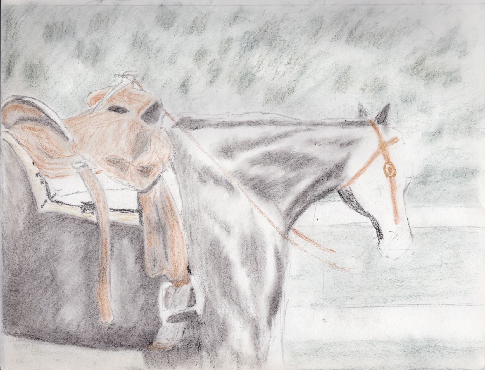
Some of you might recall the little teaser I dropped at the end of my charcoal drawings post where I mentioned getting the Derwent tinted charcoal set – first the small six-color set to try it out, then the biggest set of 24 pencils before I even got this far on my first drawing because I love how they feel on the paper along with really loving the resulting drawing. I stopped messing with this particular sketch as I realized I stumbled across the first practical lesson for tinted charcoal: use the lightest shades first. See that saddle blanket? While waiting for the big set of charcoals to arrive, I had picked up a black charcoal pencil and doodled in the border design. When I got the big set and pulled out the one called sand to pencil in the rest of the blanket, I realized as soon as I try to blend it with a paint brush, the black will smear. So, like Bob Seger sang, it was time to turn the page. I’ll be revisiting that reference photo in the future, because I really do like it, and will certainly be doing a color version, though I might do a monochrome version just because it looks like a good piece to do in only one color. I just have not yet decided whether that will be black or one of the brown charcoals.

Blog posts I’ve enjoyed over the past couple weeks

I’ve been doing a lot of reading and listening to videos and podcasts on the subject of blogging, partly as a refresher course and partly to see what has changed over the decade I wasn’t blogging. The fundamentals are still the same: write your blog for people to read and enjoy, and the search engines will follow. Some of the stuff we used to do back in the day (like this link roundup feature I am trying to resurrect) just fell by the wayside, and I am not seeing a reason why other than the “oh, that’s so 2008!” statement. If gas station prices are going to look like ’08, then why not blogs?

Another thing I see that hasn’t changed is that the good blogs all have a “why” for their existence. This dovetails neatly with the recent article I read about how an artist’s statement helps the fans and viewers to better grok the artist’s body of work. I wanted to link to this article, but apparently that is one of the email-subscription only pieces, as the Inside Art site skips that day in the post sequence. The short version of this point is I am giving the concept some thought about how to expand my artist’s statement beyond, “I make art to bring some beauty into the world.”

So why am I blogging again? I got frustrated with Facebook. It’s (*bleep!*) difficult to link back to previous posts – and most days it’s (*BLEEP!*) difficult to even find a post again unless you leave a tab open with it. Facebook may be “more” interactive than blogs (which is a very debatable point, IMO) but it is not what I think user-friendly ought to be. (I should note that I never intended to have a FB account, but it seems to be expected, and a good portion of my family is on there. I’m just trying to set up a lemonaide stand with the FB lemon.) Last summer, I got frustrated enough with trying to find something again on FB that I announced to hubby, “I am going back to blogging!” And after a brief stint over on blogspot, I made my way here, back to my own domain and even back to WordPress. Now, it’s time to work on improving the site. If you are not already a subscriber, now would be a really good time to subscribe, either through a reader or by email, because I am only getting started here.

Speaking of starting, on Monday I’ll be participating in a new three-day art challenge, where the theme is “fire.” I’ve done it in colored pencil, twice, so I will be experimenting with other media. Right now, I think I’d like to break out the oil pastels for this, though I might try my brush with either watercolor or acrylic. Stay tuned!

Two drawings from last year

As I was looking over my art catalogue last night for something to feature today, I realized that I had forgotten to blog about two drawings I did last year. What a perfect way to remedy that – by spotlighting these two pieces!

Horse head in charcoal

First is one that anyone who knew me growing up would expect: a horse head. The reference photo I found is of a beautiful chestnut mare, likely a Quarter Horse, looking out from the darkness of a barn or stall. I call it Bridled, and recall spending the better part of an afternoon working first to get the background dark enough, then on getting as much of the highlights and shadows right to my eye. This was also the first time I used the Strathmore 500 series charcoal paper, with its laid texture, and the result was pleasing enough I later purchased another pad of it. My only gripe is the paper feels so lightweight after working with multimedia and watercolor papers, but charcoal works need to be displayed behind glass anyway.

charcoal drawing of bridled horse head
Bridled, charcoal on paper, 9 by 12 inches, $80 USD

The original piece is available – you can purchase it through Daily PaintWorks, which uses PayPal, or in person at One Stop Feed Store in Crescent City if you are local – and it is uploaded for art prints at my Pixels store in various sizes. I’ll probably look back at this in a few years as “not my best,” but right now I am pleased with how it turned out. I drew this in June of 2021.

Pansy pair in graphite

Prior to that, February of 2021 judging from my notes, was this page from my sketchbook that I worked at until I could call it done. Rendered in graphite, which accounts for the greyness, and now a bit worse for the wear after a year of me carrying my sketchbook about, this scan is record of how it looked immediately after completion. Looking back, I am glad I scanned it before moving to the next page, as I went back to this and traced it over transfer paper to paint in watercolor which ended up as my Johnny Jump Ups painting I’ve blogged about previously.

purple pansies drawn in graphite
Pansies Pair, sketchbook page

Since I not only left the page in my sketchbook, but used it to transfer the lines to another paper, the original is not available to buy, but since I did scan it, prints are available of it at my Pixels store. Its original size is 9 by 12 inches – perhaps my favorite size for a sketchbook because it is so portable – but the scan was good enough to print larger. It is also available as puzzles for the folks who love a good puzzle and are willing to work on one in greyscale instead of color. I have too many cats in the house to attempt an actual, physical puzzle, or I would give it a go just to see if time spent playing MicroSoft Jigsaw translates into the real world.

More to come soon!

The rest of the month of drawing in charcoal

Now, for part two of my unplanned month of drawing that bled into the last day of 2021, and continued to the first day of February, and lasted the entire month of January. (Wow, that makes it sound really long!) Considering it is still in progress, I guess we are now well beyond the month idea, so perhaps I should call this a season of drawing? One big advantage drawing has over painting is how quickly it can be set aside to go do something else, and considering I have two nanny goats due to kid in the next month I think it is safe to say I’ll be working with dry media until probably mid to late March because one of the pure JOYS of having my goats is bottlefeeding the kids each spring. Even if I want to take a break from monochrome charcoal, I have soft pastels (I often call them dusties), pastel pencils, regular colored pencils, and even oil pastels, though the oilies will smear if a cat walks across before I’ve sealed it.

Inspiration for charcoal drawing

Enough rambling – back to the drawing spree I am still currently doing. A couple weeks ago, I got an email on a list I subscribed to for a free tutorial offering the “legacy class bundle” for a discounted price. I thought it over, then decided the sale price was fair and bought a whole huge heap of video tutorials, and decided to start with the drawing ones. While I am bouncing around as to which one I do any given day, depending on my mood, here are the first pieces I’ve drawn with the tutorials. I should probably mention the artist who made the tutorial bundle does photorealism. I call what I do just realism, as I don’t actually try to copy a photo down to the tiniest detail, but there are all kinds of small tips and pointers littered throughout the videos’ run times that can benefit me even if I don’t go as detailed as she does.

First a rose

First, I just had to start with this rose in charcoal. Seriously, what is not to love here? I enjoy drawing and painting roses, and apparently people enjoy seeing drawings and paintings of roses, and a single white rose against a mostly-black background is about as dramatic as you can get without using color. To be honest, sometimes the monochromatic charcoal black on white can be more dramatic than color (when the stars align just right and and the picture feels like it just flows out from the pencil). This is in 8 by 10 inch format, and the very first page of a new sketchbook, plus I put it in the top corner instead of centered on the page so the original for this will not be available to buy … but I can do it again if someone wants me to, and in different size or aspect ratio. I do have prints available at my Pixels store, but I didn’t upload it to RedBubble because I am not sure my charcoal work looks as good there.

Single White Rose drawing in charcoal
Single White Rose, 8 by 10 inch charcoal (in sketchbook)

Fun flamingoes head study in charcoal

The very next day I wanted to do another drawing, and picked a reference photo for a different tutorial. It was a video on how to transfer an image from a printed photo onto your art paper, so this is me taking the tips and general method from the rose video to make these two flamingo heads. Flamingoes are definitely one of my favorite birds to draw and paint, and this image just caught my imagination. This time, I centered the 8 by 10 inch image on my not-quite 9 by not-quite 12 inch sketchbook page, so if anyone wants to purchase the original I can remove the page and trim it down with no problem – if you live outside my area you can buy through Daily Paintworks. Or you can get prints in your desired size at my Pixels store.

Two flamingoes, charcoal drawing
Two Flamingoes, 8 by 10 inch charcoal on heavy paper, $80 USD

Update: This drawing is now officially an award-winning artwork, taking 2nd place in the 2022 Creative Arts Festival for monochromatic drawing.

Kicking up my heels with a horse drawing

Those of y’all who have known me a while are already wondering how long it took me to go completely off the tutorials to do my own thing … and the magic number was three. Two days after drawing the flamingo heads, I decided it was past time I did another horse in charcoal. It took me a while to pick out a reference photo, but in the end I went with a galloping filly. I decided to try using hot press watercolor paper instead of multimedia or charcoal/pastel paper, and that goes back to the tutorial series. It is the first time I’ve used watercolor paper for something other than watercolor, and it is also the first time I’ve heard of using a dry media on paper for water media. I think I need to try a few more times before I can say if I like it or not, but it does have a different feel than normal dry drawing paper. This one is an actual 12 by 9 inch pad of paper, and the original is available for purchase through Daily PaintWorks. Prints of various sizes are available at my Pixels site as well.

Frolicking Filly, charcoal drawing of young horse cantering in the pasture
Frolicking Filly, 12 by 9 inch charcoal on paper, $80 USD

Practice for a portrait

I mentioned at the start of this post that my drawing kick kicked off on New Year’s Eve, and that is because I drew the winner of December’s frame giveaway that evening before bed. Since Murphy’s Law governs more than just the army, the winner wants her portrait to go into the frame she won. I am still knocking the rust off my people-drawing skills, and there is a series for that in the big legacy class bundle. First things first – an eye study since the eyes are the main feature that will make-or-break a portrait. I had my dog-eared almost-full old sketchbook within reach, so this is one I am not offering the original … and I have not uploaded it for prints either. About the only place I could see this in a frame and on a wall would be the waiting room of an optometry office. It is still “good training,” as we used to say in the army.

eye study in charcoal on paper
Eye study, 12 by 9 inch charcoal, in sketchbook

So this brings me current, as of today. I have tutorials on drawing the nose and the mouth to work through, then one on doing a whole face. After that, I may feel brave enough to try my hand at Dorothy’s portrait again. Yes, again – I did try early in January and was not satisfied with the result (which made the sale on the tutorial videos quite timely for me). I may be very much behind my self-set schedule for getting this out, but as I remarked to my husband yesterday, I won’t call a piece done until I am satisfied with how it has turned out. If that means I need to redo it until I get it to my satisfaction, well we did that in the army as well!

Until my next check-in!