Feature Friday 5: Let’s get blog-retro

It’s Friday once again, and this week I grew a brain and started this post the day before, in the spirit of the old army saying: “Proper planning prevents poor performance.” Soldiers being the eloquent creatures we’ve been since the dawn of time, call this “the five Ps,” although most would add in a sixth word starting with P that is not family-friendly. Last Friday I failed to plan, and when the thunderstorms rolled in about midmorning to mess with our satellite internet, I had nothing ready to go. Once bitten, twice shy … at least for now. With two weeks’ worth of links to share, let’s get this round-up started!

Blog links for your weekend reading

  • Jim Cook at Ramblings of a Hot Shot Photo Guy took some lovely travel-brochure style photos of a Japanese garden in Fort Worth, Texas called Mono No Aware. I think he captured to quiet beauty of the place so nicely. (Remember, I make no claims to being a photographer myself, as I have proven in previous Feature Fridays.)
  • Sharon Popek posted photos from her experiments using clear glass and liquids. I always thought photographing liquids in transparent or translucent glass would be so much easier than drawing or painting it, but apparently I am mistaken in that idea, and there is real technical know-how required for photography as well as drawing or painting.
  • Bill Swartwout freely admits he was in the right place at the right time to get the gorgeous colors in his beach photo at Ocean City, Maryland. I could so see that as a painting, or maybe three paintings – and I mean that in a nice way. It’s a great photo, but the painter in me would love the chance to try my brush at it.
  • Siena Blue posted her blog hop featuring the blind contour challenge. Overall, she is happy to have gotten someone new to play old-fashioned blogosphere party games (that would be ME) and is thinking of doing another one. I’m down for that! Let’s bring back all the fun stuff bloggers used to do back in the day like link round-ups, blog hops, link parties, and if we can get enough art bloggers who are up to it, maybe we can resurrect the old blog carnival idea. (If you blog your art – or are thinking about blogging your art – do join us. It really is a fun and motivating way of blogging.)
  • Hiding behind the pen name of Pencil Paws, is another animal and wildlife graphite artist who looks to be restarting her blog with a lovely drawing of her two cats, along with the story of they came into her life (spoiler alert: they were rescues). I like her careful and meticulous style, and hope she decides to continue blogging her artwork.
  • Finally, the blogging powerhouse known as Judith shows she isn’t shy of tackling a deep and somewhat dark chapter in art history with her exploration of the “degenerate art” of late 1930s Germany, along with some commentary about being lefthanded and how back in the day adults tried to “correct” this. Her post gets deep from almost the first paragraph, but it really impressed me, not just her research but some of the conclusions she reaches by the end. I am the type of person who believes we should know all of our history, not just the pleasant parts, because when we forget the bad stuff, we have this bad habit of repeating our mistakes.

Links to art supplies

For a few years now, I have been splitting my art supply budget between Jerry’s Artarama and Dick Blick art supplies, because each carries some items I like that the other does not. Jerry’s does not have an affiliate program … but Blick does! I signed up this week, and am now an affiliate as well as a customer, which means if you use my links to purchase something from their site, I will earn a small commission at no extra cost to you. Personally, I love it when they run the eCard sales, where you get an eCard code in a certain amount that arrives in your inbox two weeks after you’ve ordered. I still have to figure out where all the promo items like images and banners are in the platform, but I figured I would make a general announcement. I’ll be putting together a page with my personal recommendations, because I do indeed have my favorites from them. If the link looks funny to you, it’s because it runs through a tracking system. Both Blick and the platform have a good reputation online.

Obligatory eye candy snapshots

This being a blog all about my visual art means I need to have at least one image in the post, even my link round-ups. I thought this week I would feature the squash plant(s) that have grown out of the compost heap that are still going strong despite the heat of summer settling in (and wreaking havoc on my poor Swiss chard plants). This started out back in the autumn, October or November, when I bought some picturesque produce to get reference photos for my still life drawings. The butternut squash got wet and started to mildew, so we tossed it out on the compost heap to let it continue its breakdown. Usually, I don’t expect seeds from a grocery store-bought vegetables to sprout since I figure they are picked early to keep them from getting too bruised in transit. The seeds sprouted, and they must be dreaming of world domination at this point.

the squash plants have spread out from the compost heap and are shading the grass in the chicken yard
this is only about one third of the squash plants’ growth

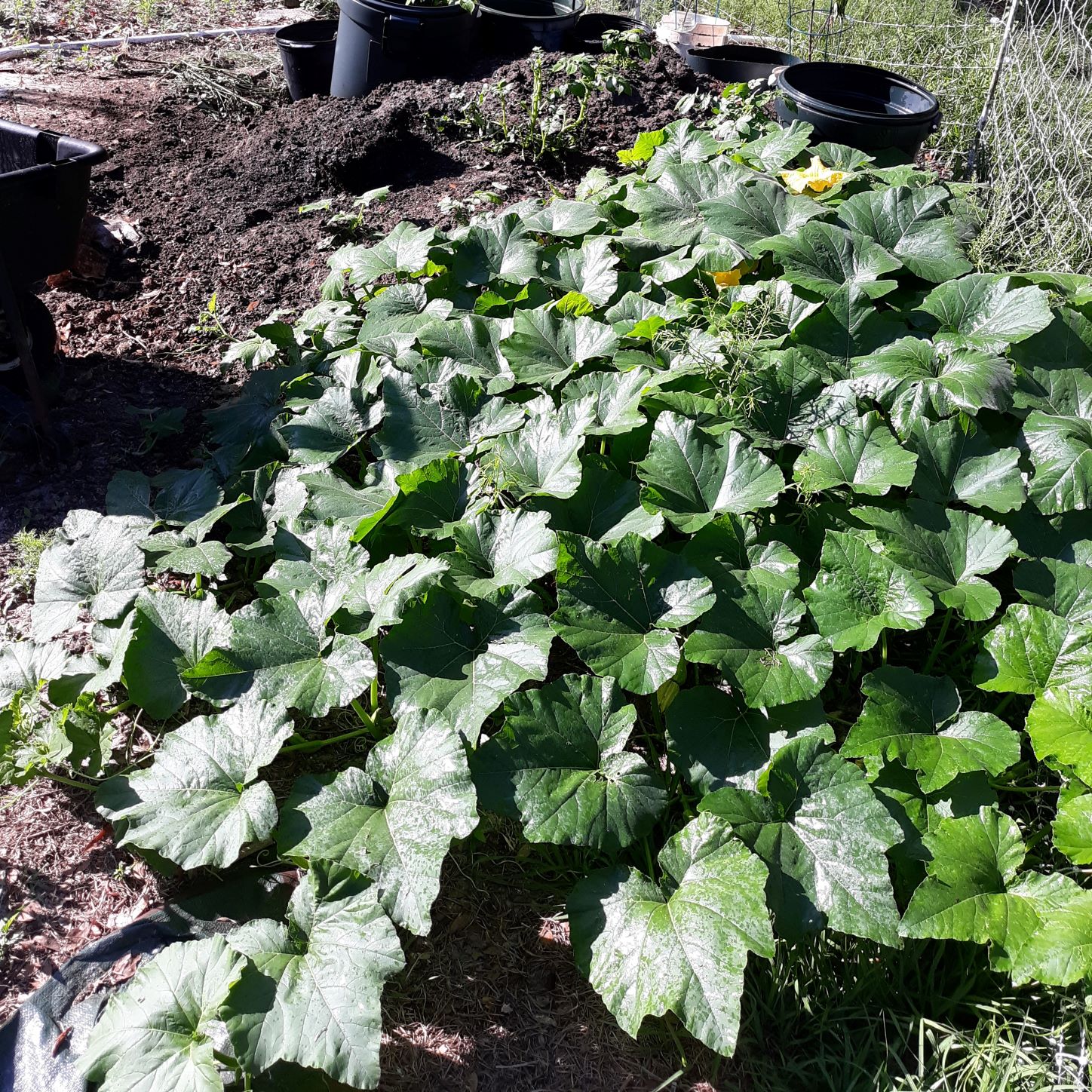
Just an FYI: this particular snapshot is from a week or so ago, and the plants are colonizing the open area on the other side of the fence con mucho gusto. My husband has needed to trim some off to keep the footpath to the pumphouse and water spigot for the pig pen clear, because squash vines can be a bit tangle-foot-ish.

yellow squash flower among the green leaves
big yellow-orange squash flower in among big squash leaves

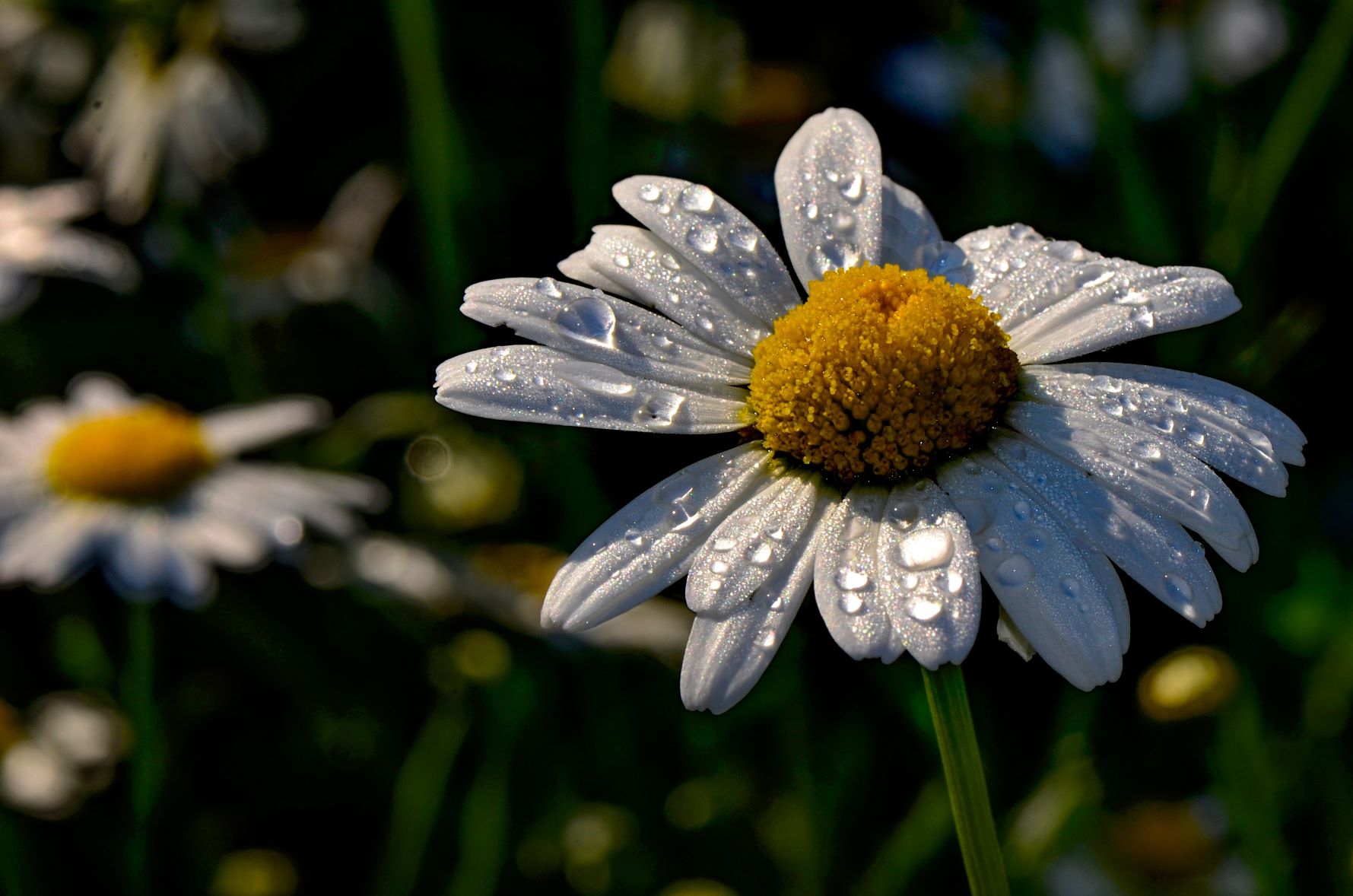
We’ve been trying to get nice snapshots of the flowers I can use as reference photos to paint, and I got to say it is difficult to get nice photos in the bright morning sun here in Florida, especially on the humid mornings when there are dew drops everywhere reflecting the sunlight. I still intend to keep trying for that one decent photo of a big honkin’ squash flower – seriously, the one that opened yesterday was bigger across than my hand. I also need to start bringing some of the squashes in for a nice picturesque pile. There will also be bean blossom and bean group snapshots soon as our summer garden beans are budding.

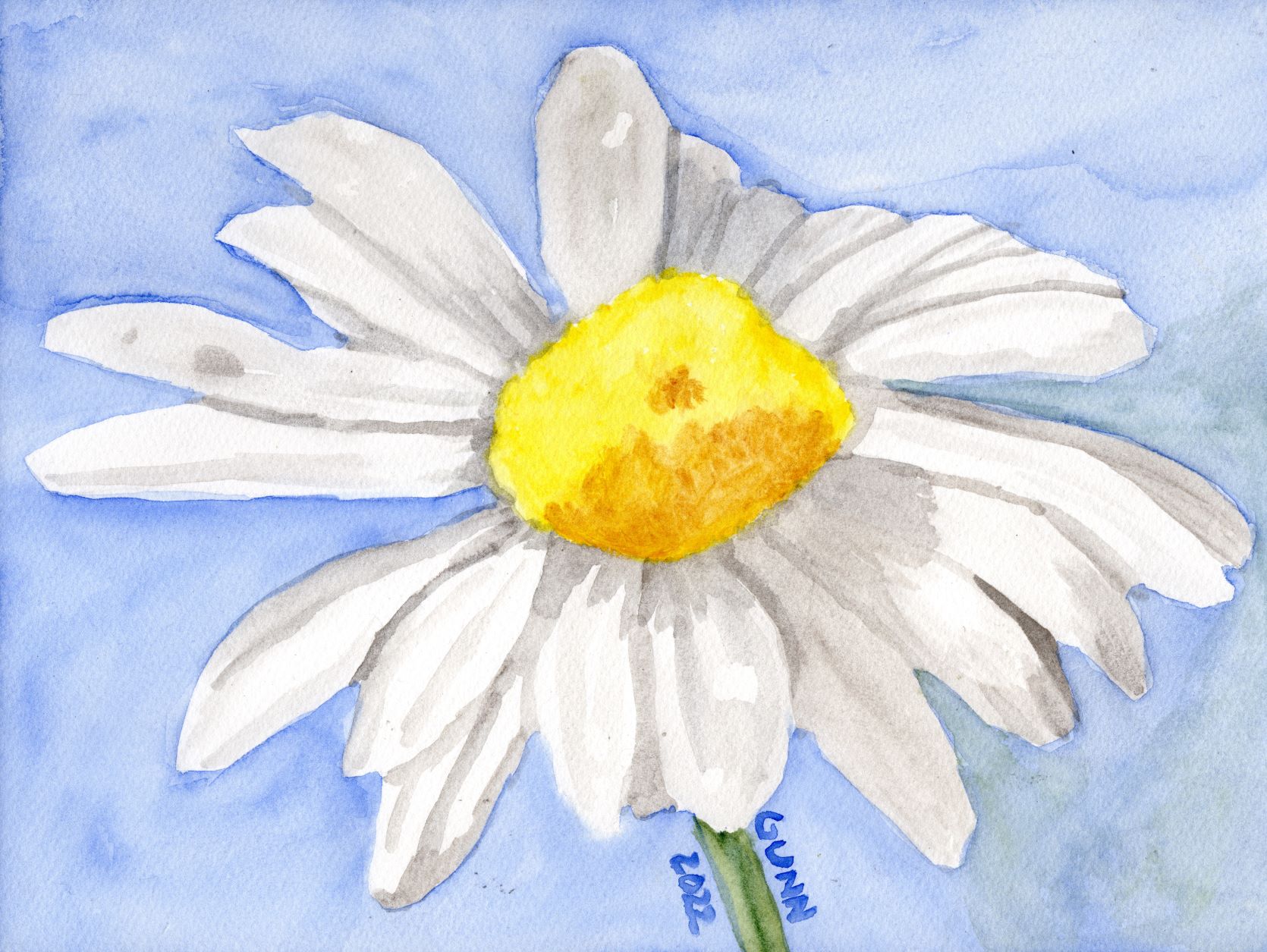
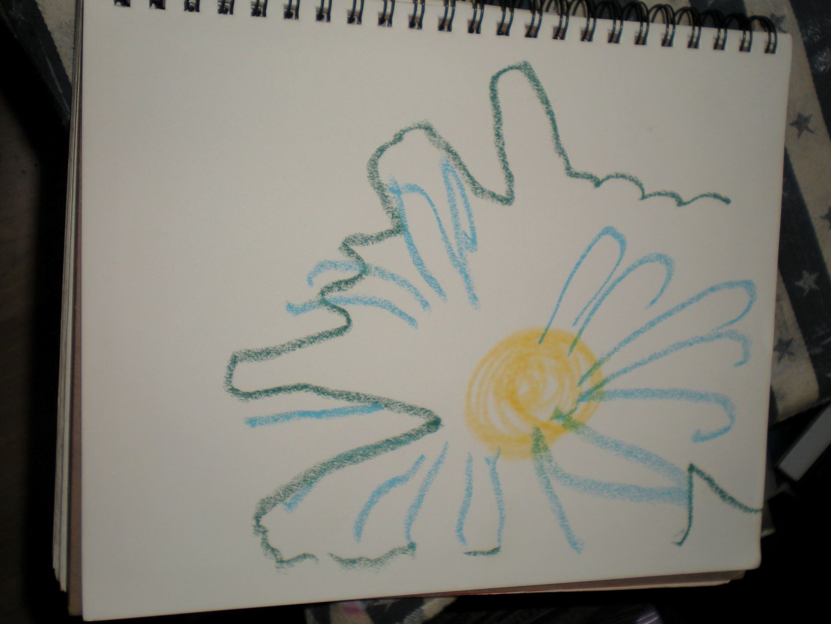
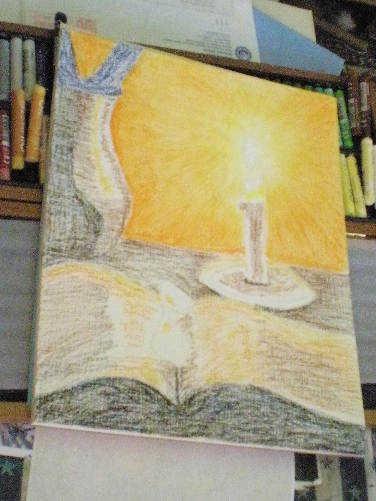
I still have one more daisy piece from the three day challenge over last weekend, plus a daisy drawing I forgot to post on the blog from last summer that may interest you. I also have the final painting from my candle light series a couple weeks ago that I just have not gotten around to posting. Then it will be time for a new art challenge – if I don’t see one that I like, I’ll just post one here and see who wants to play along with me.

That’s pretty much all I have for today, though I will leave y’all with this market research question: When you have bought artwork (original or prints) what was/were your main motivation(s)? Inquiring artists want to hear!

Daisy watercolor painting in only four colors

While I am behind on blogging it, I did finish up the three-day daisy art challenge. Before I start in with the second day’s daisy watercolor painting, I thought I would share a comment left on my Pixels page for the blind contour daisy drawing that made me chuckle. Fellow challenge participant Karen Kasper remarked that it reminds her of a Pablo Picasso drawing, and she suggests I get a better image of it so it could potentially be a bestseller on the site. (I should probably clarify she means Picasso’s later work – he started out classically trained and did wonderfully detailed representational drawing and painting, but later followed his muse to something completely different.) I intended to replace the blind contour with the acrylic painting I was looking at while drawing it, but in light of Karen’s comment I may leave it up.

Next daisy artwork, a watercolor painting

Now to move on to day two of the three day art challenge focused on daisies as its theme. I knew I wanted to do at least one daisy painting in watercolor, so Sunday after sketching out a single flower, I transferred the outline to the first cold press watercolor block I picked up and then sorted through my watercolor paints to see how few tubes of paint I would actually need. I am up to three brands of watercolor paint now: the Mijello Mission Gold paints that I discovered in late 2020, that are excellent for beginners because they don’t run across cold press paper as much as other brands; the Turner paints that don’t lift as easily as Mijello, run at a medium rate, and have always been in stock over at Jerry’s Artarama each time I’ve looked; and my new brand, QoR from Golden (more about this brand later). I had purchased a bottle of QoR’s synthetic oxgall to make my Mijello paint run better for backgrounds, and holy cow does it make the Turner paint really spread, so I knew this would be my most unpredictable paint to work with wet-on-wet. (Note to self: this probably makes no sense to anyone who has not painted with watercolor paint. Must write a post on what all this means.)

Choosing the specific watercolor paints

I ended up with only four tubes of paint: Turner ultramarine blue for the background (because daisies need either a green or a blue background), Turner permanent yellow and transparent yellow oxide for the center of the daisy and to mix with the blue for the bit of stem, then QoR’s ardoise gray for the shadows on the petals. Just don’t ask me to pronounce that name. I wanted to get the paint done while cats were napping, and succeeded, so I was pleased with the result.

watercolor painting of single daisy flower using only four colors
Four Color Daisy watercolor sketch, 9×12 inches on paper, $80 USD original available

The one thing that sticks out to my eye is that the transparent yellow oxide (yellow ochre for all intent and purpose) does not go well with the permanent yellow in the flower’s center. I probably could have gotten away with mixing the grey and permanent yellow together to achieve a more-harmonious shadow for that part, and I may do it over doing just that sometime this summer.

Links to purchase

The 9 by 12 inch original is available through Daily PaintWorks, as usual sealed with Dorland’s wax medium. If you want a larger print, those are available through my Pixels store, along with greeting cards and some accessories. RedBubble apparel, accessories, and swag is here.

The starting photo

For those curious, the reference photo I used is this one from Pixabay. When I look for a reference photograph, I don’t worry about the shot’s composition, just lighting and subject, because as you can see I crop it to what would make a good painting or drawing to my eye.

the reference photo for my Four Color Daisy

I suppose my lack of reverence for the original photo is a product of my total lack of photography skills – I’ve received valid criticism of my wildflower snapshots, but the simple fact is I am not much of a photographer. If I am going to do a fine art image, that will require something other than a camera. Once again, all I can say is I am so glad digital cameras were invented, or I would still be wasting money and resources on film developing.

Still one more daisy picture from the challenge, then I will need to post up one I did last summer for a 30 day drawing challenge I ended up dropping out of about halfway through, and of course I will need to finished the acrylic painting I used for the blind contour drawing, so there will still be plenty more daisy artwork in the near future.

Starting the Daisy Challenge with a Blind Contour Drawing

I have started a new art challenge at the usual forum, where the challenge mastermind Abbie has been running a series of three-day challenges which started with the “fire” challenge, then moved to two challenges that had themes that just aren’t in my repertoire, bedroom items and aircraft. When I saw the theme for this challenge, I knew I wanted to to do it- daisies. I have a folder of reference photos on my computer marked daisies, not to mention a collection of more ref photos over on Pixabay – which reminds me: I really ought to start linking to the original photos I base my paintings and drawings on so y’all can see how I interpret them since I do not actually copy the reference photos.

This will also address a second challenge from here on the blog, the blind contour drawing challenge I linked to in last week’s Feature Friday, so this first piece covers both. I pulled out my almost-full sketchbook that has served me so well these past two years, then grabbed three oil pastels (because I am still in a bit of an oil pastel mood) and set up my inspiration: an unfinished acrylic painting that has been waiting for its feature in an “On the Easel” post here, or for me to feel like finishing it. I’ll likely work on it today when the storms roll in and knock out our satellite internet connection (like yesterday). I didn’t close my eyes, but I didn’t look at my sketch – I looked at this:

unnamed 10×10 inch acrylic painting of a bee on a daisy on stretched canvas

I had started this so enthusiastically a while back, then had to stop working on it to put critters up or something to do with the critters, I honestly don’t remember exactly why, but I put it on the easel the other week and my mother-in-law saw it last time she came down and remarked how much she likes it so far. (Note ref photo for this is here on Pixabay, for those curious.)

Blind contour daisy drawing

Now, for the blind contour reveal. I’ll say upfront that it isn’t bad for not looking at it – I tend to have a good spatial memory, and if you tilt your head to the side and maybe squint it looks like the unfinished painting on the easel.

blind contour drawing of the daisy

Blind contour drawings can run the range from abstract to primitive to just downright funny-looking, and this one fits in there somewhere. It’s a fun little exercise, and often provokes laughter, which is a good way to start out for a day’s art session. Art doesn’t always need to be so serious. For those who missed it last week, Siena Blue came up with this idea and will be posting links to all the participants on the 15th for an old-fashion blog hop/link party (which is another fun thing we used to do back in the day that I would love to see make a comeback).

So, who else is brave enough to post up their blind contour drawings?

Feature Friday 4: June already

It is June already, and 2022 is almost half way done! Oh wow, I have about a month before I need to start posting artwork for holiday cards, because things are just weird in the various supply chains and delivery. Usually, I am all about, “One holiday at a time!” but this year it looks like if you want to order something to be printed up and shipped to you, it will be a good idea to do that earlier than usual. We could cry and moan about it, or we can adjust fire and use however many brain cells are still working to plan ahead. I am trying to stay ahead of supply chain hiccups by buying when things are in stock and also on sale, instead of waiting until we are low. Sometimes it works, other times it just doesn’t despite my best efforts.

This being a visual art blog, I’ll bet some of y’all are thinking, “Where are the pictures?” We’ve had a couple minorly busy days with family visiting earlier today, but I do have an in-progress snapshot to appease you. This is my third in the candles’ flame series I started last week as an art challenge that came to screeching halt when our ISP upgraded and our equipment was no longer compatible. (My internet doesn’t feel faster, though we do have more bandwidth.) I am still thinking I’d like to do this in watercolor as well, just to compare how the two media turn out when put side-by-side.

in-progress photo of the third piece in my candlelight series, 11 x 14 oil pastel on primed paper

Now, for your weekend reading enjoyment, here is the link round-up part of Feature Friday!

Interesting and fun art blog posts I’ve recently read

  • I am not the only one who remembers the old blog hop/blog carnival idea from back in the day! SienaBlue is hosting an interesting one, which involves blind contour drawing. Blind contour drawing is pretty much what it sounds like – you draw without looking at the paper. I am wondering if any of my photographer blogging buddies are brave enough to try? Oh, and hat tip to Judith for sharing the info on her blog as well.
  • Steven from Backyard Image shares photos from Kauai, Hawaii where he takes advantage of jet lag to be awake early enough to get sunrise pictures. Apparently he has been doing this off-and-on since 2014 and has quite a collection at this point. I know both of my parents think Hawaii is the most beautiful state in the union, and they love to visit when they can. Looking at some of the photos, I can see why.
  • Sharon posted some nice photos of the Smithsonian Institute in Washington, DC. While I have been to DC, we didn’t get to go to the Smithsonian so I was interested in the beautiful building. I’ve visited the train station in DC the most often now, usually with a layover to change trains.
  • Jim of Ramblings of the Hotshot Photoguy posted photos from his visit to the Hagerman National Wildlife Refuge in Texas (north of Dallas). Another place I have not been to, as when we lived in Texas we were closer to Houston than the metroplex. I had to look up where in Texas it is, because Texas is BIG, even the way my aunt drives (and Dad says Grandma drove fast too).
  • Bob from Carolina Footprints posted wildflower photographs, some of which grow down here in Florida like the coreopsis and daisy fleabane (which I can assure you, do NOT repel fleas, I am disappointed to say because I have these wild on my property). His post shows why he is the photographer, and I am not. If you missed my snapshots of wildflowers in my second Feature Friday, it makes for an … interesting … comparison.
  • Finally, a Facebook post instead of a blog post, but Daily PaintWorks featured my watercolor painting Pumpkin Close-Up on Wednesday, which gave me a feeling of validation. Sometimes, it is the thing that looks minor to others that just gives that wonderful feeling of, “Someone else likes my artwork also!”

June 2022 frame and art giveaway

Since it is June, and I did have a new frame (and artwork) giveaway planned for this month over on my Facebook page, I thought I’d post links and the image. For the record, that frame was not easy to get a decent photograph of – since it is brushed metallic, I had to turn off the flash. Then of course there is the constant challenge of getting it all in frame and in focus. Making it into a graphic in Facebook’s preferred size was the easy part for me. The post will be pinned to the top of my page at FB, so people should not have any issues finding it, but just in case (never underestimate FB’s ability to mess up your searches) here is the direct link to the post itself. I should probably stop there, since I really don’t want my feelings about FB to take over what should be an enjoyable feature here.

the Facebook graphic – getting a photo was the hardest part for me

Oh, one last thing – the voice on the Anchor/Spotify podcast thingy isn’t me. I suppose I should find a decent enough microphone and start recording my own voice at some point in the near future.