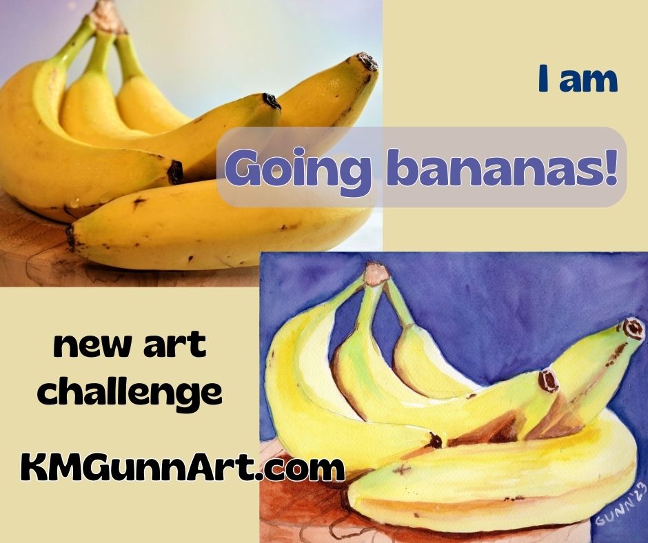
I could not resist jumping in on a quick three-day art challenge over on Fine Art America’s artist discussion board. Like most of the art challenges over there, this one has a theme: banana(s). I have thought about doing a series of banana-themed fruit still life like my Apples and Oranges series for a while, so I figured this was my cue to just do it. Just to be cute, I am calling this short series “Going bananas!” and intend to execute it in classic still life format as I see it.
(I should note that I have not abandoned the 100 faces challenge. I am only taking a quick side-quest, as the DnDers would say. I’ll also say that I successfully completed the challenge, and just need to get caught up on blogging it.)
Finding paintable reference photos
I’ve probably mentioned before that what makes for a good painting reference is not always what makes a good photograph. Hunting up some reference photos to use proved that – most have softer lighting so the subject can be seen as well as a two-dimensional image can allow. A good painting, on the other hand, works best with dramatic lighting, with a single light source ideally. Dramatic lighting produces dramatic shadows, which a lot of photographers seem to avoid. I did manage to find three photos with a more or less classic still life arrangement … and one that is more of a wild card that I may do as a bonus.
Setting some clear objectives
I wanted to do this short (and fun) art challenge with some pre-defined objectives, which is military for goals. (The cranky old Army sergeant in me still rises to the surface from time to time.) I knew I wanted to do somewhat traditional fruit still life paintings, so that cried out for a mostly-traditional medium. Since I hadn’t used my watercolor paints in quite a while, this seemed the perfect excuse to work in watercolor. I did choose to use more modern pigments, and am happy with the results.
Since only one of my reference photos had anywhere near the level of drama in its lighting, another objective was to see if I could adjust for that on my paper.
My final objective was to utilize complementary colors: the obvious yellow/purple, but also some red/green where I could.
Painting the bananas in my still life
With my objectives in mind, I went to work. This first painting simply FLOWED from first my pencil, then my paintbrush. It was one of those days when every step went smooth as silk. In fact, I started the sketch at approximately 1030 and was waiting for the paint to dry so I could scan it before 1530! Only five hours from start to finish, including drying time, is a quick and easy watercolor painting for me.
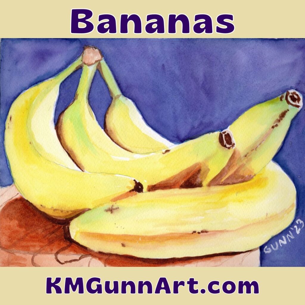
Hubby says he loves how the green looks on the bananas, with the comment that this small bunch looks exactly like what I search for in the grocery store – still a touch green. To contrast with the green, I chose to paint the plate as a reddish wood, instead of the really light color in the photo.
Overall, I am VERY pleased with how this one turned out. I feel I nailed both the color and the lighting, though I should probably at some point practice painting wood grain, as that is the only part that I think needs improvement. It scanned even better than it looks in person (to my eye; hubby disagrees) which is unusual for my work. Personally, I think my painting is better than the photo I used for reference.
All in all, a good start to this new art challenge.
How to purchase!
If you have the right space for the 9 by 12 inch original painting, then click over to the listing at Daily Paintworks to handle the transaction. It’s likely quicker than trying to hunt me down when I am in a mood to be unplugged.
Need a bigger and bolder version? I have art prints available through my Pixels shop ranging from as small as 8 by 6 inches to as large as 60 by 45 inches, so that should cover most walls quite nicely. You can also get jigsaw puzzles through this link.
Want to wear my art, like my mother and sister prefer? Click through to see the options at my RedBubble shop. There are also some home accessories – and yes, my favorite is still the analog clock.
I made a video of this post
Check it out on YouTube, give it a like and share!