Pink for Breast Cancer Awareness month

Yesterday was the first of October, but it didn’t really click for me until I ran into town to pick up some critter feed and saw a couple of businesses with the flocks of plastic pink flamingoes: October is breast cancer awareness month, and locally that means it’s time for Pink-Out Putnam again. Local participating businesses will not only decorate with the standard pink ribbons, but since this is Florida it means there will be a population explosion of those wonderfully tacky plastic pink flamingo yard ornaments.

Along with pink being one of my favorite colors to wear, and flamingoes being one of my favorite birds to paint, there is a darker personal connection for me. Both of my mom’s sisters and my dad’s surviving sister have all gone through breast cancer diagnosis and treatment. Thankfully, all three are still alive to tell about it, but having women on both sides of my family get diagnosed leaves me at a higher risk of developing this myself. (For the record, my appointment for my next mammogram in early November. VA healthcare system takes this seriously.)

My pink flamingo watercolor series

Last year, I did a series of six watercolor paintings that featured flamingoes in or near water as part of an art challenge, which included my first place winning Flamingo in Rippled Water. I’ll be taking the series to various local businesses to see if any new small mom-and-pop places would like to display them.

Pink flower paintings

Pink flowers are also on my list of favorite things to paint, and I have some of those to share for this very pink post. I did a cherry blossom watercolor painting this spring, actually a little earlier than they bloomed, but it is very much an annual thing and I love to see photos and paintings of them in March. I also did two pink rose pieces last year: one in watercolor and one in oil pastel. Gathering up the links for this post made me realize I have not yet blogged one of my pink flower paintings yet …

Pink Hibiscus
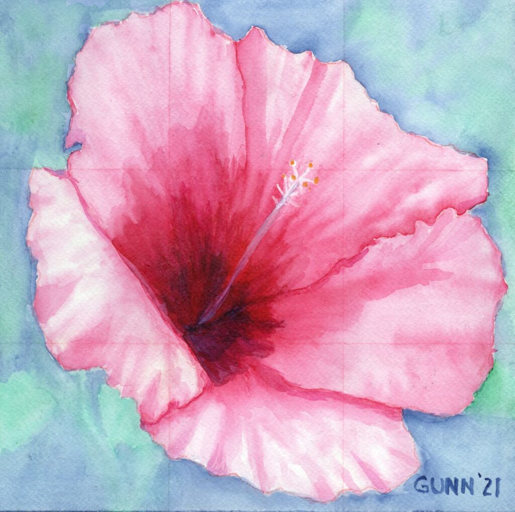
Pink Hibiscus watercolor painting by Katrina Gunn
Pink Hibiscus, 10 x 10 inch watercolor painting, original available $100 USD

First things first: yes, if you look closely you can see the grid I used for sketching the proportions out properly. I had used a red watercolor pencil to do this, thinking when I painted over it would dissolve. It was a lesson learned. Not all pigments in watercolor pencils will disappear with regular application of water. I should note that this was the last time I did my grid-and-sketch directly on my watercolor paper. Now I sketch in one of my sketchbooks and use graphite transfer paper to make my marks on the watercolor paper. The punchline here is that people who see it don’t seem to care. Feedback on this paintings has always been quite positive despite the graphite outline and grid lines showing. I guess folks feel that shows this was painted by a person and not a software program.

Purchase info so you too may “Pink Out” like Putnam

Along with overlooking this piece here on the blog, I had also forgotten to upload it to my gallery over at Daily PaintWorks, which is the online venue where I prefer to sell my original artwork. This has been rectified. I had also forgotten to upload it to my RedBubble shop, but I fixed that as well now, so those of y’all who want your RB swag with this painting can have at it. Finally, for those who want an art print larger (or smaller) than the original 10 by 10 inches can order it at my Pixels shop.

So pick your favorite pink painting for Breast Cancer Awareness month. Please feel free to share this post, because this is an issue that has affected my family … and perhaps yours as well. My county will be decorated to the nines with pink ribbons, pink signs, and of course plastic pink flamingoes everywhere, and I invited everyone to join us! I have at least one new pink flamingo painting in my mind already, so stay tuned.

Working on my artist’s statement

I am in Florida, and we got lucky with the named storm that blew through here. Actually, it didn’t fully blow through as it shifted south. Knowing I would definitely lose my internet access (we are on satellite), and possibly even electric power, I decided to assign myself some hurricane homework for my offline time. I decided it is time to work on my artist’s statement. I do have a simple starting artist statement: “I make art to bring some beauty into this world,” but I feel I need to expand on that.

For the past couple years – since my husband persuaded me to get back into art – I have just made art that makes me happy. Some pieces have succeeded quite well (see this year’s entries into the regional VA Creative Arts Festival) and some I think I need to redo them better, but I picked up a series of articles on crafting a personal vision statement that I printed out and read through while hiding in the house from wind and rain the past couple days.

Vision statement series overview

This series of blog posts or emails breaks down what a vision statement is, why it matters, gives some examples of personal vision statements (including a couple from famous people), and then walks the reader through a four-step process of crafting a vision statement. It’s quite general, since it was written to be broadly applicable, so I intend to work through it here on the blog so anyone who wants to can come along for this small personal journey. I will of course be applying it to the concept of an artist’s statement, which is the lens I am viewing it through, but this can be used in any context.

So what is a vision statement and how is it different from an artist’s statement?

Generally speaking, a vision statement is a tool used by business and organizations to convey their mission, values, and goals succinctly to employees, shareholders, and other parties. It also helps guide decisions to stay in alignment with the overall purpose of the business or group. A personal vision statement – which this series of lessons is focused on – is using this idea on a personal level to focus on goals and values. Sometimes this will include a purpose in life or a desire to leave an impact on this world as your legacy.

An artist’s statement is a more-narrowly defined vision statement. I received a great email on the subject back in the spring from Inside Art, but apparently this is another email-only article. I’ve emailed the author to ask if he’ll post it so everyone can read it, but two very short quotes will get today’s idea across: “An artist’s statement is a paragraph that introduces viewers to a body of your work,” and “Your statement is actually crucial to how art professionals understand, talk about, draw attention to, and attempt to generate interest your work.” If you stop and think about that for more than a minute, you begin to realize that is some serious and heavy lifting for just a sentence or two!

So this is what I am starting: a series of blog posts about crafting a personal vision statement and/or my artist’s statement. I’ll know later in the series if I am doing one or two statements as I work through the steps. I am inviting all y’all (that’s the plural) to join me in this endeavor, either as a fellow participant and traveler or just as an interested spectator. I am happy to share the process here, as it often helps me to get feedback.

Artwork still in progress

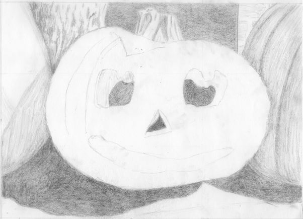
The other thing I intended to work on during the storm was this sketch that I started earlier in the week, only intending it to be a simple line sketch to transfer to my watercolor paper to paint. As I was working on it over the previous weekend, I realized I am enjoying the drawing process so much I just keep going on with it. There are two main limitations to my drawing time, and both are cats in the house. They were both all about cuddling my lap for their comfort while the wind gusted and the rain fell. Here is where I am still at as of this morning:

pencil sketch for new jack o'lantern painting
pencil sketch for new jack o’lantern painting

Behind the storm, we have cooler temperatures and now the sun has even come out with a lovely cool blue sky that reminds me of the watercolor painting I did last December call Make Hay While the Sun Shines. My mom loves the title of this painting, as her parents used this phrase a lot when she was growing up (Grandpa was a farmer all his life) though Mom says I put “too much” sky in this particular piece. I told her that is how it feels down here on a cloudless day.

We didn’t even need to run our generator yesterday because we only lost power from midmorning to midafternoon, so the gas in the fuel cans will likely go into the truck’s tank. Here’s hoping this is our only late-season named storm for the year.

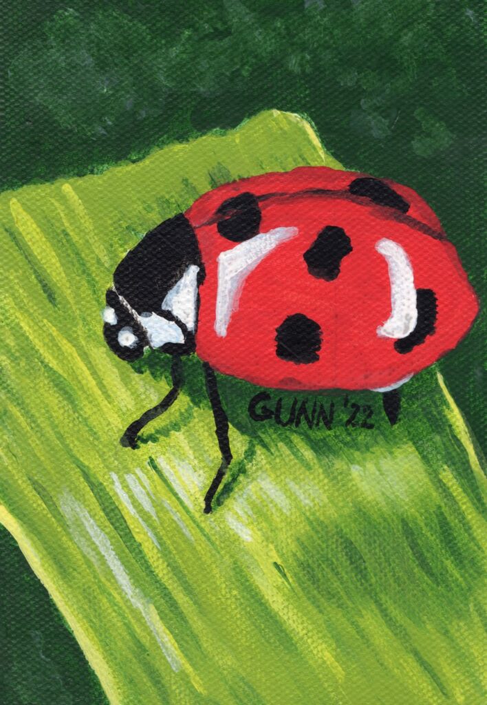
Mostly realistic Ladybug painting only art prints available

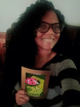
So I finally have a photo from Whitney, who won the June 2022 frame giveaway, with her face and her prize both in frame. She says she loves it. It may not be big – the frame holds only a 4 by 6 inch picture – but she can always look at it knowing she won the frame and was able to request a realistic ladybug painting to go in it. Personalized art is the benefit of working with living artists!

Whitney holding the framed realistic ladybug painting she won
Whitney holding her framed painting

Planning and painting the ladybug

When Whitney entered the giveaway, she had said she wanted some kind of pretty plant – her exact phrase was, “Surprise me!” Once I messaged her to let her know she had won, she changed that to ask if I could paint her a ladybug, as she wanted to use a ladybug as part of her logo. Not a problem, as I already had a reference photo selected for when I got around to doing up some more pretty bugs in my art.

Ladybugs are not complex objects; in fact, compared to butterflies and dragonflies, they are really rather simple until they open their wings. I expected the trick for this painting to be more about getting the blade of grass right, so it looked curved with just the right amount of texture to it.

Ladybug acrylic painting You can order art prints of this, but the original is claimed
Ladybug 4 x 6 inch acrylic painting, prints available

The canvas is from a 6×8 inch canvas pad by Paramount, and seems to have a smooth-enough surface up until I did a bit of drybrushing, then the texture also showed up in the scan. I used the quick-dry acrylic paints that my husband has used for years, and are sold at WalMart under the names Apples Barrel and Folk Art, made by Plaid who also makes Mod Podge that I use to seal my oil pastel pieces. I painted two layers, and thought that was sufficient to cover the graphite pencil lines … but if you look closely at the scan you can just see them on the ladybug’s carapace. I need to remember to do a minimum of three paint layers for the next one.

Realistic ladybug art prints and accessories for sale

The original painting was put into the frame and mailed off in a timely manner – Whitney probably doesn’t realize how significant that statement is. The point is, if you want the original, you’ll need to try to talk her out of it. Personally, I have my doubts anyone will be able to do that within the next decade. You can still order yourself a ladybug art print though! As usual, art prints are available to purchase through my store at Pixels, along with a few printed accessories. If you want to wear my artwork, then check out the apparel options at my RedBubble store.

About Whitney

In addition to being mother to small children, Whitney runs the online business Healing Over Everything. We met on Facebook in a blogging group we both participate in, and she asked for links to her Facebook business page. So, you can check out her Healing Over Everything page on Facebook, and maybe even check out her blog (which I am working on a guest post for).

More pretty insect art from me

If that is not enough bug art for you, Tatiana at GiftSmart has a cute macro photo of an insect on a green leaf that does look like it is laughing.

Entries for this year’s creative arts festival

Y’all recall last year when I placed first in two of the three categories I entered in the regional VA healthcare-sponsored creative arts festival? I am entering again, but this year picking the artwork to enter seemed much more difficult, given I can only enter three pieces again this year. I work in six media categories, not including mixed, and have made multiple pieces in most of those categories in the past year. So I took to Facebook and even Twitter to ask for opinions on which pieces I ought to put in the competition. This actually did not help as much as I hoped.

Oil pastel artwork

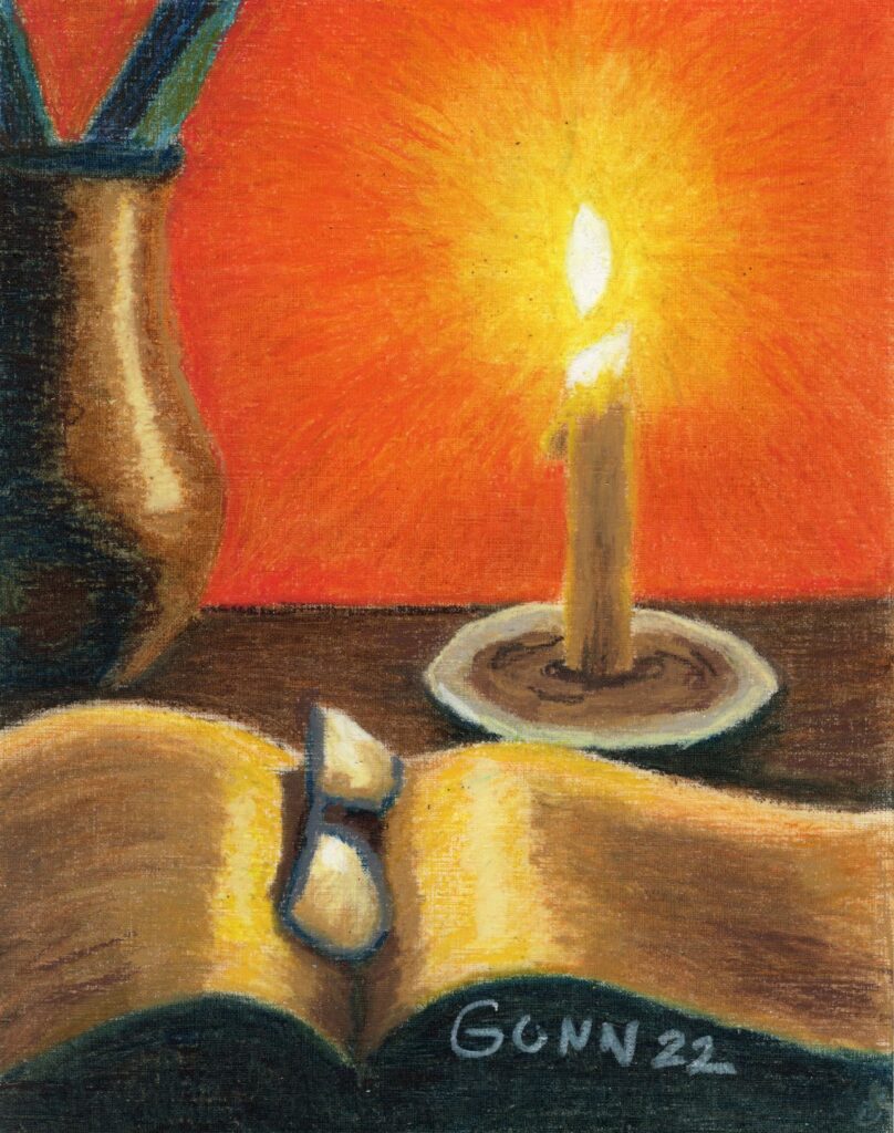
Oil pastels are not judged in the pastel category for this competition, but against oil painting as they define the category to include oil paint, oil sticks (which I have yet to try) and oil pastel. Basically, they want anything that includes pigment with some form of oil to fix it to a surface, which is not limited to canvas either. I felt my two best pieces from the past year are my Sunset Over the Hayfield landscape and my candle still life, Book Reading by Candlelight.

Folks on Twitter preferred the hayfield, while folks on Facebook preferred Candlelight, and when added together the votes were just about a dead heat. Any wonder why I asked for help deciding? In the end, I stopped to think (while milking goats) about the category and potential competition, and went with Candlelight because a bit of the textured paper shows in Hayfield, which might be enough to knock my piece down compared to the more traditional paintings.

Book Reading by Candlelight oil pastel still life
Book Reading By Candlelight oil pastel still life composition

Picking a watercolor painting

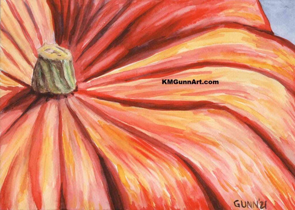
For this category, it was pretty easy for me. I simply love how my Pumpkin Close-Up came out last autumn. Truth be told, I really have not made many watercolor paintings over the past year, and this particular pumpkin one is my favorite of the three I did last fall (even though my mom just loves my Jack O’Lantern).

Pumpkin Close-Up watercolor painting

Picking a charcoal drawing

If y’all have been reading since the beginning of the year, you will know I was on a major charcoal drawing kick that started prior to New Year’s Day and continued through the spring goat kid bottling season. I made quite a few charcoal drawings, both traditional black and the tinted charcoal I am still experimenting with.

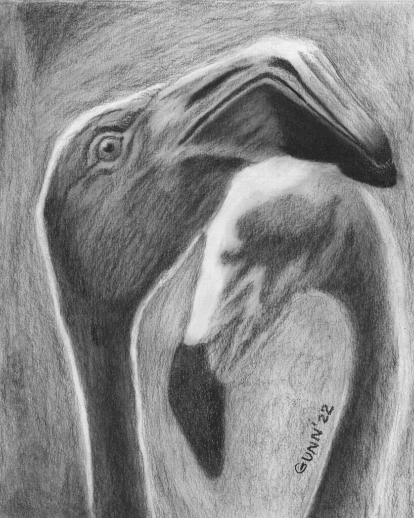
I managed to get my short list down to three, then once again asked on Facebook and Twitter which I ought to enter. The results surprised me. Personally, I had been thinking to enter my Apples 3 still life, but my husband said he really likes my Two Flamingoes. Meanwhile, my Single White Rose (in the same post as the flamingoes) tends to get positive reactions from folks. Both Twitter and Facebook enthusiastically said I should enter the flamingoes, though the rose was in second. What sealed the deal for me was the comments about how flamingoes usually aren’t depicted in black and white, and that I nailed the expression on the front bird’s face.

Two Flamingoes charcoal drawing

So, there we have it: my three entries to this year’s creative arts festival. I sent them off this morning, because today is the deadline. For whatever reason, I seem to always wait until the last day to enter. Perhaps it ties in with my usual answer when asked what I think my best piece of art is. My answer is always, “The next one.”

Update with results

(December) Results are finally back, and that required its own post because all three placed!

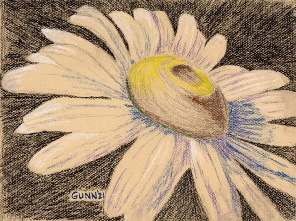
Ox-eye Daisy drawing in charcoal and pastel pencil

I actually drew this ox-eye daisy for an art challenge back in June of 2021, but it got lost in the shuffle along with the horse head drawing in black charcoal I call Bridled. In fact, I drew it prior to Bridled, first piece of artwork for that challenge, and initially was not so pleased with it because it looks a bit different than previous drawings, even of flowers. At the time, I thought this was more of an experiment in mixed dry drawing media that didn’t turn out as well as I hoped, as it was the first time I mixed black traditional charcoal with splashes of color from pastel pencils, all on toned paper.

Inspiration behind the drawing

The inspiration behind this drawing is actually quite simple: I hadn’t drawn a daisy in ages, and wanted to see what I could do with it. I had recently purchased the Canson Mi-Tientes assorted colors pad, marked as being for pastels in particular though I had used a sheet for my Blue Dragonfly I did in colored pencil. So with an idea in my mind, I next went to Pixabay to hunt for a reference photo that I wanted to use, in the process creating a folder of nothing but daisies photographs. (Trust me when I say, there will be many more daisies in my artwork!) I found this one, then cropped it to my satisfaction, and then it was a matter of making marks with the traditional black charcoal until it looked like a daisy.

charcoal and pastel pencil drawing Ox-Eye Daisy
Ox-Eye Daisy, 9 x 12 inch charcoal and pastel pencil drawing, original available $100 USD

Experimenting with color alongside the charcoal

Not satisfied with just black marks on the toned paper, I then decided to mix my dry media, just to see how I liked the result. I had a small set of eight pastel pencils that came with a twenty-some year old drawing set, the kind that tends to sell well around the end of the year, and the set has white, yellow, blue, and a medium purple. I purchased a sepia toned oil charcoal pencil to try out, and used that for the shading on the ox-eye center. Then I fiddled some more with the shadows on the petals, first with blue, then with purple, then added in the white highlights, but leaving the midtone areas blank to allow the paper’s tone to show. Lastly, I picked up the bright yellow and used that for the highlights on the top of the flower’s center.

Purchase links for Ox-Eye Daisy drawing

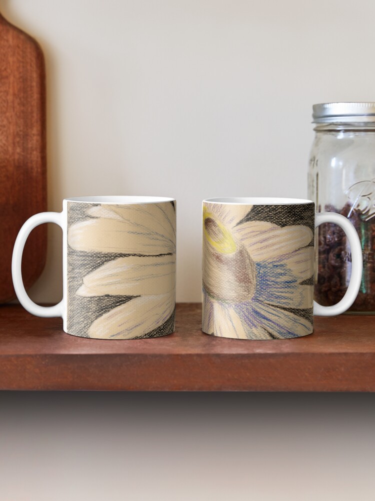
The 9 x 12 inch original drawing is available through Daily Paintworks here. If you’d like a smaller or larger art print for your wall, you can order what prints you need through my Pixels store. If you’d like this printed on apparel or accessories, check out the various swag at my RedBubble shop. Personally I think it looks best on the classic coffee mug:

two mugs on a shelf showing both sides of the print design Ox-eye Daisy
my mixed dry media drawing Ox-eye Daisy on a classic mug at RedBubble

Evolution of my feelings about this drawing

As I have hinted at throughout this post, my feelings about this experimental drawing have changed over the fifteen months since I made it. Now when I look at it, I get the subtle impression of movement – and given the floral subject, that movement feels like a very gentle swaying in the slightest of breezes, almost nodding a greeting to the sun’s rays that must be hitting the flower in spots where I put the white on the petals and the bright yellow of the center. Usually I have all the subtlety of a wrecking ball, and am notorious for not picking up on hints, so this change surprised me when I reviewed this in preparation for the daisy challenge this summer.

More daisy artwork since then

It has not been that long since I did the short three day art challenge with the challenge theme being daisies, but I thought this was a good spot to mention those for newer readers. Working backwards, and very much related to this piece, is my Daisies in tinted charcoal. The day prior I did a single daisy in watercolor using only four colors, though if I redo that one I will see how it looks with only three colors. To start the challenge, and cover down on a different art challenge from a different source, I did a blind contour drawing of a partially-painted daisy that is still (!) on the easel, waiting for me finish. It made a good model to stare at as I drew without looking at the sketch pad. If you are trying to parse that statement … just go read the post. Seriously, blind contour drawings are an “in-context” thing.

Finally, here’s a small selection of daisy photos from Bob Decker’s blog archive. He seems to have just about every angle covered for this one flower.

As a final thought, here is a very accurate article from Inside Art about the truth behind a quote attributed to Edgar Degas: “Painting is easy when you don’t know how, but very difficult when you do.” It hit my inbox last evening, and boy howdy did it resonate with me! Something to think about as I settle in to work on more art today.