Ox-eye Daisy drawing in charcoal and pastel pencil

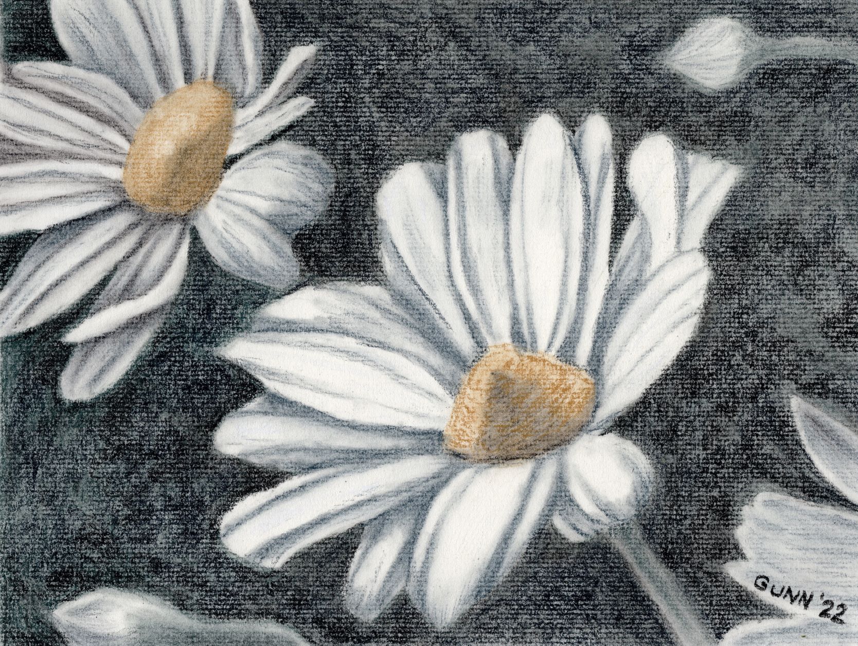
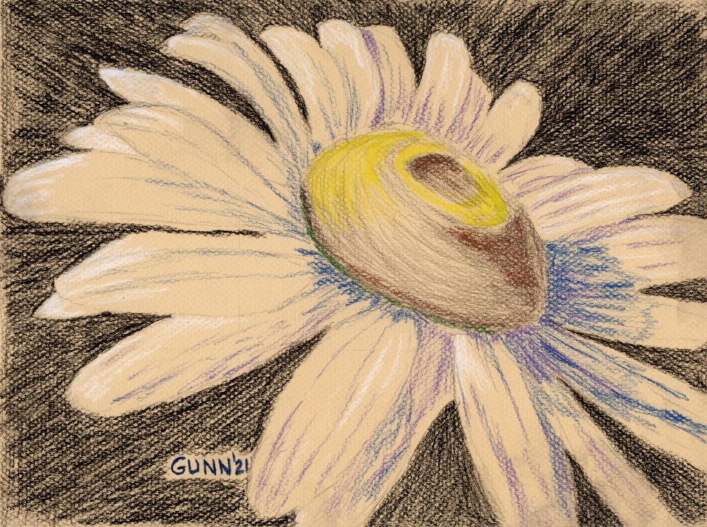
I actually drew this ox-eye daisy for an art challenge back in June of 2021, but it got lost in the shuffle along with the horse head drawing in black charcoal I call Bridled. In fact, I drew it prior to Bridled, first piece of artwork for that challenge, and initially was not so pleased with it because it looks a bit different than previous drawings, even of flowers. At the time, I thought this was more of an experiment in mixed dry drawing media that didn’t turn out as well as I hoped, as it was the first time I mixed black traditional charcoal with splashes of color from pastel pencils, all on toned paper.

Inspiration behind the drawing

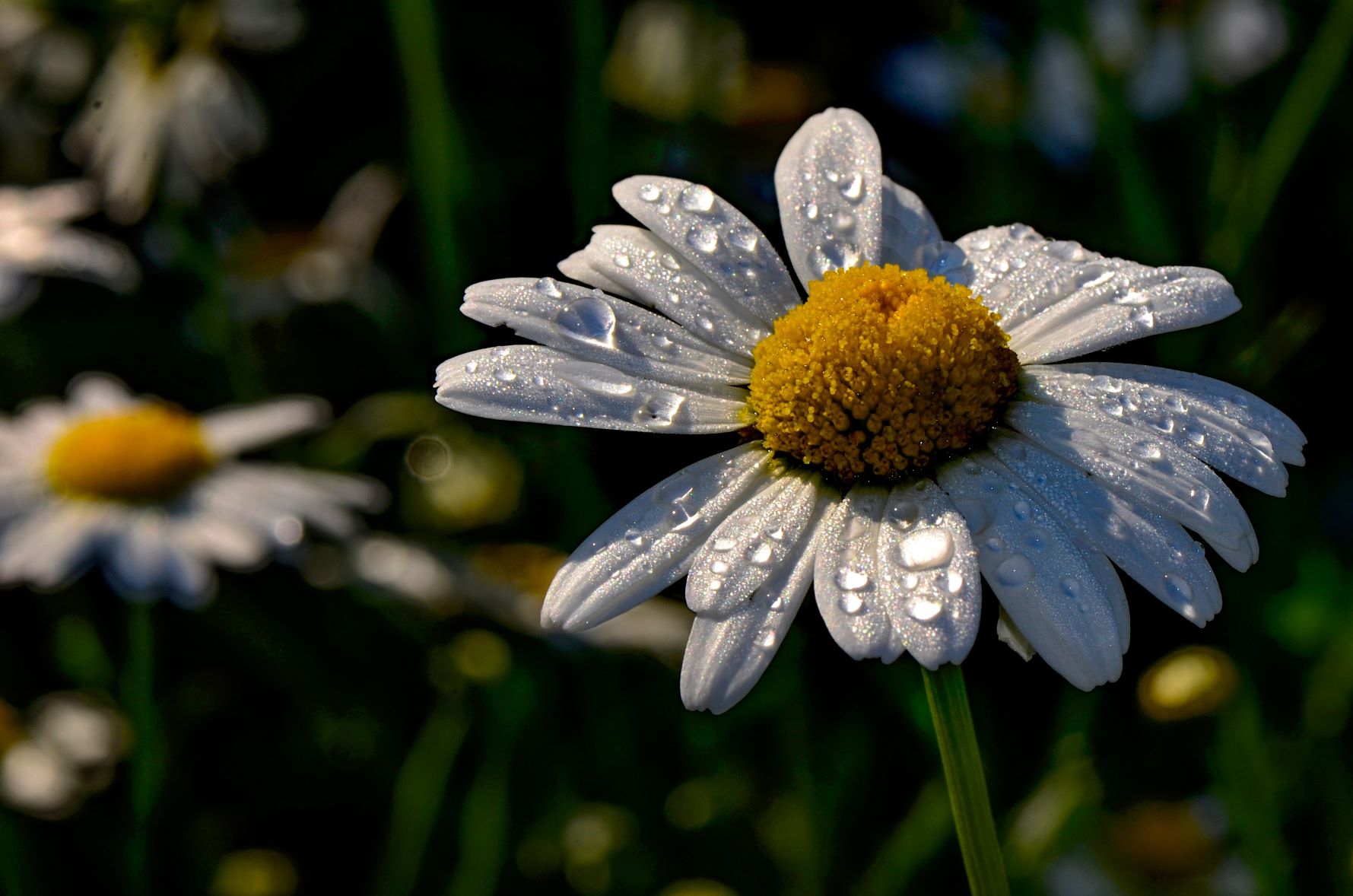
The inspiration behind this drawing is actually quite simple: I hadn’t drawn a daisy in ages, and wanted to see what I could do with it. I had recently purchased the Canson Mi-Tientes assorted colors pad, marked as being for pastels in particular though I had used a sheet for my Blue Dragonfly I did in colored pencil. So with an idea in my mind, I next went to Pixabay to hunt for a reference photo that I wanted to use, in the process creating a folder of nothing but daisies photographs. (Trust me when I say, there will be many more daisies in my artwork!) I found this one, then cropped it to my satisfaction, and then it was a matter of making marks with the traditional black charcoal until it looked like a daisy.

charcoal and pastel pencil drawing Ox-Eye Daisy
Ox-Eye Daisy, 9 x 12 inch charcoal and pastel pencil drawing, original available $100 USD

Experimenting with color alongside the charcoal

Not satisfied with just black marks on the toned paper, I then decided to mix my dry media, just to see how I liked the result. I had a small set of eight pastel pencils that came with a twenty-some year old drawing set, the kind that tends to sell well around the end of the year, and the set has white, yellow, blue, and a medium purple. I purchased a sepia toned oil charcoal pencil to try out, and used that for the shading on the ox-eye center. Then I fiddled some more with the shadows on the petals, first with blue, then with purple, then added in the white highlights, but leaving the midtone areas blank to allow the paper’s tone to show. Lastly, I picked up the bright yellow and used that for the highlights on the top of the flower’s center.

Purchase links for Ox-Eye Daisy drawing

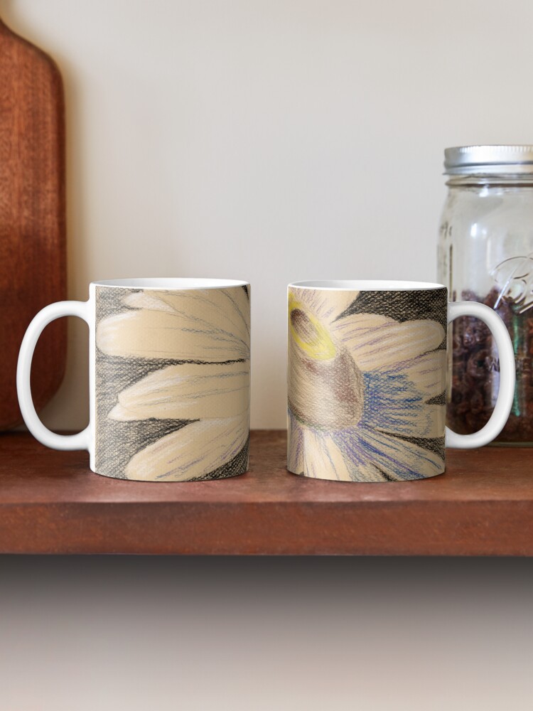
The 9 x 12 inch original drawing is available through Daily Paintworks here. If you’d like a smaller or larger art print for your wall, you can order what prints you need through my Pixels store. If you’d like this printed on apparel or accessories, check out the various swag at my RedBubble shop. Personally I think it looks best on the classic coffee mug:

two mugs on a shelf showing both sides of the print design Ox-eye Daisy
my mixed dry media drawing Ox-eye Daisy on a classic mug at RedBubble

Evolution of my feelings about this drawing

As I have hinted at throughout this post, my feelings about this experimental drawing have changed over the fifteen months since I made it. Now when I look at it, I get the subtle impression of movement – and given the floral subject, that movement feels like a very gentle swaying in the slightest of breezes, almost nodding a greeting to the sun’s rays that must be hitting the flower in spots where I put the white on the petals and the bright yellow of the center. Usually I have all the subtlety of a wrecking ball, and am notorious for not picking up on hints, so this change surprised me when I reviewed this in preparation for the daisy challenge this summer.

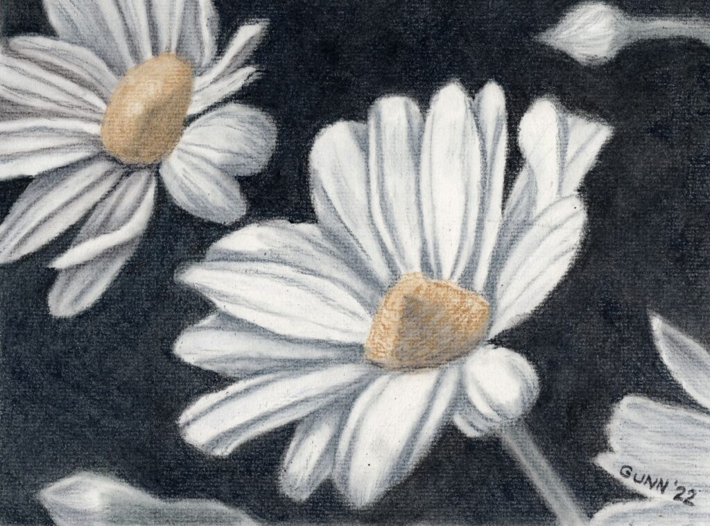
More daisy artwork since then

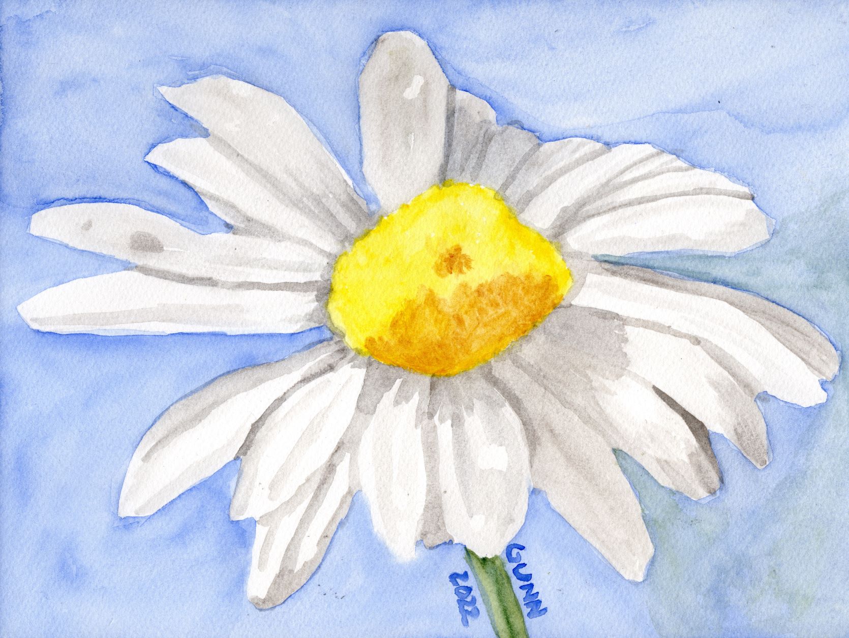
It has not been that long since I did the short three day art challenge with the challenge theme being daisies, but I thought this was a good spot to mention those for newer readers. Working backwards, and very much related to this piece, is my Daisies in tinted charcoal. The day prior I did a single daisy in watercolor using only four colors, though if I redo that one I will see how it looks with only three colors. To start the challenge, and cover down on a different art challenge from a different source, I did a blind contour drawing of a partially-painted daisy that is still (!) on the easel, waiting for me finish. It made a good model to stare at as I drew without looking at the sketch pad. If you are trying to parse that statement … just go read the post. Seriously, blind contour drawings are an “in-context” thing.

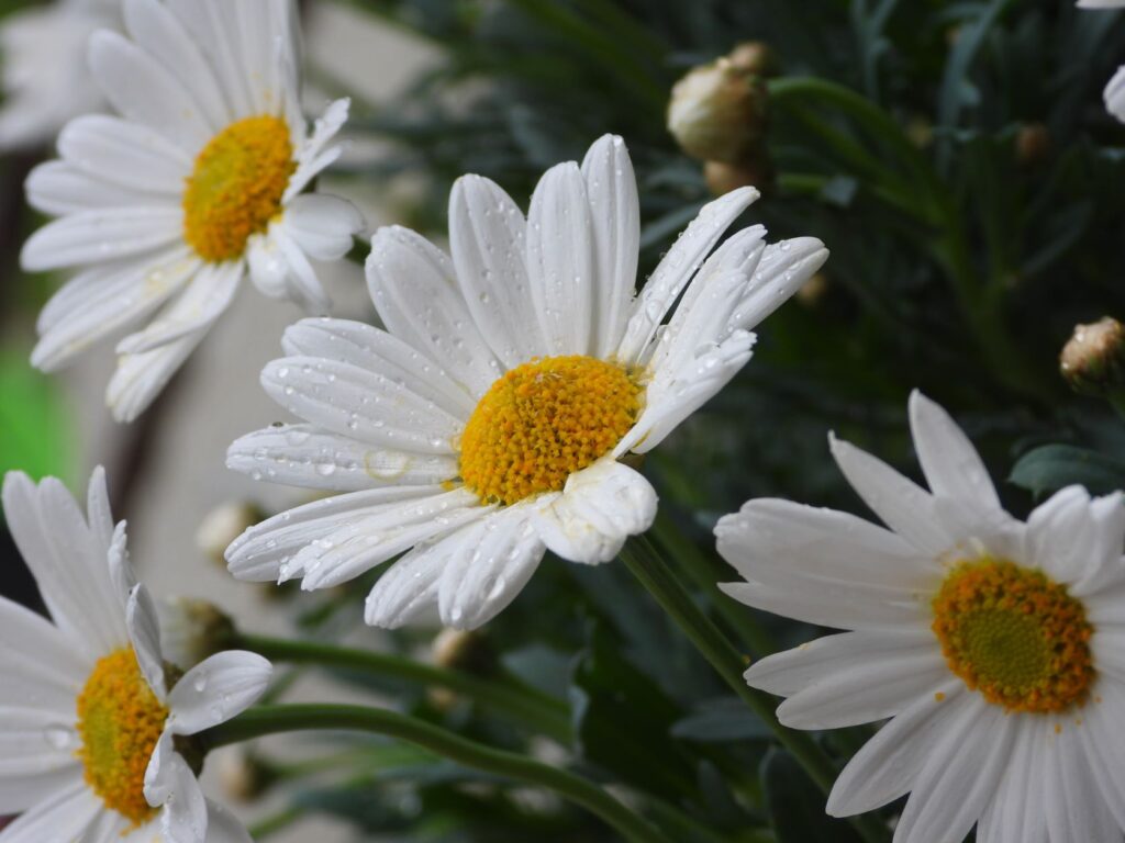
Finally, here’s a small selection of daisy photos from Bob Decker’s blog archive. He seems to have just about every angle covered for this one flower.

As a final thought, here is a very accurate article from Inside Art about the truth behind a quote attributed to Edgar Degas: “Painting is easy when you don’t know how, but very difficult when you do.” It hit my inbox last evening, and boy howdy did it resonate with me! Something to think about as I settle in to work on more art today.

Feature Friday 6: Summer sunflowers

It’s almost August, and summer is in full swing here in humid Florida! We come into the house after morning chores totally soaked with sweat, and have about six to eight weeks more of that to look forward to. According to the news, we aren’t the only ones this year. While it is past the time for sunflowers to bloom here in the very deep south, apparently they are blooming in parts to my north. Honestly, here in the US is there anything that says summer like big, blooming sunflowers?

Summer sunflowers

our volunteer sunflower plant earlier this summer

Kicking off the Friday features are a pair of posts all about sunflowers, complete with enough good photographs to make up for the snapshots I am inflicting upon y’all.

  • Bill Swartwout started it with this collection of recent sunflower pictures. He even includes some interesting facts about sunflowers, which appeals to my inner geek in a major way.
  • Also feeling the sunflower power, Bob Decker shares his recent sunflower photos from North Carolina, along with the mention that sunflowers were a part of the “three sisters” gardening by native tribes.
volunteer sunflower next to the chicken fence
volunteer sunflower amid the volunteer squash in the compost pile

More art blog features for your summer reading pleasure

Getting back to my Friday features from around the art blogosphere, I think this is the perfect place to continue a conversation that started in the comments of my post about my Daisies in tinted charcoal, then Steven expanded his thoughts and added photo examples for a full blog post on how much software editing is considered fair game in fine art photography. If that wasn’t enough, he seems to be exploring his software filters and asks which filter is better for a photograph of an historic and landmark brick building on campus near him, then applies a completely different filter to some photos from his recent trip to Alaska. I find it soothing to see someone else who thinks about his art as much as I think about mine. More feature links:

  • Anne Haile has an intriguing post about the ancient language of flowers. While I’ve known that various flowers have had specific meanings throughout history, but particularly in Victorian England, I’ve not explored that topic with my usual geek intensity yet. I really need to research this, as it has some very interesting application to floral painting.
  • Jim Cook from HotShot PhotoGuy caught some fascinating photos of some eastern bluebirds – first two males squabbling over who would nest with the female, then the happy couple nesting in a wooden birdhouse he has.
  • Sharon Popek has done more book-themed photo compositions that involve multiple photos, including using her edition of Fanny Farmer’s Cookbook, one I have on my cookbook shelf as well (great resource, if you ask me). I would never have thought of doing photo mashups like that, but that is what makes the art world so interesting!
  • PencilPaws has a new drawing, this time an apparent family of monkeys from Bali. She used tinted graphite, which I have seen at the art store and looks similar to my tinted charcoal. She has the patience to do the finely detailed lines of the fur, so be sure to check it out.

Final thoughts – I need to draw and paint some sunflowers

Writing up this post made me realize that while I like sunflowers, and have joked about having “sunflower envy” in the past, I have not yet made any drawings or paintings featuring these lovely cheerful flowers! (Insert shocked gasp here.) I know all spring just about everyone and anyone was doing up sunflowers as the national flower of Ukraine, which is actually a bit odd considering sunflowers are a new world plant and did not appear in Europe until after the 1500s (similar to the potato and its association with Ireland among other European countries). I remember thinking at the time that if I did one it would surely get lost in the shuffle, but I don’t have any excuse for prior to that despite having several potential reference photos saved at Pixabay.

The big takeaway here is that I should try my pencil and brush at doing a bit of sunflower-themed artwork. It is definitely on my to-do list now. I have an oil pastel flower piece currently in progress, and I do have some artwork that I still have not blogged, so I need to try to keep out of the summer doldrums and just power through, sweaty mess and all.

Calla Lilies 3 drawing in tinted charcoal

I’ve been battling a summer slump, but Sunday afternoon it suddenly cleared and I grabbed my rather-quick graphite sketch of three calla lilies in my sketchbook and decided to clean up the lines and finish the drawing in tinted charcoal.

When my husband heard the familiar rasp of a pencil moving across paper, he got up to see what I was working on, then he started snapping photos of the piece to record the process and progress layer by layer.

Starting with the darkest dark

first in-progress photo, starting with the  background
starting with the background, using a dark blue tinted charcoal

For this drawing, I decided I would use black on the background, for at least one layer. I started with the background, because it helps me to get the darkest portion on the white paper first. While I am not sure this will explain it adequately to the nonartists out there, when starting with a white blank page it helps me to have the opposite extreme of the value scale to then be able to visualize all the middle values once the two extremes are there.

darkening the background with a layer of actual black charcoal

It took three layers to get the rich, deep dark I wanted: one layer of dark blue, one layer of black, then one layer of dark purple. I should probably point out that even when I work with only traditional black charcoal, it still takes about three layers to achieve the contrast in values the Italians call chiaroscuro (literally translated as “light-dark”) that makes a good charcoal drawing so eye-catching.

Adding the leaves and stems with green tinted charcoal

starting to shade in the leaves and stems with green tinted charcoal
starting to add in the green tinted charcoal

Once the background looked dark enough, after three color layers (dark blue, black, dark purple) it was time to start on the leaves and stems. I used the medium green from my big set of tinted charcoal, and tried to keep it from being too dark so it didn’t blend into the background. I wanted the greenery to only cover the middle range of values.

Starting to shade the white calla lilies

beginning shading the white calla lilies with a light purple
starting to shade in the white calla lilies

Even before I had the greens shaded in completely, I decided to start putting in the shadows on the white calla lilies. Shadows on white flowers are often either a blue tint or a purple tint, and I chose the lighter purple (labeled lavender) for this drawing, mostly to contrast nicely with the yellow ochre of the main flower’s stamen. Purple and yellow are opposite on the color wheel, and really look nice, as a look through my portfolio of work will show. (See Electric Yellow Rose for a good visual.)

adding the yellow ochre to the center of the main calla lily
Adding the yellow ochre to the main calla lily, and it is starting to really look nice

Finishing the drawing

At this point, it was just a matter of intensifying some of the colors, since the tinted charcoal set is more about subtle colors than bright, high-chroma or saturated color. It’s a bit of a seesaw, where I added more tinted charcoal to one section, then look to make sure the rest are in balance with it. Rinse and repeat however many times necessary – and this time it didn’t take as much fiddling and fussing to get to a point where I decided to call it done.

Calla Lilies 3, drawing in tinted charcoal, prints available
Calla Lilies 3, drawing in tinted charcoal in sketchbook, prints available

Since this is in my well-worn sketchbook, the original is not for sale. The corners on this sketchbook are quite rounded at this point. The scan came out very nicely, so prints are available through my Pixels store, while the various apparel and accessories are up at my RedBubble shop.

I have already started a similar piece, this time using my oil pastels (which is just about the polar opposite of charcoal drawing!) on some larger paper. I am still thinking about trying to do this in watercolor at some point as well, just not sure when. Calla lilies are just visually interesting for me, and I confess I have fallen in love with this flower since the first time I did the white on black drawings last year.

Daisies drawing in tinted charcoal

Now, to wrap up the three day daisies art challenge from last weekend. For the third day, I decided to do multiple daisies instead of another solo daisy study, and it was high time I did something significant with my Derwent tinted charcoal set that I’ve mentioned before. Before I show the result, I want to mention that I did not use a black charcoal at all for this piece, despite how it may look. I used two shades of green, two shades of blue, a yellow ochre shade called sand, a medium brown they call driftwood, and white charcoal for the highlights. I drew the preliminary sketch in that trusty old sketchbook, which ought to be full by summer’s end, and then transferred the contour sketch to my good charcoal paper, Strathmore 500 series with laid texture in what they call a natural white and what I call a warm white.

first version of Daisies, tinted charcoal on paper
Daisies, tinted charcoal drawing on paper, before darkening the background

Looking at the scan, I could probably have worked the dark on the background in a little better, to push the value contrast (the fancy art term is chiaroscuro, which is Italian for “light-dark”) that gives charcoal drawings their visual impact. In fact, now that I have seen that, I cannot unsee it and therefore must fix it.

Two charcoal layers later

Okay, I am back now. I think this is an improvement, though I am staring to feel tempted to just grab a soft black traditional charcoal pencil or stick to seriously darken that background up, despite starting this wanting to use only the tinted charcoal.

Final version of charcoal drawing Daisies
Daisies, tinted charcoal drawing on paper (darker final version), 12 by 9 inches, original available $100 USD

The reference photo

I almost forgot to include the reference photo I used from Pixabay. As y’all can see, I cropped it to simplify the composition and took my usual amount of artistic license after that.

photo of multiple daisies
original photograph

Links to purchase

Now that I have fiddled with it a bit more, time for the links y’all will need. If you want the original in all its dusty glory (and that is with a couple layers of fixative spray) and have the right spot and frame, you can purchase the unframed drawing through Daily Paintworks. You can order larger or smaller prints through my Pixels subdomain, with some fun swag as well. For an even-larger variety of apparel and accessories, browse my RedBubble shop.

Final rambling thoughts

If anyone is wondering what took so long for me to post the last piece of the daisy art challenge, I decided to move the blog to a new host and it did not go smoothly. I spent an entire weekend banging my head against vague error codes, and once it was finally done I did not want to even look at the blog for a couple days. Now I will be going back and revising all my previous posts, since I now have more tools to use.

Meanwhile, I feel like I have fallen even further behind. I have another new artwork to show off – the painting for my June 2022 frame giveaway, which I mailed off today – and forgot to get a snapshot of before I packed it up. I still have the last candlelight piece to post here as well as finding some more small watercolors from before I was blogging anywhere, so plenty more art-blogging to come.

Daisy watercolor painting in only four colors

While I am behind on blogging it, I did finish up the three-day daisy art challenge. Before I start in with the second day’s daisy watercolor painting, I thought I would share a comment left on my Pixels page for the blind contour daisy drawing that made me chuckle. Fellow challenge participant Karen Kasper remarked that it reminds her of a Pablo Picasso drawing, and she suggests I get a better image of it so it could potentially be a bestseller on the site. (I should probably clarify she means Picasso’s later work – he started out classically trained and did wonderfully detailed representational drawing and painting, but later followed his muse to something completely different.) I intended to replace the blind contour with the acrylic painting I was looking at while drawing it, but in light of Karen’s comment I may leave it up.

Next daisy artwork, a watercolor painting

Now to move on to day two of the three day art challenge focused on daisies as its theme. I knew I wanted to do at least one daisy painting in watercolor, so Sunday after sketching out a single flower, I transferred the outline to the first cold press watercolor block I picked up and then sorted through my watercolor paints to see how few tubes of paint I would actually need. I am up to three brands of watercolor paint now: the Mijello Mission Gold paints that I discovered in late 2020, that are excellent for beginners because they don’t run across cold press paper as much as other brands; the Turner paints that don’t lift as easily as Mijello, run at a medium rate, and have always been in stock over at Jerry’s Artarama each time I’ve looked; and my new brand, QoR from Golden (more about this brand later). I had purchased a bottle of QoR’s synthetic oxgall to make my Mijello paint run better for backgrounds, and holy cow does it make the Turner paint really spread, so I knew this would be my most unpredictable paint to work with wet-on-wet. (Note to self: this probably makes no sense to anyone who has not painted with watercolor paint. Must write a post on what all this means.)

Choosing the specific watercolor paints

I ended up with only four tubes of paint: Turner ultramarine blue for the background (because daisies need either a green or a blue background), Turner permanent yellow and transparent yellow oxide for the center of the daisy and to mix with the blue for the bit of stem, then QoR’s ardoise gray for the shadows on the petals. Just don’t ask me to pronounce that name. I wanted to get the paint done while cats were napping, and succeeded, so I was pleased with the result.

watercolor painting of single daisy flower using only four colors
Four Color Daisy watercolor sketch, 9×12 inches on paper, $80 USD original available

The one thing that sticks out to my eye is that the transparent yellow oxide (yellow ochre for all intent and purpose) does not go well with the permanent yellow in the flower’s center. I probably could have gotten away with mixing the grey and permanent yellow together to achieve a more-harmonious shadow for that part, and I may do it over doing just that sometime this summer.

Links to purchase

The 9 by 12 inch original is available through Daily PaintWorks, as usual sealed with Dorland’s wax medium. If you want a larger print, those are available through my Pixels store, along with greeting cards and some accessories. RedBubble apparel, accessories, and swag is here.

The starting photo

For those curious, the reference photo I used is this one from Pixabay. When I look for a reference photograph, I don’t worry about the shot’s composition, just lighting and subject, because as you can see I crop it to what would make a good painting or drawing to my eye.

the reference photo for my Four Color Daisy

I suppose my lack of reverence for the original photo is a product of my total lack of photography skills – I’ve received valid criticism of my wildflower snapshots, but the simple fact is I am not much of a photographer. If I am going to do a fine art image, that will require something other than a camera. Once again, all I can say is I am so glad digital cameras were invented, or I would still be wasting money and resources on film developing.

Still one more daisy picture from the challenge, then I will need to post up one I did last summer for a 30 day drawing challenge I ended up dropping out of about halfway through, and of course I will need to finished the acrylic painting I used for the blind contour drawing, so there will still be plenty more daisy artwork in the near future.