
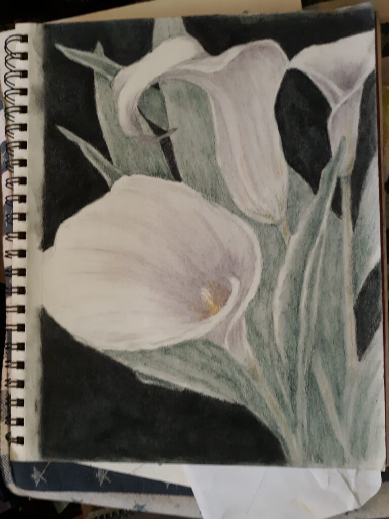
I’ve been battling a summer slump, but Sunday afternoon it suddenly cleared and I grabbed my rather-quick graphite sketch of three calla lilies in my sketchbook and decided to clean up the lines and finish the drawing in tinted charcoal.
When my husband heard the familiar rasp of a pencil moving across paper, he got up to see what I was working on, then he started snapping photos of the piece to record the process and progress layer by layer.
Starting with the darkest dark
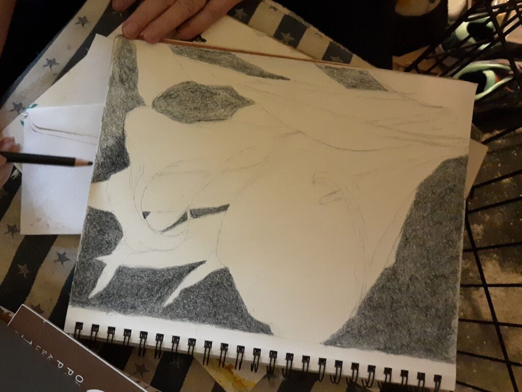
For this drawing, I decided I would use black on the background, for at least one layer. I started with the background, because it helps me to get the darkest portion on the white paper first. While I am not sure this will explain it adequately to the nonartists out there, when starting with a white blank page it helps me to have the opposite extreme of the value scale to then be able to visualize all the middle values once the two extremes are there.
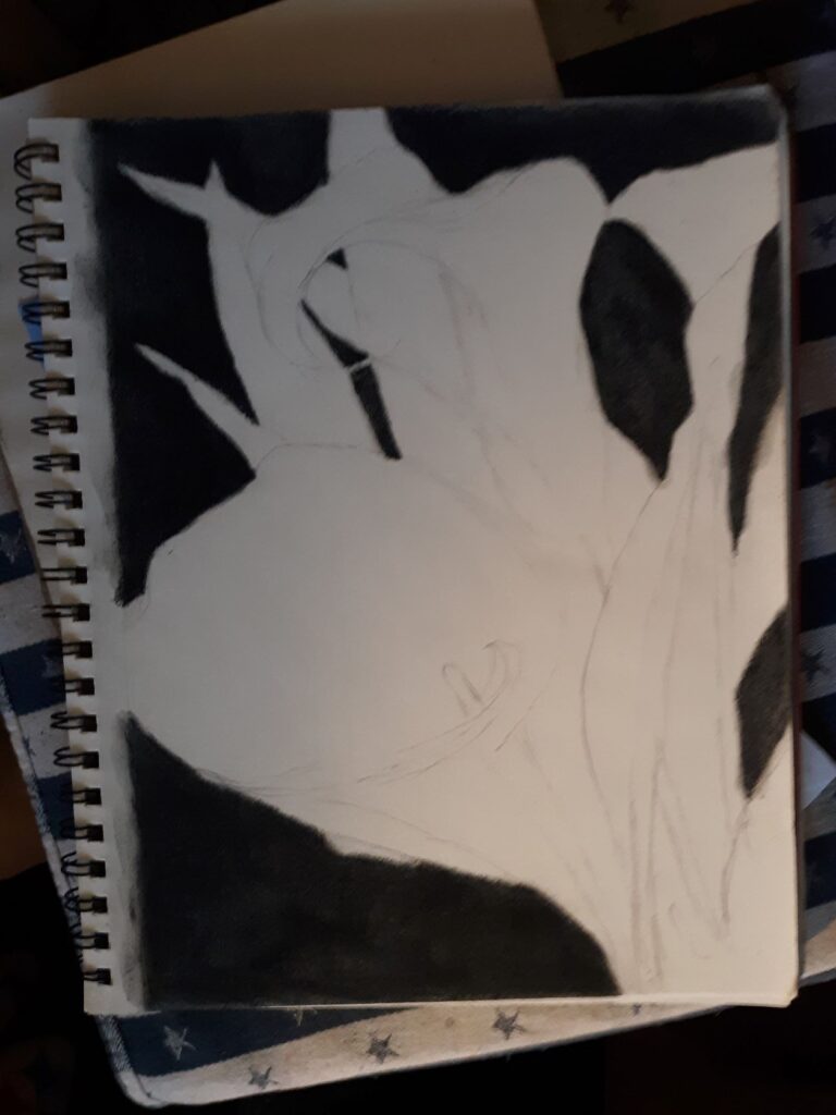
It took three layers to get the rich, deep dark I wanted: one layer of dark blue, one layer of black, then one layer of dark purple. I should probably point out that even when I work with only traditional black charcoal, it still takes about three layers to achieve the contrast in values the Italians call chiaroscuro (literally translated as “light-dark”) that makes a good charcoal drawing so eye-catching.
Adding the leaves and stems with green tinted charcoal
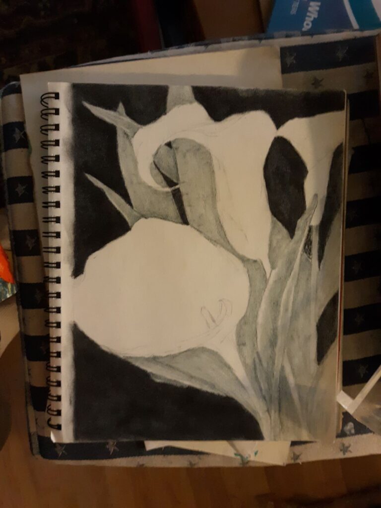
Once the background looked dark enough, after three color layers (dark blue, black, dark purple) it was time to start on the leaves and stems. I used the medium green from my big set of tinted charcoal, and tried to keep it from being too dark so it didn’t blend into the background. I wanted the greenery to only cover the middle range of values.
Starting to shade the white calla lilies
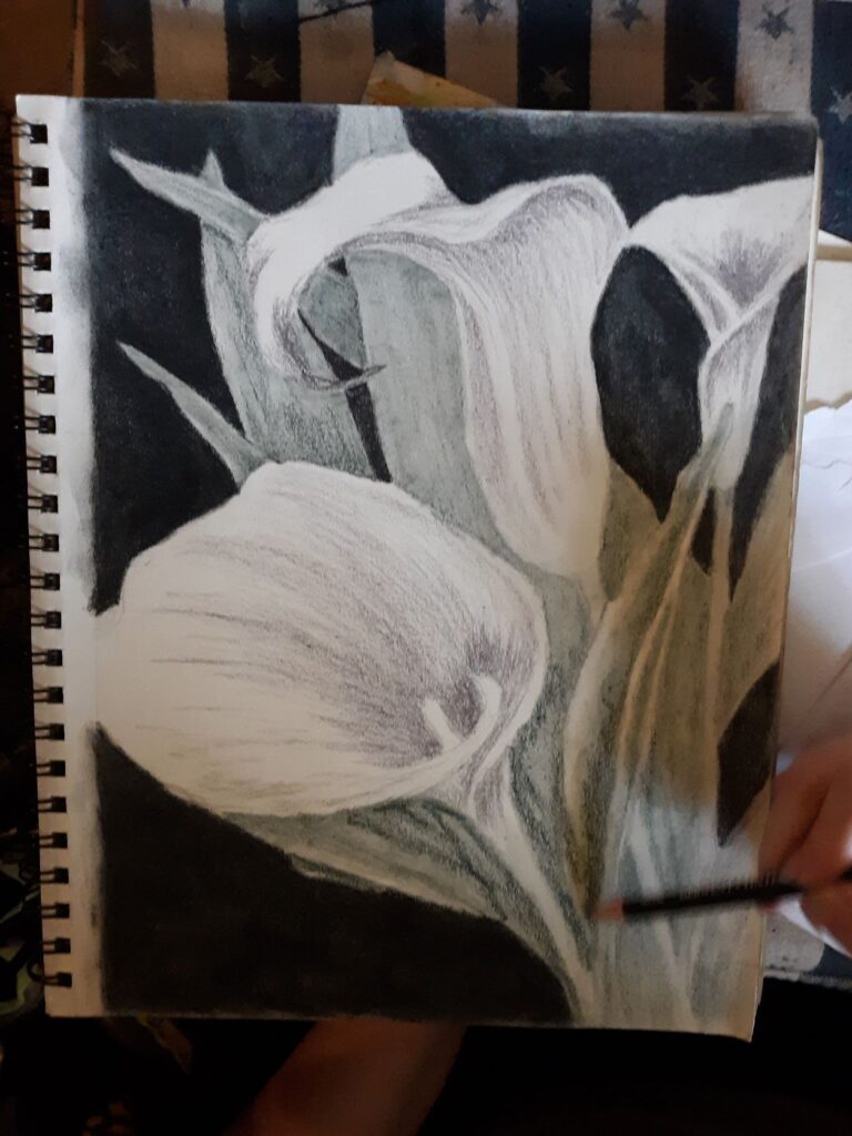
Even before I had the greens shaded in completely, I decided to start putting in the shadows on the white calla lilies. Shadows on white flowers are often either a blue tint or a purple tint, and I chose the lighter purple (labeled lavender) for this drawing, mostly to contrast nicely with the yellow ochre of the main flower’s stamen. Purple and yellow are opposite on the color wheel, and really look nice, as a look through my portfolio of work will show. (See Electric Yellow Rose for a good visual.)
Finishing the drawing
At this point, it was just a matter of intensifying some of the colors, since the tinted charcoal set is more about subtle colors than bright, high-chroma or saturated color. It’s a bit of a seesaw, where I added more tinted charcoal to one section, then look to make sure the rest are in balance with it. Rinse and repeat however many times necessary – and this time it didn’t take as much fiddling and fussing to get to a point where I decided to call it done.
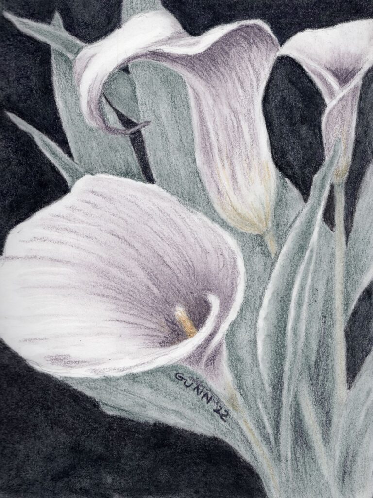
Since this is in my well-worn sketchbook, the original is not for sale. The corners on this sketchbook are quite rounded at this point. The scan came out very nicely, so prints are available through my Pixels store, while the various apparel and accessories are up at my RedBubble shop.
I have already started a similar piece, this time using my oil pastels (which is just about the polar opposite of charcoal drawing!) on some larger paper. I am still thinking about trying to do this in watercolor at some point as well, just not sure when. Calla lilies are just visually interesting for me, and I confess I have fallen in love with this flower since the first time I did the white on black drawings last year.
Calla Lilies are one of my favourite flowers despite their sad meanings. I grew my own to take photographs of and have found lots of green and yellow shades in them even though they are supposed to be white. Lovely images by you.
Thank you, Anne – and I also see tints of yellow and green in these white flowers! It makes it fun to draw and paint them.
Lovely! And so nice to see the progression as the sketch developed. Glad to see you are back in action – we have missed you! I’ve even done some more “digital art” awaiting your commentary, but I must admit it is missing some spark of originality.
You have really managed to show the curves and shapes of the flowers with just slightly different shades. Impressive.
Thank you, Steve! I’ll pass on your appreciation of the process photos to my husband (also named Steve).
It’s so interesting to see your process and watch this work progress into a lovely finished work of art. Thanks for sharing.
Thank you, Bob!
Love how you did them on a black background, really made them stand out.
Thank you – and I am all about that value contrast when I work in charcoal.
Wonderful image of Calla Lilies! I love seeing the progression and thought process involved! – Sharon Popek
Thank you, Sharon. My husband says he found it interesting to see all the photos when it was done.