Entries for this year’s creative arts festival

Y’all recall last year when I placed first in two of the three categories I entered in the regional VA healthcare-sponsored creative arts festival? I am entering again, but this year picking the artwork to enter seemed much more difficult, given I can only enter three pieces again this year. I work in six media categories, not including mixed, and have made multiple pieces in most of those categories in the past year. So I took to Facebook and even Twitter to ask for opinions on which pieces I ought to put in the competition. This actually did not help as much as I hoped.

Oil pastel artwork

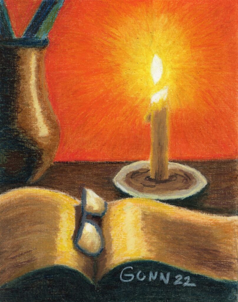
Oil pastels are not judged in the pastel category for this competition, but against oil painting as they define the category to include oil paint, oil sticks (which I have yet to try) and oil pastel. Basically, they want anything that includes pigment with some form of oil to fix it to a surface, which is not limited to canvas either. I felt my two best pieces from the past year are my Sunset Over the Hayfield landscape and my candle still life, Book Reading by Candlelight.

Folks on Twitter preferred the hayfield, while folks on Facebook preferred Candlelight, and when added together the votes were just about a dead heat. Any wonder why I asked for help deciding? In the end, I stopped to think (while milking goats) about the category and potential competition, and went with Candlelight because a bit of the textured paper shows in Hayfield, which might be enough to knock my piece down compared to the more traditional paintings.

Book Reading by Candlelight oil pastel still life
Book Reading By Candlelight oil pastel still life composition

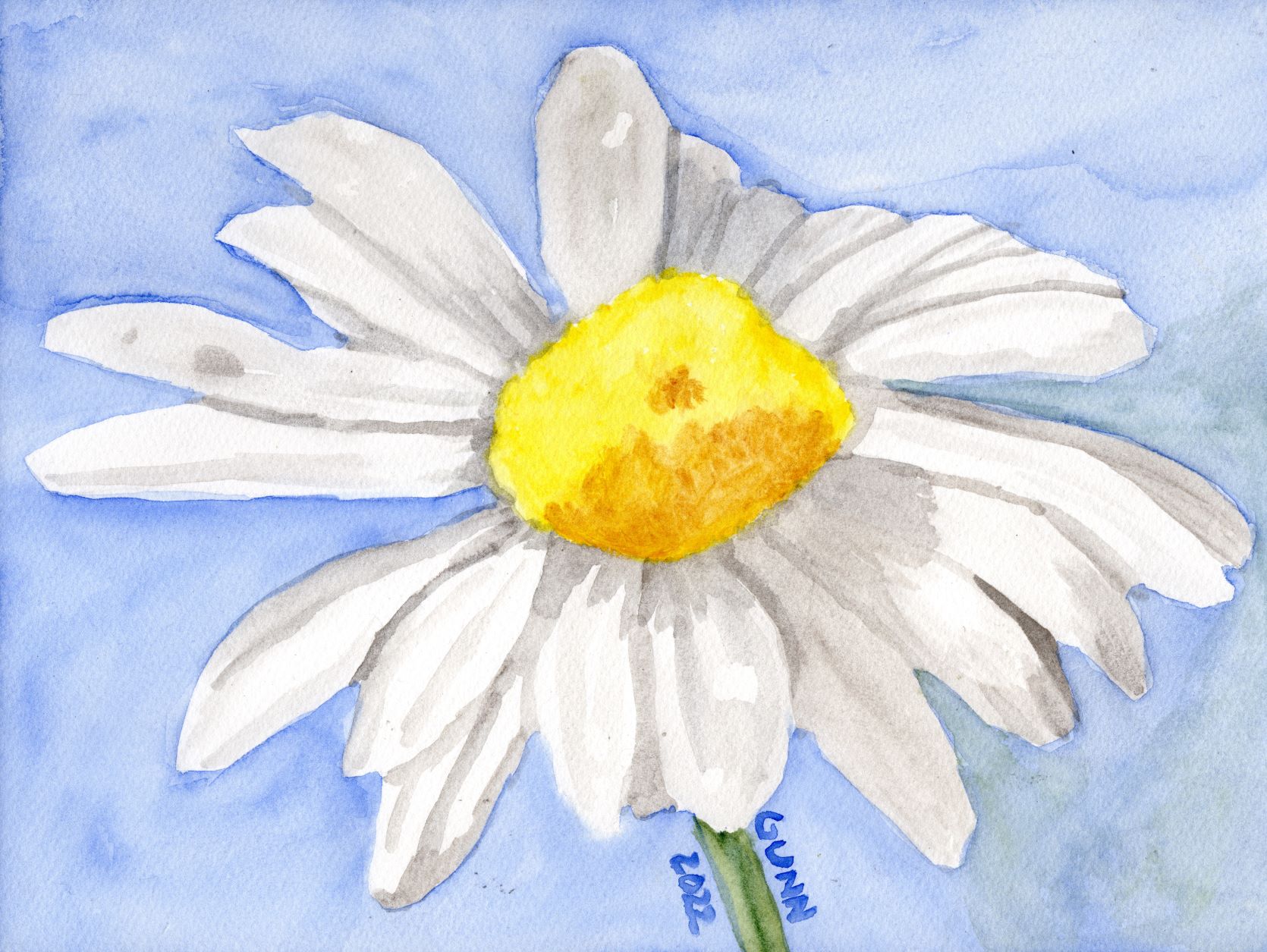
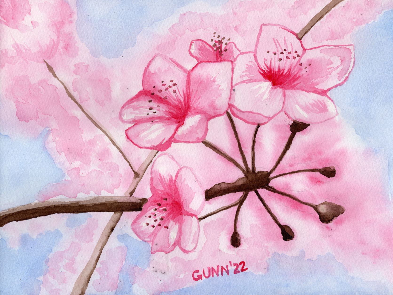
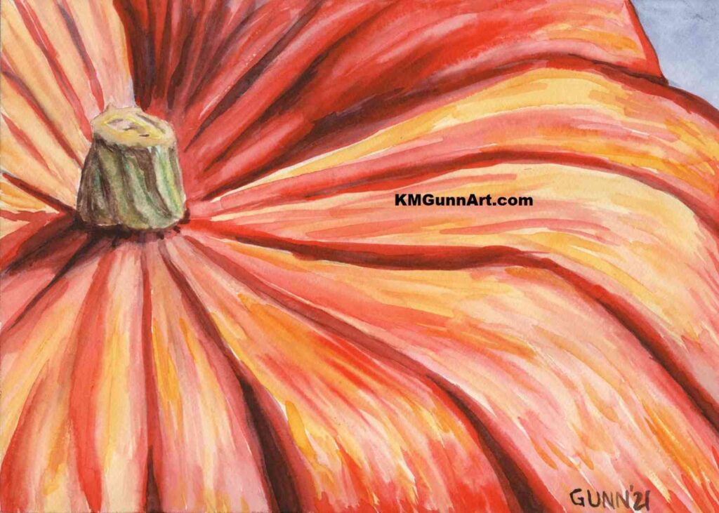
Picking a watercolor painting

For this category, it was pretty easy for me. I simply love how my Pumpkin Close-Up came out last autumn. Truth be told, I really have not made many watercolor paintings over the past year, and this particular pumpkin one is my favorite of the three I did last fall (even though my mom just loves my Jack O’Lantern).

Pumpkin Close-Up watercolor painting

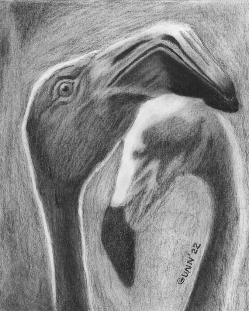
Picking a charcoal drawing

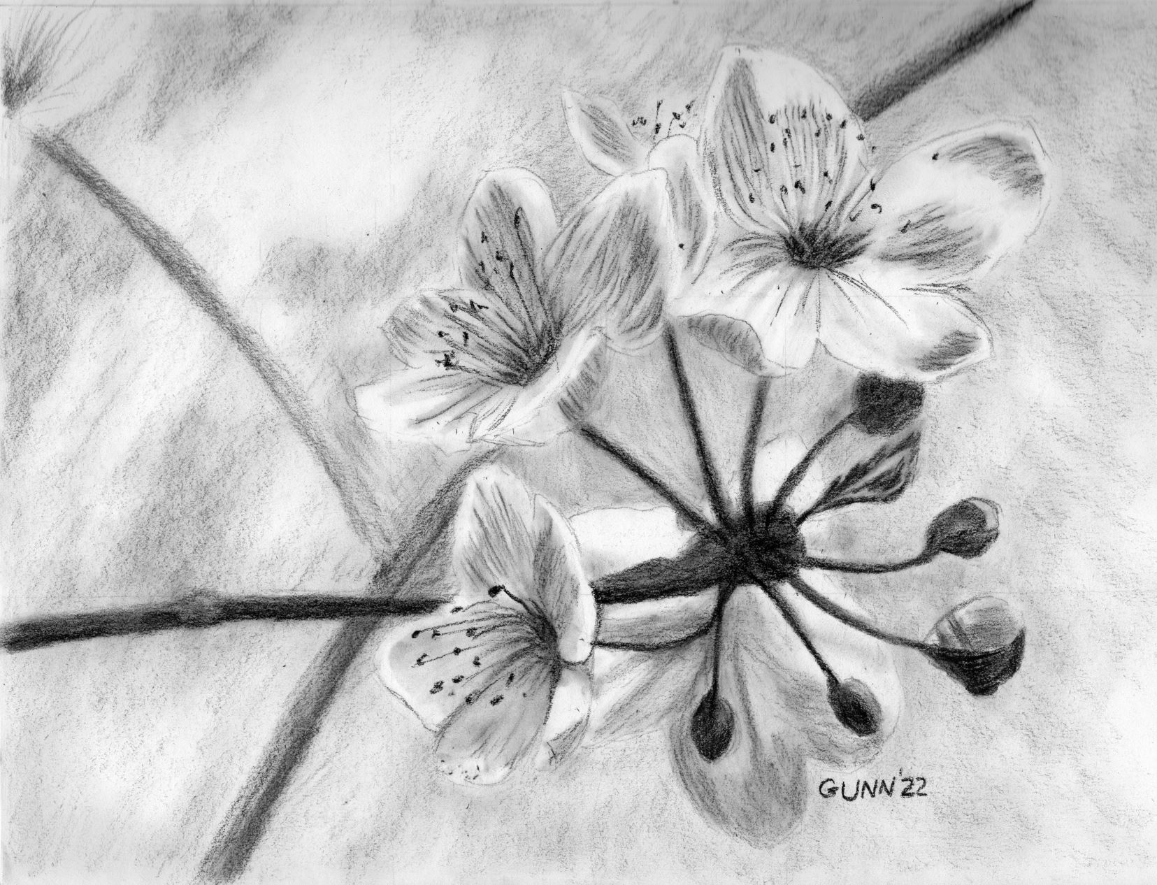
If y’all have been reading since the beginning of the year, you will know I was on a major charcoal drawing kick that started prior to New Year’s Day and continued through the spring goat kid bottling season. I made quite a few charcoal drawings, both traditional black and the tinted charcoal I am still experimenting with.

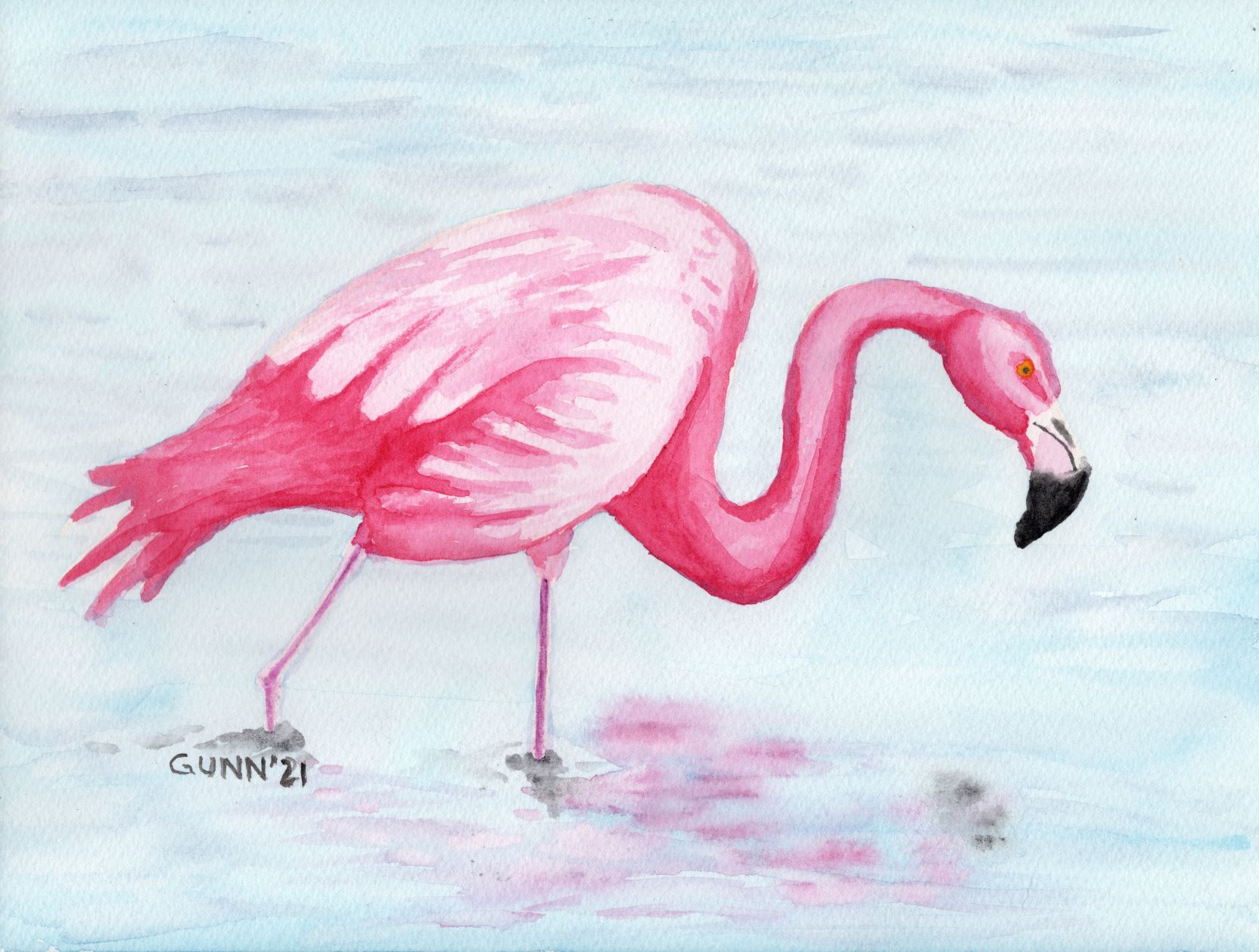
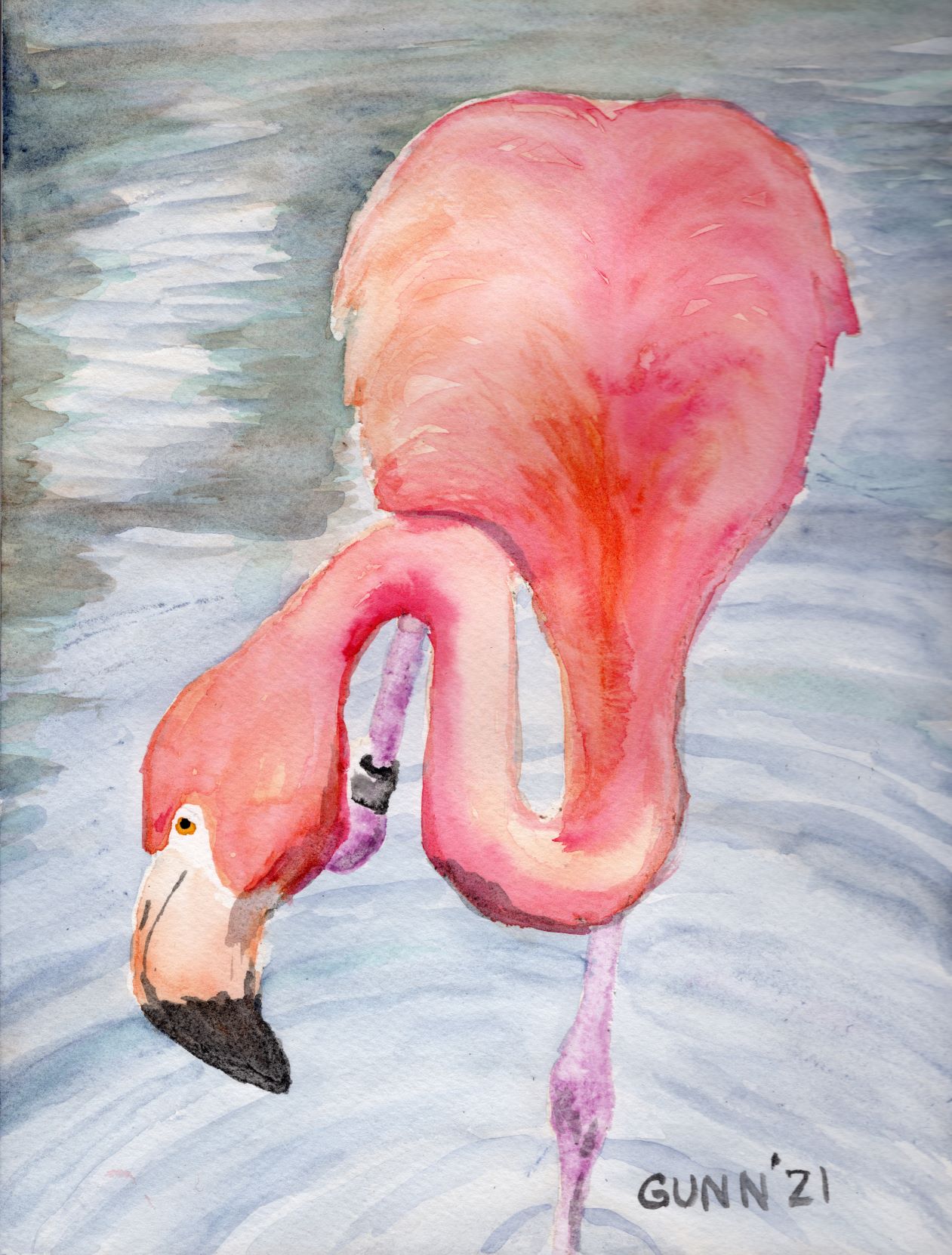
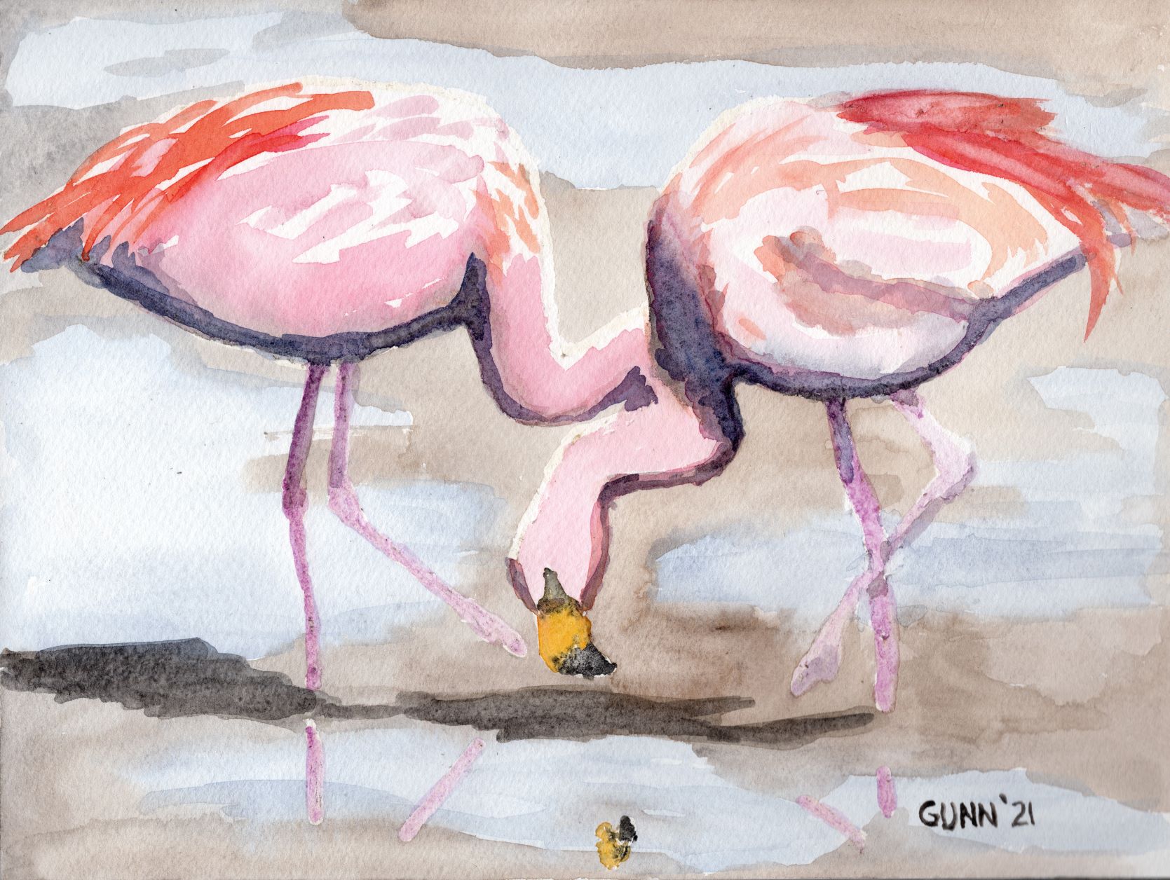
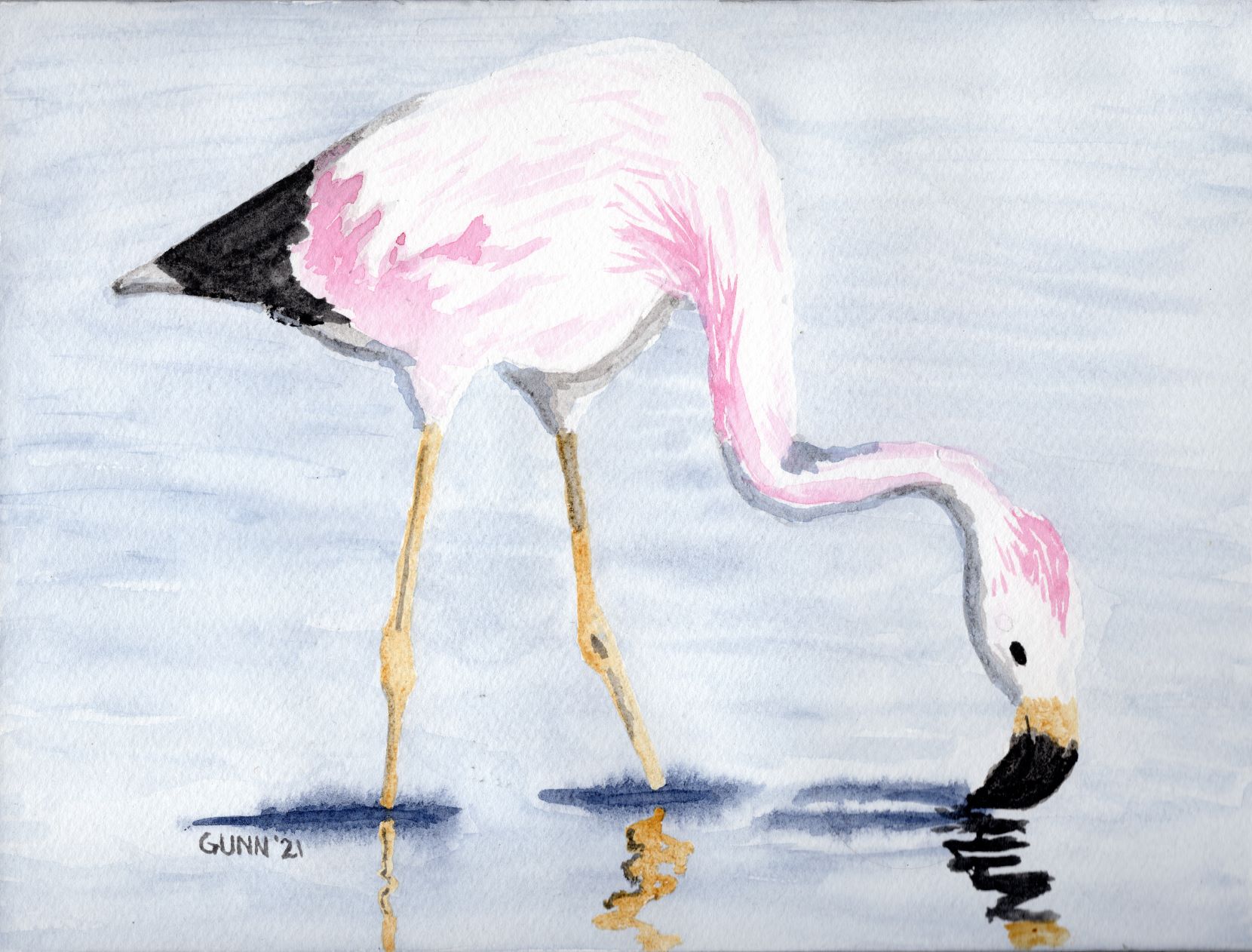
I managed to get my short list down to three, then once again asked on Facebook and Twitter which I ought to enter. The results surprised me. Personally, I had been thinking to enter my Apples 3 still life, but my husband said he really likes my Two Flamingoes. Meanwhile, my Single White Rose (in the same post as the flamingoes) tends to get positive reactions from folks. Both Twitter and Facebook enthusiastically said I should enter the flamingoes, though the rose was in second. What sealed the deal for me was the comments about how flamingoes usually aren’t depicted in black and white, and that I nailed the expression on the front bird’s face.

Two Flamingoes charcoal drawing

So, there we have it: my three entries to this year’s creative arts festival. I sent them off this morning, because today is the deadline. For whatever reason, I seem to always wait until the last day to enter. Perhaps it ties in with my usual answer when asked what I think my best piece of art is. My answer is always, “The next one.”

Update with results

(December) Results are finally back, and that required its own post because all three placed!

Daisy watercolor painting in only four colors

While I am behind on blogging it, I did finish up the three-day daisy art challenge. Before I start in with the second day’s daisy watercolor painting, I thought I would share a comment left on my Pixels page for the blind contour daisy drawing that made me chuckle. Fellow challenge participant Karen Kasper remarked that it reminds her of a Pablo Picasso drawing, and she suggests I get a better image of it so it could potentially be a bestseller on the site. (I should probably clarify she means Picasso’s later work – he started out classically trained and did wonderfully detailed representational drawing and painting, but later followed his muse to something completely different.) I intended to replace the blind contour with the acrylic painting I was looking at while drawing it, but in light of Karen’s comment I may leave it up.

Next daisy artwork, a watercolor painting

Now to move on to day two of the three day art challenge focused on daisies as its theme. I knew I wanted to do at least one daisy painting in watercolor, so Sunday after sketching out a single flower, I transferred the outline to the first cold press watercolor block I picked up and then sorted through my watercolor paints to see how few tubes of paint I would actually need. I am up to three brands of watercolor paint now: the Mijello Mission Gold paints that I discovered in late 2020, that are excellent for beginners because they don’t run across cold press paper as much as other brands; the Turner paints that don’t lift as easily as Mijello, run at a medium rate, and have always been in stock over at Jerry’s Artarama each time I’ve looked; and my new brand, QoR from Golden (more about this brand later). I had purchased a bottle of QoR’s synthetic oxgall to make my Mijello paint run better for backgrounds, and holy cow does it make the Turner paint really spread, so I knew this would be my most unpredictable paint to work with wet-on-wet. (Note to self: this probably makes no sense to anyone who has not painted with watercolor paint. Must write a post on what all this means.)

Choosing the specific watercolor paints

I ended up with only four tubes of paint: Turner ultramarine blue for the background (because daisies need either a green or a blue background), Turner permanent yellow and transparent yellow oxide for the center of the daisy and to mix with the blue for the bit of stem, then QoR’s ardoise gray for the shadows on the petals. Just don’t ask me to pronounce that name. I wanted to get the paint done while cats were napping, and succeeded, so I was pleased with the result.

watercolor painting of single daisy flower using only four colors
Four Color Daisy watercolor sketch, 9×12 inches on paper, $80 USD original available

The one thing that sticks out to my eye is that the transparent yellow oxide (yellow ochre for all intent and purpose) does not go well with the permanent yellow in the flower’s center. I probably could have gotten away with mixing the grey and permanent yellow together to achieve a more-harmonious shadow for that part, and I may do it over doing just that sometime this summer.

Links to purchase

The 9 by 12 inch original is available through Daily PaintWorks, as usual sealed with Dorland’s wax medium. If you want a larger print, those are available through my Pixels store, along with greeting cards and some accessories. RedBubble apparel, accessories, and swag is here.

The starting photo

For those curious, the reference photo I used is this one from Pixabay. When I look for a reference photograph, I don’t worry about the shot’s composition, just lighting and subject, because as you can see I crop it to what would make a good painting or drawing to my eye.

the reference photo for my Four Color Daisy

I suppose my lack of reverence for the original photo is a product of my total lack of photography skills – I’ve received valid criticism of my wildflower snapshots, but the simple fact is I am not much of a photographer. If I am going to do a fine art image, that will require something other than a camera. Once again, all I can say is I am so glad digital cameras were invented, or I would still be wasting money and resources on film developing.

Still one more daisy picture from the challenge, then I will need to post up one I did last summer for a 30 day drawing challenge I ended up dropping out of about halfway through, and of course I will need to finished the acrylic painting I used for the blind contour drawing, so there will still be plenty more daisy artwork in the near future.

Pink flamingoes in watercolor

So, I intended to do up a flamingoes watercolor painting roundup when I noticed I only blogged about two of my six paintings last year. Oops! It’s high time I fix that, so grab a beverage and some popcorn (if you like popcorn and your husband hasn’t yet eaten it all) and let me get caught up on my favorite pink-feathered birds.

As I mentioned last year while it was happening, this was for a seven day challenge that had the theme of liquid. I naturally decided to use watercolor paint as my medium for the entire week, and picked out seven reference photos of flamingoes in or near water, and my Flapping Flamingo was the first one I painted. I fell behind on the blogging portion of the challenge, resurfacing to post my favorite of the series, Flamingo in Rippled Water, which y’all will recognize as one of the artworks that won first place in last autumn’s VA Healthcare system regional competition. When I finished up the challenge with a beachscape, I mentioned I would upload the others “soon.” I suppose less than a year can sort-of count as “soon,” in a certain light.

Very pink flamingo

For the second painting of the series, I did up this one I just call Wading Flamingo. I seriously doubt I will ever win any recognition for naming my art, but that doesn’t really bother me so I keep naming things with an obvious title. While this one isn’t really my favorite of the bunch, I have heard from a few folks who saw it and liked it. One artist also participating in the challenge said it was her favorite of the set. Like all the other flamingo paintings, this is on 9 by 12 inch watercolor paper, and prints are available. The page at my RedBubble swag shop is here.

Wading Flamingo watercolor painting
Wading Flamingo, 9 by 12 inch watercolor on paper, $100 USD available

Fun flamingo pose

Third in this series, and my second favorite overall, is this much more subdued version I call Curious Flamingo. My husband says flamingoes have such expressive faces, and that expression often looks startled, but I have found some nice ref photos where the bird looks not-startled, like this one. It still looks almost silly, the way this flamingo has cocked its head just so, but the overall effect with the less-saturated colors just work for me. Also on 9 by 12 inch watercolor paper, with prints available in larger sizes. Link to the RedBubble swag shop here.

Curious Flamingo watercolor painting
Curious Flamingo, 9 by 12 inch watercolor on paper, $100 USD available

Flamingoes on the beach

For my fourth flamingo watercolor painting, I managed to salvage something workable from what at the time looked like very much the disaster. After a couple days of touch-and-go, my masking fluid finally tore the (bleep) out of my paper. I was furious, went on Facebook and asked in a watercolor artists’ group for a better brand than what I was using. Once armed with a brand name that was recommended, I placed an order that very evening for what I now use, which is Pebeo drawing gum. As for the painting, which I was originally going to call Beachcombing Flamingoes but instead titled Impressionist Flamingoes … I totally intended for it to be done in an Impressionist style. That’s my story, and I’m sticking to it. I am still a bit ambivalent about the idea of selling the original due to the damage to the paper’s surface, but it scanned well and I uploaded it to RedBubble for apparel and accessories. Prints in various sizes are available.

Impressionist Flamingoes, was intended to be called Beachcombing Flamingoes
Impressionist Flamingoes, 9 by 12 inch watercolor

Pale flamingo

Pale Flamingo is as its title suggests, and a pale pink on the flamingo’s feathers while it feeds in shallow pale blue water. The black of the beak and tail feathers provides sharp contrast with all the pale versions of color, and this one was identified as another artist’s favorite of the series. The contrast is certainly eye-catching. The original is also on 9 by 12 inch watercolor paper, and prints are available from my Pixels store, while the RedBubble swag is located here.

Pale Flamingo watercolor painting
Pale Flamingo, 9 by 12 inch watercolor on paper, $100 USD available

So this gets me finally caught up on my flamingo series of watercolor paintings, which means it’s about time I painted and drew some new flamingo artwork. I’ll need to finish a few pieces on the easels – yes, I now have multiple easels to hold my works-in-progress – and one of those just happens to be a flamingo.

Cherry Blossoms of Spring

Spring is my busy season around the property, and this year has been par for the course with five goat kids, firing up the incubator, and rabbits kindling. While I have been on a charcoal kick so far for 2022, yesterday and this morning it felt so good to have a paint brush in my hand and to work with some color. The interesting angle on this is Judith over at Artistcoveries posted the other day about an historical debate between color and drawing, and how she feels she is on the color side of the argument because she can do color without drawing. I commented that given my ongoing charcoal drawing kick, I have to take the drawing side of that argument, because I can (and do) draw without employing color but flounder on the idea of using color without some drawing element. I suppose that is a succinct way of saying I just don’t feel abstract art like some folks do. We then agreed that it is better to not try to draw a line between these aspects since the art world is certainly big enough for not only both viewpoints, but some that are outside of this binary.

Inspiration

Yeah, I do indeed read other artists’ blogs, and heartily recommend doing so because the interplay of ideas often sparks inspiration all around. Case in point, fellow art blogger Steven of Backyard Image was inspired by my charcoal monarch butterfly I posted last time to play with his photographs and filter software to produce his own new piece. What he doesn’t (yet) know is a previous post of his inspired me to do up both charcoal and watercolor pictures of cherry blossoms, because what says spring quite like the brief glorious week of the cherry trees in Washington, D.C. in bloom? My post inspired him, and one of his inspired me.

I had intended to use the cherry blossom motif for a new art challenge which had the stated theme of “time,” but apparently the lady who organizes these challenges had a much more narrow interpretation than I do. I wasn’t the only participant who took a broader view of the theme, though most focused on timepieces of one sort or another. I just quietly dropped out to pursue my own thing, because that is what I do.

Value study sketch in charcoal

First step for me was to hop onto Pixabay and hunt up some nice cherry blossoms reference photos. As usual, I found a good handful that suited what I had in mind, then it was on to cropping it “just right” because I am just picky like that. Once I selected my target ref photo and had it cropped, then it was time for a charcoal value sketch, where I get a feel for the shapes and shadows. This is “just” a sketch, so nothing as fancy as a full drawing for a charcoal piece, and since it is in my raggedy sketchbook, there is no original to offer, but I did upload it to Pixels for art prints since it makes a nice companion to the watercolor version.

charcoal value sketch for Cherry Blossoms of Spring
charcoal value sketch for Cherry Blossoms, 9 by 12 inches, in sketchbook

Adding color

Once I was satisfied the image has enough value contrast to be visually appealing, it was time to transfer it to watercolor paper to paint. These days I do not sketch on watercolor paper, because even when I use watercolor pencils I can still see grid lines, so I now draw it in my sketchbook and use graphite transfer paper to get the necessary lines, which I often lighten up with a kneaded eraser before laying down paint. Just for fun, I wanted to see if I could pull this painting off only using three colors: cobalt blue, rose red (which is more a magenta if you ask me), and burnt umber. I think I succeed.

watercolor painting Cherry Blossoms of Spring
Cherry Blossoms of Spring, 9 by 12 inches, watercolor, $80 USD

For this iteration, the original is available, 9 by 12 inches, sealed with Dorland’s wax medium and if you are not local you can purchase through Daily PaintWorks via PayPal. Prints are through Pixels, along with a bit of swag like puzzles or a fancy shower curtain. I also uploaded the image to RedBubble, which has a nice variety of apparel, plus the face clock. I simply must include the image of the face clock – I think it looks awesome.

Cherry Blossoms of Spring watercolor painting as an analog clock face
Cherry Blossoms of Spring as a clock face

Now, for the best news: the goat kids are down to two and three bottle feedings a day, which means I now have more time to get back to my art. They are cute, they are affectionate, but for the first four to five weeks they are rather needy, but now they are growing up and two have gone off to a new home where I have no doubt they will be spoiled rotten (no change from their life here).

Make Hay While the Sun Shines: watercolor landscape

I sat down this afternoon determined to at least play with my watercolor paints. I’ve tried to do some painting the past few days, but my cats have been determined to get all of my attention. When I finally get one off my lap, the other hops up. They can be needy as well as kneady. Today, the coast was clear for at least a quick watercolor sketch. The only question was: what should I paint?

I started out just playing with the paints and water, as I tried to decide on a subject to sketch, thinking to myself, “I need to make hay while the sun shines.” As soon as that thought popped into my head, I remembered I noticed fresh round bales in a hayfield on the way into town. I had remarked to hubby it would make a nice painting as we drove past, with the sun shining down on the new hay bales.

watercolor landscape painting Make Hay While the Sun Shines
Make Hay While the Sun Shines, 12 by 9 inch watercolor on paper, $100 USD plus shipping

It is honestly a simple sketch in paint, but I think it worked. My husband says the sky came out quite nicely. I quipped, “I am pleased with how it turned out, and maybe after I paint a thousand more then perhaps I’ll be consistent!” It felt good to be able to upload a new painting again.

Original painting and art prints available

Now, for the grubby details – the original is available through Daily PaintWorks, while prints are at my Pixels store, and apparel and accessories (including hats now) are at RedBubble. I will be doing more hay fields, using other media like oil pastel or acrylic. I have reference photos, all I need is a handful of hours without a cat either on my lap or on my desk.