Cherry Blossoms of Spring

Spring is my busy season around the property, and this year has been par for the course with five goat kids, firing up the incubator, and rabbits kindling. While I have been on a charcoal kick so far for 2022, yesterday and this morning it felt so good to have a paint brush in my hand and to work with some color. The interesting angle on this is Judith over at Artistcoveries posted the other day about an historical debate between color and drawing, and how she feels she is on the color side of the argument because she can do color without drawing. I commented that given my ongoing charcoal drawing kick, I have to take the drawing side of that argument, because I can (and do) draw without employing color but flounder on the idea of using color without some drawing element. I suppose that is a succinct way of saying I just don’t feel abstract art like some folks do. We then agreed that it is better to not try to draw a line between these aspects since the art world is certainly big enough for not only both viewpoints, but some that are outside of this binary.

Inspiration

Yeah, I do indeed read other artists’ blogs, and heartily recommend doing so because the interplay of ideas often sparks inspiration all around. Case in point, fellow art blogger Steven of Backyard Image was inspired by my charcoal monarch butterfly I posted last time to play with his photographs and filter software to produce his own new piece. What he doesn’t (yet) know is a previous post of his inspired me to do up both charcoal and watercolor pictures of cherry blossoms, because what says spring quite like the brief glorious week of the cherry trees in Washington, D.C. in bloom? My post inspired him, and one of his inspired me.

I had intended to use the cherry blossom motif for a new art challenge which had the stated theme of “time,” but apparently the lady who organizes these challenges had a much more narrow interpretation than I do. I wasn’t the only participant who took a broader view of the theme, though most focused on timepieces of one sort or another. I just quietly dropped out to pursue my own thing, because that is what I do.

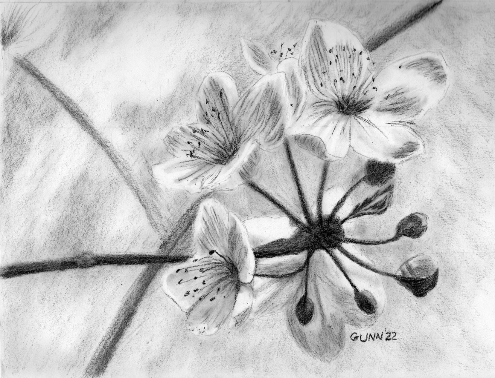
Value study sketch in charcoal

First step for me was to hop onto Pixabay and hunt up some nice cherry blossoms reference photos. As usual, I found a good handful that suited what I had in mind, then it was on to cropping it “just right” because I am just picky like that. Once I selected my target ref photo and had it cropped, then it was time for a charcoal value sketch, where I get a feel for the shapes and shadows. This is “just” a sketch, so nothing as fancy as a full drawing for a charcoal piece, and since it is in my raggedy sketchbook, there is no original to offer, but I did upload it to Pixels for art prints since it makes a nice companion to the watercolor version.

charcoal value sketch for Cherry Blossoms of Spring
charcoal value sketch for Cherry Blossoms, 9 by 12 inches, in sketchbook

Adding color

Once I was satisfied the image has enough value contrast to be visually appealing, it was time to transfer it to watercolor paper to paint. These days I do not sketch on watercolor paper, because even when I use watercolor pencils I can still see grid lines, so I now draw it in my sketchbook and use graphite transfer paper to get the necessary lines, which I often lighten up with a kneaded eraser before laying down paint. Just for fun, I wanted to see if I could pull this painting off only using three colors: cobalt blue, rose red (which is more a magenta if you ask me), and burnt umber. I think I succeed.

watercolor painting Cherry Blossoms of Spring
Cherry Blossoms of Spring, 9 by 12 inches, watercolor, $80 USD

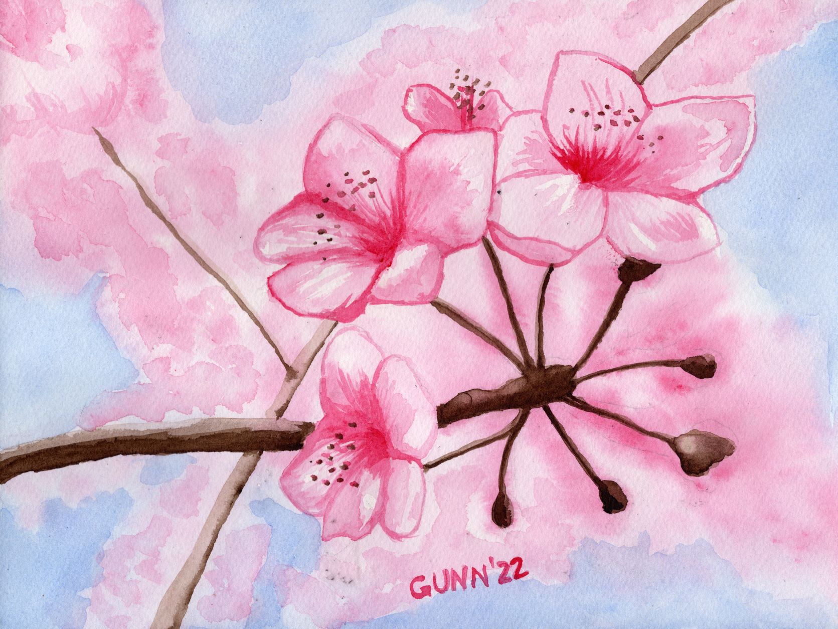
For this iteration, the original is available, 9 by 12 inches, sealed with Dorland’s wax medium and if you are not local you can purchase through Daily PaintWorks via PayPal. Prints are through Pixels, along with a bit of swag like puzzles or a fancy shower curtain. I also uploaded the image to RedBubble, which has a nice variety of apparel, plus the face clock. I simply must include the image of the face clock – I think it looks awesome.

Cherry Blossoms of Spring watercolor painting as an analog clock face
Cherry Blossoms of Spring as a clock face

Now, for the best news: the goat kids are down to two and three bottle feedings a day, which means I now have more time to get back to my art. They are cute, they are affectionate, but for the first four to five weeks they are rather needy, but now they are growing up and two have gone off to a new home where I have no doubt they will be spoiled rotten (no change from their life here).

Two drawings from last year

As I was looking over my art catalogue last night for something to feature today, I realized that I had forgotten to blog about two drawings I did last year. What a perfect way to remedy that – by spotlighting these two pieces!

Horse head in charcoal

First is one that anyone who knew me growing up would expect: a horse head. The reference photo I found is of a beautiful chestnut mare, likely a Quarter Horse, looking out from the darkness of a barn or stall. I call it Bridled, and recall spending the better part of an afternoon working first to get the background dark enough, then on getting as much of the highlights and shadows right to my eye. This was also the first time I used the Strathmore 500 series charcoal paper, with its laid texture, and the result was pleasing enough I later purchased another pad of it. My only gripe is the paper feels so lightweight after working with multimedia and watercolor papers, but charcoal works need to be displayed behind glass anyway.

charcoal drawing of bridled horse head
Bridled, charcoal on paper, 9 by 12 inches, $80 USD

The original piece is available – you can purchase it through Daily PaintWorks, which uses PayPal, or in person at One Stop Feed Store in Crescent City if you are local – and it is uploaded for art prints at my Pixels store in various sizes. I’ll probably look back at this in a few years as “not my best,” but right now I am pleased with how it turned out. I drew this in June of 2021.

Pansy pair in graphite

Prior to that, February of 2021 judging from my notes, was this page from my sketchbook that I worked at until I could call it done. Rendered in graphite, which accounts for the greyness, and now a bit worse for the wear after a year of me carrying my sketchbook about, this scan is record of how it looked immediately after completion. Looking back, I am glad I scanned it before moving to the next page, as I went back to this and traced it over transfer paper to paint in watercolor which ended up as my Johnny Jump Ups painting I’ve blogged about previously.

purple pansies drawn in graphite
Pansies Pair, sketchbook page

Since I not only left the page in my sketchbook, but used it to transfer the lines to another paper, the original is not available to buy, but since I did scan it, prints are available of it at my Pixels store. Its original size is 9 by 12 inches – perhaps my favorite size for a sketchbook because it is so portable – but the scan was good enough to print larger. It is also available as puzzles for the folks who love a good puzzle and are willing to work on one in greyscale instead of color. I have too many cats in the house to attempt an actual, physical puzzle, or I would give it a go just to see if time spent playing MicroSoft Jigsaw translates into the real world.

More to come soon!

The rest of the month of drawing in charcoal

Now, for part two of my unplanned month of drawing that bled into the last day of 2021, and continued to the first day of February, and lasted the entire month of January. (Wow, that makes it sound really long!) Considering it is still in progress, I guess we are now well beyond the month idea, so perhaps I should call this a season of drawing? One big advantage drawing has over painting is how quickly it can be set aside to go do something else, and considering I have two nanny goats due to kid in the next month I think it is safe to say I’ll be working with dry media until probably mid to late March because one of the pure JOYS of having my goats is bottlefeeding the kids each spring. Even if I want to take a break from monochrome charcoal, I have soft pastels (I often call them dusties), pastel pencils, regular colored pencils, and even oil pastels, though the oilies will smear if a cat walks across before I’ve sealed it.

Inspiration for charcoal drawing

Enough rambling – back to the drawing spree I am still currently doing. A couple weeks ago, I got an email on a list I subscribed to for a free tutorial offering the “legacy class bundle” for a discounted price. I thought it over, then decided the sale price was fair and bought a whole huge heap of video tutorials, and decided to start with the drawing ones. While I am bouncing around as to which one I do any given day, depending on my mood, here are the first pieces I’ve drawn with the tutorials. I should probably mention the artist who made the tutorial bundle does photorealism. I call what I do just realism, as I don’t actually try to copy a photo down to the tiniest detail, but there are all kinds of small tips and pointers littered throughout the videos’ run times that can benefit me even if I don’t go as detailed as she does.

First a rose

First, I just had to start with this rose in charcoal. Seriously, what is not to love here? I enjoy drawing and painting roses, and apparently people enjoy seeing drawings and paintings of roses, and a single white rose against a mostly-black background is about as dramatic as you can get without using color. To be honest, sometimes the monochromatic charcoal black on white can be more dramatic than color (when the stars align just right and and the picture feels like it just flows out from the pencil). This is in 8 by 10 inch format, and the very first page of a new sketchbook, plus I put it in the top corner instead of centered on the page so the original for this will not be available to buy … but I can do it again if someone wants me to, and in different size or aspect ratio. I do have prints available at my Pixels store, but I didn’t upload it to RedBubble because I am not sure my charcoal work looks as good there.

Single White Rose drawing in charcoal
Single White Rose, 8 by 10 inch charcoal (in sketchbook)

Fun flamingoes head study in charcoal

The very next day I wanted to do another drawing, and picked a reference photo for a different tutorial. It was a video on how to transfer an image from a printed photo onto your art paper, so this is me taking the tips and general method from the rose video to make these two flamingo heads. Flamingoes are definitely one of my favorite birds to draw and paint, and this image just caught my imagination. This time, I centered the 8 by 10 inch image on my not-quite 9 by not-quite 12 inch sketchbook page, so if anyone wants to purchase the original I can remove the page and trim it down with no problem – if you live outside my area you can buy through Daily Paintworks. Or you can get prints in your desired size at my Pixels store.

Two flamingoes, charcoal drawing
Two Flamingoes, 8 by 10 inch charcoal on heavy paper, $80 USD

Update: This drawing is now officially an award-winning artwork, taking 2nd place in the 2022 Creative Arts Festival for monochromatic drawing.

Kicking up my heels with a horse drawing

Those of y’all who have known me a while are already wondering how long it took me to go completely off the tutorials to do my own thing … and the magic number was three. Two days after drawing the flamingo heads, I decided it was past time I did another horse in charcoal. It took me a while to pick out a reference photo, but in the end I went with a galloping filly. I decided to try using hot press watercolor paper instead of multimedia or charcoal/pastel paper, and that goes back to the tutorial series. It is the first time I’ve used watercolor paper for something other than watercolor, and it is also the first time I’ve heard of using a dry media on paper for water media. I think I need to try a few more times before I can say if I like it or not, but it does have a different feel than normal dry drawing paper. This one is an actual 12 by 9 inch pad of paper, and the original is available for purchase through Daily PaintWorks. Prints of various sizes are available at my Pixels site as well.

Frolicking Filly, charcoal drawing of young horse cantering in the pasture
Frolicking Filly, 12 by 9 inch charcoal on paper, $80 USD

Practice for a portrait

I mentioned at the start of this post that my drawing kick kicked off on New Year’s Eve, and that is because I drew the winner of December’s frame giveaway that evening before bed. Since Murphy’s Law governs more than just the army, the winner wants her portrait to go into the frame she won. I am still knocking the rust off my people-drawing skills, and there is a series for that in the big legacy class bundle. First things first – an eye study since the eyes are the main feature that will make-or-break a portrait. I had my dog-eared almost-full old sketchbook within reach, so this is one I am not offering the original … and I have not uploaded it for prints either. About the only place I could see this in a frame and on a wall would be the waiting room of an optometry office. It is still “good training,” as we used to say in the army.

eye study in charcoal on paper
Eye study, 12 by 9 inch charcoal, in sketchbook

So this brings me current, as of today. I have tutorials on drawing the nose and the mouth to work through, then one on doing a whole face. After that, I may feel brave enough to try my hand at Dorothy’s portrait again. Yes, again – I did try early in January and was not satisfied with the result (which made the sale on the tutorial videos quite timely for me). I may be very much behind my self-set schedule for getting this out, but as I remarked to my husband yesterday, I won’t call a piece done until I am satisfied with how it has turned out. If that means I need to redo it until I get it to my satisfaction, well we did that in the army as well!

Until my next check-in!

First place, TWICE!

Apparently, last evening after I had checked my email for the night, I received not one but TWO emails with the subject line saying, “Congratulations from the North Florida/South Georgia VA Healthcare system.” I immediately knew what it was: I had entered the NFSG’s Creative Arts Festival competition. In fact, I had sent in three entries, as I had artwork for three categories listed: watercolor, monochromatic drawing, and multicolor drawing. Both emails informed me I had won FIRST PLACE in the watercolor and monochromatic drawing categories, and my entries will be automatically advanced to the national level to represent our region.

digital certificate of my two awards
The pdf attachment of my award – both looked the same

The image in a pdf file was just the icing on the cake, so to speak. Yes, both attachments were the same, but I really am still feeling a bit too jazzed about taking top spot two out of three times to quibble. Now, what did I enter? Interestingly enough, all three entries were the result of various art challenges I participated in over the summer (entry deadline was at the end of August).

First, the one that didn’t place: my colored pencil on black paper Christmas Candle, which happens to be my friend Keashia’s current favorite. In the watercolor category, I entered one of my favorites, Flamingo in Rippled Water. I need to do up an “on the easel” post for the 16 by 20 inch acrylic painting I am working on, based off this watercolor, but that can wait for another day. And in the monochromatic drawing, I entered my Dew on a Calla Lily piece, which is my favorite from the black and white challenge.

The emails mentioned the regional coordinator is putting together a showcase of the winners scheduled for December, and I am very interested in that … so the two winning pieces have been placed on hold and will not be available to ship or be picked up until after that. I’ve amended the listing for Flamingo in Rippled Water over at Daily Paintworks, and have not listed the calla lily drawing yet. I suppose that technically I could sell these, but hold them until after the winners’ showcase. Eh, it’s not an issue yet, but right now I am quite thrilled, as this is the first time placing in an art competition since I was a schoolkid. Hmm, it’s also the first one I’ve entered in about as long. Either way – I won first place, twice!

Dew on a Calla Lily, white pencil on black paper
Dew on a Calla Lily, white pencil on black paper, 9 by 12 inches
Flamingo in Rippled Water, watercolor painting
Flamingo in Rippled Water, watercolor on paper, 12 by 9 inches

Summer Jalapeno acrylic painting

I am finally getting to the final image from the black and white challenge, which ended up being a photograph I took in early July of my husband’s jalapeno plant, cropped, straightened, and with the color taken out. I had a busy day out of the house that day, running errands up in Palatka, and was tired both physically and mentally once I got home. I really was not happy with the result, and immediately planned to redo it and replace the image with something better, something more “me” than a cluttered and busy photo.

black and white photo of my husband's jalapeno plant with blossoms and peppers
greyscale version of my reference photo

That something else ended up being the very next challenge, which I started with the Calla Lily painting in acrylic. Since the theme for the next challenge was “anything goes,” I figured to do up three images from the black and white challenge in color, using acrylic paint since I could use the practice with that medium.

Starting the painting

Some days, the paint just flows perfectly, and the painting comes together “like magic,” as the saying goes. Then, there are days when I feel as though I am fighting every step of the way … and the first day of this painting was definitely a struggle. I blocked out the position of everything easily enough, but my first stab at the background color turned out too purple, so I mixed up some more paint and tried again, with this time being too light a blue. Then, when that dried, I noticed I didn’t cover the too-violet paint well enough in some spots, so I went over it a third time, using the paint straight from the bottle. Then, I turned my attention to the green leaves and stems.

Trouble getting the green of summer

At the time, I only had two shades of green at hand, and neither one was dark enough to be a good jalapeno green. I tried mixing, but at this point it was time to put the critters up for the night and I was frustrated enough I needed to suppress the urge to throw the canvas across the room. That’s usually a clear sign to stop working on it, and try again the next day. So, this painting knocked me out of the short, three-day “anything goes” art challenge, which requires one completed work each day of the challenge. Dropping out of a challenge is only a minor disappointment for me, and one I actually prefer to posting up something I don’t like.

After officially dropping out, hubby was home and asked me what part of the painting had me so frustrated. When I got to the part about not having a good green, he started digging around his bunch of paint (he has used this brand for several years now) and started pulling out half a dozen shades of green for me to choose from. Then he remembered some blending medium that slows drying time that he tried but doesn’t use often, and also a wet palette setup to keep the paint you mix up on the palette from drying while you work.

Finishing the painting

With the expanded selection of greens available the next day, this painting came together so much easier! This one I actually like, and it is currently on display at El Amigo Mexican Restaurant – because that really is a perfect place to display a painting of a jalapeno plant that has a couple white blossoms, one dark green fruit, and two ripe red peppers (when jalapenos turn red, they are called chipotles). This particular painting may not be perfect (and to be honest, it isn’t because I can spot mistakes) but I like it much better than the photograph.

Summer Jalapeno, acrylic painting on stretched canvas
Summer Jalapeno, 11 by 14 acrylic painting on 5/8 deep stretched canvas, original available $175 USD

I’ll likely do a similar painting, or maybe recrop the photo for a more close-up view of it, and hopefully it will have fewer mistakes and be less frustrating. For those who may want a print either larger or smaller than the original 11 by 14, check out my Pixels store. If you want this printed on apparel or swag, look here on RedBubble. For the original, you can purchase through Daily PaintWorks – or call the number on my business card at the restaurant.