I’ve had this idea pinging around my brain for about a month now, and yesterday for art group I sat still and just did it. I will be making pen-and-ink contour drawings (as in simple line drawings) as a fun little gift for my email subscribers to print out and color for themselves. Right now, one a month feels very doable for me. The very first coloring page is a rose, since Valentine’s Day is next month. I still need to hammer out a couple technical details, but I should have those squared away in a couple days.
The start of the idea
This all started because conventional wisdom in the current blogging space is that email subscribers want to be wooed with some kind of gift or freebie to sign up. For some bloggers, this is an easy thing to whip up. For an art blogger who wants to sell her artwork, it didn’t seem so obvious. I am persistent if nothing else – some might call me stubborn even. Browsing through examples of gifts for various email lists, I saw my niche: coloring pages. THAT I can do!
At the start of art group yesterday, I asked the others if they would subscribe to an email list to get a printable coloring page “like this.” Immediately one of the other artists, who works 3d instead of 2d, responded with a very enthusiastic, “Hell yeah!” I guess that answered any doubts I was having.
A rose for the first coloring page
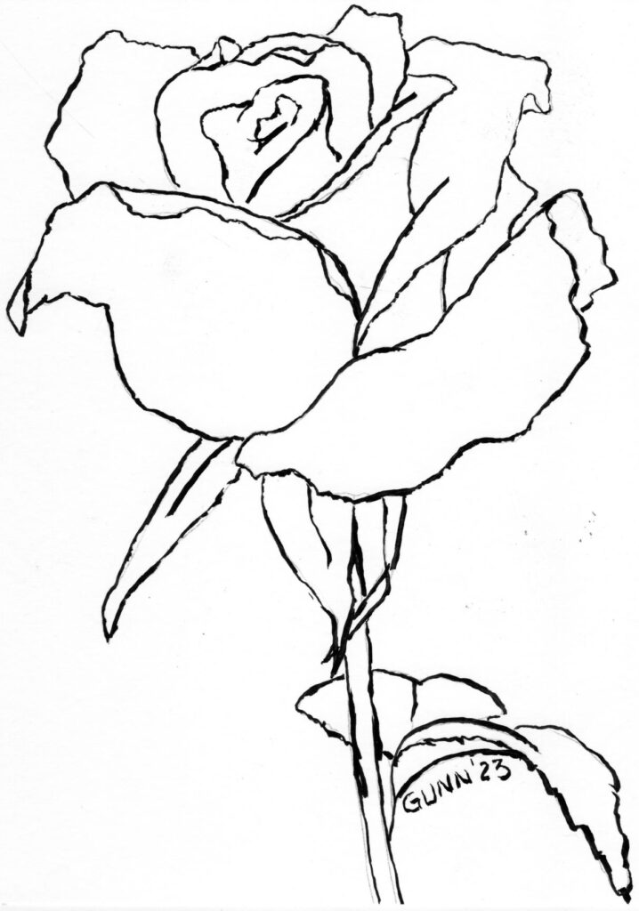
This is the first coloring page, a single rose with only enough detail to make it obvious what it is. The original is 9 by 12 inches, and is for sale if you’d like to hang it on your wall. I will NOT be making prints of this available, and the printable coloring page is 8.5 by 11 inches (standard US letter size). For those outside the US, that is approximately 21.5 cm by 28 cm.
I’ve used this rose drawing before
If you are thinking this rose drawing looks familiar, you are correct! I used it last January during my month of charcoal drawing. It is the basic outline for my black and white charcoal piece, A Single Rose.

This actually started out as a practice exercise, but I kept working on it because it just flowed out of the charcoal and onto the page at the time. It’s in my new sketchbook, and the edges are looking a bit worn already. I could do it again, or even in color, if you’d like to commission that. Or you could just order an art print of it in whatever size you need to beautify that empty space on your wall.
More coloring pages to come
I already have two more pen-and-ink drawings for the next two coloring pages: the line drawing for my Apples and Oranges 1 as well as one of a rooster crowing. Perhaps by the time I get to the rooster page, I’ll finally have a painting of it available. It was one of those days when I brought my sketchbook with me for the waiting room at the doctor’s office.
Want on the email list to get your monthly coloring page? There is a sign-up box at the bottom of each individual blog post, as well as a sign-up form at the top of the sidebar (which is below the posts on mobile touchscreen phones). Keep scrolling down to find it. Once you’ve entered your email address, the email service will send you a confirmation link, which you need to click to verify that yes, you did sign up for this. If you sign up after the 15th of the month, you can always email me and ask for a previous one.
Finally, do we want to have a cute or clever name for the email list? If so, does anyone have any ideas to share in the comments? My last two working brain cells have not come up with anything, so I am open to suggestions if you have them.