Candle still life in oil pastel

Finally returning to the third and last piece I did for the flame challenge, though I was not able to upload it on time. I already showed a preview of it in the early stages, but have had this candle still life in oil pastel done for a while now. May I present Book Reading By Candlelight, as I finally named it. (In all honesty, it took me almost as long to figure out the title as it took to blend the base layer!)
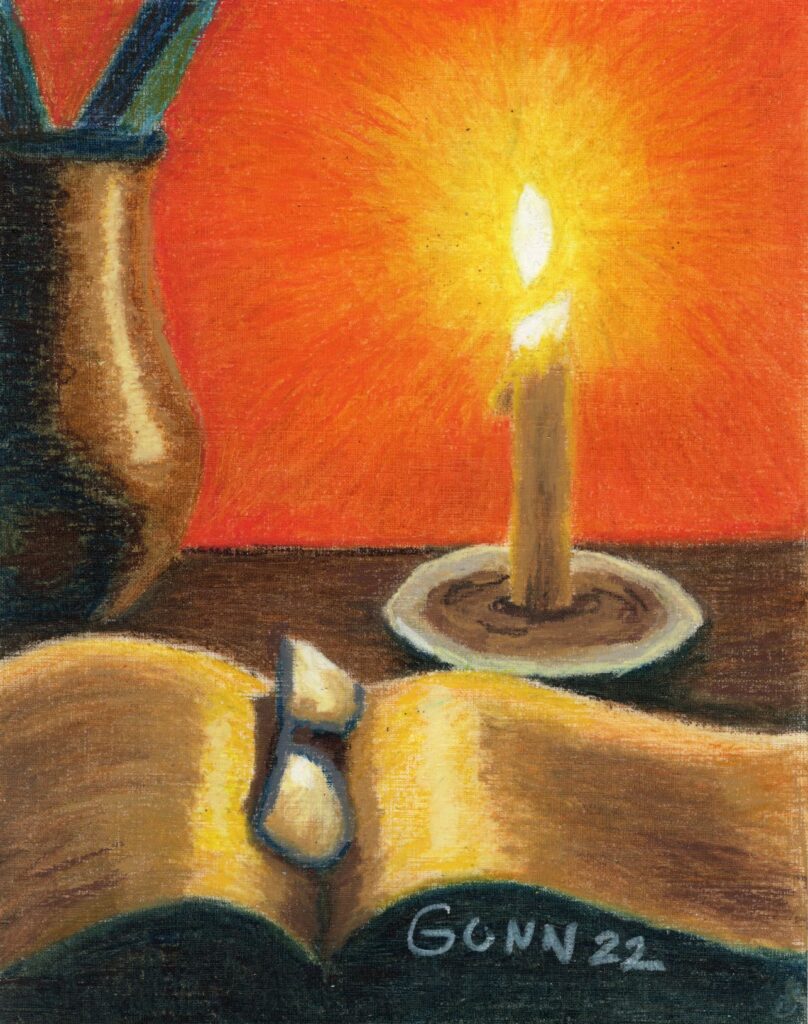
candle themed still life with open book and reading glasses on wooden table, with lighted candle as focal point
Book Reading By Candlelight, 11 by 14 inch oil pastel on primed paper, original and art prints available

Art supplies used

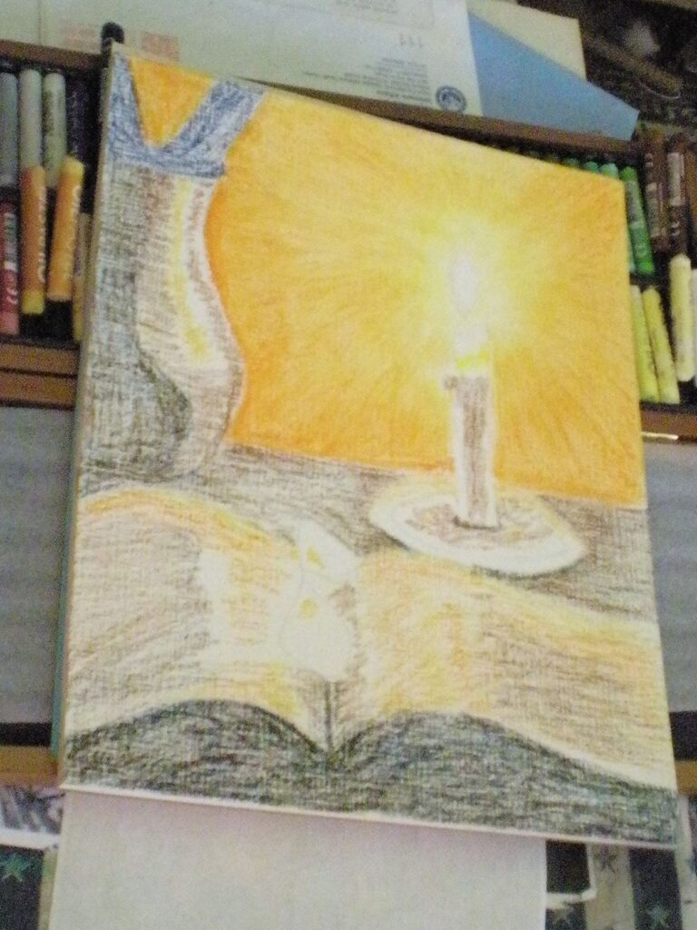
I used a sheet of Canson XL oil and acrylic primed paper, because I absolutely love the texture on it for oil pastels. I used my Mungyo Gallery standard set for the base layer, because that lovely texture will eat up softer oil pastels. For the record, that textured paper also tears up the cotton swabs I use to blend, so it is a good thing I can get a nice big package for only a few dollars at WalMart. On larger areas, I sometimes use napkins that I keep on my desk from takeout – those also do a great job of cleaning up spills (paint, coffee, etc).
base layer of Book Reading by Candlelight
base layer of oil pastel for Book Reading By Candlelight, on my 72 color set of Mungyo Gallery standard

I’m afraid I only have the one in-progress picture, because once I blended the base layer and took a break I put on my headphones and got into the zone, totally forgetting about the digicam as I happily lost myself in the sheer joy of playing with sticks of color. What can I say? I am an artist. This is an artist thing.

For the top layers, I used my Gallery Artist set – only 48 colors, so as I often do I used my Erengi Art Aspirer 50 stick set alongside it since the two manufacturers include different colors in their very comparable and compatible sets. I should note that since then, I purchased the 72 color set from Mungyo in a nice wooden box, and the 92 stick set from Erengi, also in a nice wood box. The Erengi set also includes two colorless blenders … if those work better than cheap cotton swabs I’ll be buying them by the dozen.

Links to purchase original and art prints

Now, for the part y’all have been waiting eagerly for: how to get this for your wall! At present, the original is available (though my friend Keashia says she is very tempted to get this because it will match the decor in her new house) and you can purchase it through Daily Paintworks. For larger (or even smaller) art prints to fit the empty spot over your favorite reading chair, browse the selection at my Pixels store. I uploaded it to my RedBubble shop so you can get it printed on apparel, accessories, and fun swag.

Update: This is now officially an award-winning artwork!

Feature Friday 6: Summer sunflowers

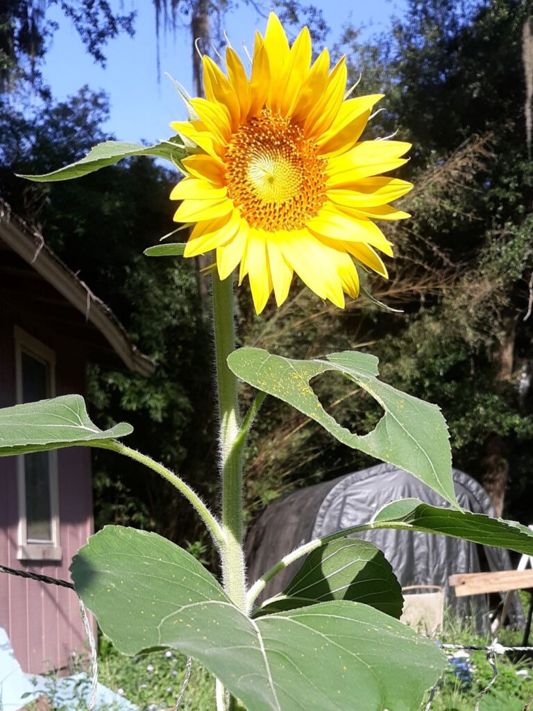
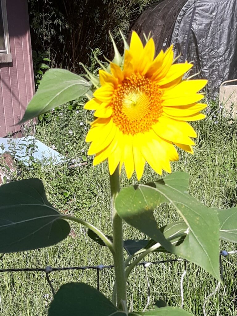
It’s almost August, and summer is in full swing here in humid Florida! We come into the house after morning chores totally soaked with sweat, and have about six to eight weeks more of that to look forward to. According to the news, we aren’t the only ones this year. While it is past the time for sunflowers to bloom here in the very deep south, apparently they are blooming in parts to my north. Honestly, here in the US is there anything that says summer like big, blooming sunflowers?

Summer sunflowers

our volunteer sunflower plant earlier this summer

Kicking off the Friday features are a pair of posts all about sunflowers, complete with enough good photographs to make up for the snapshots I am inflicting upon y’all.

  • Bill Swartwout started it with this collection of recent sunflower pictures. He even includes some interesting facts about sunflowers, which appeals to my inner geek in a major way.
  • Also feeling the sunflower power, Bob Decker shares his recent sunflower photos from North Carolina, along with the mention that sunflowers were a part of the “three sisters” gardening by native tribes.
volunteer sunflower next to the chicken fence
volunteer sunflower amid the volunteer squash in the compost pile

More art blog features for your summer reading pleasure

Getting back to my Friday features from around the art blogosphere, I think this is the perfect place to continue a conversation that started in the comments of my post about my Daisies in tinted charcoal, then Steven expanded his thoughts and added photo examples for a full blog post on how much software editing is considered fair game in fine art photography. If that wasn’t enough, he seems to be exploring his software filters and asks which filter is better for a photograph of an historic and landmark brick building on campus near him, then applies a completely different filter to some photos from his recent trip to Alaska. I find it soothing to see someone else who thinks about his art as much as I think about mine. More feature links:

  • Anne Haile has an intriguing post about the ancient language of flowers. While I’ve known that various flowers have had specific meanings throughout history, but particularly in Victorian England, I’ve not explored that topic with my usual geek intensity yet. I really need to research this, as it has some very interesting application to floral painting.
  • Jim Cook from HotShot PhotoGuy caught some fascinating photos of some eastern bluebirds – first two males squabbling over who would nest with the female, then the happy couple nesting in a wooden birdhouse he has.
  • Sharon Popek has done more book-themed photo compositions that involve multiple photos, including using her edition of Fanny Farmer’s Cookbook, one I have on my cookbook shelf as well (great resource, if you ask me). I would never have thought of doing photo mashups like that, but that is what makes the art world so interesting!
  • PencilPaws has a new drawing, this time an apparent family of monkeys from Bali. She used tinted graphite, which I have seen at the art store and looks similar to my tinted charcoal. She has the patience to do the finely detailed lines of the fur, so be sure to check it out.

Final thoughts – I need to draw and paint some sunflowers

Writing up this post made me realize that while I like sunflowers, and have joked about having “sunflower envy” in the past, I have not yet made any drawings or paintings featuring these lovely cheerful flowers! (Insert shocked gasp here.) I know all spring just about everyone and anyone was doing up sunflowers as the national flower of Ukraine, which is actually a bit odd considering sunflowers are a new world plant and did not appear in Europe until after the 1500s (similar to the potato and its association with Ireland among other European countries). I remember thinking at the time that if I did one it would surely get lost in the shuffle, but I don’t have any excuse for prior to that despite having several potential reference photos saved at Pixabay.

The big takeaway here is that I should try my pencil and brush at doing a bit of sunflower-themed artwork. It is definitely on my to-do list now. I have an oil pastel flower piece currently in progress, and I do have some artwork that I still have not blogged, so I need to try to keep out of the summer doldrums and just power through, sweaty mess and all.

Calla Lilies 3 drawing in tinted charcoal

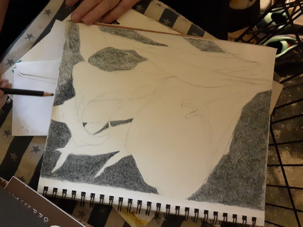
I’ve been battling a summer slump, but Sunday afternoon it suddenly cleared and I grabbed my rather-quick graphite sketch of three calla lilies in my sketchbook and decided to clean up the lines and finish the drawing in tinted charcoal.

When my husband heard the familiar rasp of a pencil moving across paper, he got up to see what I was working on, then he started snapping photos of the piece to record the process and progress layer by layer.

Starting with the darkest dark

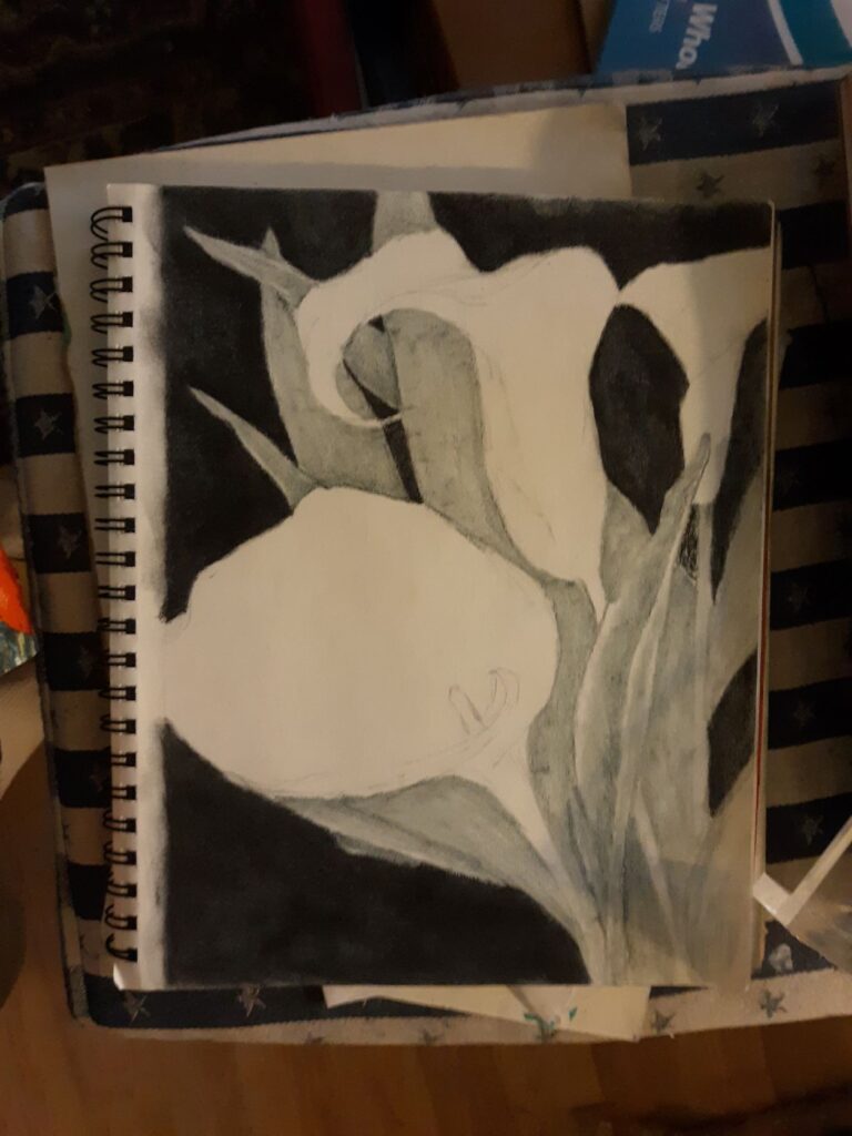
first in-progress photo, starting with the  background
starting with the background, using a dark blue tinted charcoal

For this drawing, I decided I would use black on the background, for at least one layer. I started with the background, because it helps me to get the darkest portion on the white paper first. While I am not sure this will explain it adequately to the nonartists out there, when starting with a white blank page it helps me to have the opposite extreme of the value scale to then be able to visualize all the middle values once the two extremes are there.

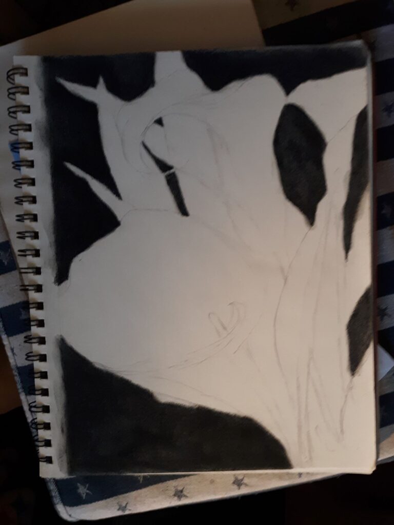
darkening the background with a layer of actual black charcoal

It took three layers to get the rich, deep dark I wanted: one layer of dark blue, one layer of black, then one layer of dark purple. I should probably point out that even when I work with only traditional black charcoal, it still takes about three layers to achieve the contrast in values the Italians call chiaroscuro (literally translated as “light-dark”) that makes a good charcoal drawing so eye-catching.

Adding the leaves and stems with green tinted charcoal

starting to shade in the leaves and stems with green tinted charcoal
starting to add in the green tinted charcoal

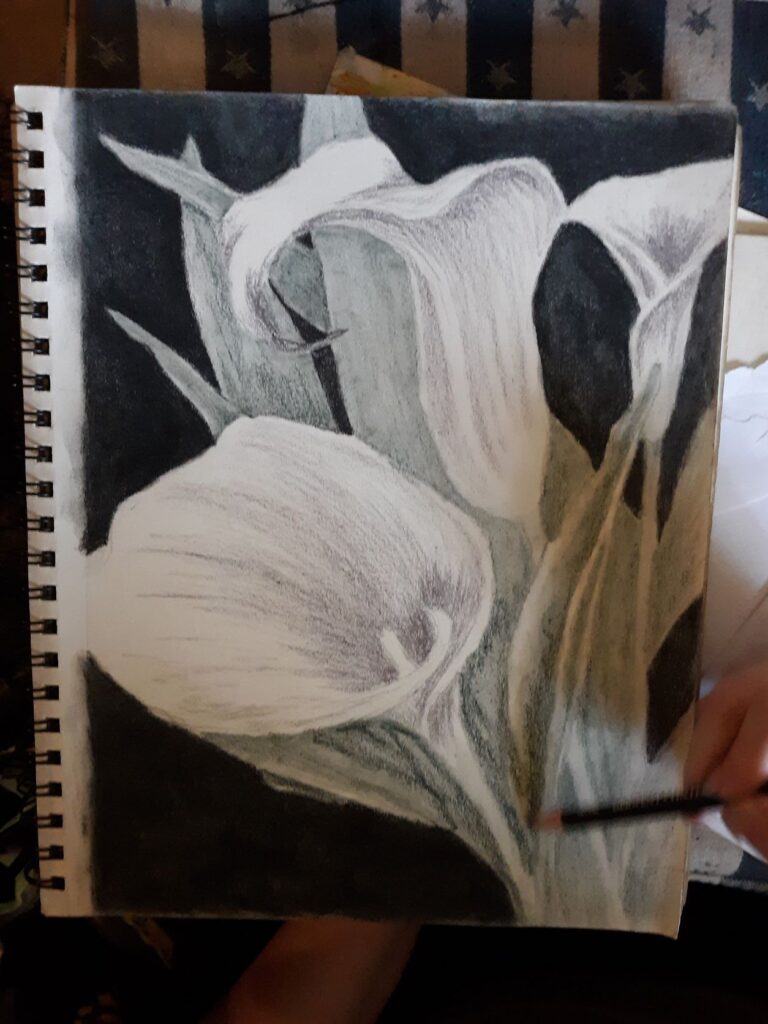
Once the background looked dark enough, after three color layers (dark blue, black, dark purple) it was time to start on the leaves and stems. I used the medium green from my big set of tinted charcoal, and tried to keep it from being too dark so it didn’t blend into the background. I wanted the greenery to only cover the middle range of values.

Starting to shade the white calla lilies

beginning shading the white calla lilies with a light purple
starting to shade in the white calla lilies

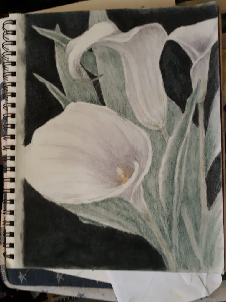
Even before I had the greens shaded in completely, I decided to start putting in the shadows on the white calla lilies. Shadows on white flowers are often either a blue tint or a purple tint, and I chose the lighter purple (labeled lavender) for this drawing, mostly to contrast nicely with the yellow ochre of the main flower’s stamen. Purple and yellow are opposite on the color wheel, and really look nice, as a look through my portfolio of work will show. (See Electric Yellow Rose for a good visual.)

adding the yellow ochre to the center of the main calla lily
Adding the yellow ochre to the main calla lily, and it is starting to really look nice

Finishing the drawing

At this point, it was just a matter of intensifying some of the colors, since the tinted charcoal set is more about subtle colors than bright, high-chroma or saturated color. It’s a bit of a seesaw, where I added more tinted charcoal to one section, then look to make sure the rest are in balance with it. Rinse and repeat however many times necessary – and this time it didn’t take as much fiddling and fussing to get to a point where I decided to call it done.

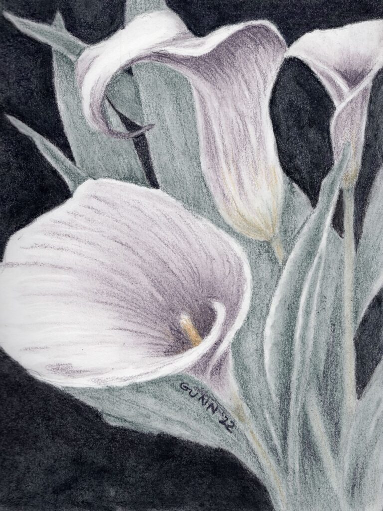
Calla Lilies 3, drawing in tinted charcoal, prints available
Calla Lilies 3, drawing in tinted charcoal in sketchbook, prints available

Since this is in my well-worn sketchbook, the original is not for sale. The corners on this sketchbook are quite rounded at this point. The scan came out very nicely, so prints are available through my Pixels store, while the various apparel and accessories are up at my RedBubble shop.

I have already started a similar piece, this time using my oil pastels (which is just about the polar opposite of charcoal drawing!) on some larger paper. I am still thinking about trying to do this in watercolor at some point as well, just not sure when. Calla lilies are just visually interesting for me, and I confess I have fallen in love with this flower since the first time I did the white on black drawings last year.

Daisies drawing in tinted charcoal

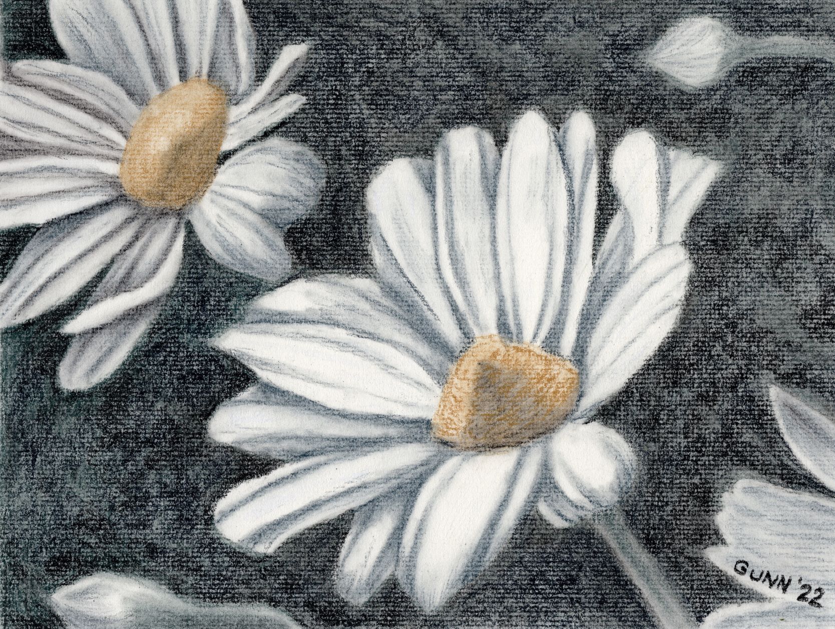
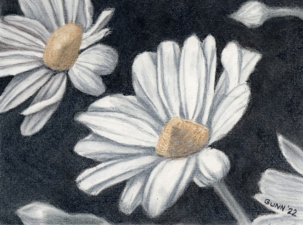
Now, to wrap up the three day daisies art challenge from last weekend. For the third day, I decided to do multiple daisies instead of another solo daisy study, and it was high time I did something significant with my Derwent tinted charcoal set that I’ve mentioned before. Before I show the result, I want to mention that I did not use a black charcoal at all for this piece, despite how it may look. I used two shades of green, two shades of blue, a yellow ochre shade called sand, a medium brown they call driftwood, and white charcoal for the highlights. I drew the preliminary sketch in that trusty old sketchbook, which ought to be full by summer’s end, and then transferred the contour sketch to my good charcoal paper, Strathmore 500 series with laid texture in what they call a natural white and what I call a warm white.

first version of Daisies, tinted charcoal on paper
Daisies, tinted charcoal drawing on paper, before darkening the background

Looking at the scan, I could probably have worked the dark on the background in a little better, to push the value contrast (the fancy art term is chiaroscuro, which is Italian for “light-dark”) that gives charcoal drawings their visual impact. In fact, now that I have seen that, I cannot unsee it and therefore must fix it.

Two charcoal layers later

Okay, I am back now. I think this is an improvement, though I am staring to feel tempted to just grab a soft black traditional charcoal pencil or stick to seriously darken that background up, despite starting this wanting to use only the tinted charcoal.

Final version of charcoal drawing Daisies
Daisies, tinted charcoal drawing on paper (darker final version), 12 by 9 inches, original available $100 USD

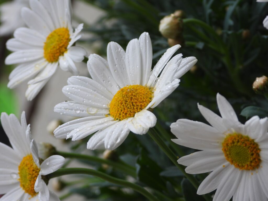
The reference photo

I almost forgot to include the reference photo I used from Pixabay. As y’all can see, I cropped it to simplify the composition and took my usual amount of artistic license after that.

photo of multiple daisies
original photograph

Links to purchase

Now that I have fiddled with it a bit more, time for the links y’all will need. If you want the original in all its dusty glory (and that is with a couple layers of fixative spray) and have the right spot and frame, you can purchase the unframed drawing through Daily Paintworks. You can order larger or smaller prints through my Pixels subdomain, with some fun swag as well. For an even-larger variety of apparel and accessories, browse my RedBubble shop.

Final rambling thoughts

If anyone is wondering what took so long for me to post the last piece of the daisy art challenge, I decided to move the blog to a new host and it did not go smoothly. I spent an entire weekend banging my head against vague error codes, and once it was finally done I did not want to even look at the blog for a couple days. Now I will be going back and revising all my previous posts, since I now have more tools to use.

Meanwhile, I feel like I have fallen even further behind. I have another new artwork to show off – the painting for my June 2022 frame giveaway, which I mailed off today – and forgot to get a snapshot of before I packed it up. I still have the last candlelight piece to post here as well as finding some more small watercolors from before I was blogging anywhere, so plenty more art-blogging to come.

Feature Friday 5: Let’s get blog-retro

It’s Friday once again, and this week I grew a brain and started this post the day before, in the spirit of the old army saying: “Proper planning prevents poor performance.” Soldiers being the eloquent creatures we’ve been since the dawn of time, call this “the five Ps,” although most would add in a sixth word starting with P that is not family-friendly. Last Friday I failed to plan, and when the thunderstorms rolled in about midmorning to mess with our satellite internet, I had nothing ready to go. Once bitten, twice shy … at least for now. With two weeks’ worth of links to share, let’s get this round-up started!

Blog links for your weekend reading

  • Jim Cook at Ramblings of a Hot Shot Photo Guy took some lovely travel-brochure style photos of a Japanese garden in Fort Worth, Texas called Mono No Aware. I think he captured to quiet beauty of the place so nicely. (Remember, I make no claims to being a photographer myself, as I have proven in previous Feature Fridays.)
  • Sharon Popek posted photos from her experiments using clear glass and liquids. I always thought photographing liquids in transparent or translucent glass would be so much easier than drawing or painting it, but apparently I am mistaken in that idea, and there is real technical know-how required for photography as well as drawing or painting.
  • Bill Swartwout freely admits he was in the right place at the right time to get the gorgeous colors in his beach photo at Ocean City, Maryland. I could so see that as a painting, or maybe three paintings – and I mean that in a nice way. It’s a great photo, but the painter in me would love the chance to try my brush at it.
  • Siena Blue posted her blog hop featuring the blind contour challenge. Overall, she is happy to have gotten someone new to play old-fashioned blogosphere party games (that would be ME) and is thinking of doing another one. I’m down for that! Let’s bring back all the fun stuff bloggers used to do back in the day like link round-ups, blog hops, link parties, and if we can get enough art bloggers who are up to it, maybe we can resurrect the old blog carnival idea. (If you blog your art – or are thinking about blogging your art – do join us. It really is a fun and motivating way of blogging.)
  • Hiding behind the pen name of Pencil Paws, is another animal and wildlife graphite artist who looks to be restarting her blog with a lovely drawing of her two cats, along with the story of they came into her life (spoiler alert: they were rescues). I like her careful and meticulous style, and hope she decides to continue blogging her artwork.
  • Finally, the blogging powerhouse known as Judith shows she isn’t shy of tackling a deep and somewhat dark chapter in art history with her exploration of the “degenerate art” of late 1930s Germany, along with some commentary about being lefthanded and how back in the day adults tried to “correct” this. Her post gets deep from almost the first paragraph, but it really impressed me, not just her research but some of the conclusions she reaches by the end. I am the type of person who believes we should know all of our history, not just the pleasant parts, because when we forget the bad stuff, we have this bad habit of repeating our mistakes.

Links to art supplies

For a few years now, I have been splitting my art supply budget between Jerry’s Artarama and Dick Blick art supplies, because each carries some items I like that the other does not. Jerry’s does not have an affiliate program … but Blick does! I signed up this week, and am now an affiliate as well as a customer, which means if you use my links to purchase something from their site, I will earn a small commission at no extra cost to you. Personally, I love it when they run the eCard sales, where you get an eCard code in a certain amount that arrives in your inbox two weeks after you’ve ordered. I still have to figure out where all the promo items like images and banners are in the platform, but I figured I would make a general announcement. I’ll be putting together a page with my personal recommendations, because I do indeed have my favorites from them. If the link looks funny to you, it’s because it runs through a tracking system. Both Blick and the platform have a good reputation online.

Obligatory eye candy snapshots

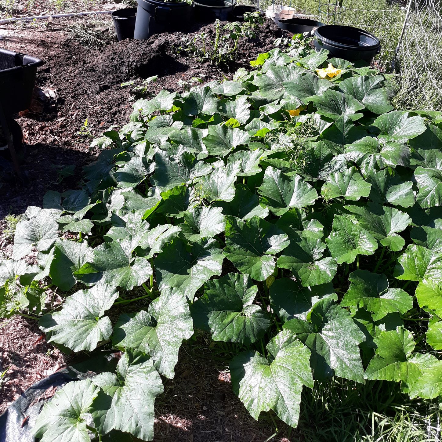
This being a blog all about my visual art means I need to have at least one image in the post, even my link round-ups. I thought this week I would feature the squash plant(s) that have grown out of the compost heap that are still going strong despite the heat of summer settling in (and wreaking havoc on my poor Swiss chard plants). This started out back in the autumn, October or November, when I bought some picturesque produce to get reference photos for my still life drawings. The butternut squash got wet and started to mildew, so we tossed it out on the compost heap to let it continue its breakdown. Usually, I don’t expect seeds from a grocery store-bought vegetables to sprout since I figure they are picked early to keep them from getting too bruised in transit. The seeds sprouted, and they must be dreaming of world domination at this point.

the squash plants have spread out from the compost heap and are shading the grass in the chicken yard
this is only about one third of the squash plants’ growth

Just an FYI: this particular snapshot is from a week or so ago, and the plants are colonizing the open area on the other side of the fence con mucho gusto. My husband has needed to trim some off to keep the footpath to the pumphouse and water spigot for the pig pen clear, because squash vines can be a bit tangle-foot-ish.

yellow squash flower among the green leaves
big yellow-orange squash flower in among big squash leaves

We’ve been trying to get nice snapshots of the flowers I can use as reference photos to paint, and I got to say it is difficult to get nice photos in the bright morning sun here in Florida, especially on the humid mornings when there are dew drops everywhere reflecting the sunlight. I still intend to keep trying for that one decent photo of a big honkin’ squash flower – seriously, the one that opened yesterday was bigger across than my hand. I also need to start bringing some of the squashes in for a nice picturesque pile. There will also be bean blossom and bean group snapshots soon as our summer garden beans are budding.

I still have one more daisy piece from the three day challenge over last weekend, plus a daisy drawing I forgot to post on the blog from last summer that may interest you. I also have the final painting from my candle light series a couple weeks ago that I just have not gotten around to posting. Then it will be time for a new art challenge – if I don’t see one that I like, I’ll just post one here and see who wants to play along with me.

That’s pretty much all I have for today, though I will leave y’all with this market research question: When you have bought artwork (original or prints) what was/were your main motivation(s)? Inquiring artists want to hear!