Apples and Oranges 2 still life in soft pastel

After the first still life art in watercolor, I decided day two simply needed to be in soft pastel. Not only because I haven’t recently played with my “dusties,” as I call them, but I also bought a sample pad of Clairefontaine’s Pastelmat, an expensive but highly recommended paper for soft pastels and pastel pencils. I figure an art challenge is a good excuse to try something new, so the apples, oranges, and bowl still life composition needed to be worked up in dusty pastel.

Apples and Oranges 2 still life art in soft pastel
Apples and Oranges 2, still life in soft pastel shown framed and hanging above a kitchen table

Selecting my reference photo

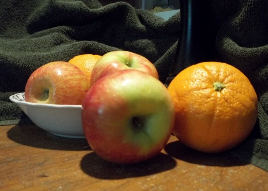
Once again, I looked through the set of photos I took back in October of 2021 for the right one to use as a reference. I almost didn’t pick this one, as I wasn’t sure at first how well the composition would work with the fruit mostly in a line like this. In the end I figured, “Why not?” This is for an art challenge and that is permission to try things that seem uncertain. So here is the cropped version of my reference photo, featuring the apples, oranges, and bowl mostly in a line.

reference photo of fruit for still life on my kitchen table - focus is a bonus when it comes to and photos!
my reference photo of a line of fruit including the white bowl on my kitchen table

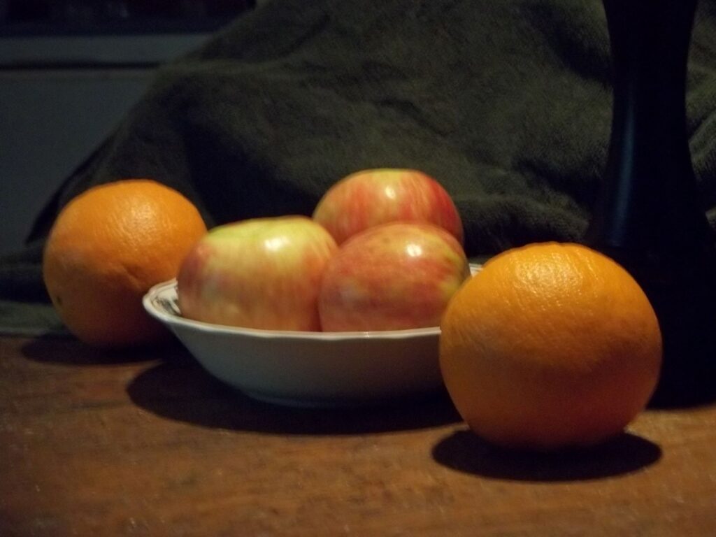
Once again, I consider focus to be a bonus feature, and not a requirement. I am most interested in the shapes and shadows for a reference photo of familiar objects. (We got very familiar with these subjects when we ate them!)

Working the still life in soft pastels

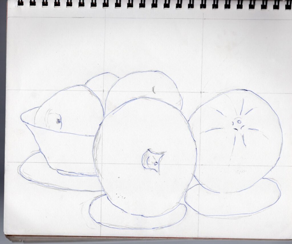
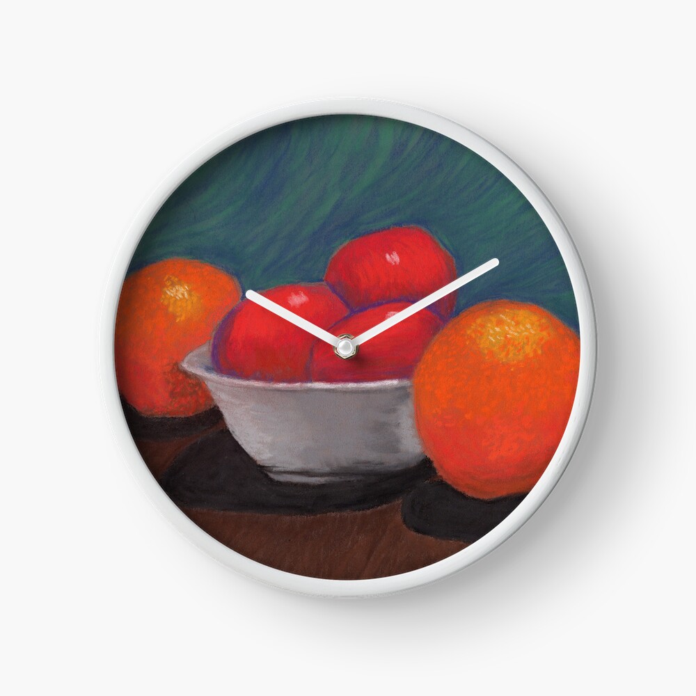
I did my basic sketch directly onto the sheet of Pastelmat, as I know I am able to cover up the light graphite lines with the dusties. Soft pastel in particular tends to be quite opaque, so I felt confident as I sketched in the main shapes after lightly gridding the sheet. I had decided before starting that I would “edit” out the background of the photo in favor of more stylized colors behind the apples and oranges. In fact, I also planned to omit the towel and pepper grinder as well, choosing to focus only on the fruit.

First the oranges

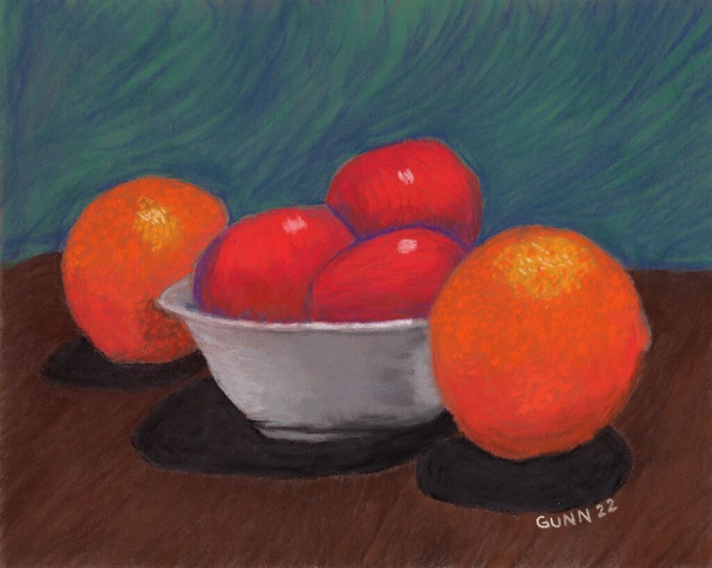
I worked on both oranges first, mostly because I knew I would need to turn the mat this way and that to keep from accidently smudging the soft pastel. Actually, I started with a reddish tone they call sienna, not wanting to deal with trying to completely cover a stark white sheet. I used my Mungyo Gallery soft pastels for the blocking in, and even for the shading. My intention had been to use my Stabilo CarbOthello pastel pencils to add in details at the end, which turned out to be barely needed as the Mungyo set worked wonderfully with the Pastelmat.

The three apples in the bowl

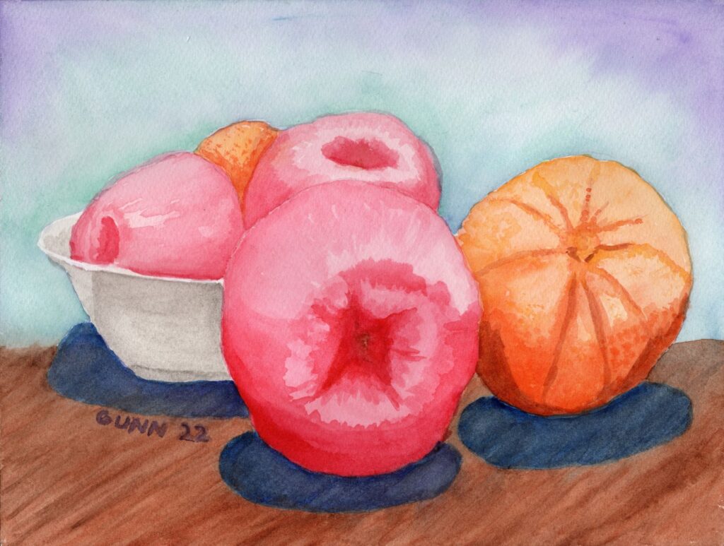
Since I had made the previous day’s apples straight red instead of the variegated red and green they actually were, I decided to keep that for this version of the still life series so they look like a cohesive set of pictures. As I worked the color into first shapes then forms, I found myself enjoying the process of laying down dry pigment onto the expensive heavy paper. By the time I had the apples in the bowl looking like red apples in a white bowl, I made the decision that I will only be buying Pastelmat for my soft pastel paintings and drawings going forward.

Coloring the table for the fruit and the background to complement the colors

I had no intention of leaving these apples and oranges to float in a colorful ether, so after I was satisfied with the fruit it was time to color in a table for it all the set on top. A couple broad strokes in brown accomplished the illusion of a table with shadows. I then turned my attention to the background. Getting the background color right was actually a critical component of how successful this composition would be! I needed just the right combination of blue and green, blended just enough to be harmonious but still dynamic enough to stay interesting. It is a fine line, but I think I am getting more familiar with where that line is on each piece.

Apples and Oranges 2, second in a series of still life paintings featuring fruit in a bowl, soft pastel on Pastelmat, 24 by 30 cm
Apples and Oranges 2, soft pastel on Pastelmat paper, 24 by 30 cm $100 USD

Links to purchase original artwork and prints

Now for the part y’all have been waiting for: links to buy. The original is on paper made in Europe, which means they measure in centimeters, so if you purchase the 24 by 30 cm pastel piece you will need to have it custom matted to fit standard US frames. The long side is 11 -7/8 inches, while the short side is 9-7/16 inches, so neither measurement will work for a 9×12 inch frame or mat. It’s worth it though! The Pastelmat holds the dry pigment surprisingly well. Seriously, I’ve been playing with pastels off and on since I was seven, and this stuff is the best I’ve ever worked on in over forty years of making dusty, colorful messes.

For art prints, I recommend my Pixels shop. There is a good variety of surface to choose from, and you can get it matted and framed as well if you like. Shipping might seem a bit steep, but the quality of product is high.

If you prefer to wear your art like my mother and sister love to do, then I recommend my shop at RedBubble for the wide variety of apparel styles. I’m also partial to the analog face clocks, even though I definitely do NOT have enough wall space to hang even half of the ones I like. The struggle is real.

Apples and Oranges 2 as an analog clock
Apples and Oranges 2 as a clock

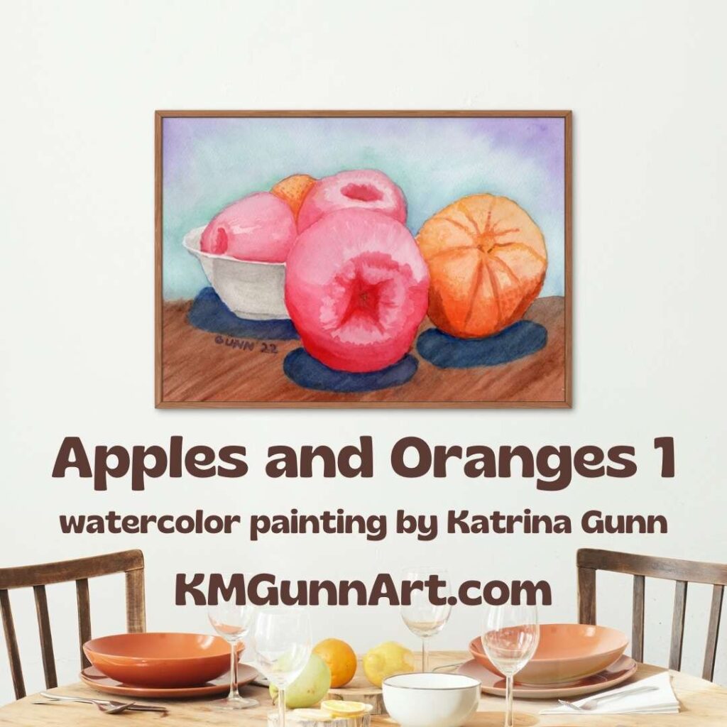
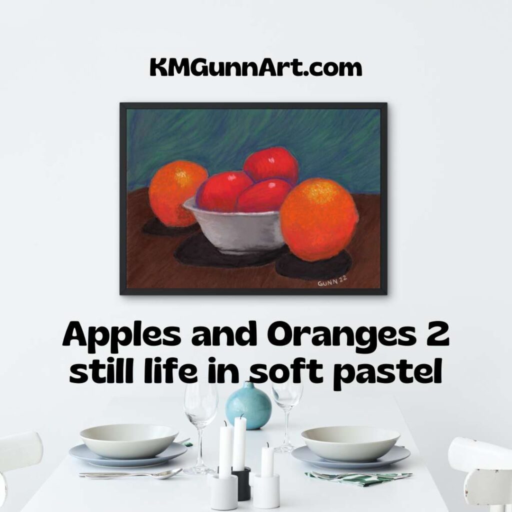
And this concludes the second in my short series of fruit in a bowl for the three work art challenge. If anyone thinks my method of naming to be boringly bland, you have permission to rename it if you purchase the original. Meanwhile, I’ll continue to refer to this still life in soft pastel as simply Apples and Oranges 2.

And with that, I wish everyone a happy new year, and I’ll be back in 2023!

Watercolor still life painting Apples and Oranges 1

So, I signed up to participate in a short three day art challenge solstice week with the theme of fruit in a bowl. Not even a full second had passed when I already knew what the first artwork would be: a watercolor still life painting using the reference photos from last year that inspired my Apples sketches and acrylic paintings. This time, though, I would only use photos with apples and oranges together in the frame. The bowl requirement excluded a handful of photos, but there was still plenty to choose from.

image of large art print of my watercolor still life Apples and Oranges 1 hanging on a wall over a set dining table
the final watercolor still life painting printed and framed in a mockup – wouldn’t this look lovely over your table?

Choosing the reference photo

Armed with the parameters of the specific theme for this art challenge, I began browsing my collection of photos taken on my own kitchen table with fruit chosen for its appearance. Yes, I actually went grocery shopping for fruit (and some vegetables) for the purpose of getting myself some reference photos that had the layout and lighting to draw and paint. As most of y’all know, I am blogging buddies with a handful of fine art photographers, and my hundred-or-so photos would probably make each of them cringe. I do not claim to be a photog, but sometimes I can get a snapshot that will make a decent painting reference. Focus tends to be a bonus, not a hard requirement. Here is the photo I chose for the first painting.

reference photo for my watercolor painting, a still life with fruit
cropped to how I wanted the fruit to fill the page

The preliminary sketch done in the sketchbook

I have learned from experience to do my gridding and layout in my sketchbook, not on my watercolor paper. Once I am happy with the general line drawing, I transfer it to my watercolor paper with graphite transfer paper. Then I take a kneaded eraser to clean up the lines and lift up any smudges from resting my hand on it.

contour drawing for the basic layout of Apples and Oranges 1, a still life watercolor painting with fruit in a bowl for the art challenge
the preliminary sketch for Apples and Oranges still life with fruit

This is where the progress photos stop, because once I picked out which paints I wanted to use, I got into the art zone and was only thinking about how I would apply the paint to paper. It took more layers than I expected, because apparently QoR brand watercolor paints have a color shift when they dry. I did do almost the entire painting with my newer QoR set, though I needed to pull out the burnt umber from my Turner set because I had evidently forgotten to make sure I had a nice strong dark brown tube when I purchased the colors last time. I’ll need to fix that with my next art supply splurge, maybe in January.

The finished still life in watercolor

I painted this fruit still life (with a bowl) on my 9 by 12 inch watercolor block, which means I did not need to tape a sheet of loose paper to a board. That means the paint goes all the way out to the edges, which is now my preference. I have not sealed it yet, because I am still debating if I should add another layer of pigment to the front apples and orange or not. If you want to purchase the original watercolor still life painting, you can make that decision for me.

Apples and Oranges 1, still life painting in watercolor on paper, 9 x 12 inches
Apples and Oranges 1, 9 x 12 inch watercolor still life on paper, original for sale $100

If you want a larger version, you can order a fine art print all the way up to 60 by 45 inches (before matting and framing) from my Pixels shop. That’s almost as tall as I am on the long side! Or, if you prefer your art printed on apparel or useful accessories for you and your home, check into the swag at my RedBubble shop. Finally, if this one is “close but not quite” for you, you can always commission a slightly different piece. I have a 12 by 16 inch watercolor block now.

Stay tuned here for the second piece in this series, which will not be in watercolor, but will still be named “Apples and Oranges.” Or put in an email address so you can have the next post delivered to your inbox. I don’t seem to be able to keep a regular schedule for publishing new blog posts, so that’s probably the best way to keep up.

Award-winning artwork 2022 Creative Arts Festival

In the absence of an email congratulating me this year, I had assumed I did not win any places for my entries to this year’s VA regional healthcare system’s Creative Arts Festival. As of checking the post office box yesterday, I am happy to report that assumption is wrong. All three of my entries this year took either first or second place! Here is the breakdown of my award-winning artwork. Oh, and the medals in the images? Those were in the envelope, and now hang on the shelf next to my desk.

First place award watercolor painting

snapshot of the first place medal for the watercolor painting Pumpkin Close-Up with on-image caption and inset of artwork
the actual medal mailed to me, with the watercolor painting that won the award

For the second year in a row, I took first place in the watercolor division! Those of y’all reading last year recall I won the first place slot (and advancement to the national competition) with my Flamingo in Rippled Water. This year it is my Pumpkin Close-Up that moves up to national competition – and the original artwork is still available if you would like to hang it on your wall and boast you own a real “award-winning” painting. If the original 10 by 14 inches is just too small, you can order a fine art print large enough to fit most people’s walls at my Pixels store. Or, if you want to wear my art like my mother sister enjoy, check out the apparel options at my RedBubble store.

Second place award winning charcoal drawing

2nd place award winning artwork Two Flamingoes in monochromatic drawing division
Charcoal artwork Two Flamingoes won 2nd place award in monochromatic drawing

Last year, I took first place in the monochromatic drawing category with my white pencil on black paper Dew on a Calla Lily. This year, both Twitter and Facebook voted that I should enter this charcoal drawing of Two Flamingoes, and it took second place. Not bad, and it really IS an unexpected medium for this subject. Most people who draw or paint flamingoes will do so in color.

Want the original drawing to put on display as award-winning artwork? It’s a small 8 by 10 inches, so it will fit into small spaces if need be. If you have a need or strong desire to go BIG, you can always order a larger art print from Pixels. I don’t currently have it up at RedBubble, but may add it in if people ask.

Second place award in oil painting with an oil pastel

Now we get to the award I feel the most pride when I think about it. This would be taking “just” second place in the oil painting division – but with an oil pastel picture! Seriously. I figure the artists who invest in the materials for oil painting and the time involved (because it takes quite a while to dry!) do so when they are confident in their artist skill. Or maybe it’s just me who has hesitated so long. Going up against oil paint on canvas and still winning a medal with my oil pastel on paper feels good.

2nd place award winning artwork Book Reading By Candlelight oil pastel artwork
Book Reading By Candlelight, oil pastel artwork won 2nd place in the oil painting category

If you want the 11 by 14 inch original artwork, I recommend buying it sooner rather than later. My friend Keashia loves this piece, and will be debating anew whether she wants to buy it or not. Want a larger art print? Head to my Pixels shop for those (or a jigsaw puzzle). This image is definitely in my RedBubble shop for apparel and accessories.

Weekly email newsletter starting

If y’all have read down this far, you might as well fill in the little form at the bottom of this post for email subscription and a weekly newsletter (especially for those weeks I don’t get a new post finished!) that I will be sending out on Fridays. It’s been on my to-do list for months, but now it is in place!

Third virtual art walk this Friday

We’re having so much fun doing these virtual art walks, and will do another this weekend. I of course will be posting on Friday so I can do a new Feature Friday. We have at least one new artist playing, so check back in.

Experimenting with Digital Art: Text-to-Image software

The other week, I saw a fellow artist post a link on Twitter about a site called NightCafe Studio where you enter in a text prompt and it generates an image (which a lot of people mistakenly called “artificial intelligence”). Curiosity finally got the better of me, so I followed the link and began to play around with the software as an experiment. You can see the portfolio of my experimenting here on my profile at NightCafe. I’ve spent almost two weeks playing with it now, which is to say I am stepping into the concept of digital art, at least on the text-to-image side of it. (It’s so much faster than drawing or painting, and right now I feel as though I have a hundred different things going.)

The good, the bad, and the “What the ****?”

The profile/portfolio I link to over on NightCafe only includes the stuff that turned out good. I started off with a simple enough prompt, “pink flower on dark green leaves” or something very similar. If you scroll down far enough you will see the result at the very bottom. I fiddled around with a couple other phrases, and deleted those results as I did not like them. I am saving all the flower ones for their own post, but then moved on to see what kind of results I could get for some classic still life subjects.

Modern style still life of red and yellow bell peppers and one cherry tomato on white plates with a blue tablecloth
Tomatoes and Peppers, digital art

Here is one that turned out nicely. I deleted probably half a dozen or more in my attempts to get a nice still life arrangement of tomatoes, peppers, garlic, and an onion – salsa still needing assembly. I figured it would be perfect to hang up at my favorite Mexican restaurant in town, especially since my Summer Jalapeno painting is there. Let’s just say the program is not good at doing an onion and totally ignored the prompt about garlic. So instead of a still life I could name “Salsa, Some Assembly Required,” I got red and yellow bell peppers and a single cherry tomato. It does look nice, although I will need to draw/paint what I actually wanted. I uploaded the digital piece to my Pixels shop and my RedBubble shop for accessories, apparel, and prints.

Classic still life subject seem to give the art generator fits. I have some truly wild examples of a big weak spot in the code – but I will save a few of those for the floral post since I was trying for an old masters’ style of fruit and flowers still life composition. I will mention the text-to-image program has some issues with what shape apples are supposed to be. It also doesn’t seem to realize that apples and pumpkins are affected by gravity like everything else.

A smashing success for text-to-image

On a whim, I decided to try a text prompt that would describe my very first pastel piece I did at the age of just seven. I have no idea if it still exists, but it has stayed in my mind all these years. The first result is still the best: here is Sunset Palms, with the Neo-Impressionist style filter applied to it.

Sunset Palms, two palm trees silhouetted against a brilliant sunset sky with simulated impasto
Sunset Palms, digital art

The software even generated simulated impasto that looks like it was applied with a palette knife. I was a little surprised to see a swathe of green in the sky, but I think it works. I put this into Microsoft Jigsaw to play with it as a jigsaw puzzle, and the colors are just fun. Art prints are at my Pixels shop (along with puzzles) and apparel and accessories are at my RedBubble shop. I can definitely see myself painting variations of this image, either in acrylic or oil paint, once I finally get a cat-free art studio where it can dry without being walked on by my cats.

The struggle for black cats

I decided I wanted to see what kind of Halloween imagery the software could generate for me, and began to enter various prompts and try different style filters. I wanted an image of a black cat’s face filling the frame, with lovely green eyes providing a stark contrast to the black fur. Instead, the program spat out this – and I have seen hairballs that look prettier.

ugly software glitch
I just call it “fugly”

Well, at least it got the green eyes part right. No matter how I tilt my head and squint at it, it just does not look like a cat as I know them. This is emphatically NOT in the public portfolio, because that would just be embarrassing. Or maybe I am just not modern enough in my art sensibilities. I kept trying with the text prompts.

Black Cat sitting, digital artwork created using text-to-image software
Black Cat Sitting, digital art

The title Black Cat Sitting is the text prompt I used, and in this specific case, the image it gave me was very nice! I love the soft focus feel to the light, and the cat sure enough looks like a real cat. When I saw this one, I began to think perhaps there is some hope for text-to-image software after all. Yeah, famous last words. Here is what the software thinks a black kitten ought to look like.

another disasterpiece from a simple prompt
a five-eyed kitten? What the ****?

Yikes. That is not public anywhere else but here on the blog. Seriously – does this have five or six eyes, and why would a supposed “artificial intelligence” think kittens look like that? I mean, I know Halloween is supposed to be all about scary imagery, but this is just so many levels of wrong. And that is about as polite as I can stand for this one. I could post a few jack o’lantern mishaps, but I think y’all get the general idea of just how spectacularly wrong the algorithm can be on some of these.

Text-to-image digital art of – ME!

One day last week, I had an “Ah-ha!” moment and decided to see what kind of software-generated digital image I could get from the text prompt describing me. Hold your laughter now. I started off with the text prompt “middle-aged woman with short blonde hair,” and ended up with this:

ugly image from what ought to be a straightforward text prompt
how I feel first thing in the morning

OK, now y’all can have a good laugh. Apparently, punctuation is important, and that hyphen in middle-aged must have messed the algorithm up good and proper. Granted, there are definitely mornings when I might feel like this, but I don’t usually look quite this rough (or so my husband says). So I tried “mature woman with short blond hair,” and the second time I got an image I am now using as my “face” here on the internet.

the internet me, from text-to-image digital art program

Now, she doesn’t look like she’s about to celebrate her 50th birthday like I am, but most of the female figures the software spits out look to be no older than 25, and most look like they could be movie stars, so an image that brings to mind Florence Henderson from The Brady Bunch probably fits the program’s parameters for mature. I like the simulated brushstrokes for it as well. Her eyes are the wrong color and she isn’t wearing glasses “thick enough to see into the future,” but she’ll be my face for the internet for now.

While the text-to-image programs used to generate digital art are far from perfect, every once in a while you get a good result. I can’t see it replacing us traditional artists any time soon, but for now it is an amusing novelty. I may just use it as a way to test composition ideas or to get inspiration. Mostly, I am just playing with it because it amuses me.

Entries for this year’s creative arts festival

Y’all recall last year when I placed first in two of the three categories I entered in the regional VA healthcare-sponsored creative arts festival? I am entering again, but this year picking the artwork to enter seemed much more difficult, given I can only enter three pieces again this year. I work in six media categories, not including mixed, and have made multiple pieces in most of those categories in the past year. So I took to Facebook and even Twitter to ask for opinions on which pieces I ought to put in the competition. This actually did not help as much as I hoped.

Oil pastel artwork

Oil pastels are not judged in the pastel category for this competition, but against oil painting as they define the category to include oil paint, oil sticks (which I have yet to try) and oil pastel. Basically, they want anything that includes pigment with some form of oil to fix it to a surface, which is not limited to canvas either. I felt my two best pieces from the past year are my Sunset Over the Hayfield landscape and my candle still life, Book Reading by Candlelight.

Folks on Twitter preferred the hayfield, while folks on Facebook preferred Candlelight, and when added together the votes were just about a dead heat. Any wonder why I asked for help deciding? In the end, I stopped to think (while milking goats) about the category and potential competition, and went with Candlelight because a bit of the textured paper shows in Hayfield, which might be enough to knock my piece down compared to the more traditional paintings.

Book Reading by Candlelight oil pastel still life
Book Reading By Candlelight oil pastel still life composition

Picking a watercolor painting

For this category, it was pretty easy for me. I simply love how my Pumpkin Close-Up came out last autumn. Truth be told, I really have not made many watercolor paintings over the past year, and this particular pumpkin one is my favorite of the three I did last fall (even though my mom just loves my Jack O’Lantern).

Pumpkin Close-Up watercolor painting

Picking a charcoal drawing

If y’all have been reading since the beginning of the year, you will know I was on a major charcoal drawing kick that started prior to New Year’s Day and continued through the spring goat kid bottling season. I made quite a few charcoal drawings, both traditional black and the tinted charcoal I am still experimenting with.

I managed to get my short list down to three, then once again asked on Facebook and Twitter which I ought to enter. The results surprised me. Personally, I had been thinking to enter my Apples 3 still life, but my husband said he really likes my Two Flamingoes. Meanwhile, my Single White Rose (in the same post as the flamingoes) tends to get positive reactions from folks. Both Twitter and Facebook enthusiastically said I should enter the flamingoes, though the rose was in second. What sealed the deal for me was the comments about how flamingoes usually aren’t depicted in black and white, and that I nailed the expression on the front bird’s face.

Two Flamingoes charcoal drawing

So, there we have it: my three entries to this year’s creative arts festival. I sent them off this morning, because today is the deadline. For whatever reason, I seem to always wait until the last day to enter. Perhaps it ties in with my usual answer when asked what I think my best piece of art is. My answer is always, “The next one.”

Update with results

(December) Results are finally back, and that required its own post because all three placed!