What a week: lighted candles still life

I had plans for this past week, which included participating in a short three-day art challenge with the theme “fire,” and had a virtual “seat” at another blogging symposium scheduled to start on Wednesday, along with my usual posts here.

A good start: Lavender Candles still life

Monday started off as planned, and even though I had an appointment and errands to run up in Palatka, I still came home and worked up my first piece for the art challenge, which I call Lavender Scented Candles. I often like to work on a theme-within-a-theme for these short art challenges, and this time was no different with my narrower theme being lighted candles. I had chosen three (and only three, this time) reference photos, and the only question I had Monday afternoon was which I thought I could do in a shorter time frame. I decided to work in oil pastel for the first one, and found a photo of two lit round candles on a tray, looking like those lovely lavender scented candles I so adore. (Lavender scent tends to evoke a relaxed feeling in most people.) Only two layers and a couple breaks to stretch my fingers, and it was time to put a coat of ModPodge over it so I could scan it, since oil pastel will indeed smear all over the scanner glass if not sealed with something, and ModPodge dries relatively quickly and adheres to the oil pastel in previous pieces.
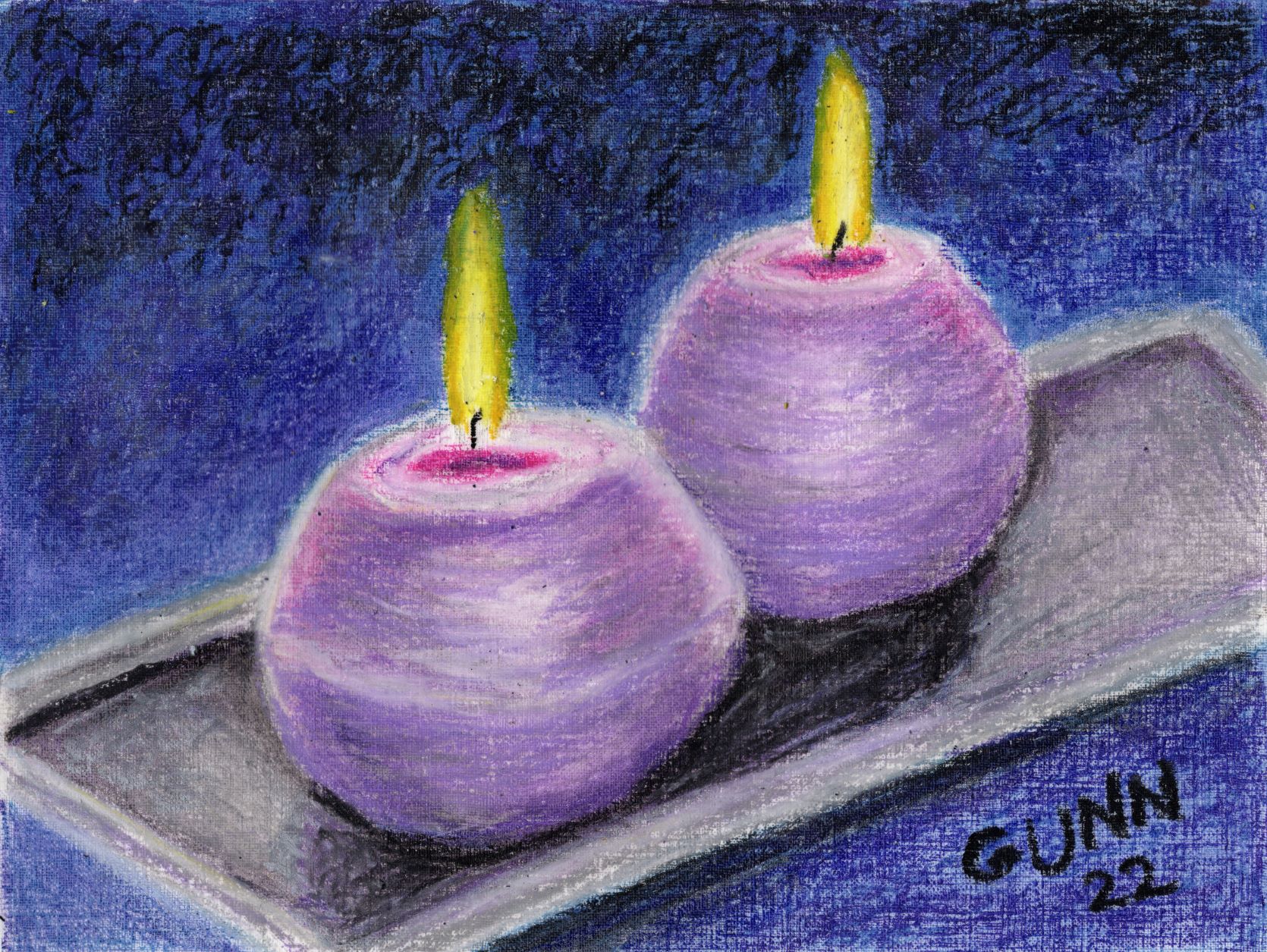
Scented Lavender Candles, 9 by 12 inch oil pastel on paper, $100 USD available

I didn’t build up enough layers to cover the laid pattern on the paper, partly because I like being able to see the texture and partly because I was working to finish within the time limit of the challenge, which is one piece both started and finished in a single day. Prints are available at my Pixels store, along with a few accessories and home decor items … and of course, puzzles for the adventurous. If I had a cat-free zone, I’d totally try one of these puzzles. For the folks who like the swag over at RedBubble, here’s your link with a note that RB has added some new items like caps, pet blankets and mats, and even a pet bandana, which is triangle and doesn’t seem to go well with most of my artwork. If you want the original, and are not local to me, you can purchase it through Daily PaintWorks, which uses PayPal although now you do not need a PP account to use it. All things considered, Monday went smoothy for me, even though I had to stay up an extra half hour to wait for the ModPodge coat to dry enough to scan it and then upload it.

Needing to improvise: stylized Holiday Hope Candle

Y’all have probably already guessed Tuesday didn’t go quite so smoothly. I gessoed a 9 by 12 inch canvas with my black gesso, and lightly sketched out the main components of my planned painting with a hard graphite pencil, then began to paint with my acrylics … and got to a point where it felt like no matter what I was doing, I just could not seem to paint my way out of the Ugly Stage. Right before we went out to round up the various critters, feed them and put them up for the night, I had a stroke of inspiration. When I came back in, I pulled out a small 6 by 8 inch canvas pad that was already primed for both acrylic and oil paint, and started painting a very stylized red candle with no background other than the white primer. Less than half an hour later, I had my second piece completed and dry enough to scan and upload, and maybe even get to bed at the normal time. I call it Holiday Hope Candle, and did no shading. Prints and greeting cards are available through my Pixels store, and the RedBubble link for apparel and accessories is here. I have plans for the original now, but if you’d like to commission another one, just let me know.
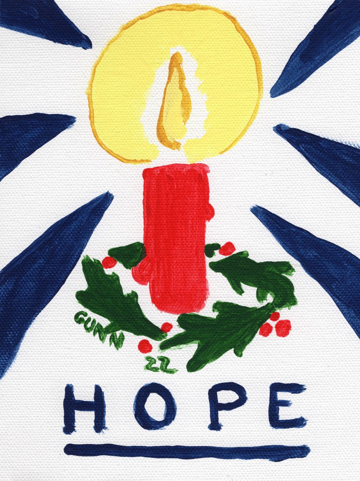
Hope Holiday Candle, 6 by 8 inches acrylic on canvas, $45 USD original available

And then things got weird

This is the part where my week went all sideways on me. We had some internet troubles on Tuesday, but it was episodic and came back up, so we didn’t think much of it … until Wednesday morning when the satellite connection was completely down with no weather-related excuse for it. Hubby got on his touchscreen phone to see if there was anything about the outage in local media. He found an announcement of an upgrade for our area, then we had to figure out how to force the company’s automated phone tree to connect us with a real person in tech support to find out whether our modem was compatible with this announced upgrade. Eventually, we navigated that obstacle, and tech support said no, our reliable old modem (purchased in 2013 when we moved here) was not compatible with the upgraded system and we needed a new one, and she could schedule a contractor to come out Thursday afternoon at the earliest. I had planned to draw or paint my third piece in my candlelight series while listening to another blogging symposium on Wednesday. So much for that.

So we went through all day Wednesday and half of Thursday with absolutely no internet. Zip, zilch, nada. The contractor came out on time, got right to work, and then made sure everything worked before he left, all in a professional and competent manner. Then it was a matter of trying to get caught up on whatever we missed. I am still not caught up on reading all my email, though I did see that the blogging symposium had been delayed due to a storm knocking out the power in the city of the person putting it on, so I was not the only person having technical difficulties this week.

Since I knew I would not be able to upload anything on Wednesday, I did not do my third piece. I was frustrated and out of sorts, so hubby put on an audio book to entertain us and I tried to play video games while listening and providing a lap for my cats. This seems to be a bad habit I do, giving up and walking away (sometimes literally) when I know it won’t get the result I desire. I need to work on this, and I think I will do that this weekend and finish my candlelight challenge even though the deadline has passed. I had been saving the best reference photo for last, and while I haven’t decided whether to do it in oil pastel or watercolor, I would like to have a third one for the series.

Feature Friday ought to return next week – some of those emails I have not read yet are from the blogs I read, and rather than try to rush anything, I’ll just get back on track and back in the saddle next week. Who knows – I may have a new and appropriate drawing by then as well.

Feature Friday 3: Back in the Saddle

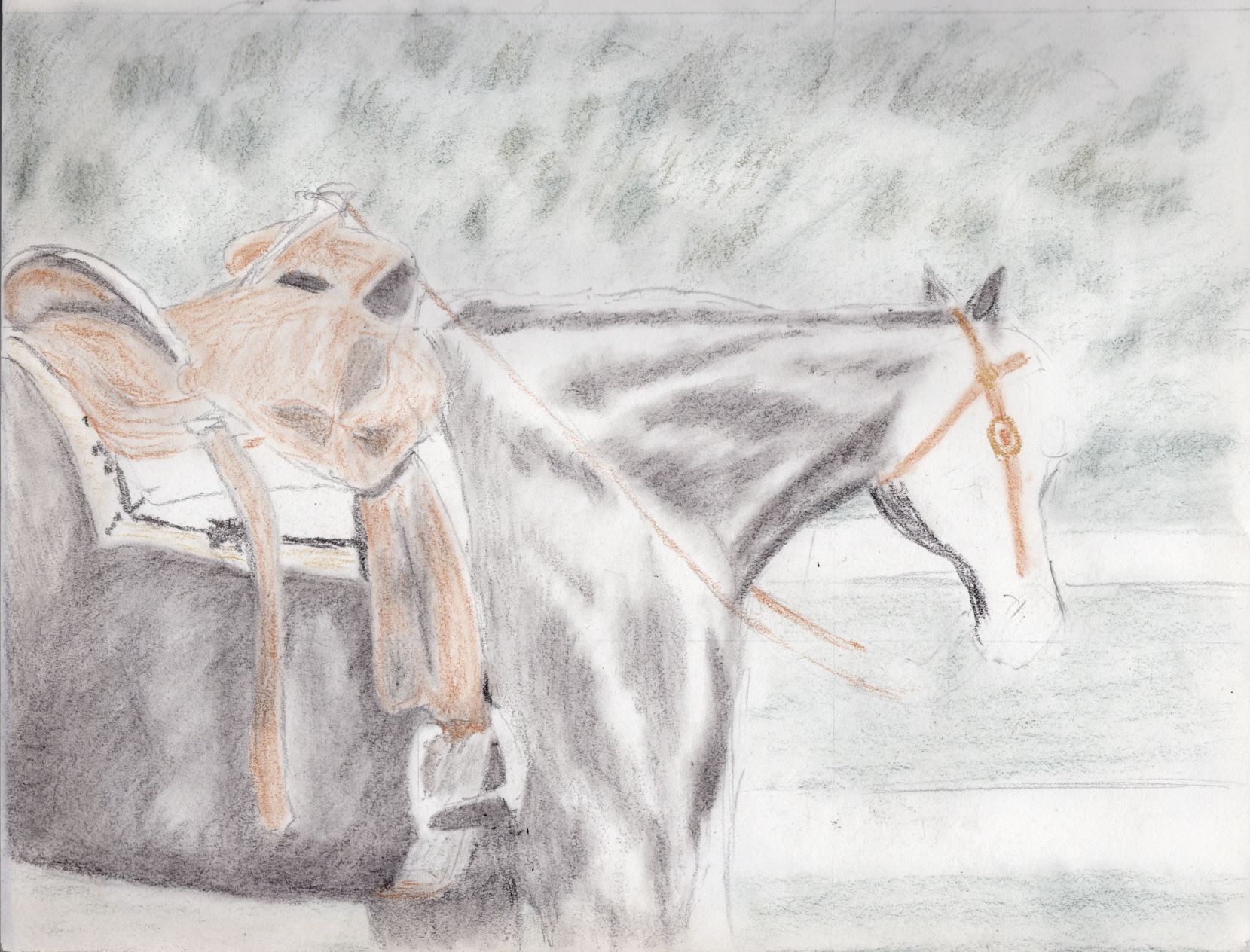
There is an old saying about how if you fall off your horse, the best thing to do is to get back in the saddle and finish the ride. Y’all probably noticed I missed a couple of Fridays in a row, but not to worry … I even have the perfect sketchbook page to share for this! I’ll likely be doing similar post beginnings, though I can’t guarantee I’ll have the appropriate drawing to share (or maybe I will?).

first drawing using my new tinted charcoal - a horse saddled up and waiting for the rider
saddled up – sketchbook page, first drawing using my tinted charcoal

Some of you might recall the little teaser I dropped at the end of my charcoal drawings post where I mentioned getting the Derwent tinted charcoal set – first the small six-color set to try it out, then the biggest set of 24 pencils before I even got this far on my first drawing because I love how they feel on the paper along with really loving the resulting drawing. I stopped messing with this particular sketch as I realized I stumbled across the first practical lesson for tinted charcoal: use the lightest shades first. See that saddle blanket? While waiting for the big set of charcoals to arrive, I had picked up a black charcoal pencil and doodled in the border design. When I got the big set and pulled out the one called sand to pencil in the rest of the blanket, I realized as soon as I try to blend it with a paint brush, the black will smear. So, like Bob Seger sang, it was time to turn the page. I’ll be revisiting that reference photo in the future, because I really do like it, and will certainly be doing a color version, though I might do a monochrome version just because it looks like a good piece to do in only one color. I just have not yet decided whether that will be black or one of the brown charcoals.

Blog posts I’ve enjoyed over the past couple weeks

I’ve been doing a lot of reading and listening to videos and podcasts on the subject of blogging, partly as a refresher course and partly to see what has changed over the decade I wasn’t blogging. The fundamentals are still the same: write your blog for people to read and enjoy, and the search engines will follow. Some of the stuff we used to do back in the day (like this link roundup feature I am trying to resurrect) just fell by the wayside, and I am not seeing a reason why other than the “oh, that’s so 2008!” statement. If gas station prices are going to look like ’08, then why not blogs?

Another thing I see that hasn’t changed is that the good blogs all have a “why” for their existence. This dovetails neatly with the recent article I read about how an artist’s statement helps the fans and viewers to better grok the artist’s body of work. I wanted to link to this article, but apparently that is one of the email-subscription only pieces, as the Inside Art site skips that day in the post sequence. The short version of this point is I am giving the concept some thought about how to expand my artist’s statement beyond, “I make art to bring some beauty into the world.”

So why am I blogging again? I got frustrated with Facebook. It’s (*bleep!*) difficult to link back to previous posts – and most days it’s (*BLEEP!*) difficult to even find a post again unless you leave a tab open with it. Facebook may be “more” interactive than blogs (which is a very debatable point, IMO) but it is not what I think user-friendly ought to be. (I should note that I never intended to have a FB account, but it seems to be expected, and a good portion of my family is on there. I’m just trying to set up a lemonaide stand with the FB lemon.) Last summer, I got frustrated enough with trying to find something again on FB that I announced to hubby, “I am going back to blogging!” And after a brief stint over on blogspot, I made my way here, back to my own domain and even back to WordPress. Now, it’s time to work on improving the site. If you are not already a subscriber, now would be a really good time to subscribe, either through a reader or by email, because I am only getting started here.

Speaking of starting, on Monday I’ll be participating in a new three-day art challenge, where the theme is “fire.” I’ve done it in colored pencil, twice, so I will be experimenting with other media. Right now, I think I’d like to break out the oil pastels for this, though I might try my brush with either watercolor or acrylic. Stay tuned!

The green challenge and the elephant ear plant

Continuing my self-audit of artwork created versus art pieces blogged, I find myself missing yet another of last summer’s art challenges, the green challenge and the elephant ear plant in my pasture. I meant to write about these last autumn, but apparently it just slipped my mind once “new project fever” swept up my last two working brain cells. I tend to get the new project fever in some rather big doses.

So, let’s travel back in time to July of 2021, which would put us after the flamingo series but prior to the blue-feathered bird series (which starts with the hyacinth macaw painting – I really need to do a roundup of that series and revisit those paintings with a fresh eye). It was another short challenge, with the theme “green,” and I just happen to have the perfect plant model that regrows each year in the goat pasture. Before the challenge started, I was out back with my old Kodak EasyShare digicam (I certainly got my $109 USD worth out of that thing!) to get reference photos of what my husband and I call the elephant ear plant for obvious reasons.

my elephant ear plant, likely a Xanthosoma species and the inspiration for the green challenge
my elephant ear plant in midmorning sun in the pasture

Since I was curious what its real name is (the plant was already here when we bought this place) I posted in a local Facebook group to see what it might be. Answers came in ranging from colocasia to taro to a xanthosoma species, and when I went researching what the differing names, I decided my specimen looks most like Xanthosoma roseum. (Edit: it may be Xanthosoma sagittifolium, which is native to the south of us and this one might have been brought up a county or two.) The largest leaves are often 18-20 inches long, and we sometimes joke about it being an escapee from the set of Jurassic Park.

The artwork

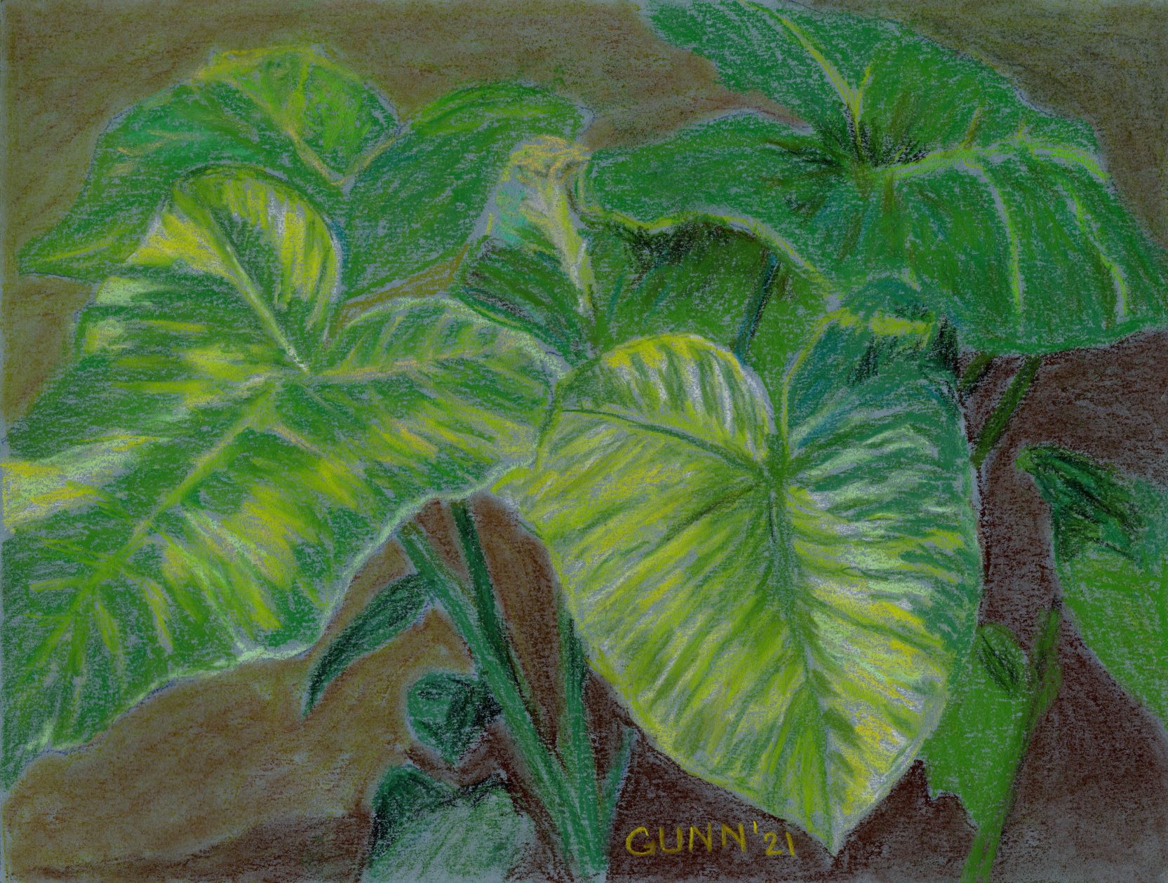
The first piece I did is similar to the above photo/snapshot, and I worked it in soft pastel (aka my “dusties”) on a blue sheet of Canson Mi Tientes paper, which I am still not enamored with except to use with colored pencil. Overall, I feel I got the shape right, but was hoping it would be brighter in the high key values (highlights) than it turned out. It isn’t awful, but I was hoping for it to be a bit more … just a bit more. The original is 9 by 12 inches, heavy paper, and lightly sprayed with fixative. Prints in larger and smaller sizes are also available at my Pixels store, and here it is on RedBubble apparel and accessories.

Xanthosoma in Morning Sun, soft pastel on paper
Xanthosoma in Morning Sun, 9 by 12 inches, soft pastel on paper, $100 USD original available

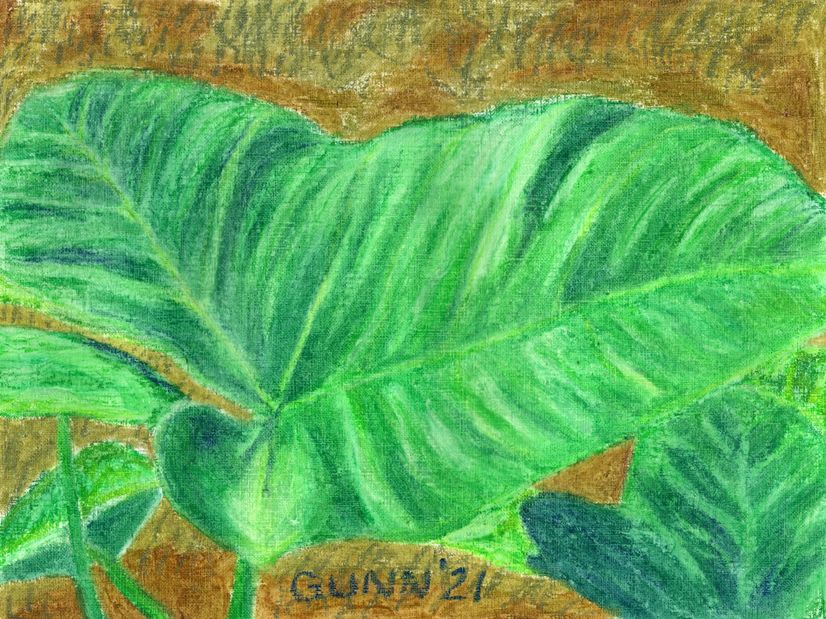
For the second day of the green challenge, I decided to zoom in on one leaf of the plant, because it really is a fun-to-draw shaped leaf (like Monstera species). I also decided to switch media and pulled out my oil pastels and the oil-primed practice paper, also a Canson product and one I like using. This piece captured the brightness I was hoping to achieve, and honestly it looks almost as if it is glowing. I so enjoy that about oil pastels – if you want serious, saturated COLOR, you can do it with the oilies. The original is also 9 by 12 inches, which is my favorite size for drawing and sketching, and it is sealed with ModPodge, which really works great for oil pastel work. Prints in larger or smaller sizes are available at my Pixels store, as are 500 and 1000 piece puzzles for those who love a good challenge and don’t have cats to “help” them with all the pieces. RedBubble swag is here.

Elephant Ear Leaf, oil pastel on primed paper
Elephant Ear Leaf, 9 by 12 inches oil pastel on primed paper, $100 USD original available

For some reason that I cannot recall, I dropped out of the green challenge after this second piece, despite having a good half a dozen more reference photos already chosen and cropped and still in a folder on my computer labeled “green.” Since yellow fly season has started here, I will be spending the majority of daylight hours hiding in the house from those vicious biting monsters that seem to wait outside my door for both of us, which means I will have plenty of time to “art it up,” as hubby says, and maybe this summer I’ll blog more of the results.

On the Easel: Red admiral butterfly in acrylic

I felt motivated to paint today, and this painting of a red admiral butterfly has actually been on my easel for a few weeks without progress. I originally picked out the subject and reference photo back in November for the red challenge that I didn’t finish. In fact, I had even done up an acrylic sketch on paper. You can even get a print of the sketch, though once I complete the final painting and scan it in, I will be replacing the image that is there now.

rough acrylic sketch for red admiral butterfly, 11 by 14 acrylic on paper

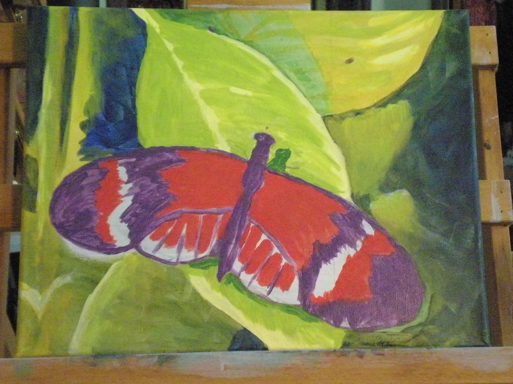
I did it quickly, and in the evening after running errands around the county and was tired and my back hurt … yet when my friend Keashia saw it, she immediately said I needed to do it again “for reals.” I didn’t get around to that until last month, and am not setting any speed-painting records on it, but today I’ve managed to make it look like I want it to look.

on the easel: red admiral butterfly, 11 by 14 inch acrylic on stretched canvas

Yes, that is purple where I will eventually be painting black (maybe). I have two sampler sets of Golden brand Open acrylic, which is their slow-drying formula made for the en plein aire painters, but right now I am using the quick-dry acrylics to get the undertones down. I don’t have actual black in the Golden Open sets, but I do have a very traditional work-around: ultramarine blue and burnt umber, along with a convenience mixture they call sap green which I am using in the background of the piece.

The red admiral butterfly

When I looked up the red admiral butterfly, all the sources said I ought to have seen this pretty and eye-catching bug at least over the winter season, as Florida is very much in their habitat range. Alas, I have yet to catch a glimpse of one, though we have plenty of swallowtails and sulfurs fluttering across and around the property. I’ll be painting those as well in the future.

Pink flamingoes in watercolor

So, I intended to do up a flamingoes watercolor painting roundup when I noticed I only blogged about two of my six paintings last year. Oops! It’s high time I fix that, so grab a beverage and some popcorn (if you like popcorn and your husband hasn’t yet eaten it all) and let me get caught up on my favorite pink-feathered birds.

As I mentioned last year while it was happening, this was for a seven day challenge that had the theme of liquid. I naturally decided to use watercolor paint as my medium for the entire week, and picked out seven reference photos of flamingoes in or near water, and my Flapping Flamingo was the first one I painted. I fell behind on the blogging portion of the challenge, resurfacing to post my favorite of the series, Flamingo in Rippled Water, which y’all will recognize as one of the artworks that won first place in last autumn’s VA Healthcare system regional competition. When I finished up the challenge with a beachscape, I mentioned I would upload the others “soon.” I suppose less than a year can sort-of count as “soon,” in a certain light.

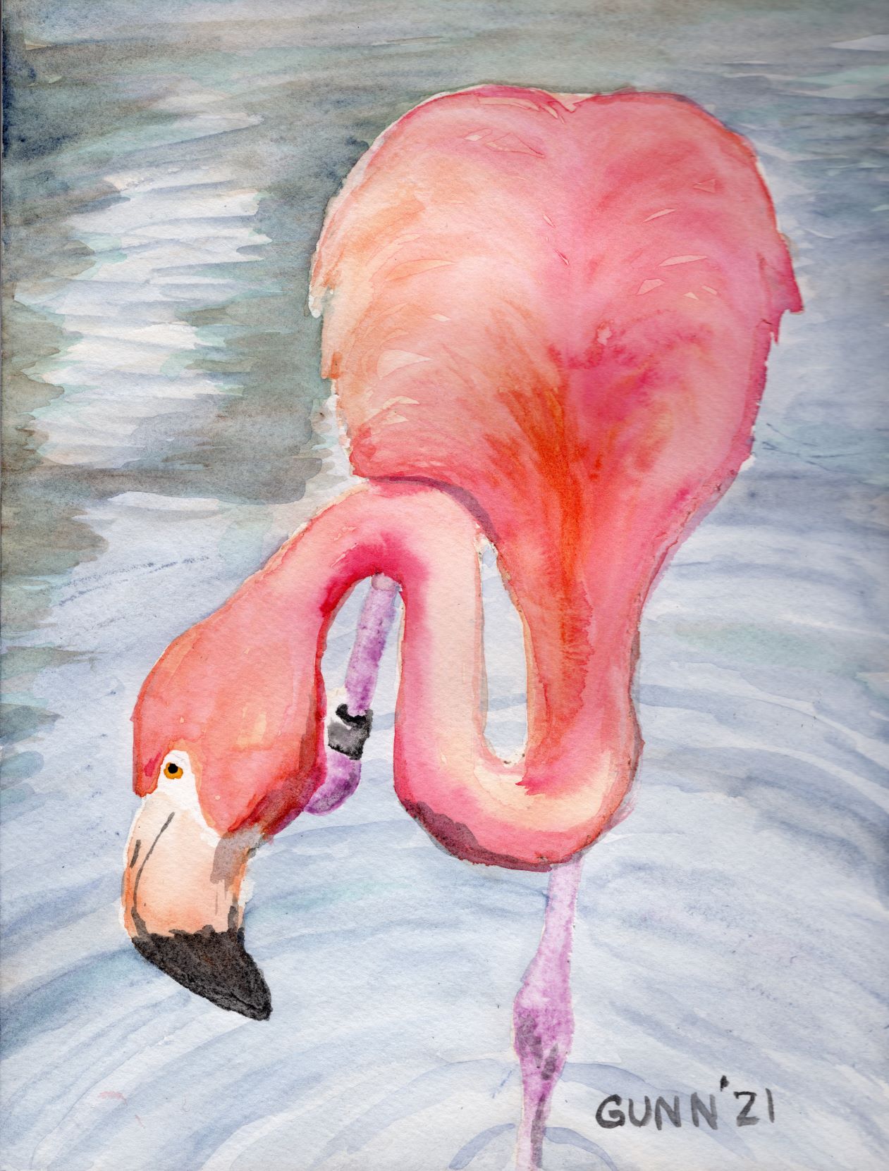
Very pink flamingo

For the second painting of the series, I did up this one I just call Wading Flamingo. I seriously doubt I will ever win any recognition for naming my art, but that doesn’t really bother me so I keep naming things with an obvious title. While this one isn’t really my favorite of the bunch, I have heard from a few folks who saw it and liked it. One artist also participating in the challenge said it was her favorite of the set. Like all the other flamingo paintings, this is on 9 by 12 inch watercolor paper, and prints are available. The page at my RedBubble swag shop is here.

Wading Flamingo watercolor painting
Wading Flamingo, 9 by 12 inch watercolor on paper, $100 USD available

Fun flamingo pose

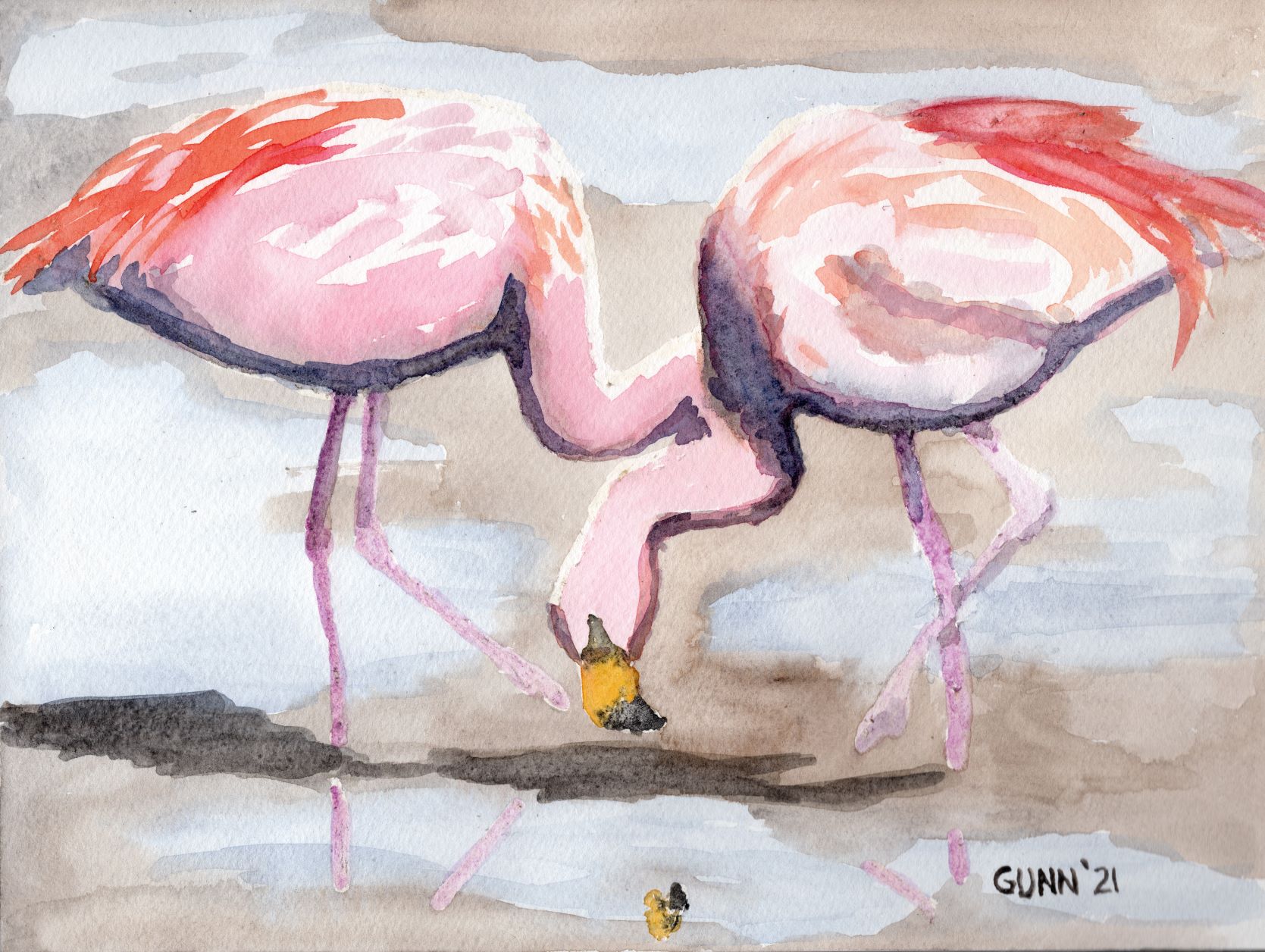
Third in this series, and my second favorite overall, is this much more subdued version I call Curious Flamingo. My husband says flamingoes have such expressive faces, and that expression often looks startled, but I have found some nice ref photos where the bird looks not-startled, like this one. It still looks almost silly, the way this flamingo has cocked its head just so, but the overall effect with the less-saturated colors just work for me. Also on 9 by 12 inch watercolor paper, with prints available in larger sizes. Link to the RedBubble swag shop here.

Curious Flamingo watercolor painting
Curious Flamingo, 9 by 12 inch watercolor on paper, $100 USD available

Flamingoes on the beach

For my fourth flamingo watercolor painting, I managed to salvage something workable from what at the time looked like very much the disaster. After a couple days of touch-and-go, my masking fluid finally tore the (bleep) out of my paper. I was furious, went on Facebook and asked in a watercolor artists’ group for a better brand than what I was using. Once armed with a brand name that was recommended, I placed an order that very evening for what I now use, which is Pebeo drawing gum. As for the painting, which I was originally going to call Beachcombing Flamingoes but instead titled Impressionist Flamingoes … I totally intended for it to be done in an Impressionist style. That’s my story, and I’m sticking to it. I am still a bit ambivalent about the idea of selling the original due to the damage to the paper’s surface, but it scanned well and I uploaded it to RedBubble for apparel and accessories. Prints in various sizes are available.

Impressionist Flamingoes, was intended to be called Beachcombing Flamingoes
Impressionist Flamingoes, 9 by 12 inch watercolor

Pale flamingo

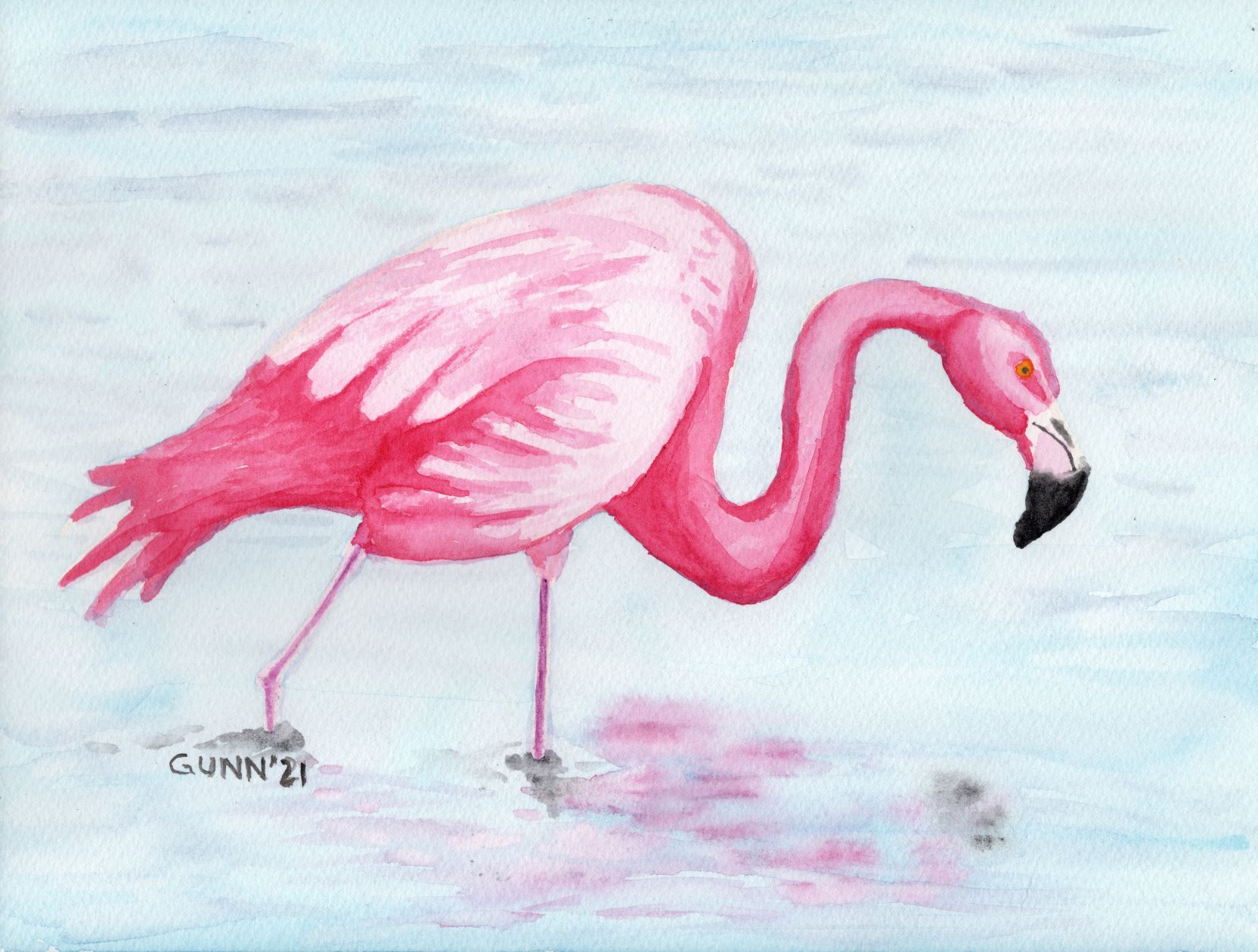
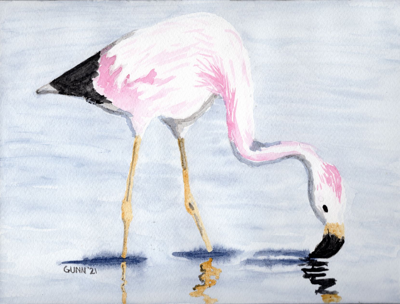
Pale Flamingo is as its title suggests, and a pale pink on the flamingo’s feathers while it feeds in shallow pale blue water. The black of the beak and tail feathers provides sharp contrast with all the pale versions of color, and this one was identified as another artist’s favorite of the series. The contrast is certainly eye-catching. The original is also on 9 by 12 inch watercolor paper, and prints are available from my Pixels store, while the RedBubble swag is located here.

Pale Flamingo watercolor painting
Pale Flamingo, 9 by 12 inch watercolor on paper, $100 USD available

So this gets me finally caught up on my flamingo series of watercolor paintings, which means it’s about time I painted and drew some new flamingo artwork. I’ll need to finish a few pieces on the easels – yes, I now have multiple easels to hold my works-in-progress – and one of those just happens to be a flamingo.