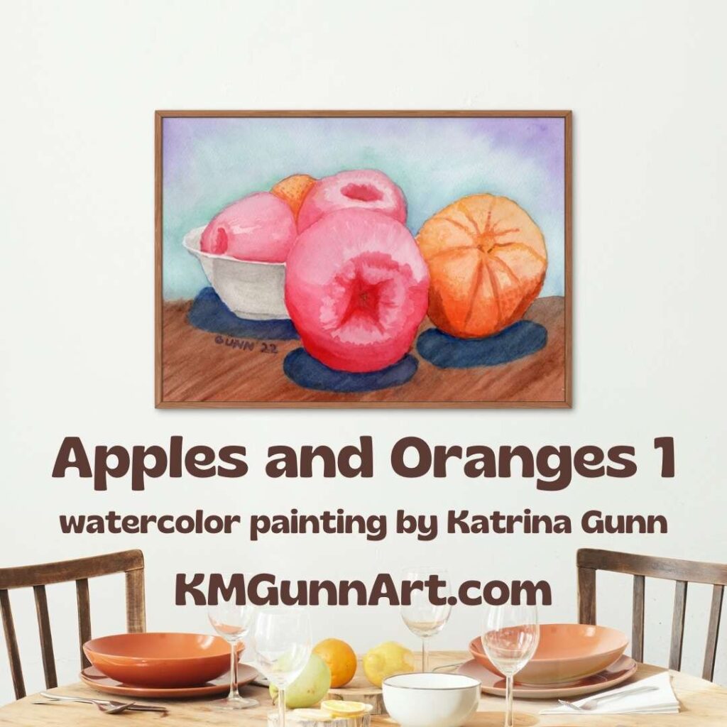
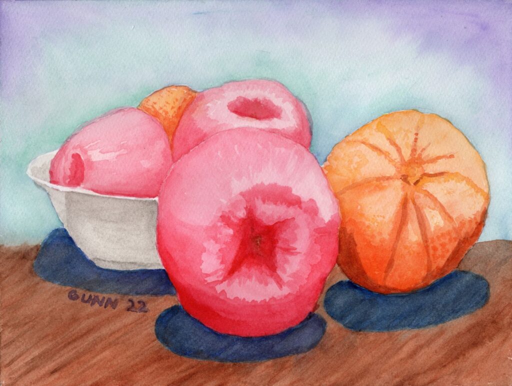
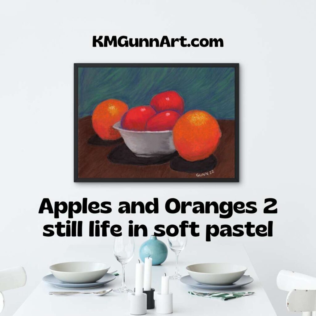
After the first still life art in watercolor, I decided day two simply needed to be in soft pastel. Not only because I haven’t recently played with my “dusties,” as I call them, but I also bought a sample pad of Clairefontaine’s Pastelmat, an expensive but highly recommended paper for soft pastels and pastel pencils. I figure an art challenge is a good excuse to try something new, so the apples, oranges, and bowl still life composition needed to be worked up in dusty pastel.
Selecting my reference photo
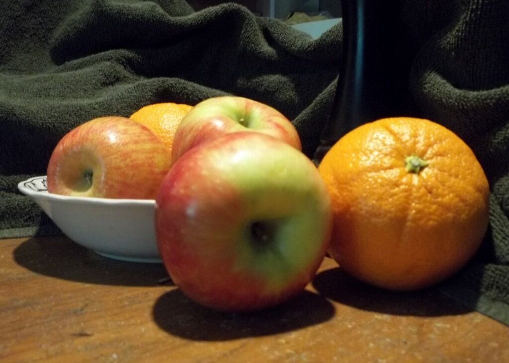
Once again, I looked through the set of photos I took back in October of 2021 for the right one to use as a reference. I almost didn’t pick this one, as I wasn’t sure at first how well the composition would work with the fruit mostly in a line like this. In the end I figured, “Why not?” This is for an art challenge and that is permission to try things that seem uncertain. So here is the cropped version of my reference photo, featuring the apples, oranges, and bowl mostly in a line.
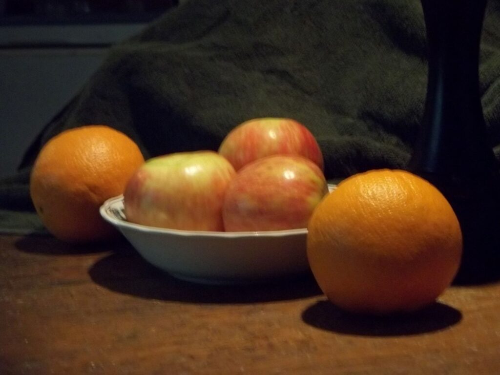
Once again, I consider focus to be a bonus feature, and not a requirement. I am most interested in the shapes and shadows for a reference photo of familiar objects. (We got very familiar with these subjects when we ate them!)
Working the still life in soft pastels
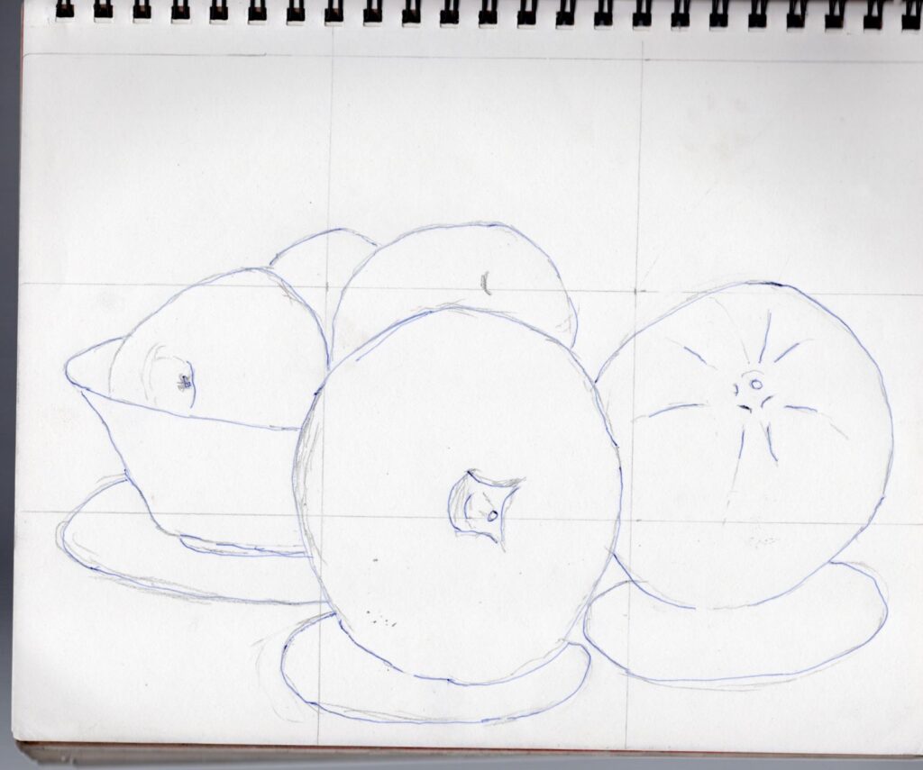
I did my basic sketch directly onto the sheet of Pastelmat, as I know I am able to cover up the light graphite lines with the dusties. Soft pastel in particular tends to be quite opaque, so I felt confident as I sketched in the main shapes after lightly gridding the sheet. I had decided before starting that I would “edit” out the background of the photo in favor of more stylized colors behind the apples and oranges. In fact, I also planned to omit the towel and pepper grinder as well, choosing to focus only on the fruit.
First the oranges
I worked on both oranges first, mostly because I knew I would need to turn the mat this way and that to keep from accidently smudging the soft pastel. Actually, I started with a reddish tone they call sienna, not wanting to deal with trying to completely cover a stark white sheet. I used my Mungyo Gallery soft pastels for the blocking in, and even for the shading. My intention had been to use my Stabilo CarbOthello pastel pencils to add in details at the end, which turned out to be barely needed as the Mungyo set worked wonderfully with the Pastelmat.
The three apples in the bowl
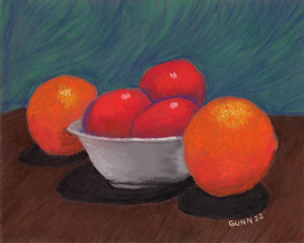
Since I had made the previous day’s apples straight red instead of the variegated red and green they actually were, I decided to keep that for this version of the still life series so they look like a cohesive set of pictures. As I worked the color into first shapes then forms, I found myself enjoying the process of laying down dry pigment onto the expensive heavy paper. By the time I had the apples in the bowl looking like red apples in a white bowl, I made the decision that I will only be buying Pastelmat for my soft pastel paintings and drawings going forward.
Coloring the table for the fruit and the background to complement the colors
I had no intention of leaving these apples and oranges to float in a colorful ether, so after I was satisfied with the fruit it was time to color in a table for it all the set on top. A couple broad strokes in brown accomplished the illusion of a table with shadows. I then turned my attention to the background. Getting the background color right was actually a critical component of how successful this composition would be! I needed just the right combination of blue and green, blended just enough to be harmonious but still dynamic enough to stay interesting. It is a fine line, but I think I am getting more familiar with where that line is on each piece.
Links to purchase original artwork and prints
Now for the part y’all have been waiting for: links to buy. The original is on paper made in Europe, which means they measure in centimeters, so if you purchase the 24 by 30 cm pastel piece you will need to have it custom matted to fit standard US frames. The long side is 11 -7/8 inches, while the short side is 9-7/16 inches, so neither measurement will work for a 9×12 inch frame or mat. It’s worth it though! The Pastelmat holds the dry pigment surprisingly well. Seriously, I’ve been playing with pastels off and on since I was seven, and this stuff is the best I’ve ever worked on in over forty years of making dusty, colorful messes.
For art prints, I recommend my Pixels shop. There is a good variety of surface to choose from, and you can get it matted and framed as well if you like. Shipping might seem a bit steep, but the quality of product is high.
If you prefer to wear your art like my mother and sister love to do, then I recommend my shop at RedBubble for the wide variety of apparel styles. I’m also partial to the analog face clocks, even though I definitely do NOT have enough wall space to hang even half of the ones I like. The struggle is real.
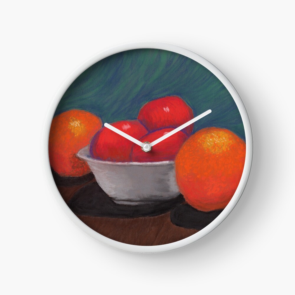
And this concludes the second in my short series of fruit in a bowl for the three work art challenge. If anyone thinks my method of naming to be boringly bland, you have permission to rename it if you purchase the original. Meanwhile, I’ll continue to refer to this still life in soft pastel as simply Apples and Oranges 2.
And with that, I wish everyone a happy new year, and I’ll be back in 2023!

