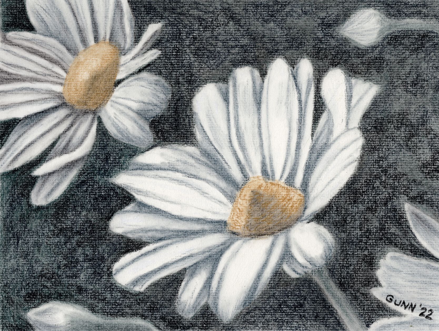
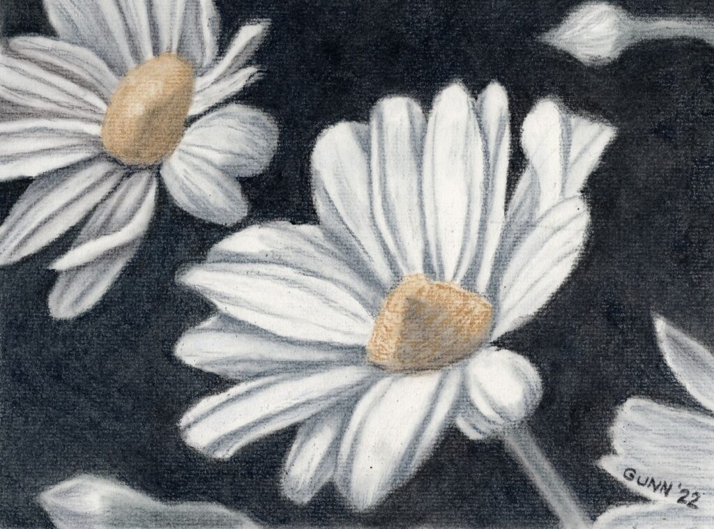
Now, to wrap up the three day daisies art challenge from last weekend. For the third day, I decided to do multiple daisies instead of another solo daisy study, and it was high time I did something significant with my Derwent tinted charcoal set that I’ve mentioned before. Before I show the result, I want to mention that I did not use a black charcoal at all for this piece, despite how it may look. I used two shades of green, two shades of blue, a yellow ochre shade called sand, a medium brown they call driftwood, and white charcoal for the highlights. I drew the preliminary sketch in that trusty old sketchbook, which ought to be full by summer’s end, and then transferred the contour sketch to my good charcoal paper, Strathmore 500 series with laid texture in what they call a natural white and what I call a warm white.

Looking at the scan, I could probably have worked the dark on the background in a little better, to push the value contrast (the fancy art term is chiaroscuro, which is Italian for “light-dark”) that gives charcoal drawings their visual impact. In fact, now that I have seen that, I cannot unsee it and therefore must fix it.
Two charcoal layers later
Okay, I am back now. I think this is an improvement, though I am staring to feel tempted to just grab a soft black traditional charcoal pencil or stick to seriously darken that background up, despite starting this wanting to use only the tinted charcoal.

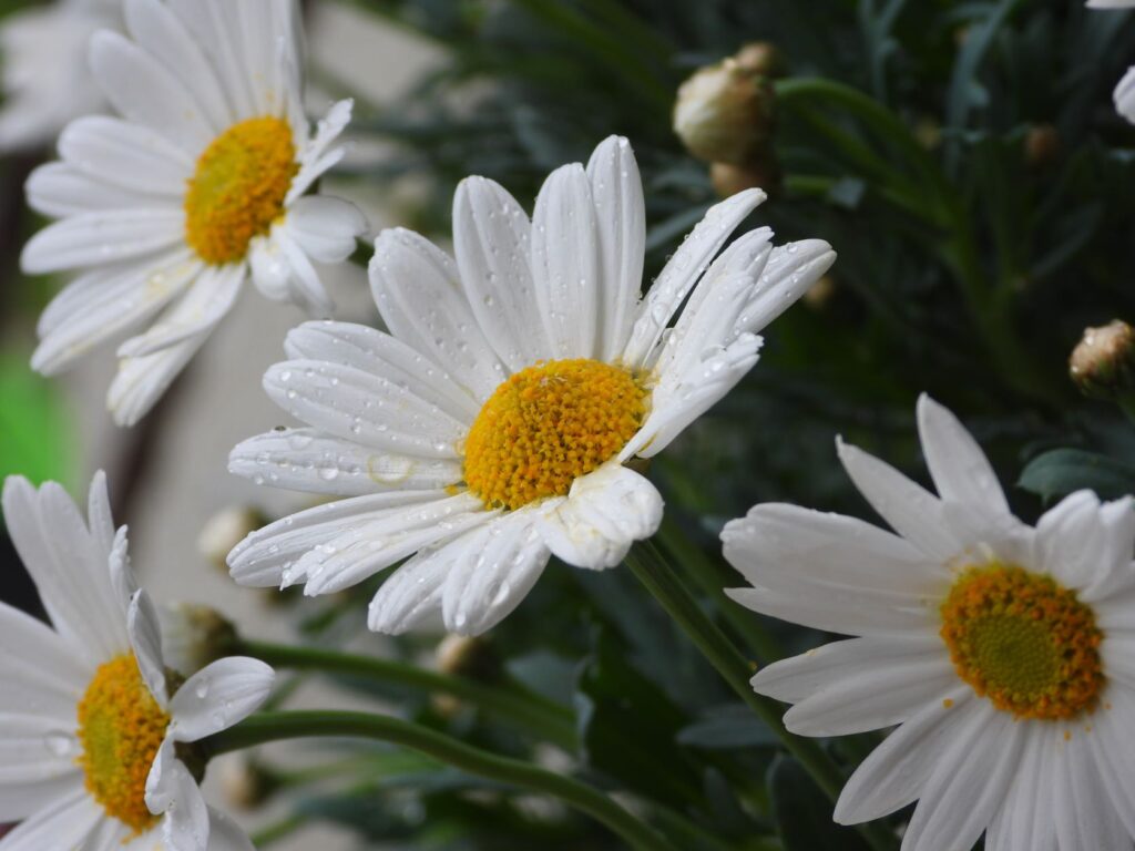
The reference photo
I almost forgot to include the reference photo I used from Pixabay. As y’all can see, I cropped it to simplify the composition and took my usual amount of artistic license after that.

Links to purchase
Now that I have fiddled with it a bit more, time for the links y’all will need. If you want the original in all its dusty glory (and that is with a couple layers of fixative spray) and have the right spot and frame, you can purchase the unframed drawing through Daily Paintworks. You can order larger or smaller prints through my Pixels subdomain, with some fun swag as well. For an even-larger variety of apparel and accessories, browse my RedBubble shop.
Final rambling thoughts
If anyone is wondering what took so long for me to post the last piece of the daisy art challenge, I decided to move the blog to a new host and it did not go smoothly. I spent an entire weekend banging my head against vague error codes, and once it was finally done I did not want to even look at the blog for a couple days. Now I will be going back and revising all my previous posts, since I now have more tools to use.
Meanwhile, I feel like I have fallen even further behind. I have another new artwork to show off – the painting for my June 2022 frame giveaway, which I mailed off today – and forgot to get a snapshot of before I packed it up. I still have the last candlelight piece to post here as well as finding some more small watercolors from before I was blogging anywhere, so plenty more art-blogging to come.

Lovely work. I like how you went back and reworked the background. As creatives we’re never really satisfied are we?
It is always interesting to see how you approach these drawings! And it often makes me think of the difference between photography and art (and I know someone will now say that photography is (or can be) art….). Your comment that you had your source photograph but then simplified the composition and added your usual artistic license struck me as interesting when you think about a photographer taking the same scene for a print. How much can be changed before someone says – you cheated, it wasn’t like that? I might write a blog post about it!
Incidentally, and I hope you don’t mind the critique, the shading on the right flower in the center doesn’t look quite right to me – it looks more like a cone rather than the gentle shape of the flower head itself?
I like to say, “My best work is my next work.” Seems to leave me room to grow.
Actually, if you look at the ref photo closely, you’ll see that one does have a cone-shaped center as opposed to the one slightly behind and to the left which has the more familiar flat center.
I look forward to such a blog post, because I imagine that is quite the debate among y’all photographers.
Beautiful work and even though it was a head banger moving the place looks great. You’re in a better place. I love your image in the header.
Thank you, Rebecca!