Summer Jalapeno acrylic painting

I am finally getting to the final image from the black and white challenge, which ended up being a photograph I took in early July of my husband’s jalapeno plant, cropped, straightened, and with the color taken out. I had a busy day out of the house that day, running errands up in Palatka, and was tired both physically and mentally once I got home. I really was not happy with the result, and immediately planned to redo it and replace the image with something better, something more “me” than a cluttered and busy photo.

black and white photo of my husband's jalapeno plant with blossoms and peppers
greyscale version of my reference photo

That something else ended up being the very next challenge, which I started with the Calla Lily painting in acrylic. Since the theme for the next challenge was “anything goes,” I figured to do up three images from the black and white challenge in color, using acrylic paint since I could use the practice with that medium.

Starting the painting

Some days, the paint just flows perfectly, and the painting comes together “like magic,” as the saying goes. Then, there are days when I feel as though I am fighting every step of the way … and the first day of this painting was definitely a struggle. I blocked out the position of everything easily enough, but my first stab at the background color turned out too purple, so I mixed up some more paint and tried again, with this time being too light a blue. Then, when that dried, I noticed I didn’t cover the too-violet paint well enough in some spots, so I went over it a third time, using the paint straight from the bottle. Then, I turned my attention to the green leaves and stems.

Trouble getting the green of summer

At the time, I only had two shades of green at hand, and neither one was dark enough to be a good jalapeno green. I tried mixing, but at this point it was time to put the critters up for the night and I was frustrated enough I needed to suppress the urge to throw the canvas across the room. That’s usually a clear sign to stop working on it, and try again the next day. So, this painting knocked me out of the short, three-day “anything goes” art challenge, which requires one completed work each day of the challenge. Dropping out of a challenge is only a minor disappointment for me, and one I actually prefer to posting up something I don’t like.

After officially dropping out, hubby was home and asked me what part of the painting had me so frustrated. When I got to the part about not having a good green, he started digging around his bunch of paint (he has used this brand for several years now) and started pulling out half a dozen shades of green for me to choose from. Then he remembered some blending medium that slows drying time that he tried but doesn’t use often, and also a wet palette setup to keep the paint you mix up on the palette from drying while you work.

Finishing the painting

With the expanded selection of greens available the next day, this painting came together so much easier! This one I actually like, and it is currently on display at El Amigo Mexican Restaurant – because that really is a perfect place to display a painting of a jalapeno plant that has a couple white blossoms, one dark green fruit, and two ripe red peppers (when jalapenos turn red, they are called chipotles). This particular painting may not be perfect (and to be honest, it isn’t because I can spot mistakes) but I like it much better than the photograph.

Summer Jalapeno, acrylic painting on stretched canvas
Summer Jalapeno, 11 by 14 acrylic painting on 5/8 deep stretched canvas, original available $175 USD

I’ll likely do a similar painting, or maybe recrop the photo for a more close-up view of it, and hopefully it will have fewer mistakes and be less frustrating. For those who may want a print either larger or smaller than the original 11 by 14, check out my Pixels store. If you want this printed on apparel or swag, look here on RedBubble. For the original, you can purchase through Daily PaintWorks – or call the number on my business card at the restaurant.

Scarlet Macaws have Blue Feathers Also

I am finally finishing up my six day blue-feathered bird series from the other week, with a pair of scarlet macaws. Personally, I’ve always thought we should call them rainbow macaws, because while most of their feathers are a lovely shade of scarlet red, they also have bright yellow, vivid green, and brilliant blue feathers, as you can see from their multicolored backs. They are certainly one of the brightest colored parrots.

Rainbow Macaws, a pair of scarlet macaws sitting on a branch with a green background
Rainbow Macaws, 11 by 14 inches acrylic on paper, original available, $140 USD

I was extremely pleased with how the tree limb perch came out, although getting the scarlet red with shading was a challenge. In retrospect, I think the green background is not quite right, and probably needed to be toned down a bit more. The birds themselves look more Impressionist style than realist, but since this was for an art challenge I had a (self-imposed) time limit on how much I could fiddle with it. Being the last day of the art challenge, I was not inclined to drop out to fuss over it. As usual, prints are at my Pixels store, while swag and accessories are at RedBubble. If you are interested in the original, you can purchase easily through Daily Paintworks.

Thoughts on this art challenge

I have to say that I am loving these art challenges organized on an art forum that I participate on. I particularly love the themed challenges, as it feels more like a group activity, instead of just me as a solitary artist trying to capture fleeting images from my mind. I remember that one semester of drawing I took in the autumn of 1991 in Texas, where there were about forty of us situated around the large room, all drawing the same objects in the center, but from forty different angles and by forty different hands. I like to listen to an art podcast while doing it, which reinforces that feeling, as we used to discuss the drawing subject while we did it.

I have finished another art challenge, seven days with the theme of “black and white,” and will be starting a shorter three days (“anything goes” non-theme) tomorrow. I may even get caught up over this week, as I am planning to redo at least two of the images I did for the black and white challenge, in color on stretched canvas, but in a different aspect ratio – 8 by 10 inches instead of 9 by 12 inches all the black and white drawings are.

Stay tuned for the next two challenges!

Christmas Candle still life drawing

I did another Christmas card artwork sooner rather than later, and yes this is related to another art challenge. The theme was not announced until the evening prior, and the prompt was, “after dark.” I have actually intended to do this holiday-themed still life for a while now, and just hadn’t sat down and done more than just a rough sketch and obtain a good reference photo. This turned out to be the perfect excuse to just do it. What I’ve had in mind is a Christmas-themed still life arrangement with a lighted candle, and for the level of detail I wanted to capture, colored pencils are best. I may not use them nearly as much as my other media, but when I do it is for something specific and detailed.

Christmas Candle still life drawing in only white on black paper for a minimalist look
Christmas Candle, white on black first stage 12 x 9 inch –

I stopped long enough to scan the image in white-on-black, just in case I was still not satisfied with the coloring-in by bedtime. Surprisingly, several of my fellow artists and challenge participants like this better than the final color version. Comments received so far include “surprising,” “minimalist,” and just plain “cool.” I do not have an original for this version for obvious reasons, but I could probably make one if requested. I only have this version up at my Pixels site for prints and even cards.

Adding color to the drawing

I have to confess, I expected the coloring-in phase to be more of a battle than it was. I often say, “Sometimes you’re the windshield; sometimes you’re the bug,” and yesterday went smooth enough to qualify as being the windshield. The black paper has a laid texture to it, and is made for charcoal and soft pastel, so it didn’t take the colored pencil as fully as smooth paper would, but I like the effect and will be using it again. If you would like to own the original, you may purchase through Daily Paintworks here.

Colored pencil on black paper, Christmas Candle still life with pine cones and colored lights
Christmas Candle, colored pencil still life on black paper, 12 x 9 inches, $100 USD

I do love how the pinecones turned out! Y’all will likely never see my first attempt at drawing a pinecone, which is probably for the best. The colors pop against the black background so nicely. Finally, the contrast between the still life objects in focus and the colored lights being completely out-of-focus in the background came out just as I had hoped. Prints and cards are at the Pixels store, while apparel and accessories are at RedBubble.

So, time to ask your input: which version do you like better, and why? Should I do up a new white-on-black version? I suppose I ought to joke, “Asking for a friend.”

Christmas Card Art, Part One: ornaments in watercolor

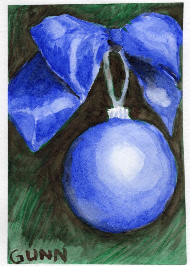
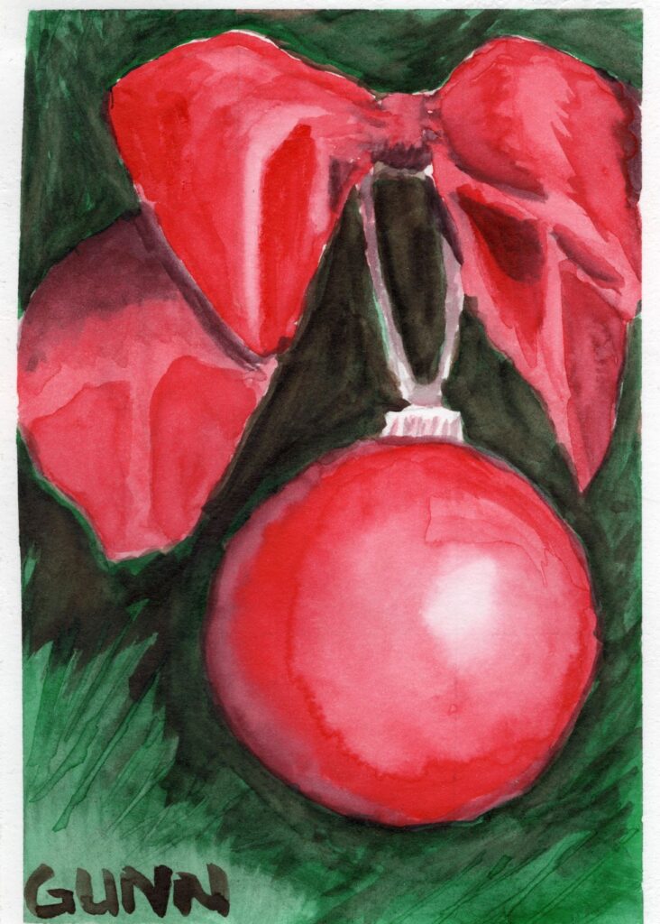
The days are beginning to get shorter here in the northern hemisphere, which means it is time to get ready for the upcoming holiday season that kicks off with Halloween and ends with the New Year. Here at the beginning of August, it means it is time to think about what art you want on your Christmas cards! I have two paintings from last year, both five by seven inches, both ornaments hanging on the tree that I have not blogged yet to go along with my Winter Snowman watercolor painting also from last year.

The why behind the art

This was actually a test of a company’s watercolor paper; the red one is on hot press and the blue one on cold press, which really matters more to me as the artist than anyone who doesn’t paint. (The brand is Legion’s Stonehenge Aqua, for other artists reading this who may be wondering.) After finding a reference photo that I really like, I painted them side by side. I was pleased with how both turned out, and it gave me a good idea of what to expect from each … along with two cheery and festive paintings that both look just right for cards!

Blue Ornament, watercolor painting on paper, 5x7 inch
Blue Ornament, 5 x 7 inch watercolor painting

Where to purchase this artwork

Both originals are currently available for $35 USD each either in person or through Daily Paintworks, and are the perfect size to fit inside most greeting card envelopes. Prints and card pack for the blue ornament are available at this page on my Pixels site, and for apparel, small prints, and cards through RedBubble click here.

Red Ornament, 5x7 inch watercolor painting on paper
Red Ornament, 5 x 7 inch watercolor painting

For the red ornament, here is the link to prints and cards at Pixels, while the RedBubble link is here.

As for why I have titled this post “part one,” I plan to paint more designs for greeting cards through the year and for more holidays as well, so keep an eye here for the newest ones!

Winter Snowman watercolor painting

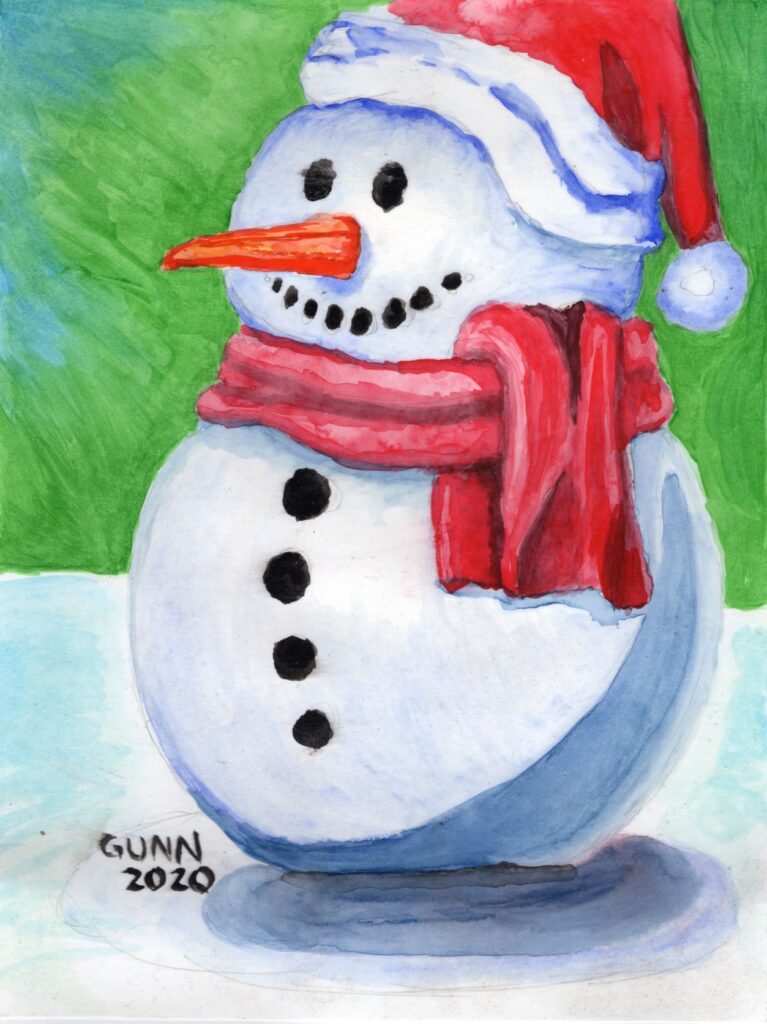
We are now in the second half of the year, which means it is time for those of us in the gift-making sector to turn our focus to the year-end winter holidays like Christmas.  I will certainly be doing Florida-themed paintings very soon, but I thought I should spotlight the watercolor paintings I did at the end of 2020. First up is this whimsical piece I just call Winter Snowman.

I had a very enjoyable time painting this, with the merry red scarf and hat, the black buttons, and the blue and purple shadows, with the swirling green in the background to make the reds pop.  Just pulling this painting out again to scan and upload has brightened my mood today!  I often use the word “whimsical” to describe this one.  While it has a different look compared to most of my other artwork, I still love it. Sometimes, it is just fun to experiment with different styles to keep myself from feeling too “stuck in a rut.”

Links to purchase original artwork and prints

The original is listed at Daily Paintworks, available for purchase if you have a eleven by fourteen inch space on your wall or desk.  For smaller or larger (up to 30 by 40 inches!) prints, visit my Pixels store.  If you want apparel or accessories, there is both my RedBubble subdomain and also a few at the Pixels site alongside the prints. (links open in new tab/window) I think it would make a great set of Christmas cards – both Pixels and RedBubble offer those. In fact, you could team this piece up with my two watercolor paintings of red and blue Christmas ornaments that are also perfect for greeting cards. I recommend ordering this early in the year at avoid shipping delays.

Winter Snowman watercolor painting
Winter Snowman, 11×14 inches, watercolor painting on paper, original available $140 USD