Continuing my self-audit of artwork created versus art pieces blogged, I find myself missing yet another of last summer’s art challenges, the green challenge and the elephant ear plant in my pasture. I meant to write about these last autumn, but apparently it just slipped my mind once “new project fever” swept up my last two working brain cells. I tend to get the new project fever in some rather big doses.
So, let’s travel back in time to July of 2021, which would put us after the flamingo series but prior to the blue-feathered bird series (which starts with the hyacinth macaw painting – I really need to do a roundup of that series and revisit those paintings with a fresh eye). It was another short challenge, with the theme “green,” and I just happen to have the perfect plant model that regrows each year in the goat pasture. Before the challenge started, I was out back with my old Kodak EasyShare digicam (I certainly got my $109 USD worth out of that thing!) to get reference photos of what my husband and I call the elephant ear plant for obvious reasons.

Since I was curious what its real name is (the plant was already here when we bought this place) I posted in a local Facebook group to see what it might be. Answers came in ranging from colocasia to taro to a xanthosoma species, and when I went researching what the differing names, I decided my specimen looks most like Xanthosoma roseum. (Edit: it may be Xanthosoma sagittifolium, which is native to the south of us and this one might have been brought up a county or two.) The largest leaves are often 18-20 inches long, and we sometimes joke about it being an escapee from the set of Jurassic Park.
The artwork
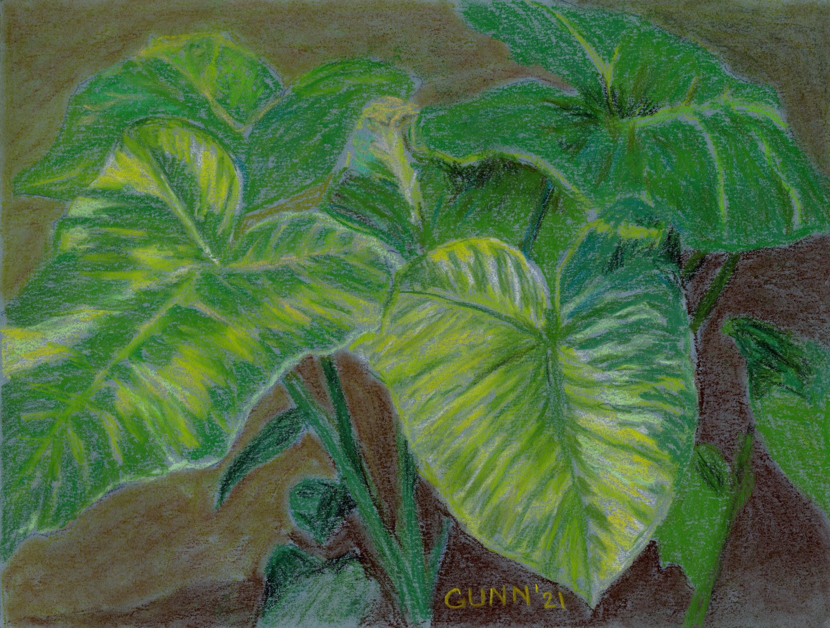
The first piece I did is similar to the above photo/snapshot, and I worked it in soft pastel (aka my “dusties”) on a blue sheet of Canson Mi Tientes paper, which I am still not enamored with except to use with colored pencil. Overall, I feel I got the shape right, but was hoping it would be brighter in the high key values (highlights) than it turned out. It isn’t awful, but I was hoping for it to be a bit more … just a bit more. The original is 9 by 12 inches, heavy paper, and lightly sprayed with fixative. Prints in larger and smaller sizes are also available at my Pixels store, and here it is on RedBubble apparel and accessories.

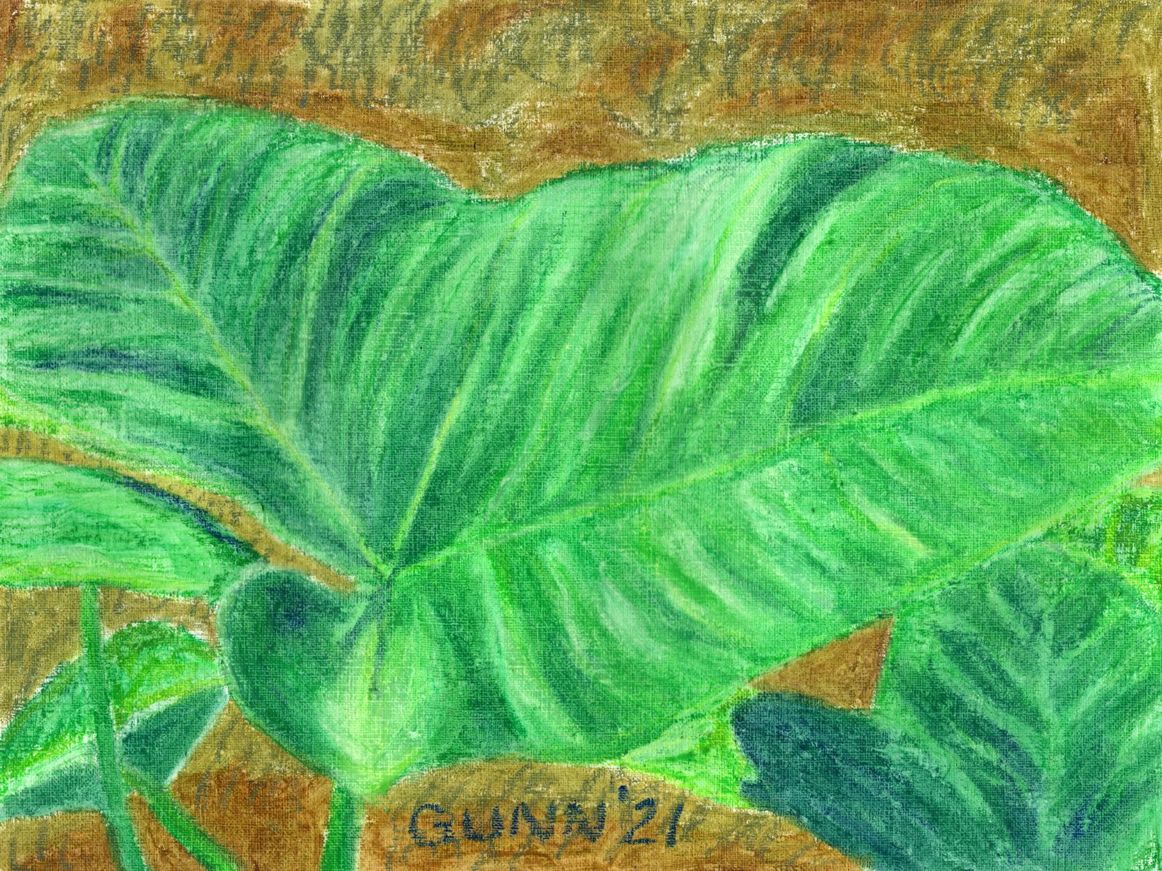
For the second day of the green challenge, I decided to zoom in on one leaf of the plant, because it really is a fun-to-draw shaped leaf (like Monstera species). I also decided to switch media and pulled out my oil pastels and the oil-primed practice paper, also a Canson product and one I like using. This piece captured the brightness I was hoping to achieve, and honestly it looks almost as if it is glowing. I so enjoy that about oil pastels – if you want serious, saturated COLOR, you can do it with the oilies. The original is also 9 by 12 inches, which is my favorite size for drawing and sketching, and it is sealed with ModPodge, which really works great for oil pastel work. Prints in larger or smaller sizes are available at my Pixels store, as are 500 and 1000 piece puzzles for those who love a good challenge and don’t have cats to “help” them with all the pieces. RedBubble swag is here.

For some reason that I cannot recall, I dropped out of the green challenge after this second piece, despite having a good half a dozen more reference photos already chosen and cropped and still in a folder on my computer labeled “green.” Since yellow fly season has started here, I will be spending the majority of daylight hours hiding in the house from those vicious biting monsters that seem to wait outside my door for both of us, which means I will have plenty of time to “art it up,” as hubby says, and maybe this summer I’ll blog more of the results.

I think my preference is for the Morning Sun version. Do you sit outside to paint these, or use your example photograph? I can see the composition is obviously different from the photo.
I use my snapshots, as working outside during the summer would result in sweat stains all over the paper. This plant is best in July, right before the goats suddenly decide to eat it down to the ground in August most years.
I definitely prefer the morning light version. Both are very nice though.
I admire your interpretations, and they look very textural!
Thank you, Bob!
Thank you, Jim!
I love elephant ears! We’re re-doing our landscaping, so I might add a few to our yard. My preference is the soft pastel version here, although I do like both. 🙂
Thank you! Interesting most people think the soft pastel one is better.
I think the color palette is what I liked most… the slightly darker, more muted green was very soothing.
OK, I can see that. I was trying to capture the bright and vibrant green reflecting the Florida sunlight, so since it was finished I’ve thought the soft pastel version to be not “quite” what I envisioned. It is quite an intense green by July.
Greens are always such tricky colors, I think. 🙂
Absolutely – attempting to capture the twenty-some shades of spring green will probably be an annual challenge for me.